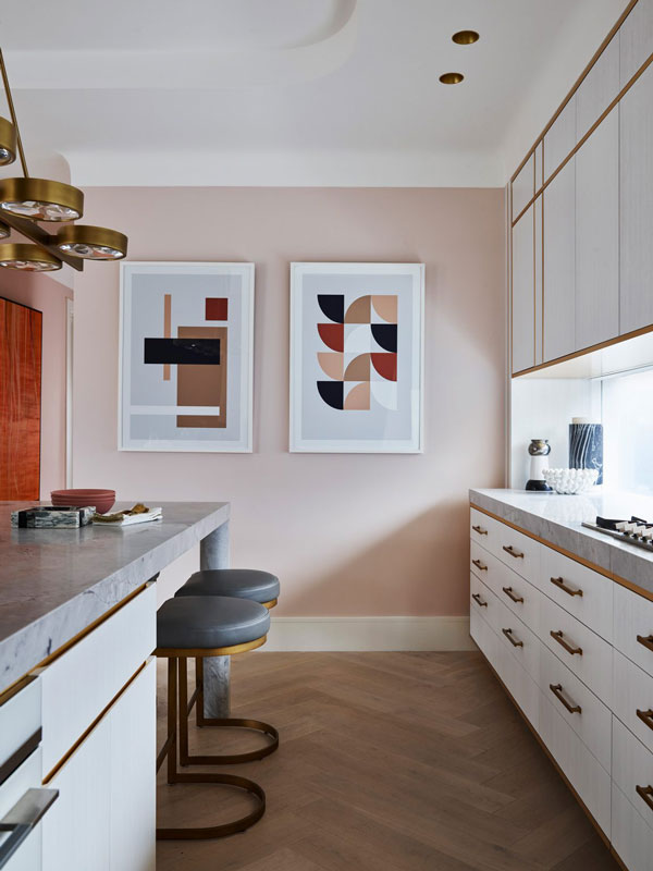
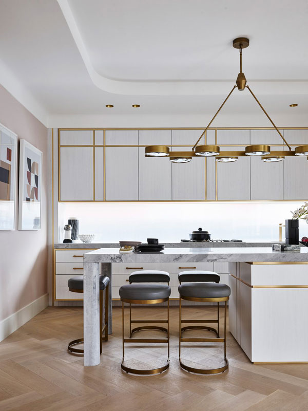
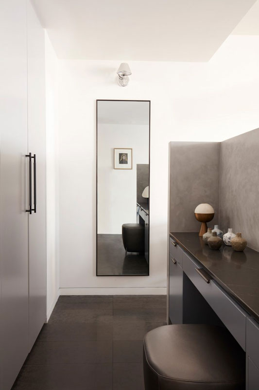
ALL-WHITE HAMPTONS by Home By Belle Interior Design
Text description provided by Home By Belle Interior Design.
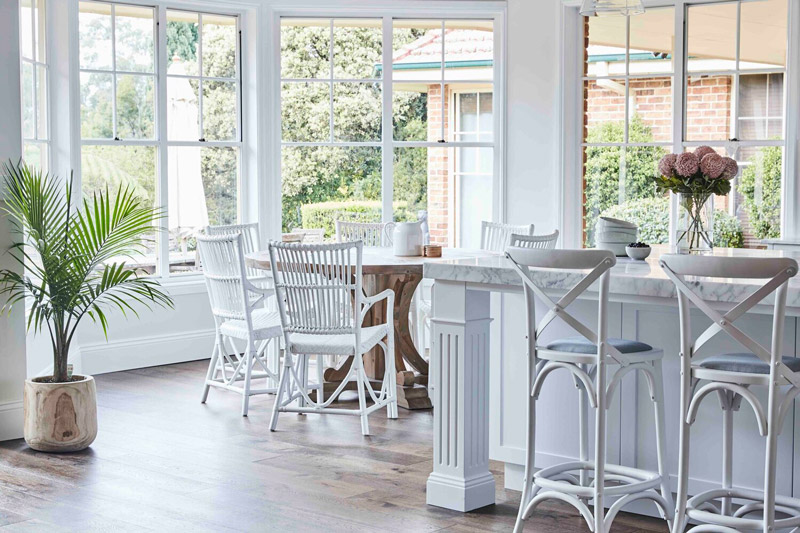
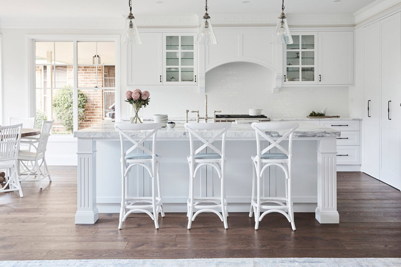
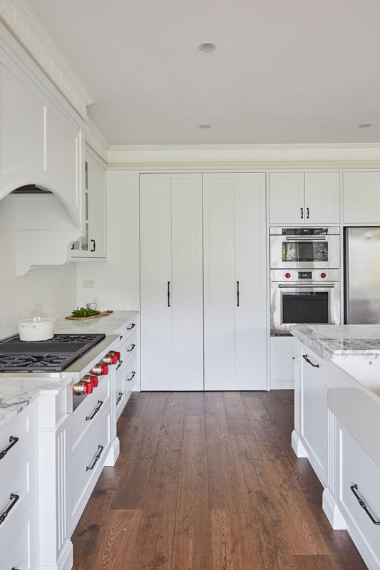
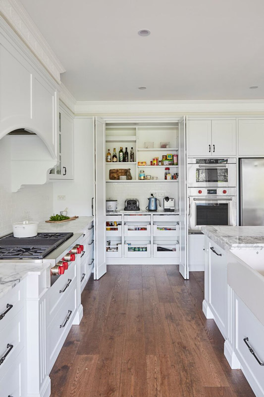
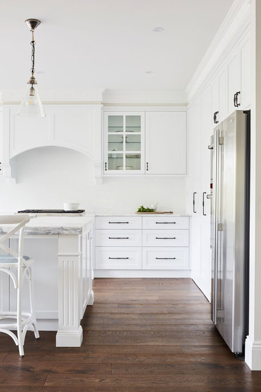
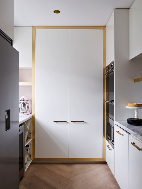
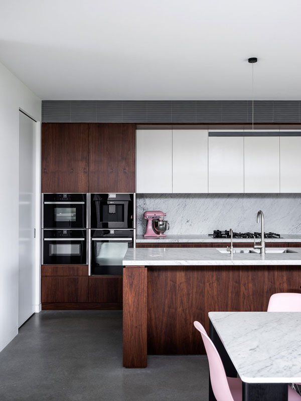
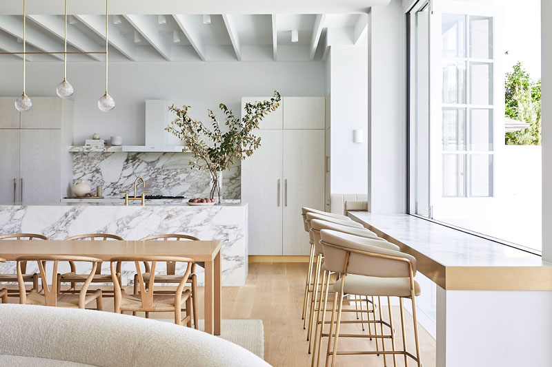
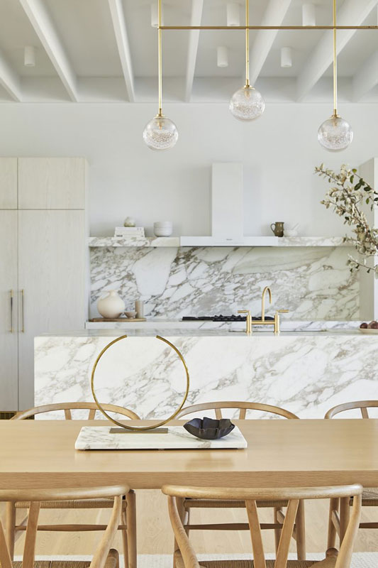
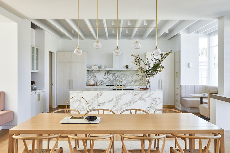
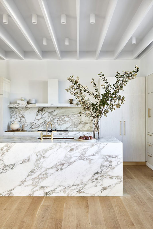
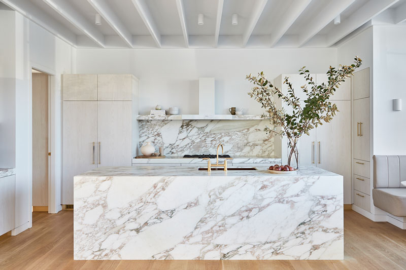
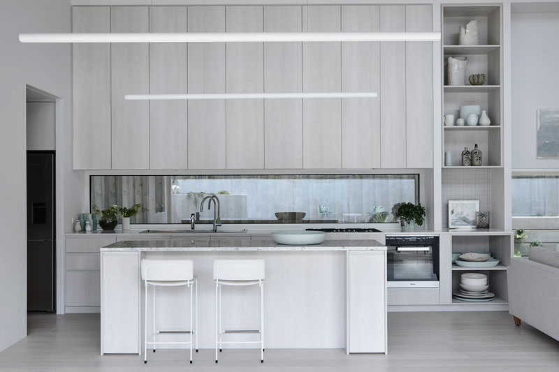
Kitchen renovation
“Our clients came to us with a clear brief, to design a bright, white and airy Hamptons kitchen that was both fluid and functional. The pared-back palette lets the craftsmanship and meticulous attention to detail shine.”- Sarah
PROJECT HIGHLIGHTS
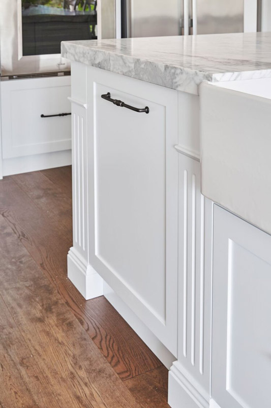
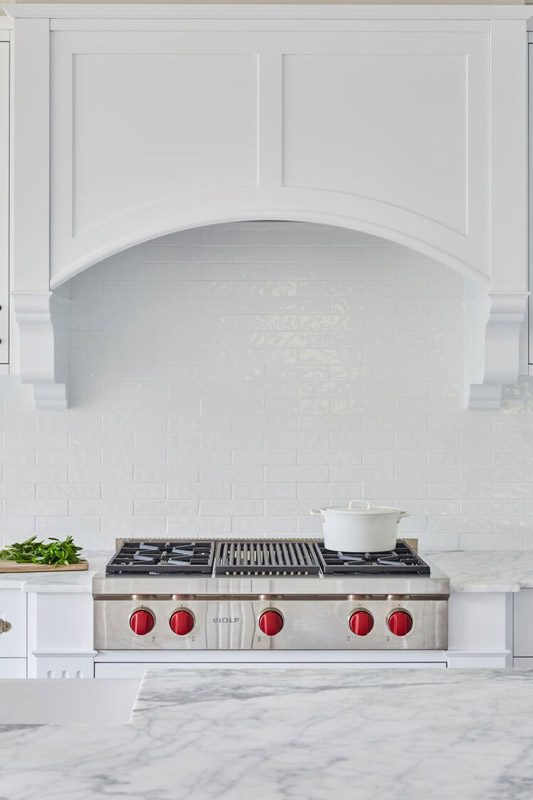
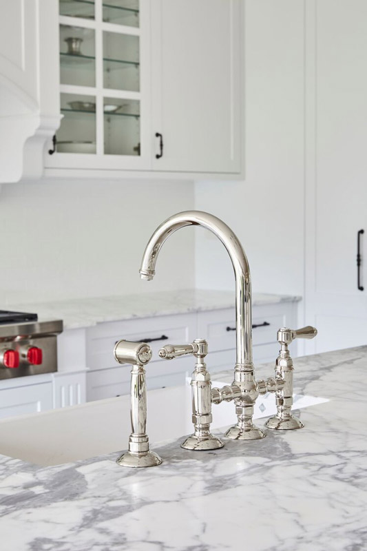
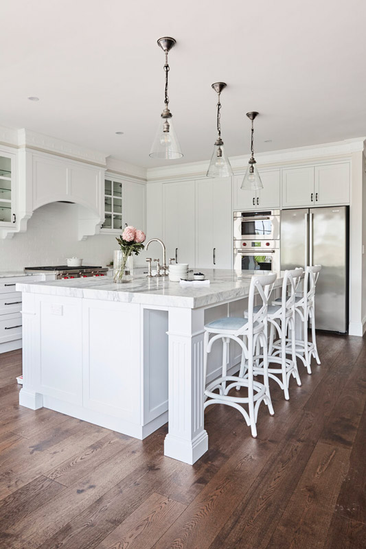
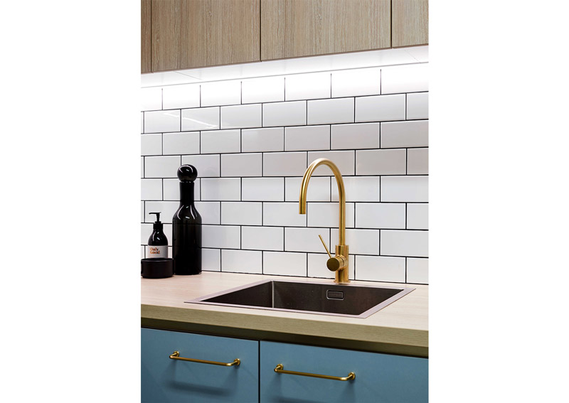
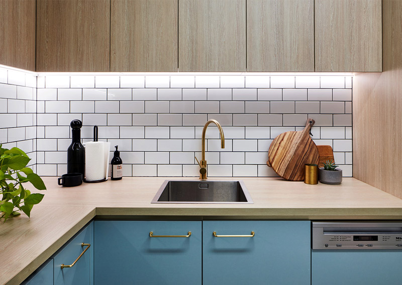
Crisp white cabinetry, polished Statuario marble benchtops, and white subway tiles establish the super clean palette.
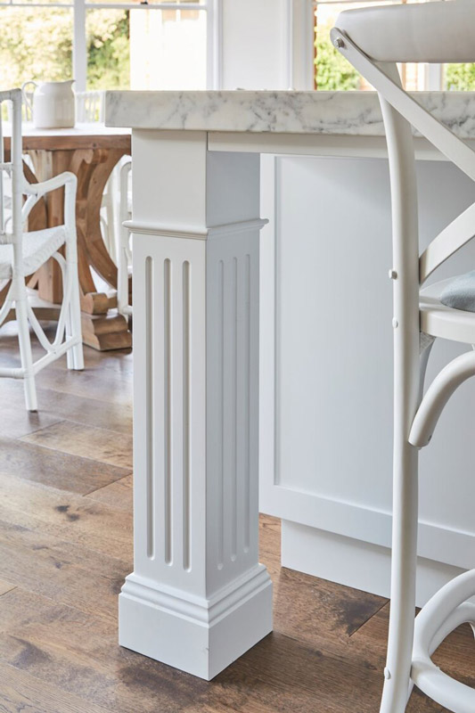
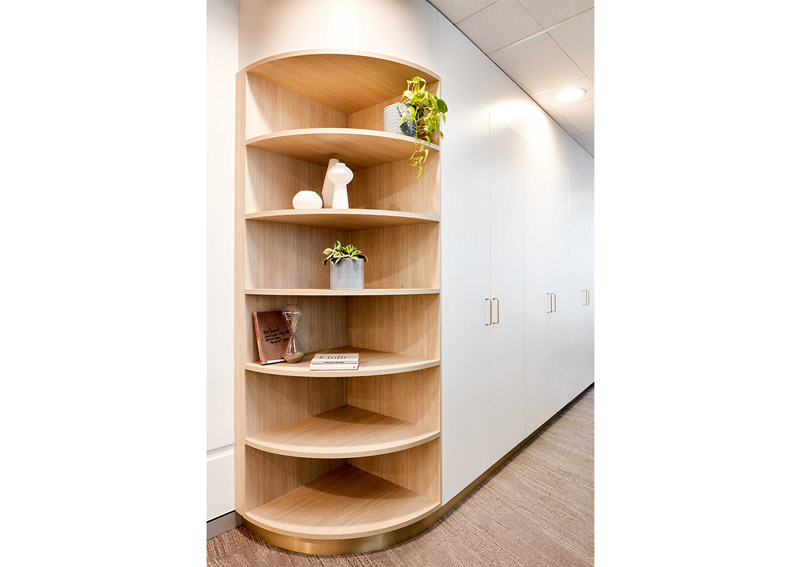
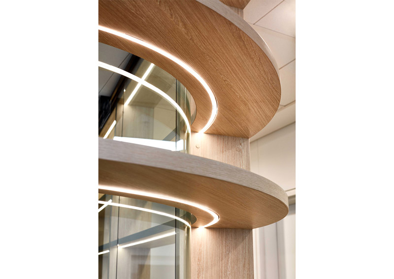
Highly detailed custom joinery features decorative capping to top cabinets and ornate rangehood corbels, cornices and skirtings.
Equipped with bi-fold doors for a seamless look, the butler’s pantry offers ample, cleverly integrated storage.
RENOVATION DETAILS Duration: 8 weeks
Scope of work: Half-home renovation of kitchen and living spaces. Kitchen included flooring, painting, custom joinery and installation of appliances, finishes and lighting.
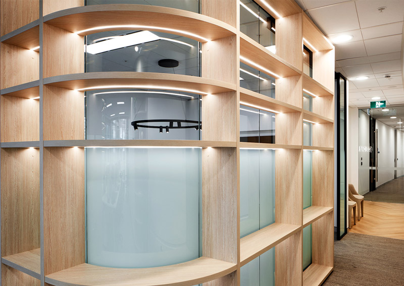
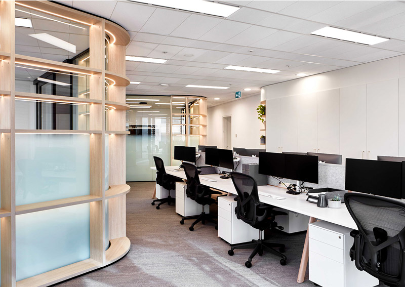
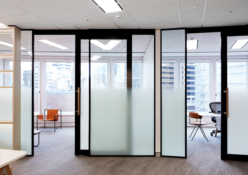
Text description provided by Vie Studio. Skyone Capital is a multi- family office firm based in Sydney CBD that focuses on creating investment opportunities to selective clienteles, especially meeting the financial needs and services for affluent families.
The brand puts emphasis on lateral thinking, logical problem solving by exploring all possible outcomes and solutions for entrepreneurs. This attitude is reflected in the text based logo which reinforces Skyone Capital’s simple intention of building a trusted and secure community for these families.
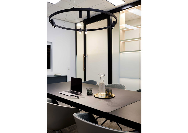
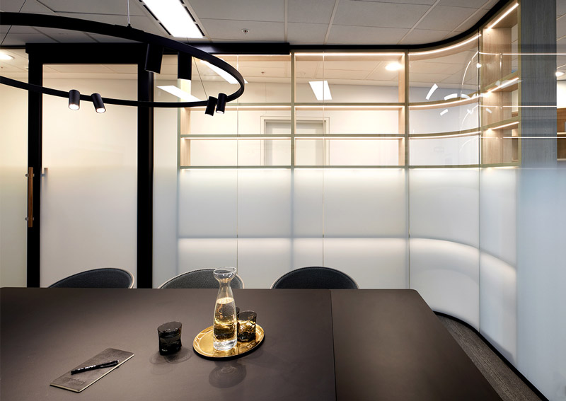
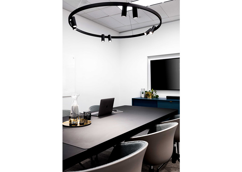
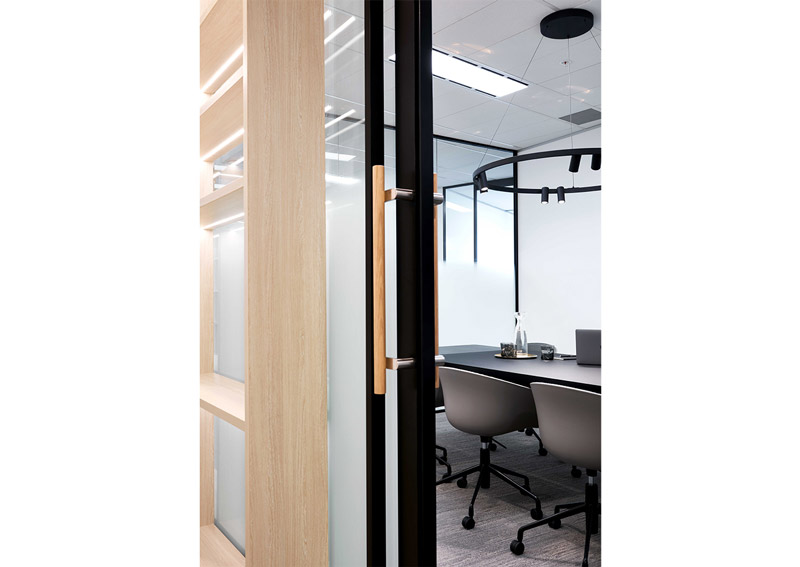
To affirm Skyone Capital’s vision, a choice of navy and sky blue colour tones have been selected as the brand’s dominant colours giving it a stable and confident persona. The overall interior styling and spatial planning design features a selection of prestige, luxe furniture and furnishings with the predominance use of timber and brass. Collaborating with Morphos, these materials have been careful selected to style the light filled 145sqm office workspace to give it a modern and sophisticated touch.
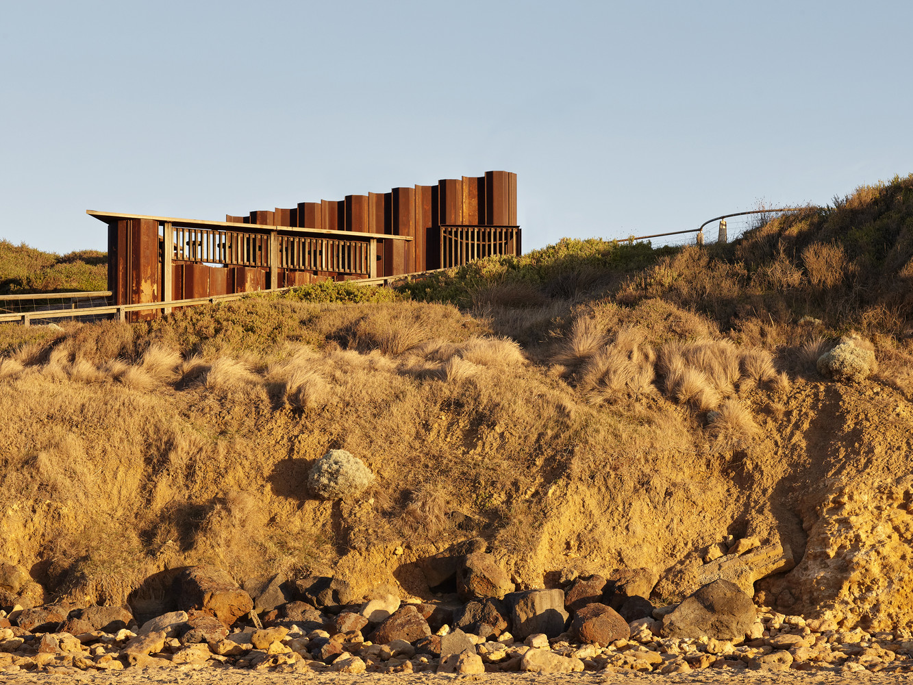
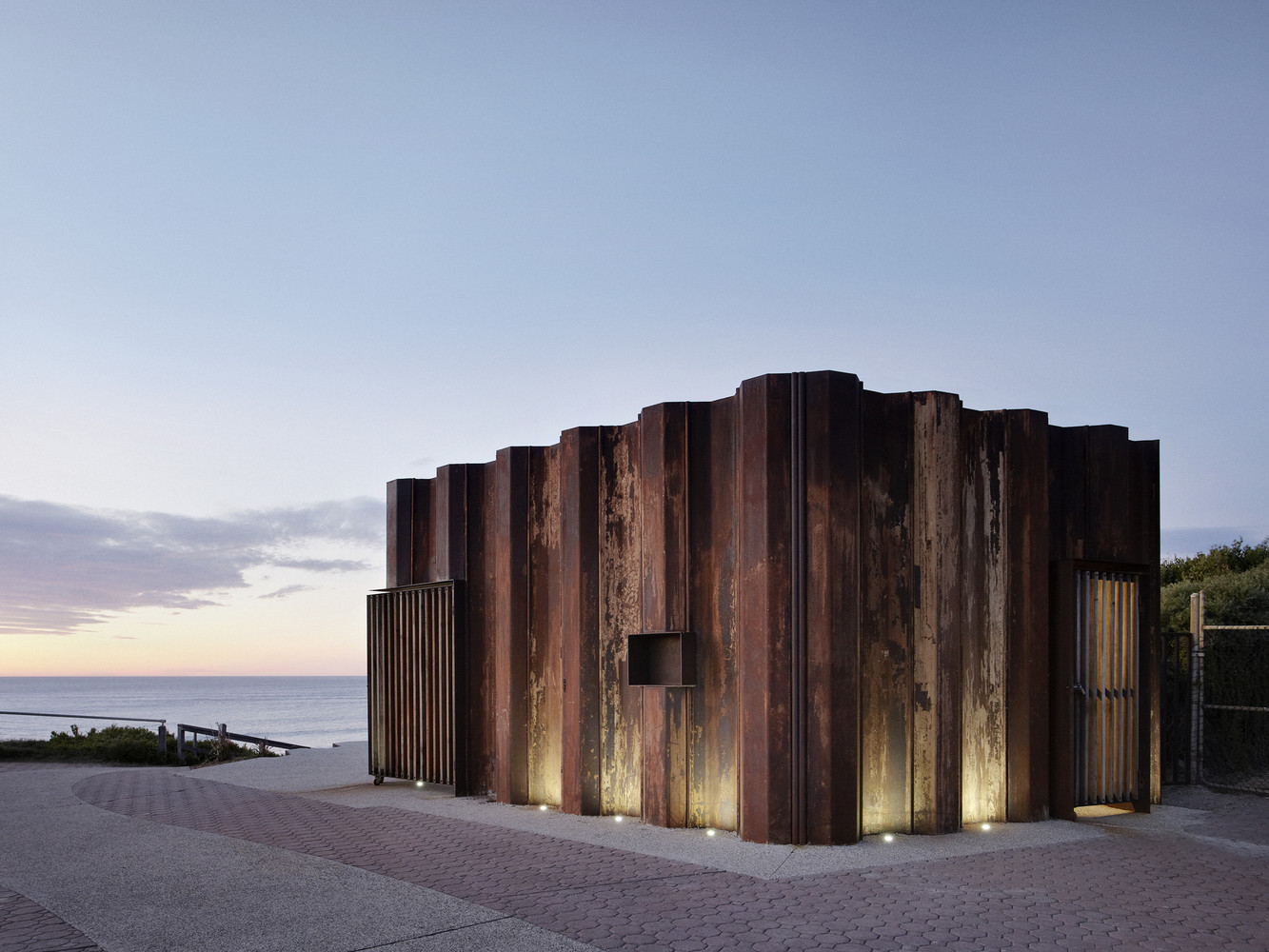
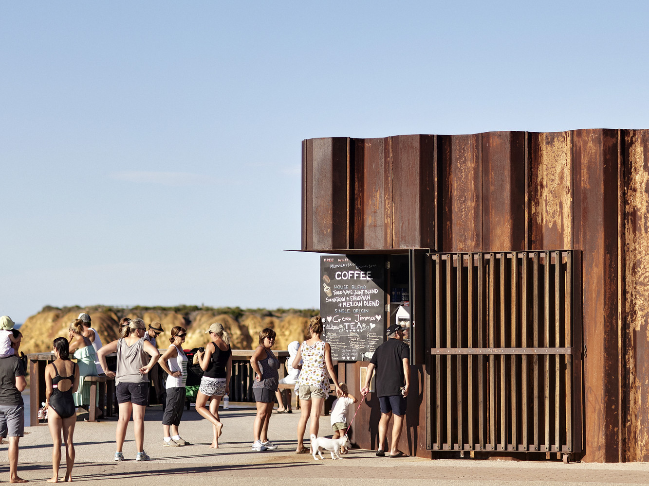
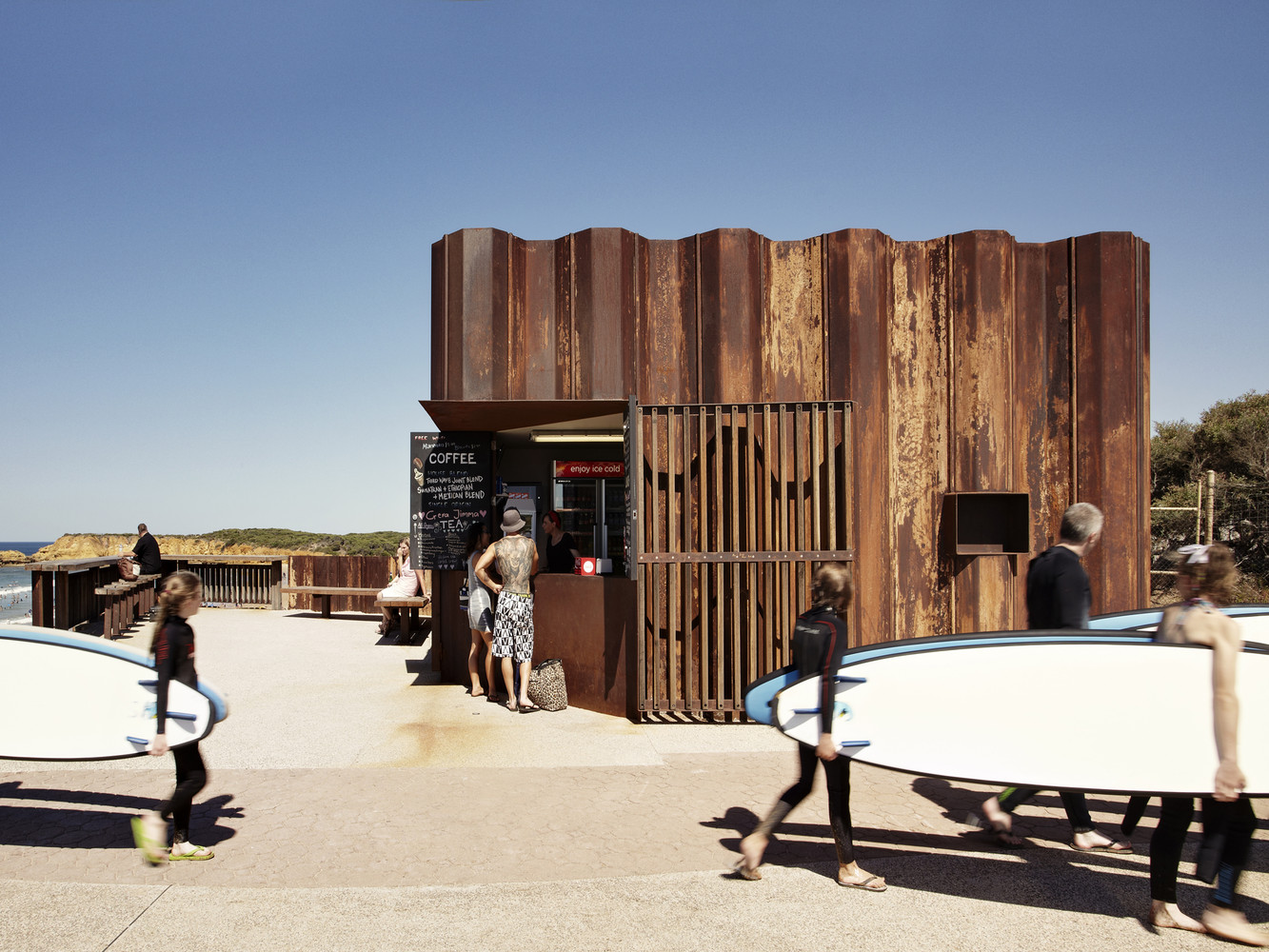
Text description provided by Tony Hobba Architects. Central to the design of the Third Wave Kiosk is reverence for its environmental setting; engagement with beach culture; resilience to natural forces and energetic youths; and attention to modest and elegant simplicity.
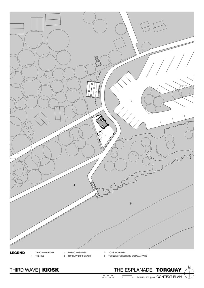
The brief was to design a new public facility at Torquay Surf Beach that contained a new kiosk, toilets and change rooms that would be open year round, service an assortment of recreation users and provide an important beachside destination.
Due to the site’s high level of local, regional and international use throughout the year, together with its visual prominence along this section of coastline, the design of the project recognized the need to adequately service community, recreation and tourist requirements whilst sensitively integrating and respecting the local coastal environment and adhering to the Victorian Coastal Strategy.
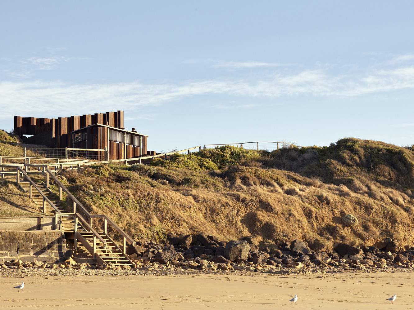
The building is positioned adjacent to the nexus of pedestrian circulation, between the main car park and beach access path, to guarantee maximum foot traffic; and is visible from the beach and water’s edge as it gently emerges from the primary dune.
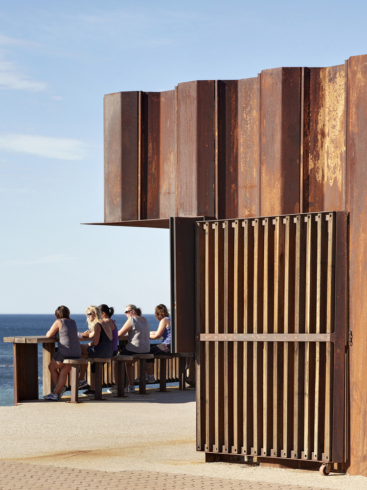
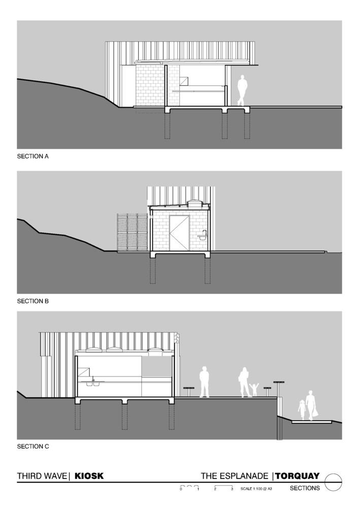
In order to engage beach goers, an elevated lookout and alfresco seating area (65m2) has been provided adjacent to the Kiosk which not only overlooks the beach but doubles as an easily identifiable landmark and meeting point. At only 20m2, the compact kiosk kitchen and servery caters for 1-3 staff depending on seasonal demand. A 25m2 service court out the back caters for additional storage, deliveries and a few empty milk crates keenly commandeered during smoko.
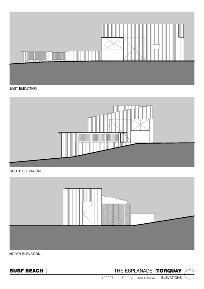
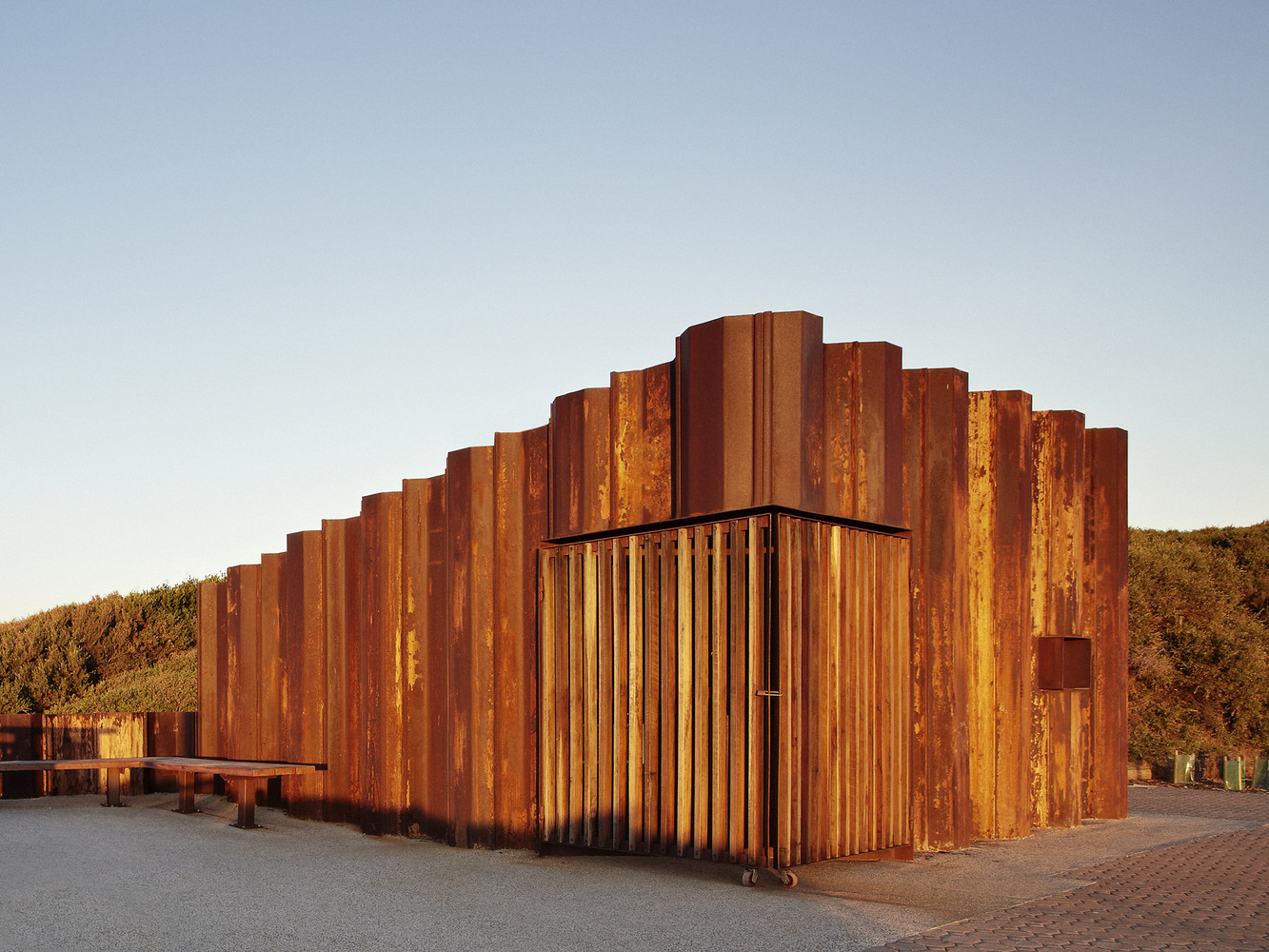
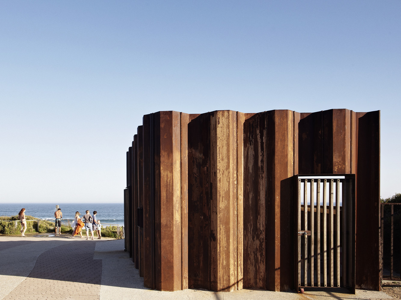
The height and profile of the building has been designed to respond to the prevailing coastline undulations and windswept vegetation, and uses these natural inflections to inform its final folded appearance. The form therefore takes on a sculptural quality which blends in with the surrounding environment and shrouds the utilitarian function of the working core.
This is accentuated through its use of coastally identifiable materials and colours by using recycled sheet piles typically used for seawall, bridge and pier construction to be the predominant exoskeleton and expression of the building. These sheet piles have intentionally been left in their original condition to emphasize the reddish brown and yellow oxides of weathered steel and harmonize with the colour of the surrounding cliffs.
This system of construction proved extremely efficient, both structurally and financially, as the sheet piles were used as permanent retaining walls for the alfresco terrace and lookout; provided permanent formwork for the building slab; and extended up as the primary structure and facade of the building. It appears that this is the first building in Australia to utilise the material in such a way, with the added bonus of reducing the projects embodied energy.
With sustainability and re-use integral to the outcome, the recycled sheet piles were procured from the 2010/2011 Victorian floods where they were last used for flood protection works along the Murray River to assist in mitigating the devastating water damage experienced by the local river communities during this extreme rain event.
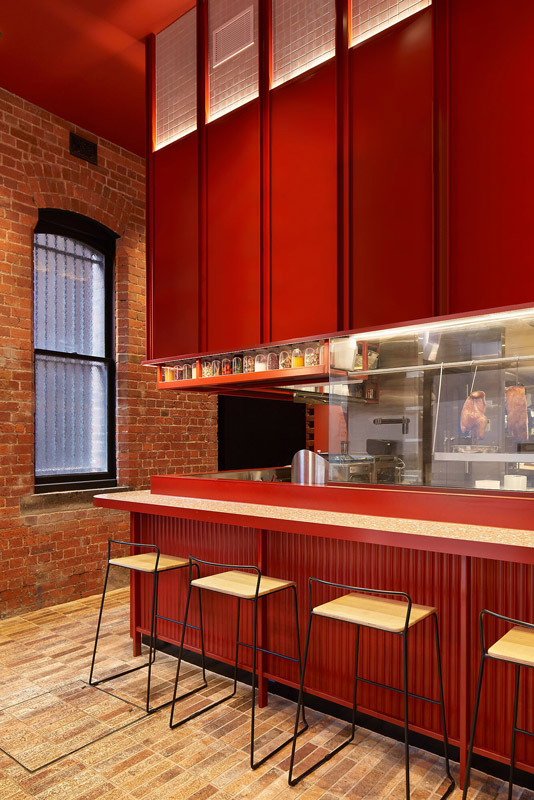
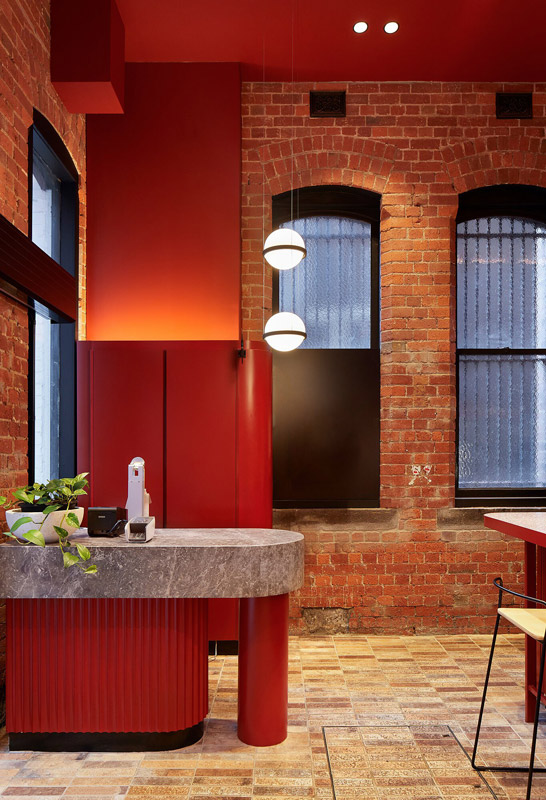
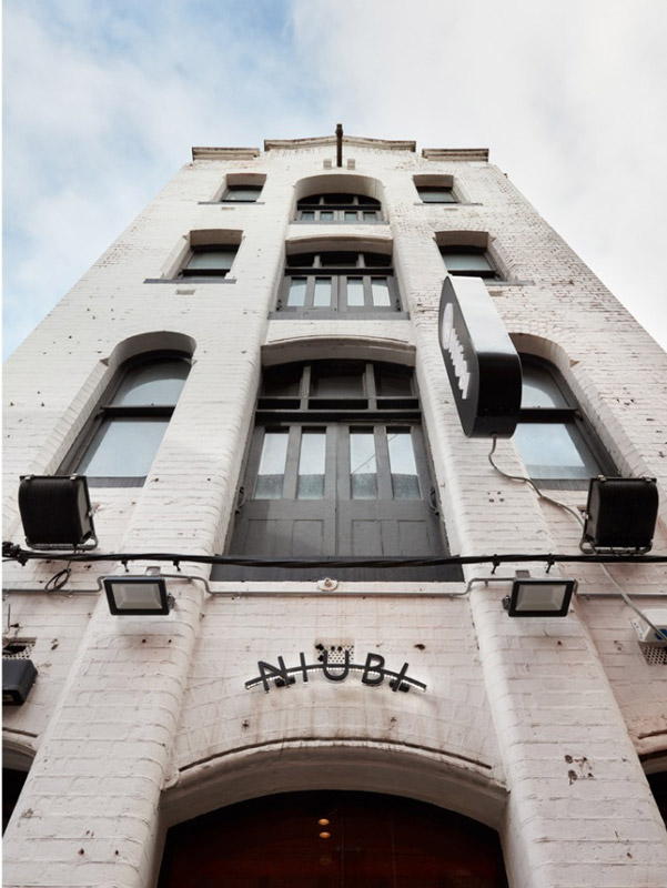
T-A Square architecture is a full service, award-winning architectural studio renowned for its multi-residential projects & its balanced understanding of design and commercial considerations. Niubi is a contemporary Asian restaurant showcasing the very best of south-east Asian dishes.
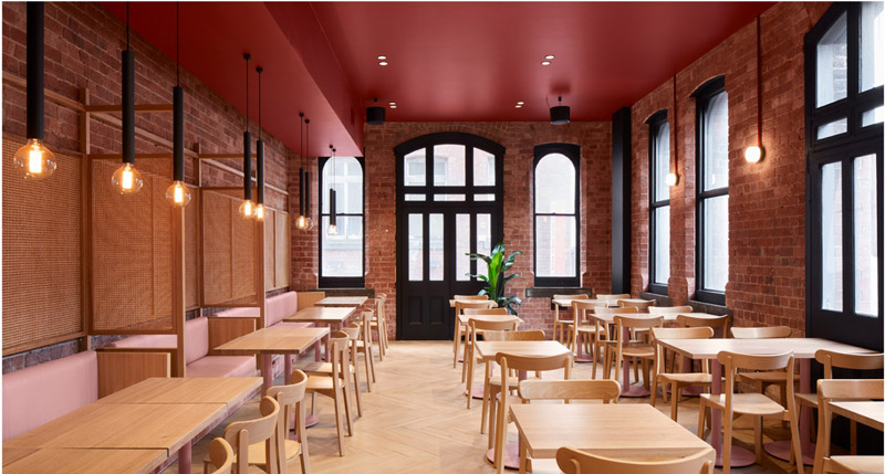
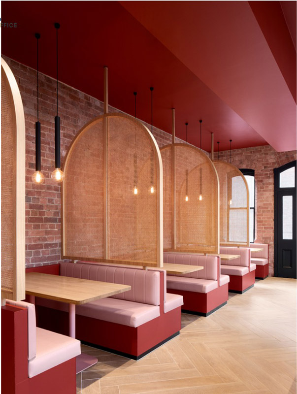
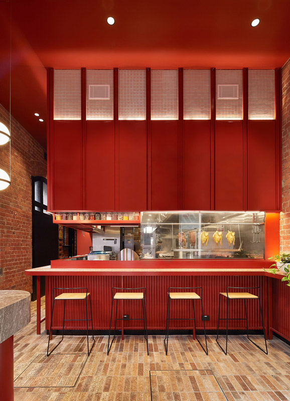
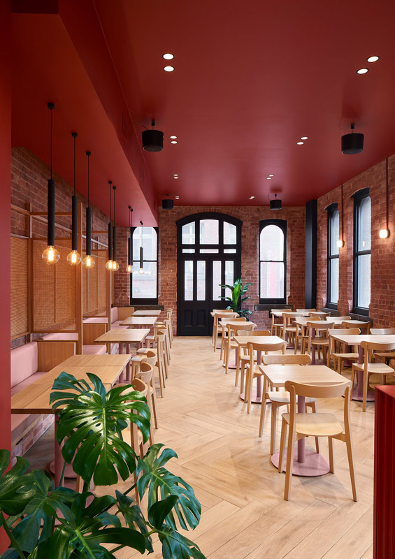
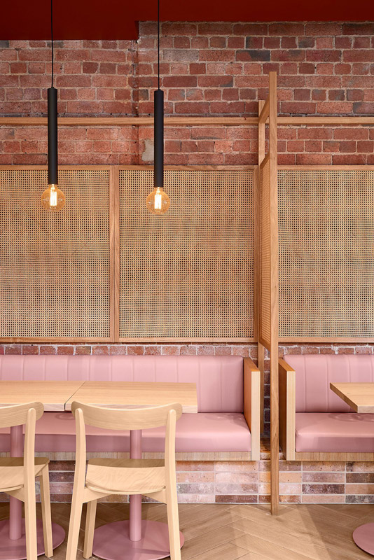
With its chic, slick and ultra-contemporary interior, the venue has been noted as one of the “most worthy for the gram”! Its pastel pink booths, wicker dividers, and bold red feature ceiling creates an aura of warmth.
It is the bold use of colour that characterises the space. bright red used throughout represent luck and happiness, while the pastel pink of builtin banquettes was included to give a sense of youthfulness and freshness
Finely crafted as a series of intimate internal gestures, Brunswick House sees the recasting of its next chapter through a veil of restraint and considered warmth. Retaining the familiar character, scale and proportions of the existing Victorian terrace, Placement Studio balances intricacy and simplicity to create spaces that softly dance with the incoming natural light.
In an effort to preserve the charm of the original quaint cottage, the architects sought to move away from a traditional renovation and addition. Rejecting the path most commonly travelled in such projects, Director and Founder of Placement Stephanie Kitingan explains that “instead of merely maintaining the front of the home and harshly severing the rear, we wanted to take a more compassionate and integrated approach.
” This was also driven by an acknowledgement of the invaluable role of green space within such a tightly woven urban fabric. “As the garden was a vital component of the home and particularly for the client, we didn’t want to encroach on this space,” she states. Thus, the focus of the renovation and extension became framed by a more refined and considered approach, delicately weaving the old and the new with intent and rigour.
A defining quality of housing typologies of the Victorian period is their narrowness. In the case of Brunswick House, nestled within the same-named inner north enclave of Melbourne, the inherited home sat flanked by neighbours and stretched a mere five metres from edge to edge. Stephanie explains that “the client had lived in the existing home for almost a decade, through his mid-20s and 30s, and over that time he’s seen it evolve into more of an adult home.
” The client’s history with the house meant that “it was important that the home felt homely, wasn’t pretentious and that it retained the sense of warmth.” From this understanding, a less common brief then ensued, with a focus on the compact and the robust, primarily within the existing narrow envelope.
“Our response was twofold – to create a feeling of openness and lightness in a south-facing home, while creating intimate and private spaces to recoil to,” Stephanie says. “The brief was interesting in not needing to design for children, as the inherent need for flexibility of spaces over time or for the unknown weren’t an issue.” Maintaining the front two rooms with a light touch – simply replastering and restumping – the midsection was then used as the main reset, defining the transition between old and new.
From here, “the approach was to do something that would stylistically stand the test of time,” Stephanie reflects. “We have designed the rear mostly as a large joinery unit, with an emphasis on heightened detailing, integrating light boxes and tiled corner benches that all come together as a series of overlapping elements.”
Expressing the emphasis on joinery as a catalyst for the new, the gesture of the unique stair that sits both sculptural and functional epitomises this notion. The transitional element allows for an additional sleeping, study or retreat space to be elevated above the mid-section. Describing this configuration, Stephanie says, “as the terrace steps down to match the slope of the backyard, the internal gradual stepping then allows for an on-grade connection to the rear, subtly increasing the internal volume and optimising the original height and proportions of the home.” The new spaces are then bound through shared principles of restraint, robustness and an ingrained warmth of materiality.
Underpinned by simplicity, Brunswick House embodies timelessness and stillness. The controlled use of tactile and textural brick, tile and timber crafts intimate connections between building and inhabitant, as Placement carefully navigates the site whilst bathing spaces in natural light. With a dappled softness, the efficient interior opens generously to the prized rear sanctuary garden space and creates a protective cocooning effect, at once contemporary and familiar.
Nautically French
- Inner West Project by Greg Natale
Combining a French sensibility with that of the P&O nautical influence, Inner West House plays with a heightened luxury in its harbourside address. Greg Natale layers rich textures and textiles to complement both the story of the home’s context and that of the owner’s own individual aesthetic.
Imbedding softness through curves and a matched palette, Inner West House sits amongst its newly developed Five Docks location in Sydney as a response to context. Abutting the ocean, a dynamic sensibility influences the approach to form, planning and the layered elements that comprise the home. Combined with a lightness, the surrounds are welcomed internally and animate the home, each surface interacting and reflecting back or absorbing the natural light throughout the day.
The owner’s own style combines with a French-inspired aesthetic and highly crafted resolve to propose a series of spaces elevated through intentionally luxurious touches. Greg Natale carefully combines the familiar elements of home with a European understanding of space and proportion.
Built by Ciolino Constructions, Inner West House embraces the Sydney outdoor lifestyle and ensures each internal space has the capacity to become doused in natural light throughout the day. Taking tonal inspiration from the initial timber flooring as the base, pink nuances were pulled from the blond wash as the muse for the resulting layers. An array of variations and iterations of the core base palette are applied throughout, expressed as wall finishes, fabric, and added textures, injecting a remarkable warmth and tying each space together.
A foundation of white plaster and paint ensures the expressive stone and brass additions are given the featured presence intended. Lighting and tapware further tie into the original P&O Style as bold insertions that add an elevated and nuanced nautical touch.
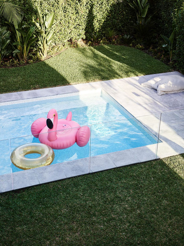
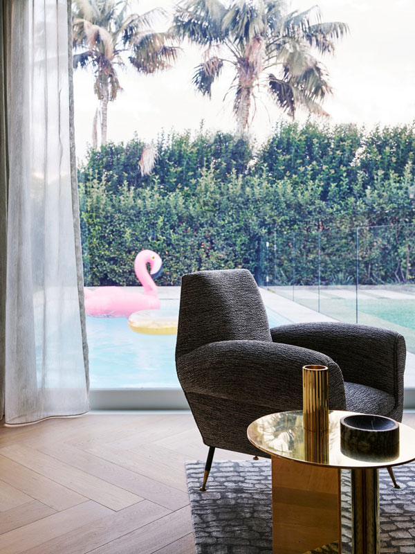
Spread over two floors, the four-bedroom home has been considered from a core and cohesive concept that then binds the home as one. Throughout, custom designed joinery and furniture sit along classic pieces, while lush carpets underfoot also by Greg Natale, ensure a sensory immersion. As the planning ensures a connected and openly flowing family home, it equally opens generously to its own landscape and private pool, reinforcing a sense of enclosure and privacy while also being outwardly connected. As an originally art deco style home, the geometries of its origins mix harmoniously with those introduced.
Greg Natale’s Inner West House brings a refined softness through its elevated palette and curved gestures, one that captures its past together with the essence of its present occupation.
Modestly discreet, Pipi House presents as a concealed and private residence from its streetscape, opening generously to the rear to engage with its surrounding landscape and natural elements. Peg and Ray Architects conjures a restrained and carefully proportioned home amongst an animated residential setting, creating a calm retreat.
Despite its lively surrounds, Pipi House sits restful and quiet behind its solid and monolithic façade of darkened timber and masonry, protective and concealing. Located north of Sydney in Chatswood, Pipi House nestles itself into an established residential neighbourhood of similar proportioned homes, varying in heritage and individual narrative. As a means to create their own sanctuary of sorts, architects and owners Peg and Ray Architects propose a series of volumes that sit interconnected and privately obscured from the street. The formal approach on site speaks to a restrained contemporary influence, while also giving a prelude to the sense of journey and discovery to unfold behind the façade. Anchored and boldly confident, Pipi House awaits discovery.
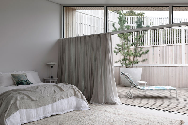
Built by Mahony Group, together with joinery by Sydney Joinery, Pipi House is split over two levels and includes a dedicated home office. From behind its concealing front, the interiors open with an inviting warmth, where polished concrete underfoot provides a robust and resilient foundation for the happenings of any family home. A similar palette is brought from the external materiality inside, where it wraps each surface, becoming more tactile and detailed in areas. As intended, the home feels protected and calm through its open connection with the rear garden and landscape. Glazing and operable façade details allow the interiors to spill out naturally into the outdoors.
Split into wings, the portion of the home to the east presents with height and strength as the face of the home to the street, while the portion to the west opens to the rear and presents as a more transparent and approachable series of spaces. Careful articulation of controls and overhangs ensures solar, and heat gain is optimised and avoided as necessary.
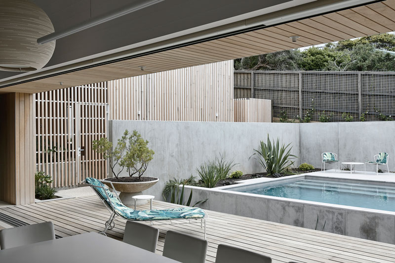
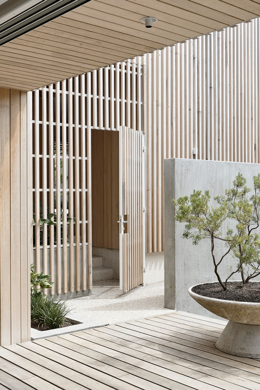
The outdoor courtyard, pool and BBQ all facilitate and ease the family functions to transpire outside in an external space that is protected and private, part of the home itself. Transitioning between the open and closed places is marked by moments of pause, connecting and navigating the flow of movement through the home. These areas are imagined as a reset and as places of contemplation.
Through compression and release, Pipi House carves its proposal of balance. Peg and Ray Architects has created a purposeful retreat, which keenly reflects the architects’ needs and how they uniquely live.
Playful and Expressive – Collaroy House by TRD Studio
Combining a bold playfulness with a familiar residential warmth, Collaroy House references the known and the expressive. TRD Studio brings organic shapes together with a linear approach to conjure a family home able to transform as needed, while remaining robust and enduring.
Navigating its corner block in the same-named milieu of Collaroy, the family home balances privacy and retreat while catering to its family of four teenage boys. A mixture of low maintenance and embedded robustness forms the foundations of the home, with elevated moments of heightened luxury creating points of difference. Throughout, flow is accentuated by geometries used while timber adds a welcomed warmth to both the spaces and the inserted elements, grounding the home in its lightness.
Combining forces with architecture by Integrated Design Group, TRD Studio designs the interiors as a free moving series of connected spaces, able to be melded to suit the growing family and their needs as they change over time.
Collaroy House draws in natural light from its surrounds, further emphasising a feeling of openness through a neutral and white base palette throughout. The mixture of veined stone used in a monolithic manner creates moments of boldness, forming sculpture-type elements within the space, while elements like the organic and oversized sofa add a more fluid and dynamic insertion – both encouraging engagement in their own way. Integrated furniture and seating grounds the home in place, embedding a sense of permanency.
The lightness of the interiors is accentuated by soft pastel hues used in covering the built-in banquette seating, the bedheads and in the layering of tactile textures throughout. Moments of these colours are balanced with a calming ambiance throughout, crafting a consistent palette tying each space together. Opting to place the outdoor space in the centre of the house instead of at the back, the central living space opens to the outdoors and encourages a spill over into the external room. This placement ensures a sense of privacy is maintained and further brings in additional natural light and ventilation into the heart of the home.
A Return to Light – Glebe Point by JCA Architects and Décor JMH
After having lived in the penthouse since 2007 – and a flood causing damage to the home during that time – a refreshed approach was inevitable and warmly received. Ideally elevated above many other pavilion homes below, Glebe Point and its encasement of floor-to-ceiling glass called for an open and connected change. Reflecting its owners, a love of colour and richness of texture, the home is given a fresh start. Embellished with aptly fitting adornment, a new interior approach reflects a heightened level of animation and personality. As both a residence to retreat to and as a perfectly positioned place to entertain, the resulting home needed to balance both a sense of enclosure and one that openly embraces its guests. Together with JCA Architects, Décor JMH draws on a modernist approach to creating a linear and iconic restraint home.
Built by CJ Duncan, the home features three bedrooms, all with their own bathroom and 180-degree views of the nearby Anzac Bridge. The Sydney Harbour Bridge sits in the distance, with the prominent view of the brutalist beauty in the foreground. Every home within the building had its own unique brief, detailed by how each resident used each space; for Glebe Point, the residence is part home, part place for entertaining and part place of work. Bringing each of these contrasting characteristics took a patient and considered approach, while also requiring an embedded flexibility as well.
Each space becomes a showcase of sorts, bringing together modernist shapes, materials and silhouettes, which are highlighted by the abundance of natural light flooding in through the glass. Referencing these pieces is a similar toned palette, seeing brass, stone and varying stains of timber create a home of warmth and curiosity. Whilst the use of colour provides a series of internal focal points, the true centre is the kitchen. As a place to gather, entertain, nurture and even work from, it caters for the changing brief of the home while also being a space that pulls all occupants and visitors together. Its careful crafting of metal detailing and warm timber further emphasises a welcoming nature, as extensive joinery ensures storage can conceal the sometimes-unsightly everyday elements.
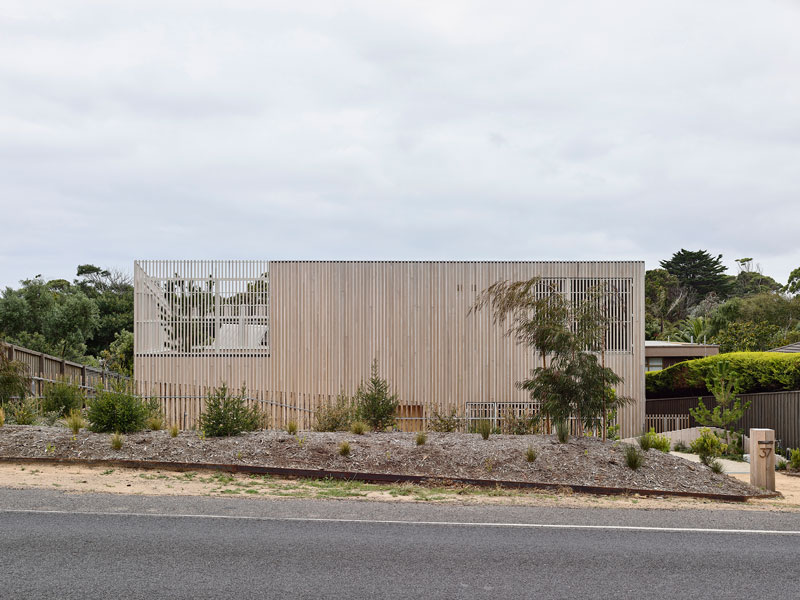
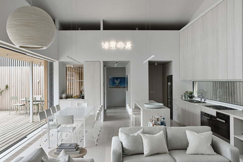
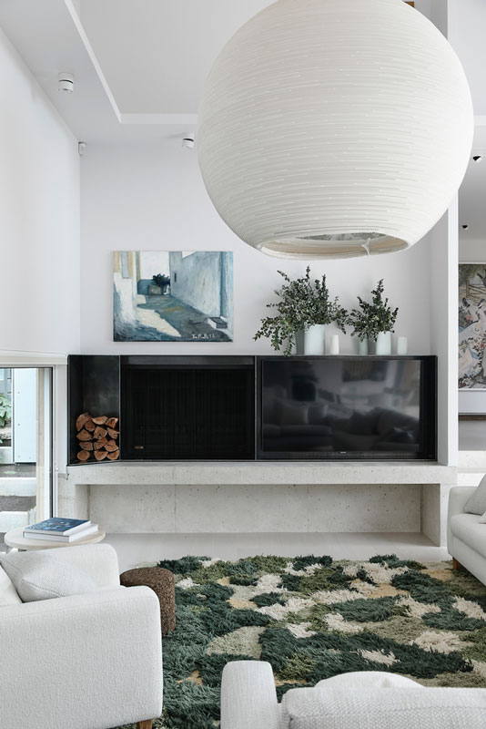
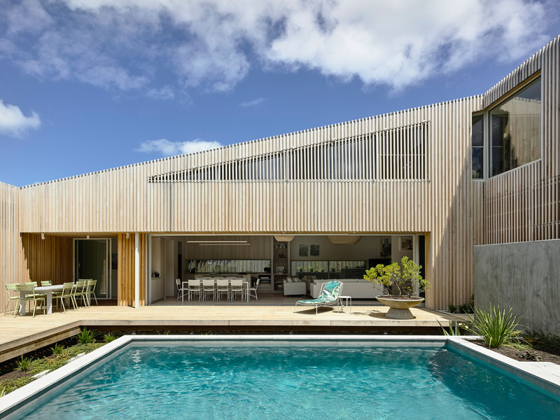
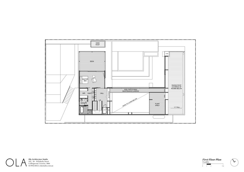
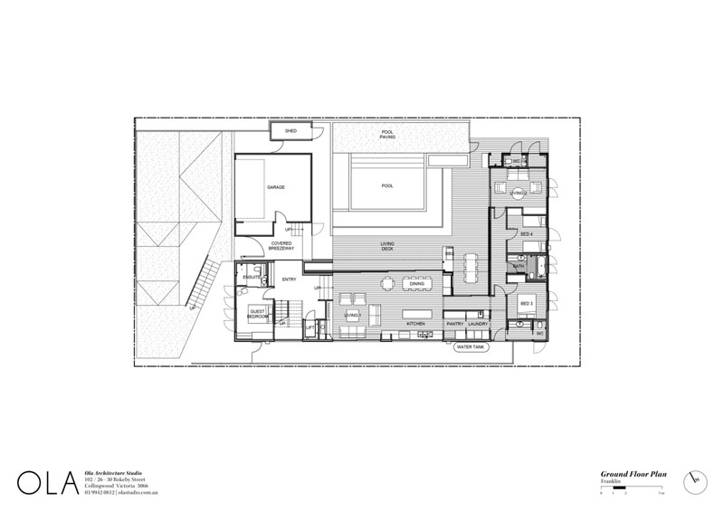
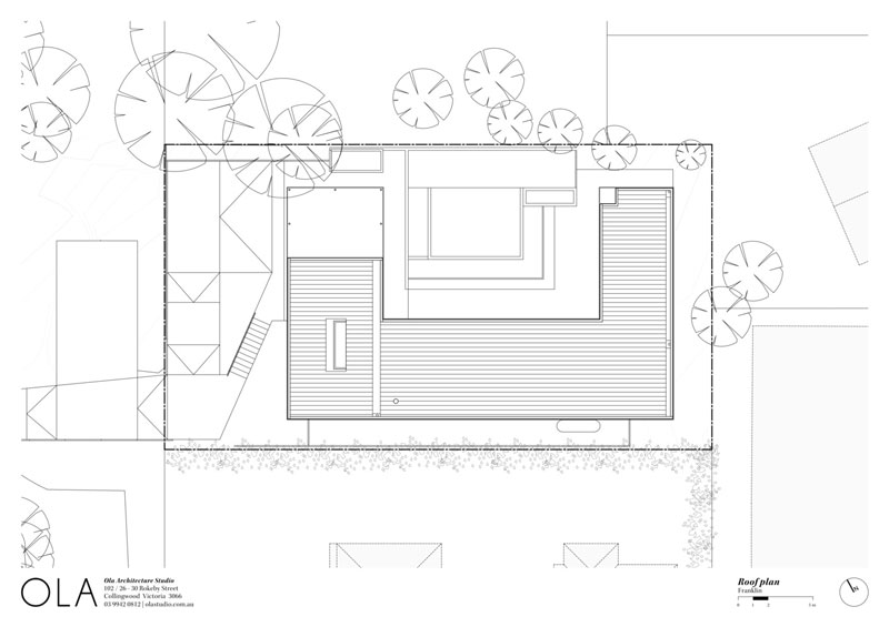
Text description provided by Ola Studio architects. Franklin is a four-bedroom residence designed for a single owner with an extended family of children and grandchildren that will overtake the place during holiday periods. Sitting calmly on the lands of the Bunurong people, the site is situated along a road screened with dense shrubs about 400 metres from the bay in Portsea. Along the road, small sandy driveways disappear into the wall of foliage, invoking a connection to the beachside setting, although much of the planting is exotic. Hidden behind the trees is a collection of unremarkable suburban houses with a couple of odd gems immediately to the site’s rear.
Informed by our clients’ eclectic art interests that specifically include Japanese, Greek, Indigenous and Mid-century Modern as well as a fascination of Japanese design in general, the design is a literal response to a well-defined design brief. The brief asked for a “Japanese inspired fuzzy white cocoon” that is private, peaceful, fresh, and organic. A tranquil place to live, work, gather and play. Something that can work with the shifting numbers of occupants and still provide a sense of calm and retreat, whether there is only one occupant or a full herd.
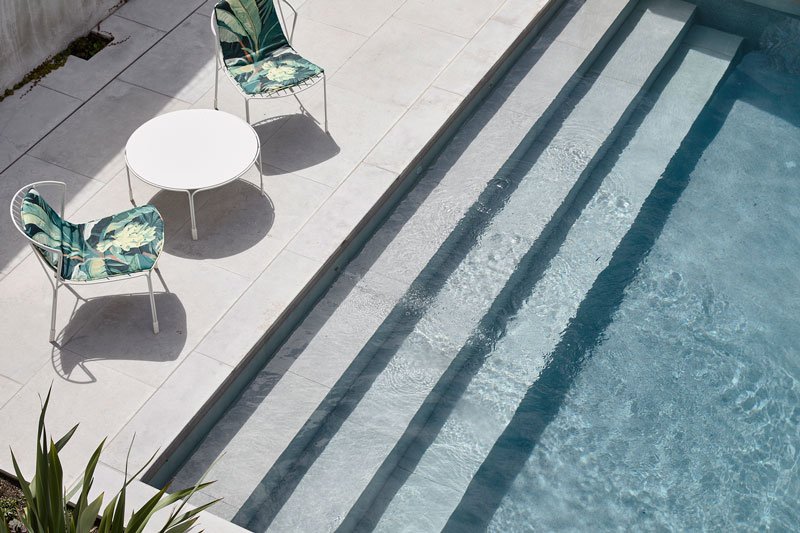
Contextually, Franklin responds to the characteristics of the beachside setting rather than the more suburban characteristics of the built neighbourhood. Design cues come from the fall of the site, which is to the rear, the coastal treetop datum, the neighbour’s dominant cypress hedge along the southern boundary, the sites orientation, and the established conditions of the neighbouring lots. The intent in responding to these elements is to establish a sense of belonging to the natural environment rather than the built, and in turn establish an architectural language of tranquility.
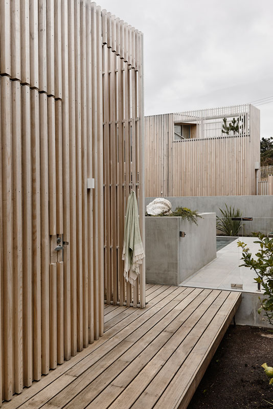
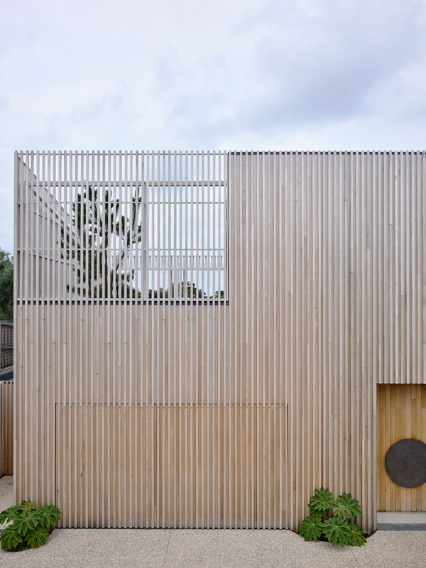
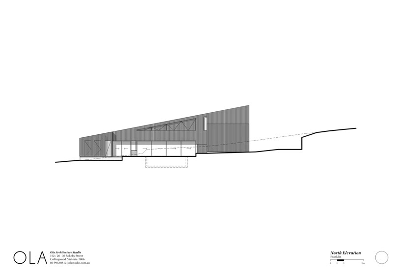
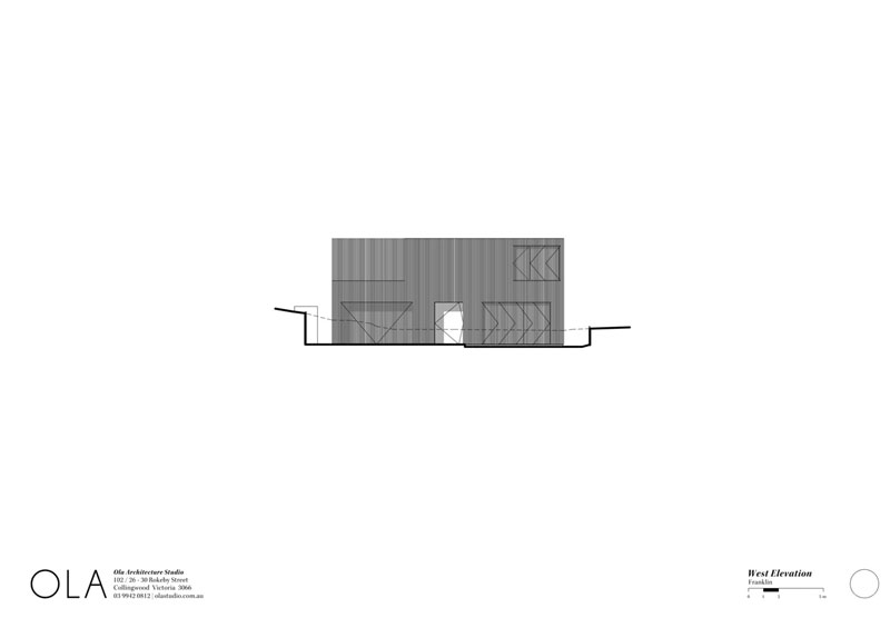
Franklin’s form is simple. Using cross laminated timber (CLT) structure including floors, walls, and roof/ceiling, made from Australian grown pine processed and fabricated in Victoria, a single skillion roof covers a simple rectangle with a large north facing cut out. The roof pitches from the rear and low end of the site level with the hedge and rakes up at a slightly steeper angle to the slope of the site allowing Franklin to gently pop his head above the tree and hedge line at the front. The frontage has been replanted with indigenous coastal scrub that will return the streetscape plant screen with planting appropriate to the area, and further enhance the beach side character.
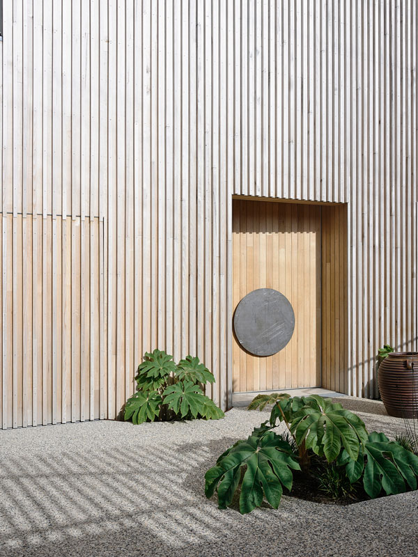
The soil on site is all sand allowing for relatively easy sculpting and carving. While the front of the house is 2 storeys, from the street it reads more as a single storey dwelling. The intent is to be humble on the outside, and full of warmth, light, joy, and scale on the inside. The scale of the house is revealed as you traverse the driveway and descend some garden steps to the front door where you are greeted by Franklin with a simple timber wall and screened fenestration hinting at what is beyond. A central slightly inset door marks the entry point, and says warmly, come in and let me show you what I have inside.