TOTORO HOUSE by CplusC Architectural Workshop

cplusC architectural totoro house
cplusC totoro house

Totoro House by CplusC Architectural Workshop

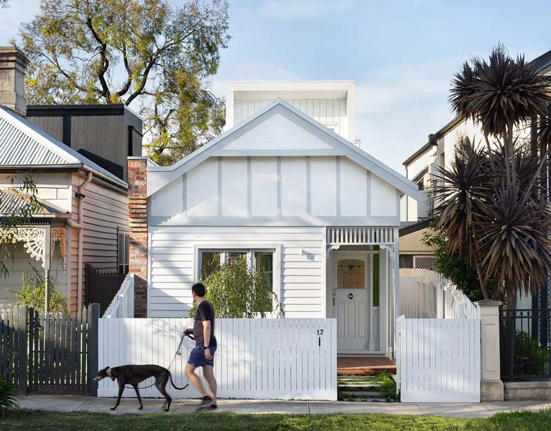
Text description provided by CplusC Architectural Workshop. Three decades ago, Studio Ghibli’s animated fantasy My Neighbor Totoro taught us about the importance of relationships; with family, friends, and nature. Similarly, the concept of Totoro House is heavily inspired by the strong family bond of the clients, the connection between its occupants and relationship to landscape.

cplusC architectural totoro house project

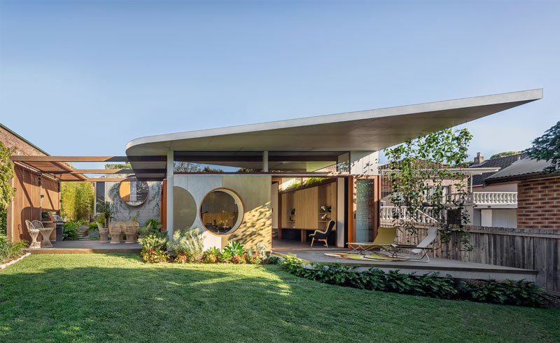
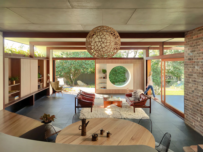
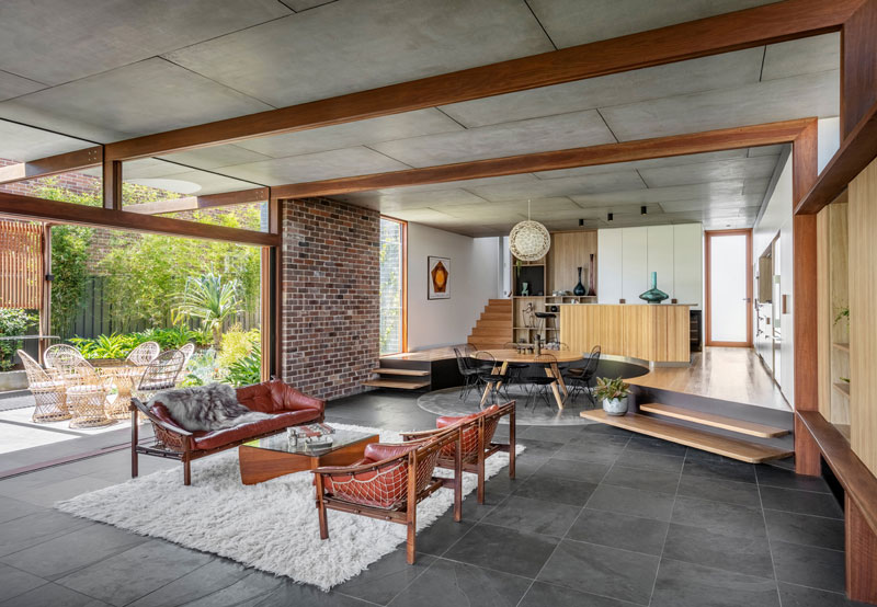
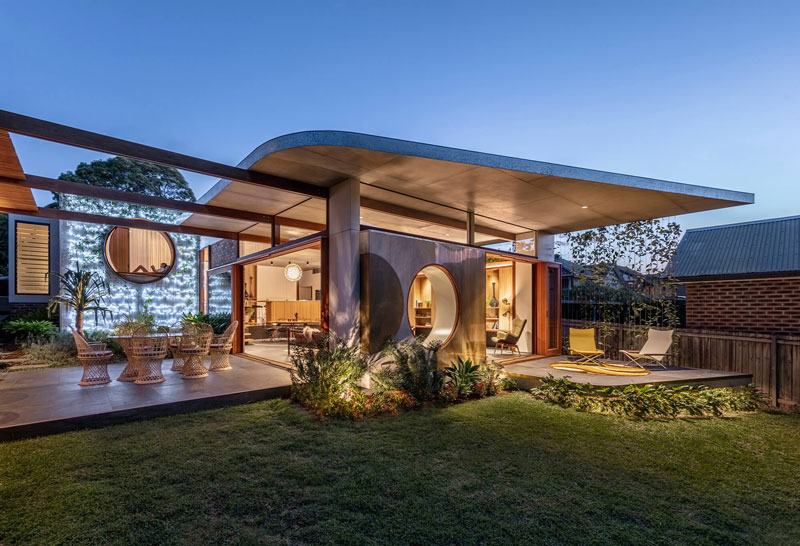
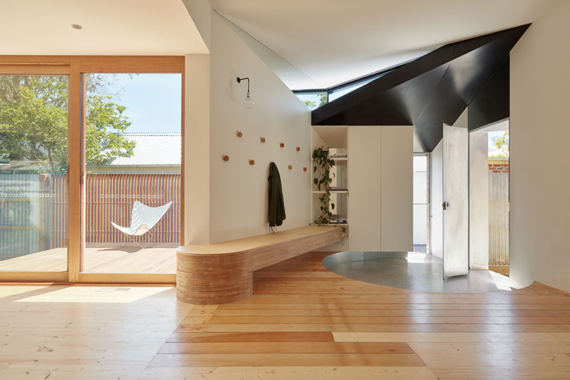
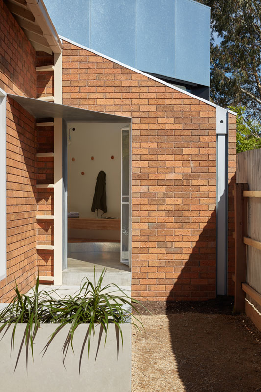
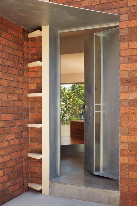
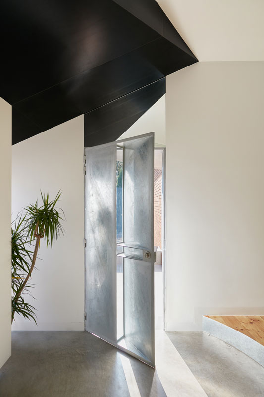
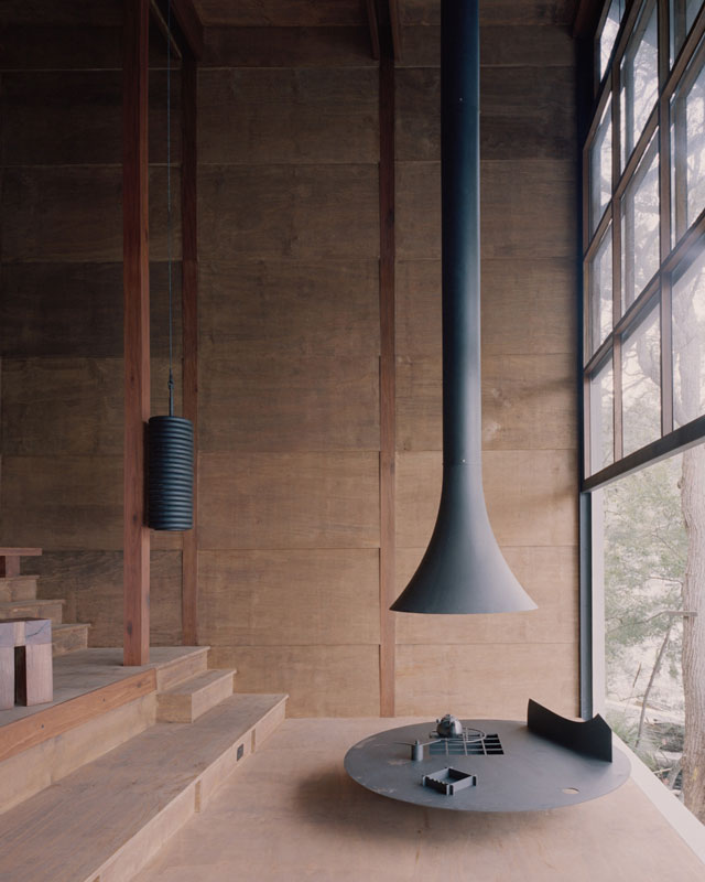
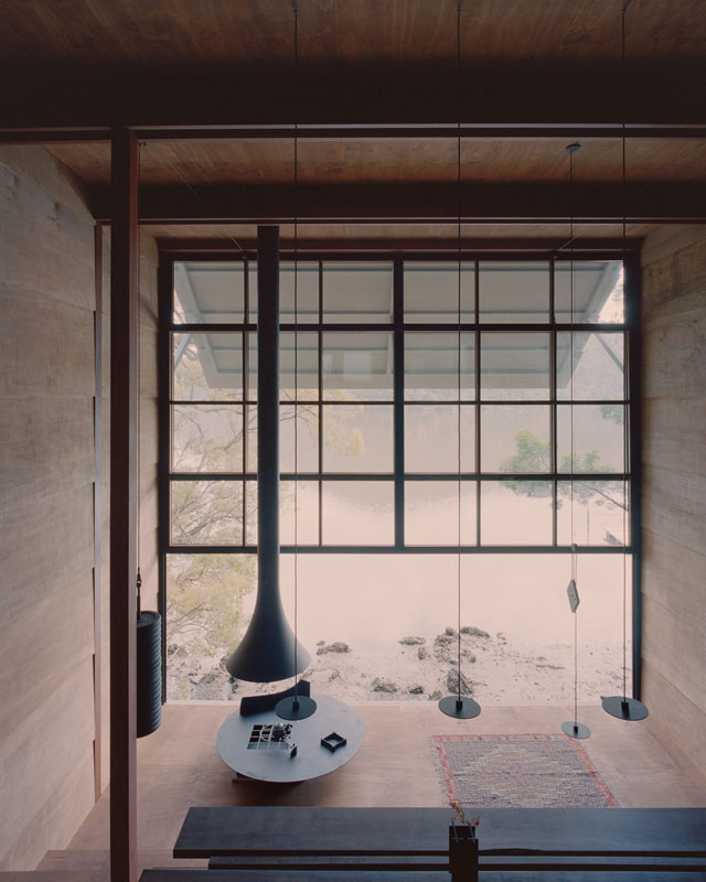
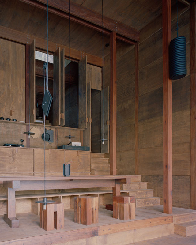
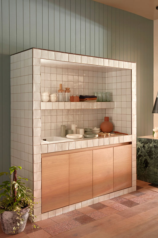
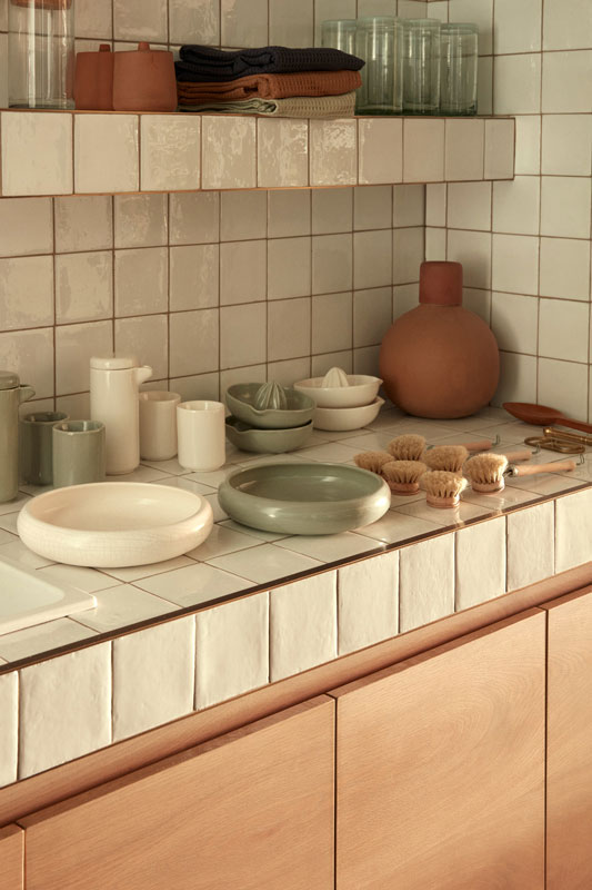
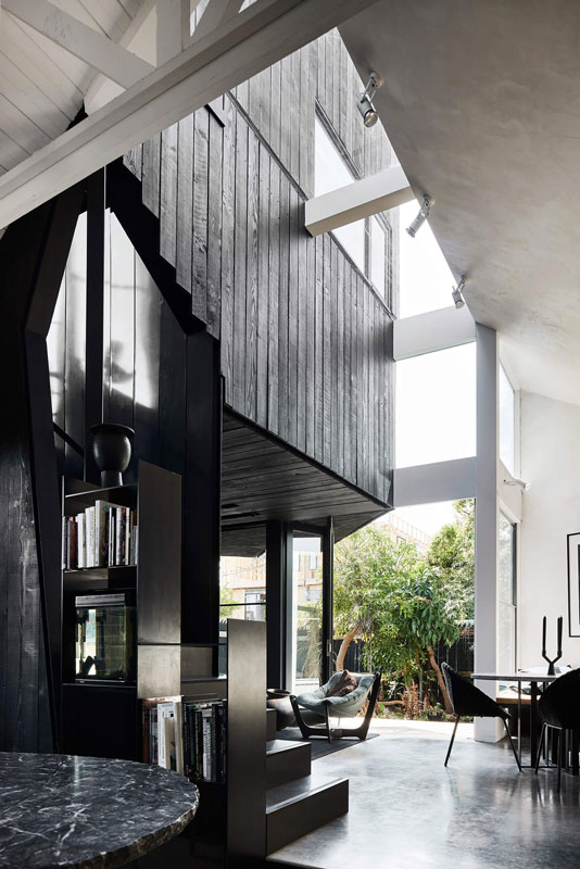
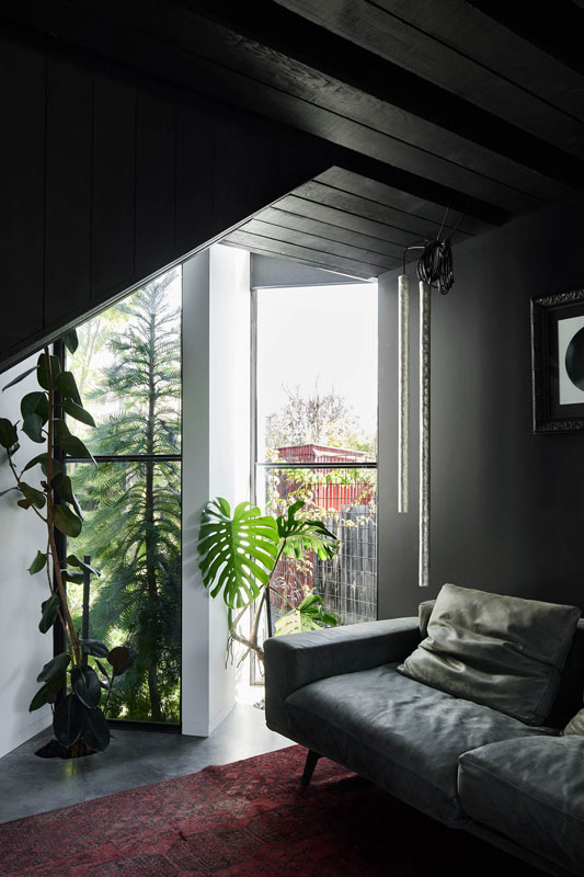
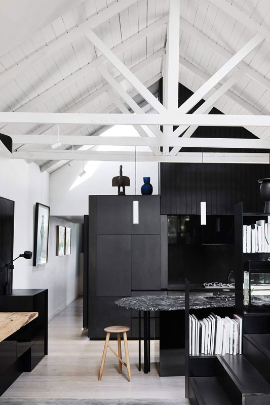
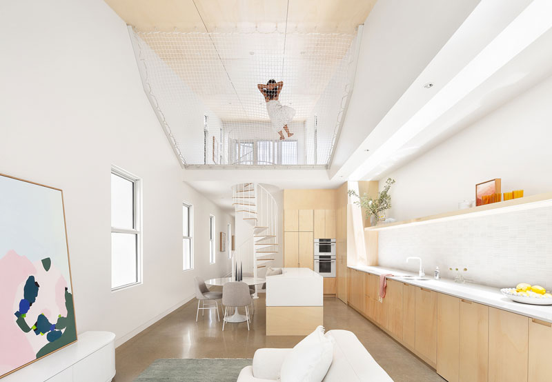
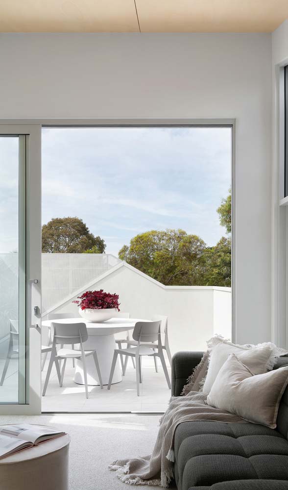
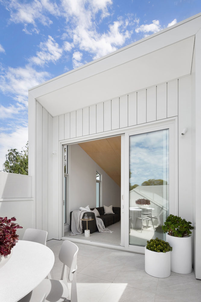
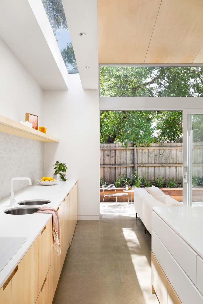
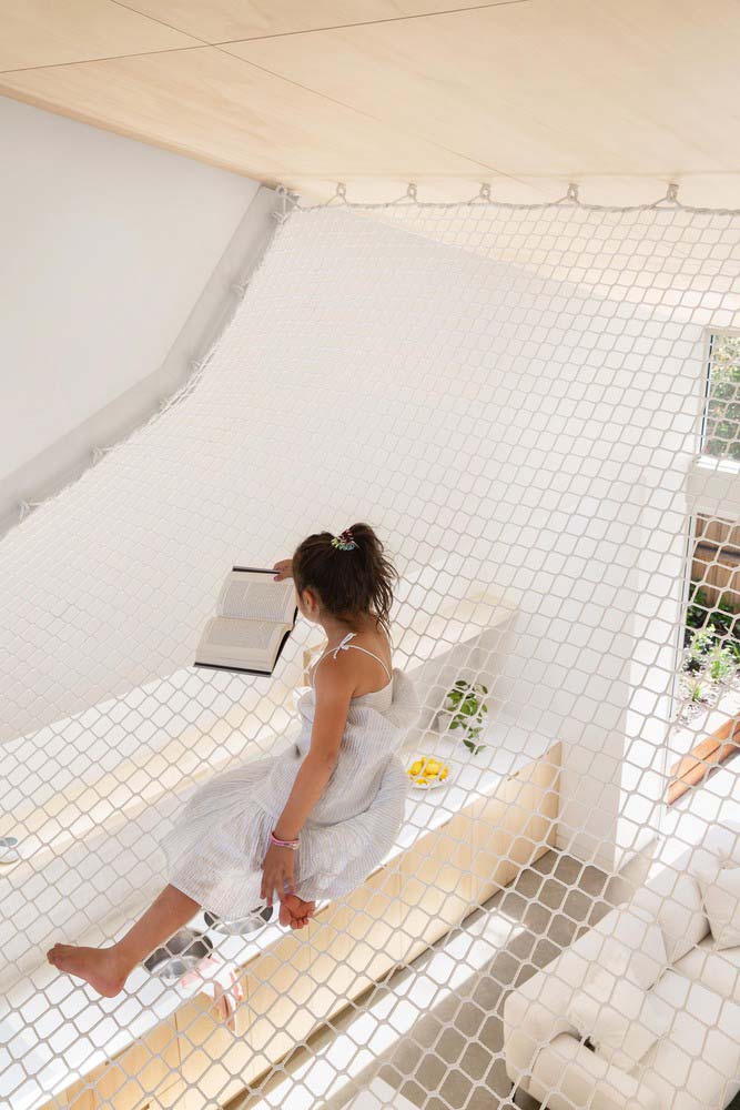
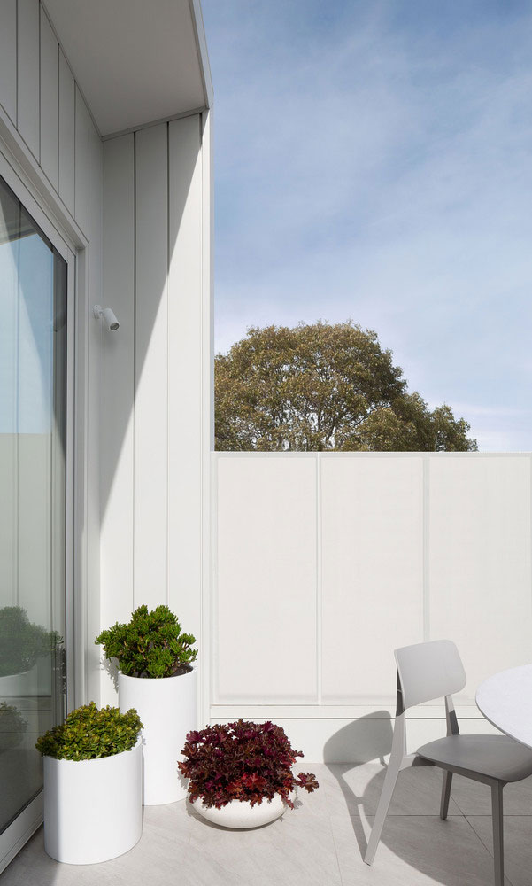
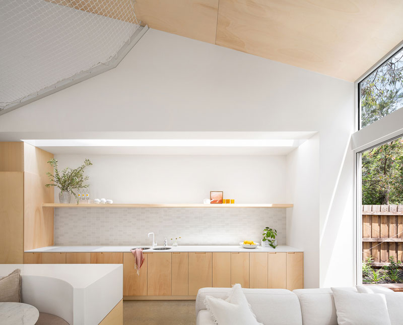
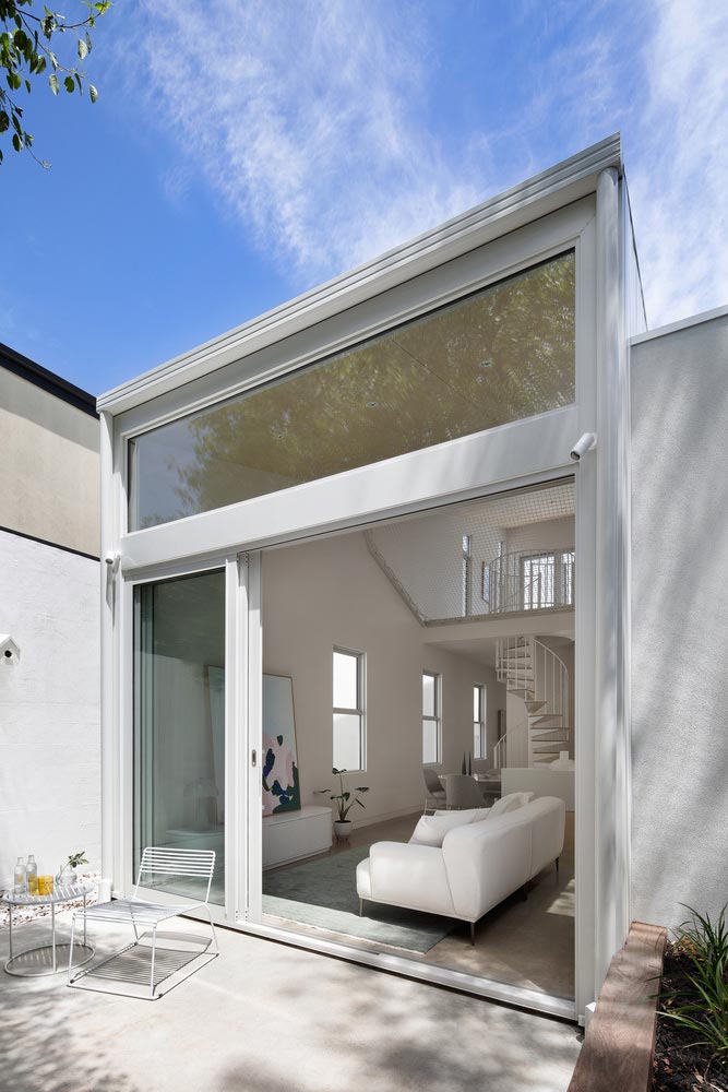
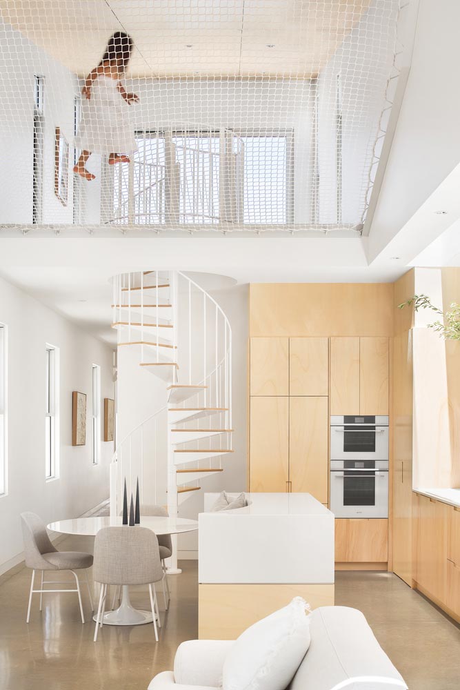
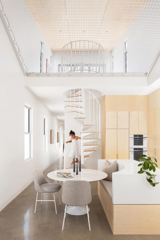
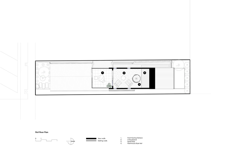
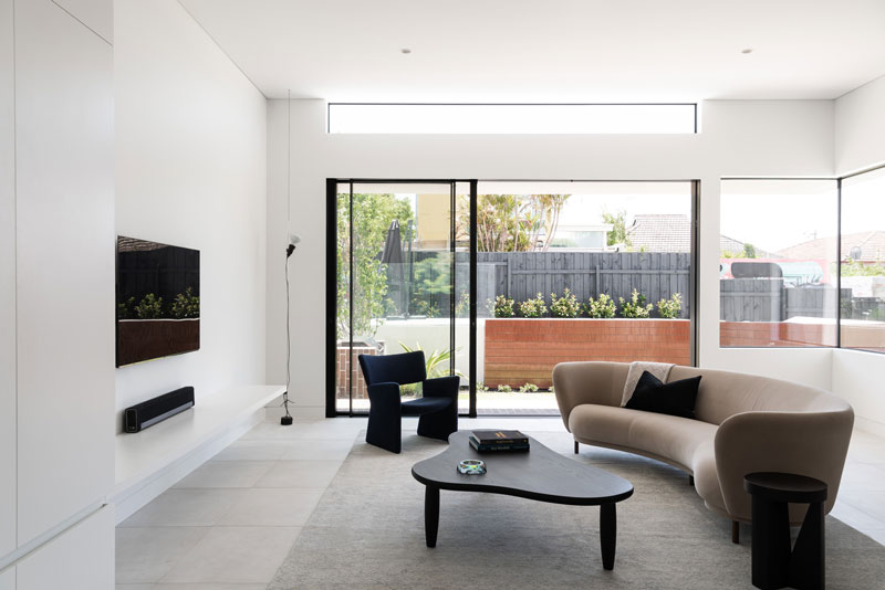
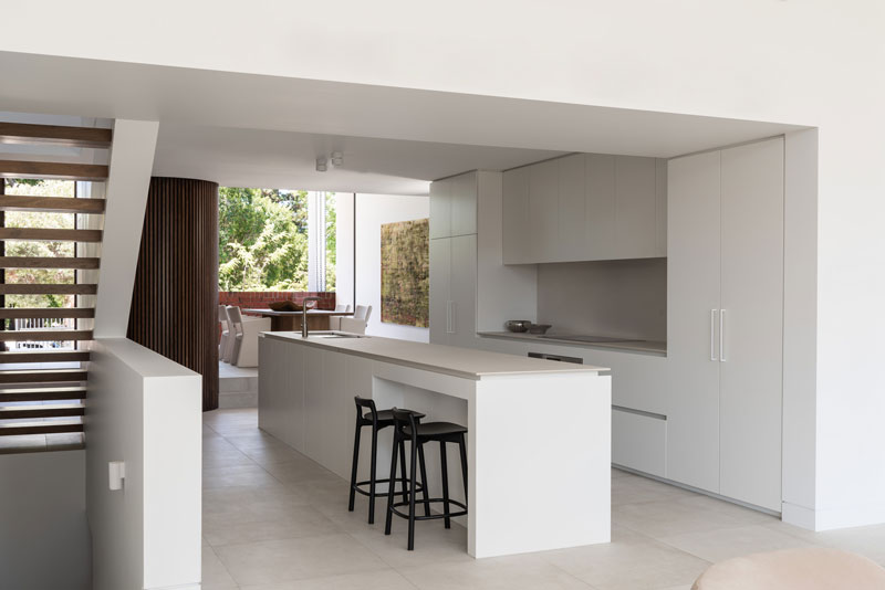
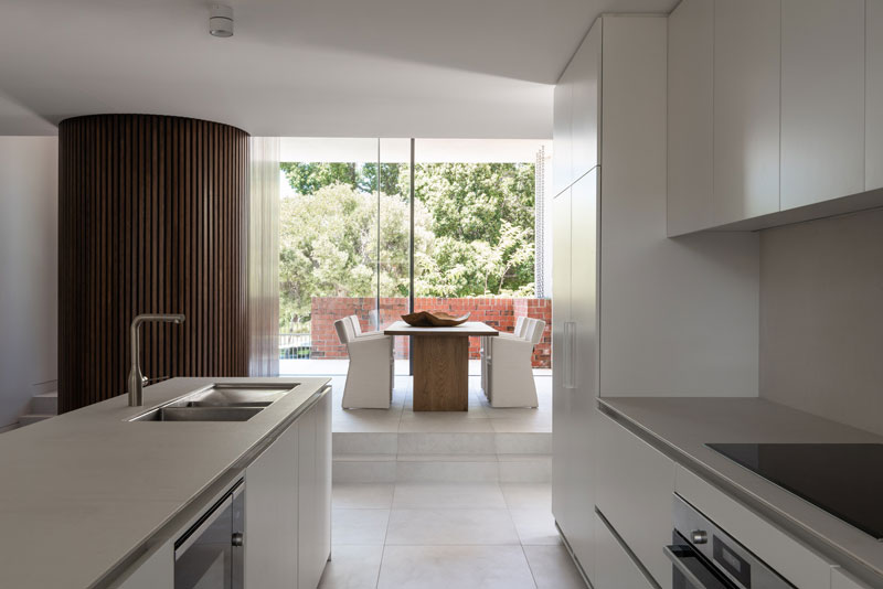
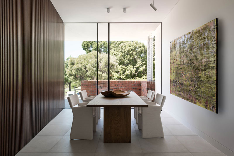
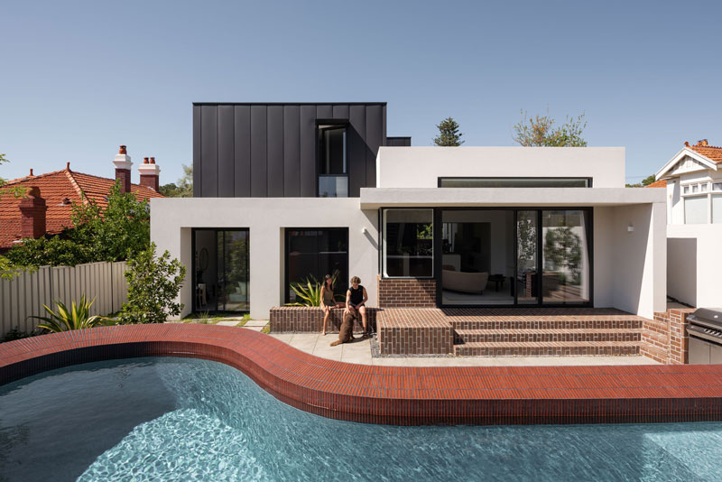
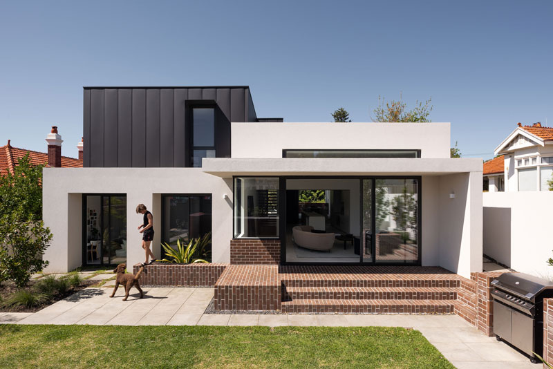
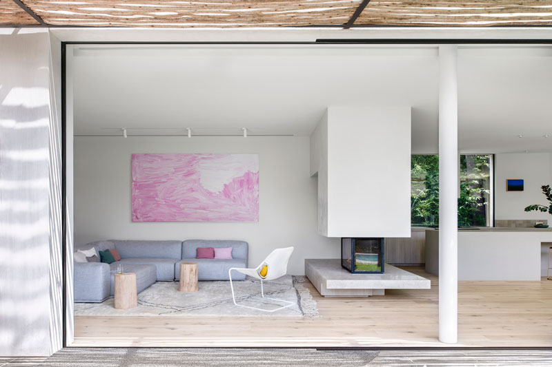
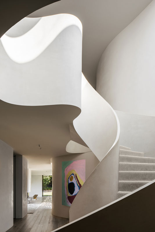
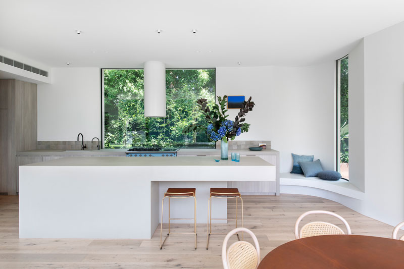
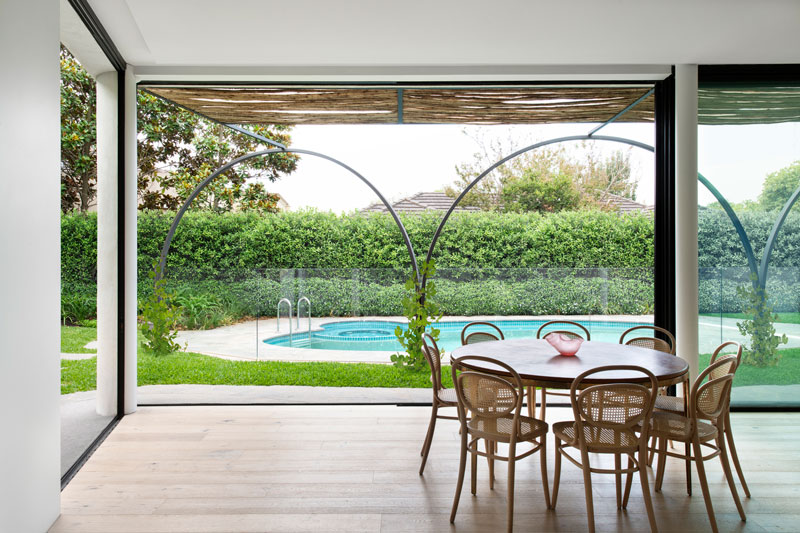
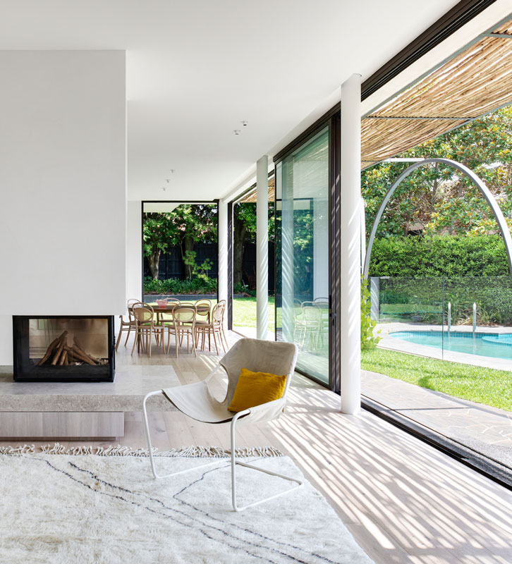
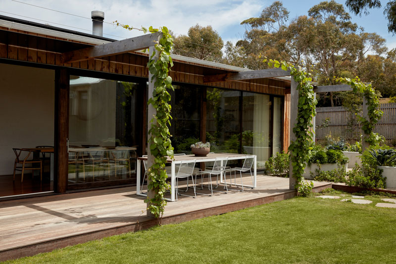
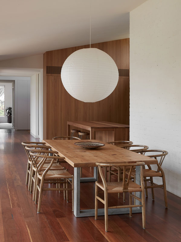
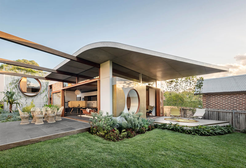
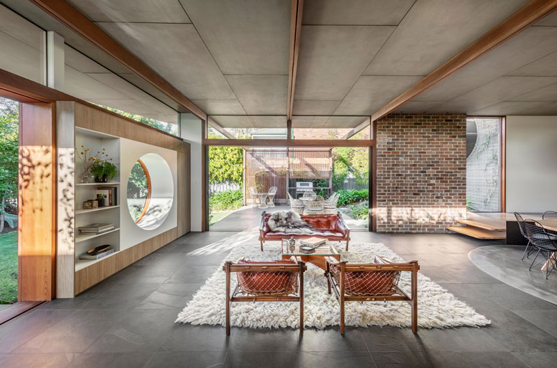
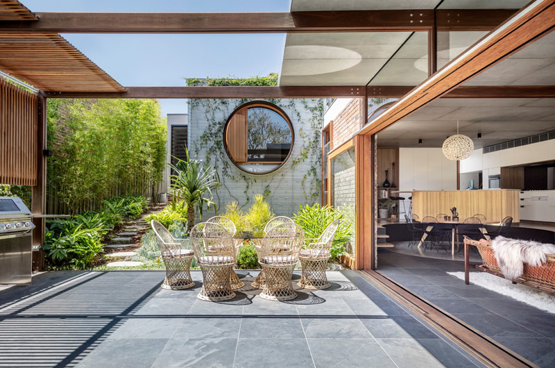
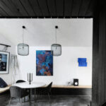
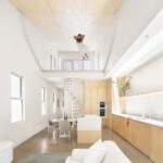
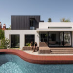
To translate this bond into architectural form, the design deliberately removes boundaries and combines the Living, Dining and Kitchen into one interwoven space; walls that separated the spaces were reimagined as a vertical threshold that keeps the occupants together despite working on different tasks. Parts of the extension are pulled outwards to form the outdoor living, cooking and seating area, softening the threshold between the house and courtyard.

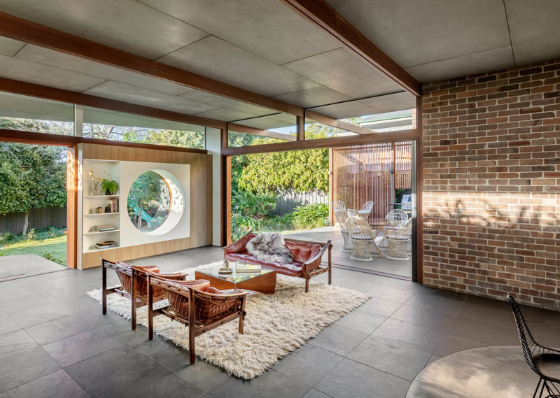
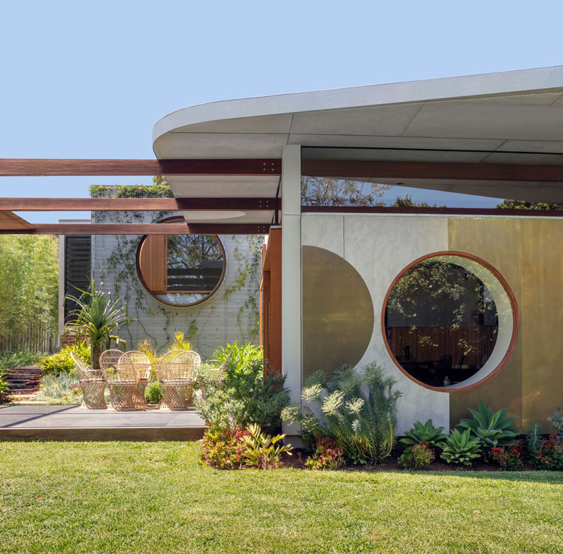
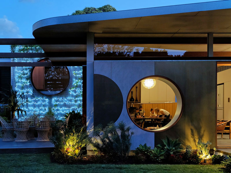
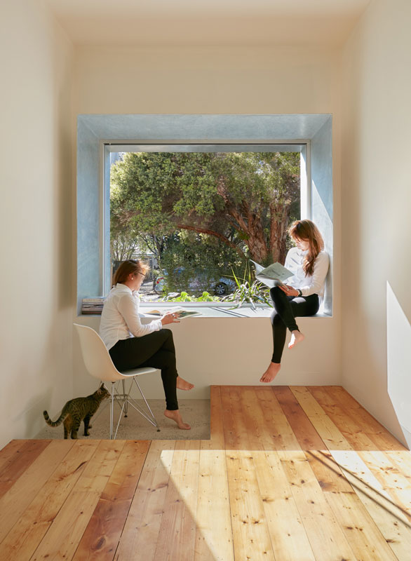
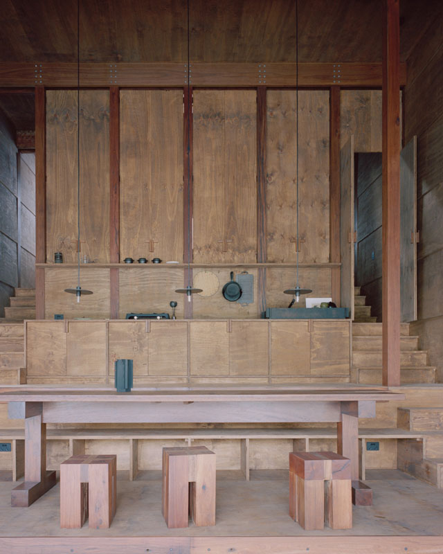
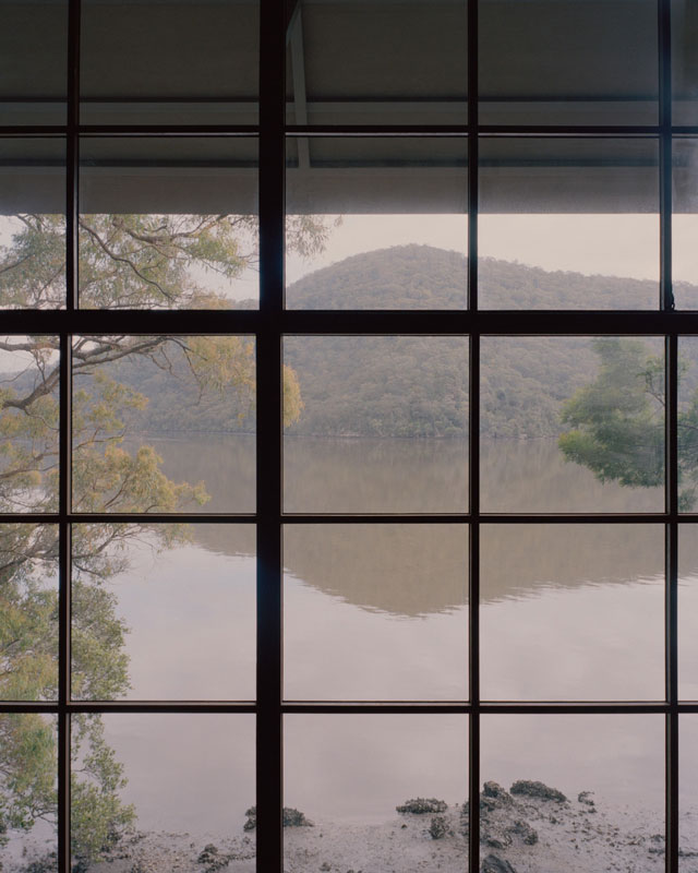
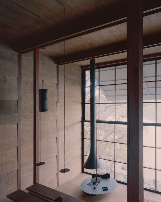
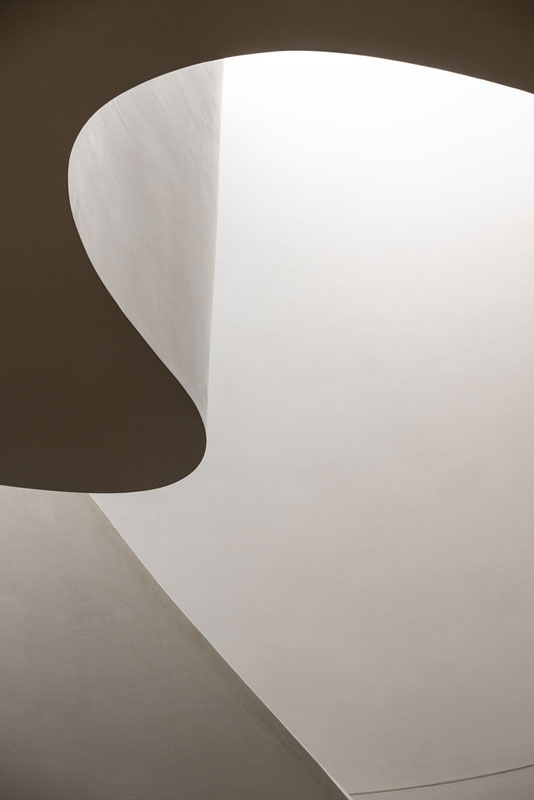
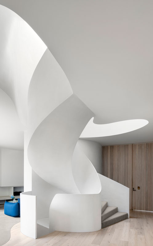
A circular motif is extended from dining area to the Living space window overlooking the rear courtyard, a framed transition from the interior to exterior influenced by the Japanese concept of Shakkei. This gives the house a sense of serenity during quiet school days while connecting the home to backyard family sports in the evening.
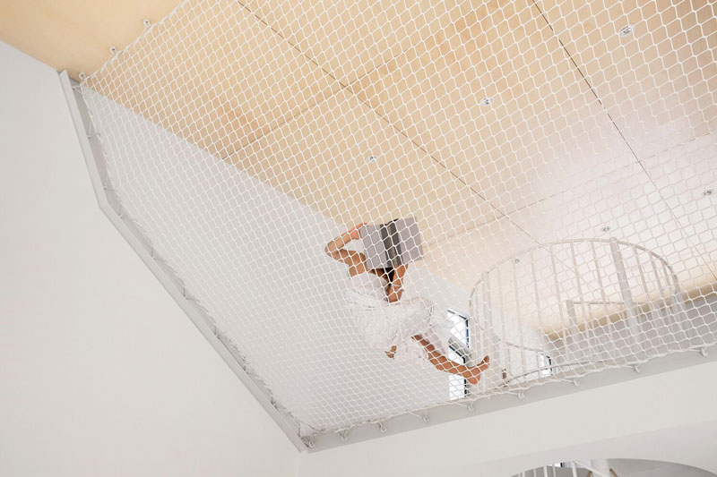
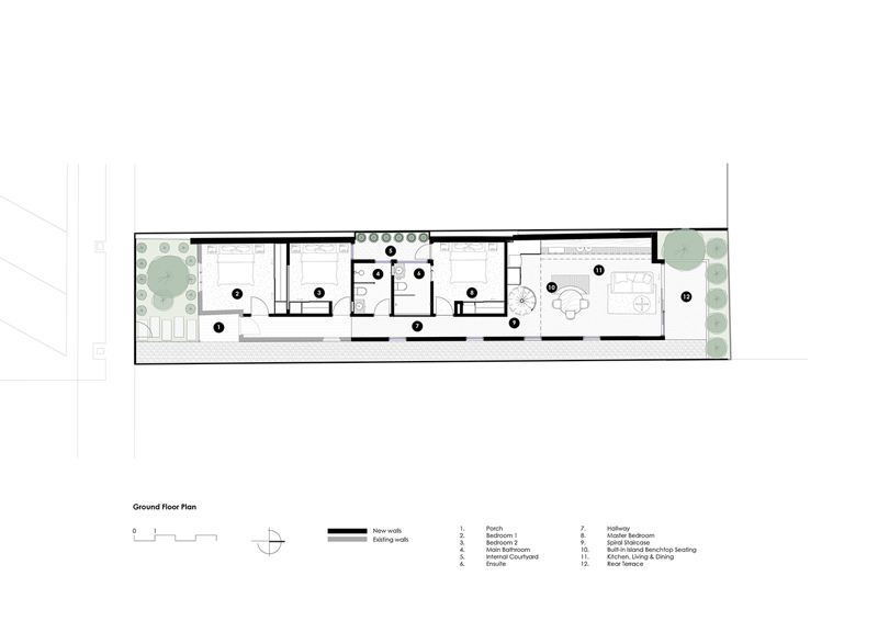
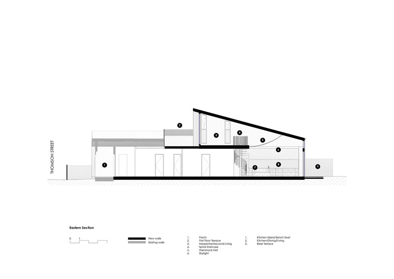
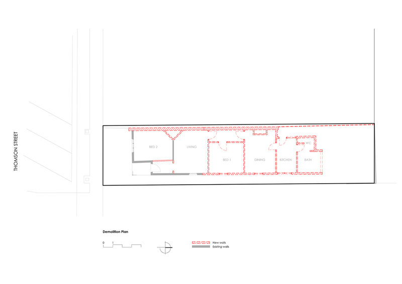
The house can be categorised into three different zones: private quarters of the existing house, living space in the new extension and the courtyard and garden.

cplusC architectural workshop project

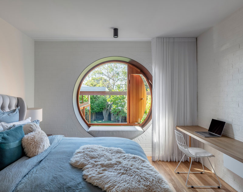
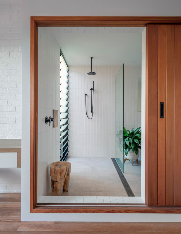
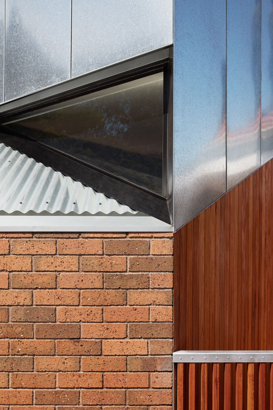
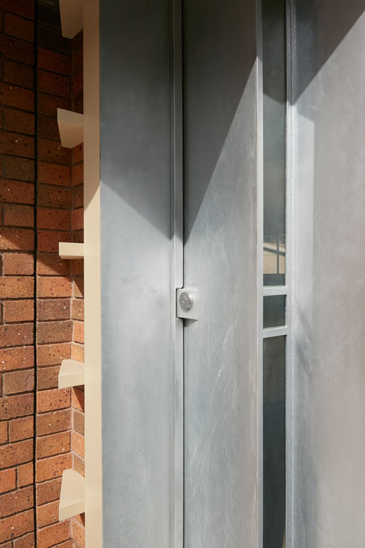
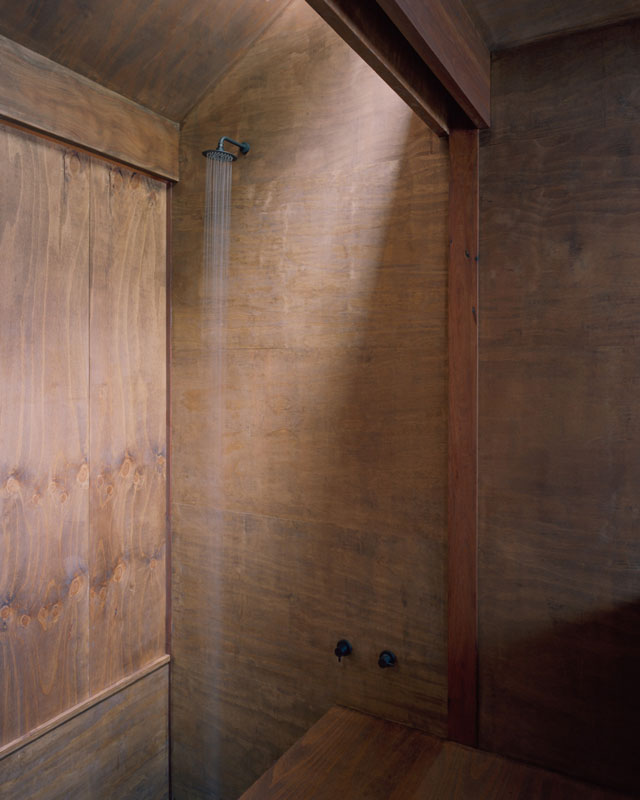
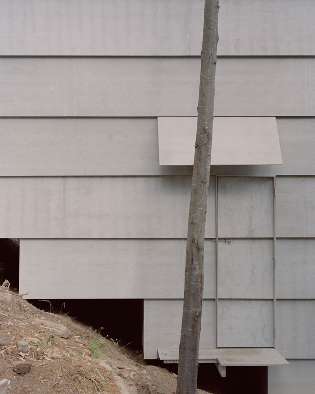
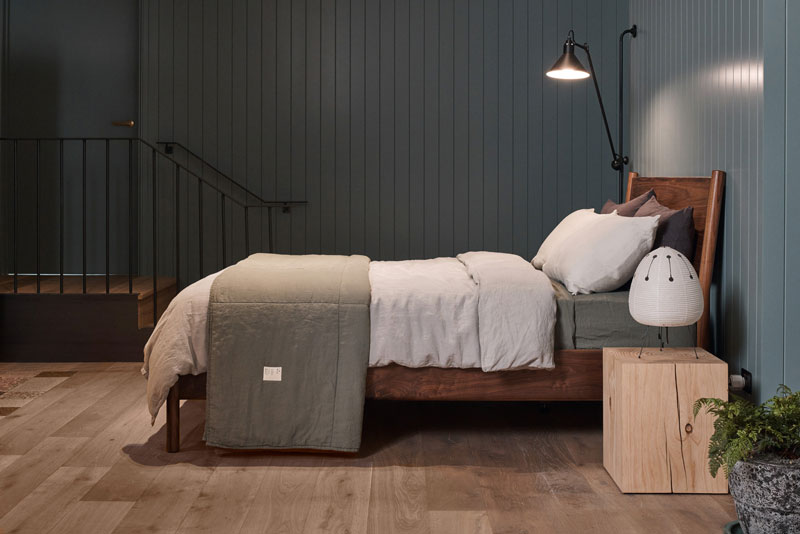
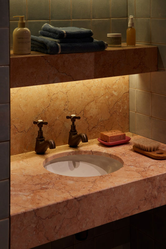
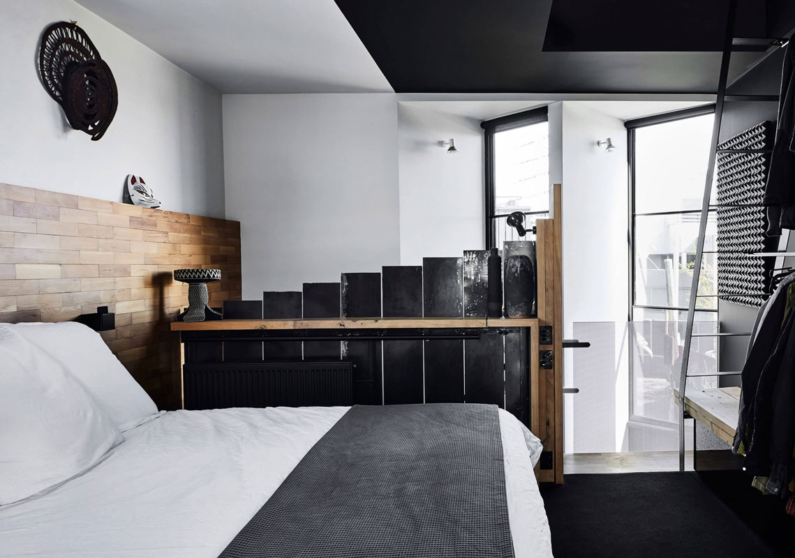
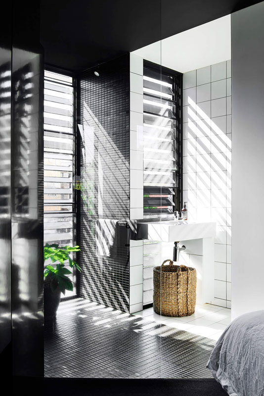
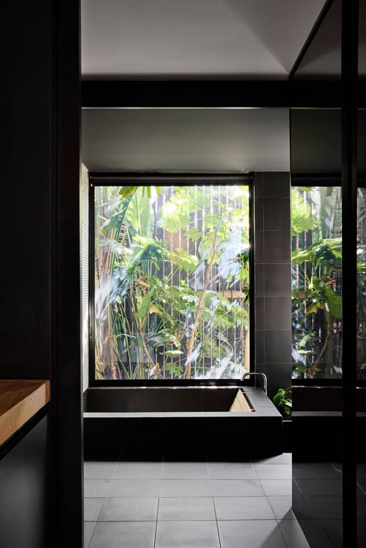
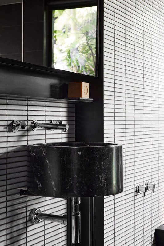
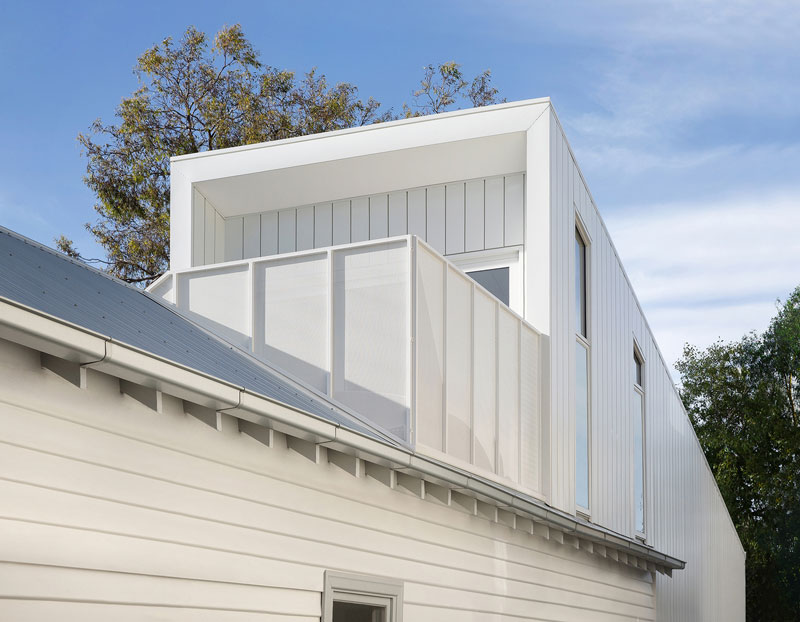
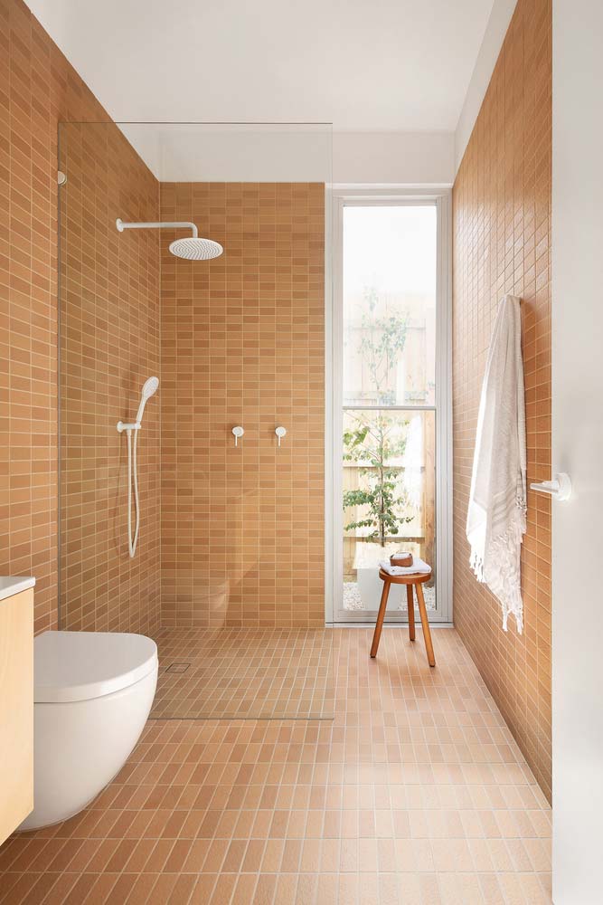
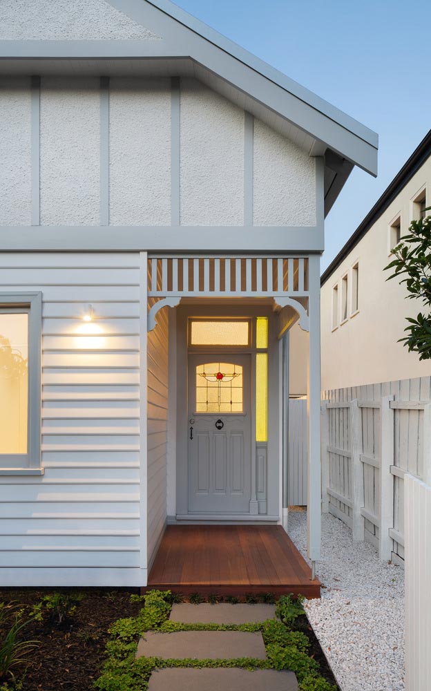
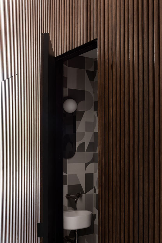
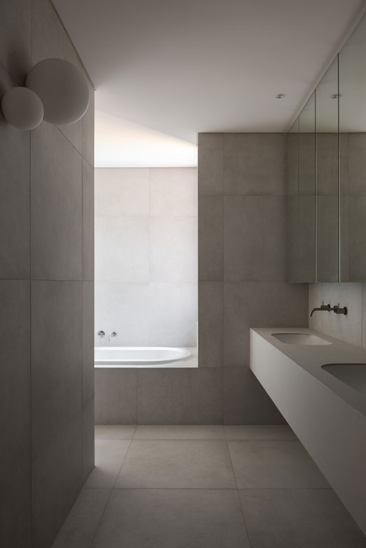
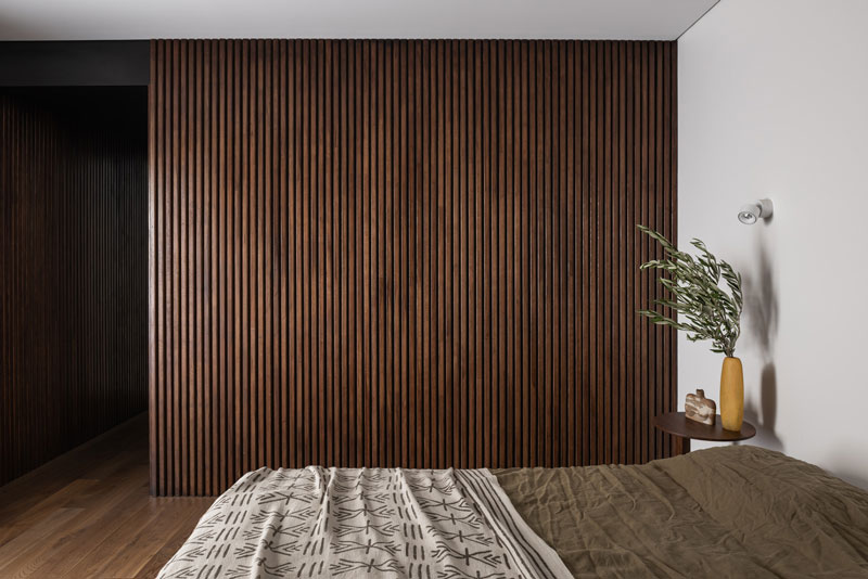
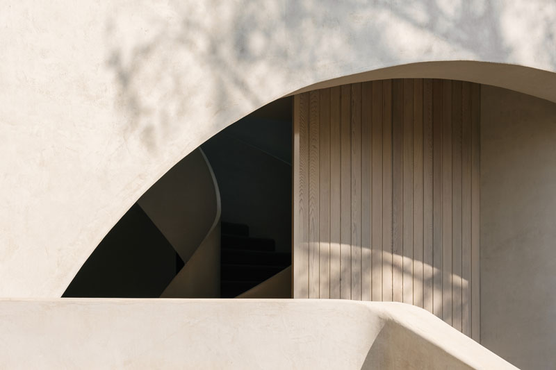
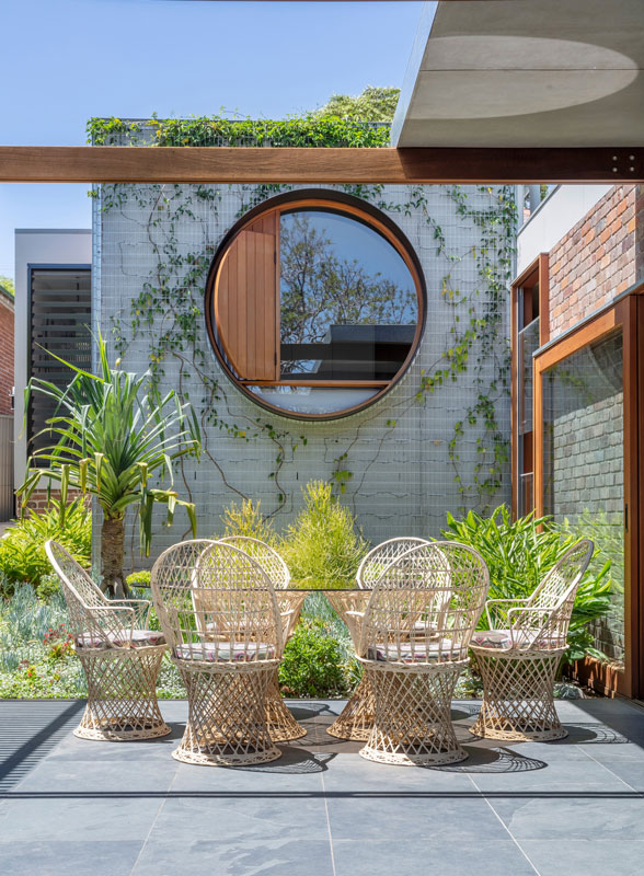
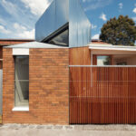
The existing house accommodates two bedrooms, a master bedroom with en-suite, a guest room and a bathroom. Although all the spaces have been rejuvenated to match the standard of the new extension, its layout has not been significantly changed with the exclusion of the main bedroom. The new design incorporates a large circular window that frames the view of the outdoor living space and backyard as inspired by the Japanese concept of Shakkei. Part of the window is made operable to allow for natural cross ventilation. The frame itself also acts as seating for young children. The room is fitted with two layers of blinds, both solid and translucent, to allow for maximum control of privacy and light.

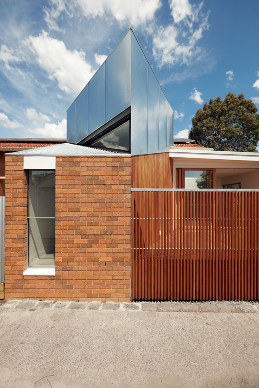
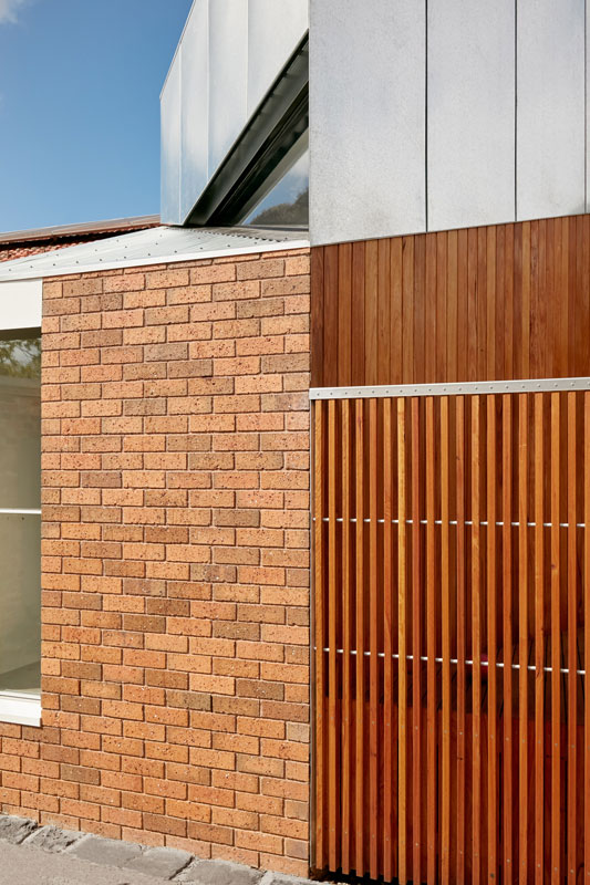
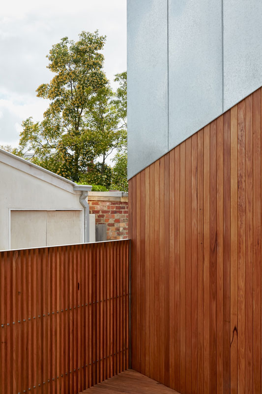
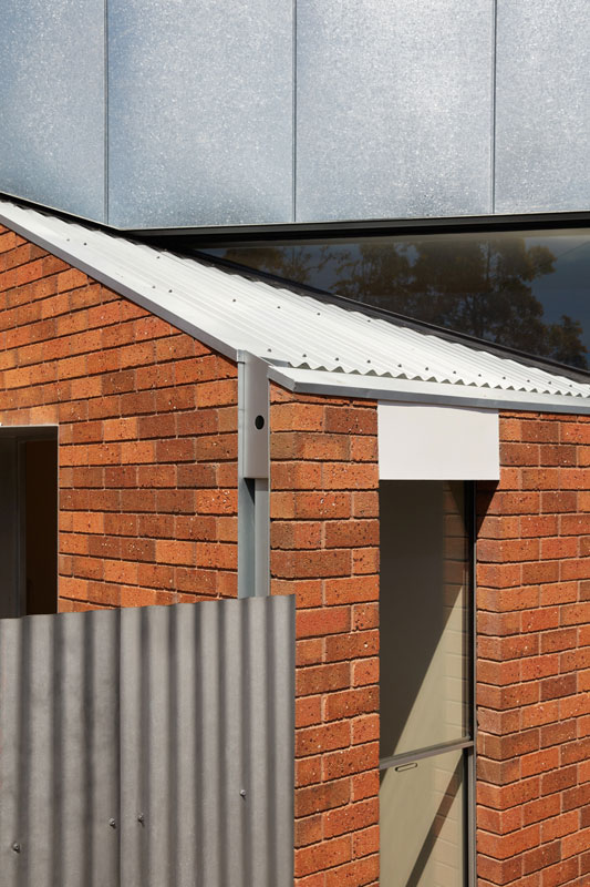
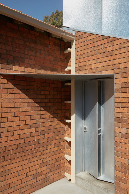
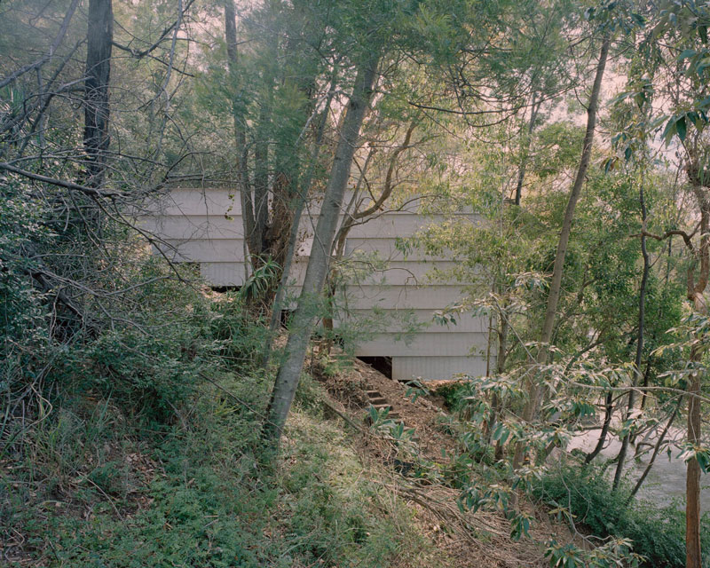
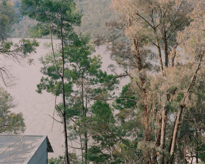
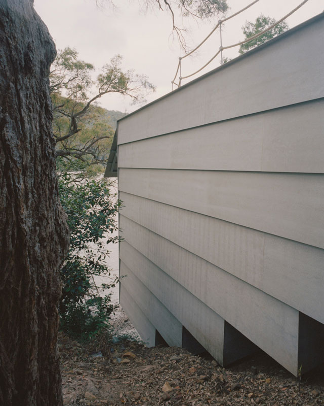
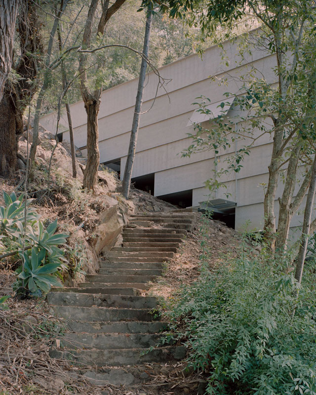
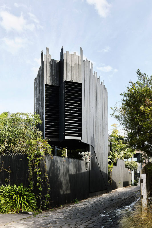
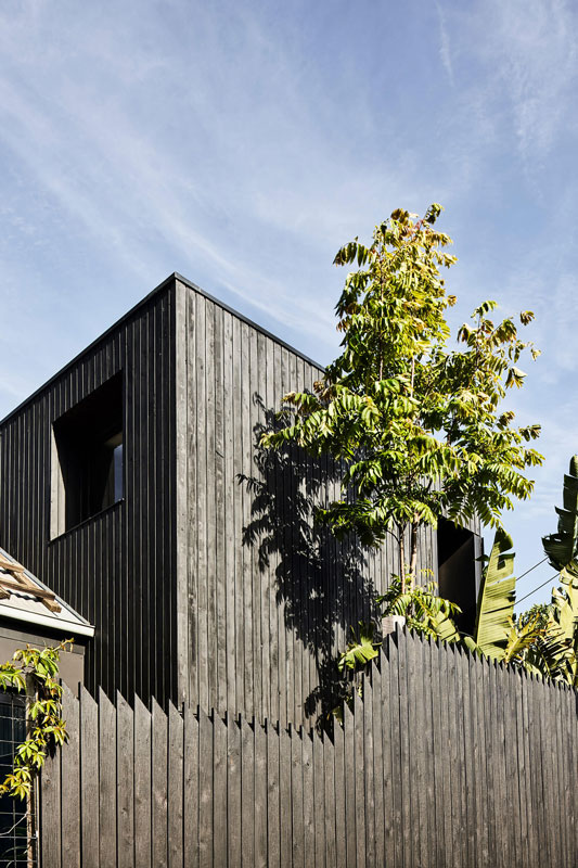
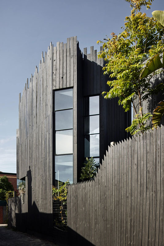
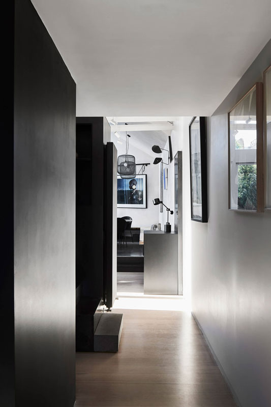
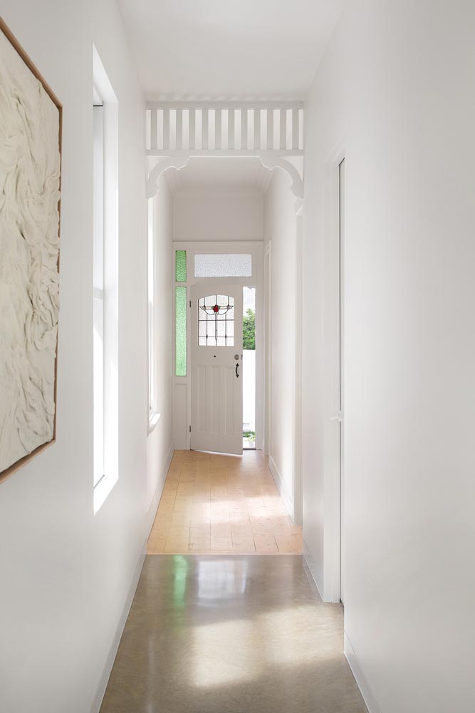
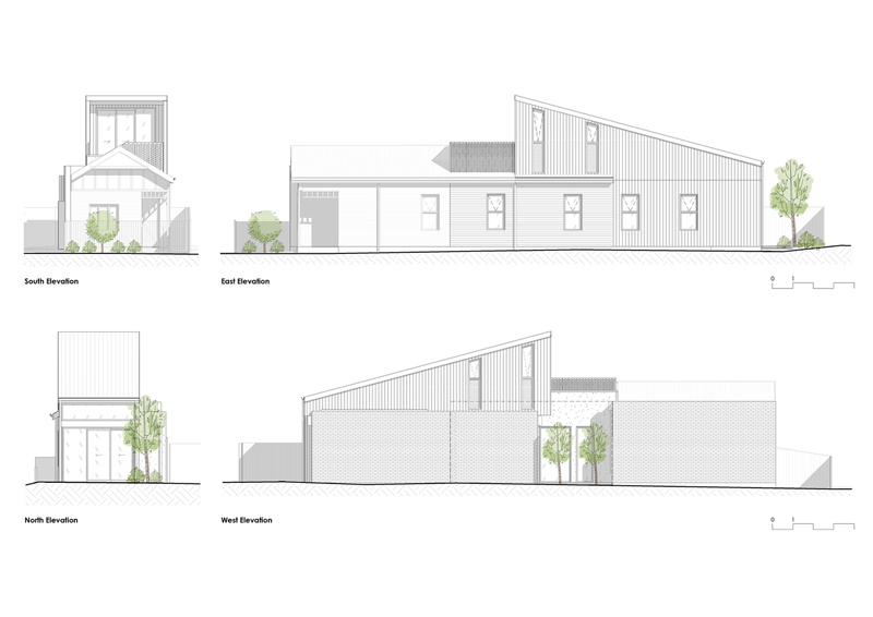
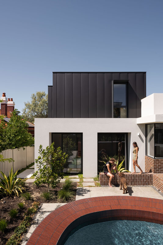
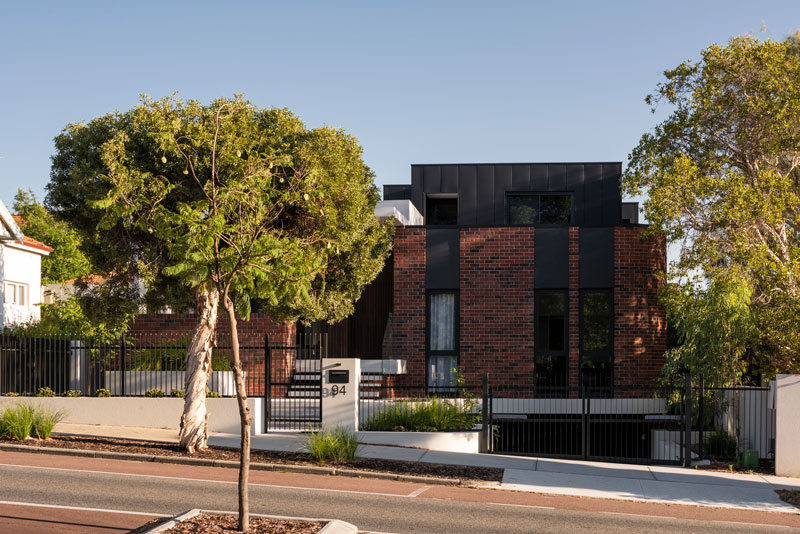
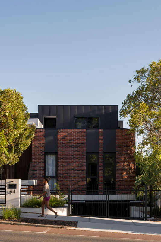
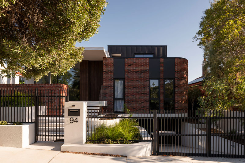
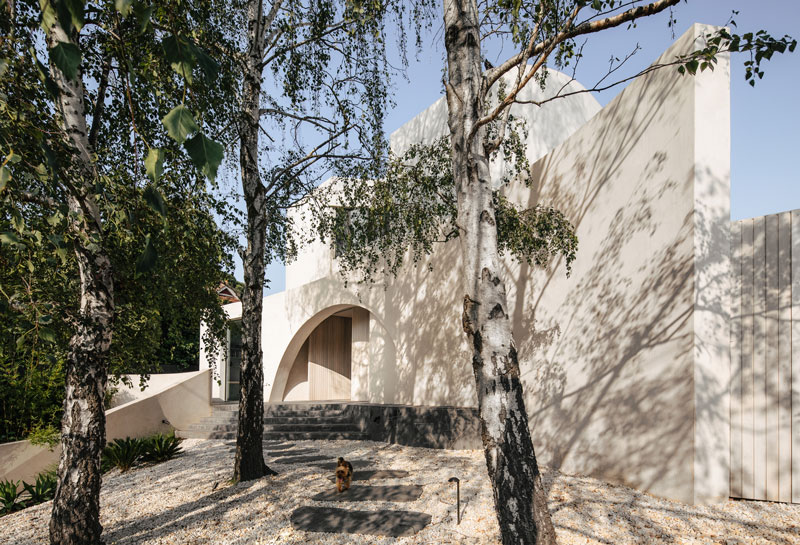
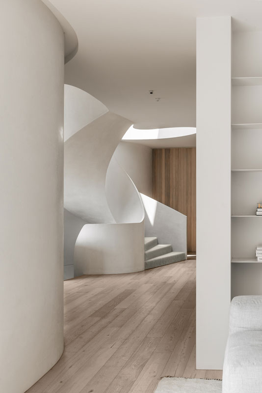
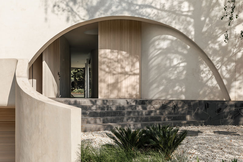
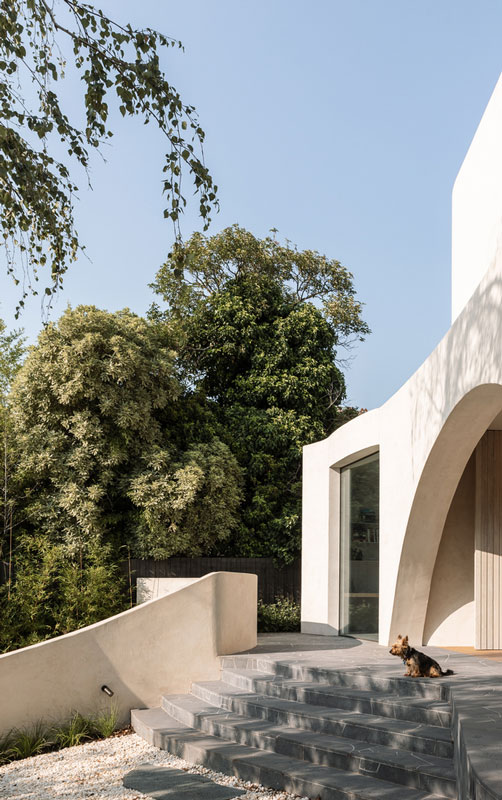
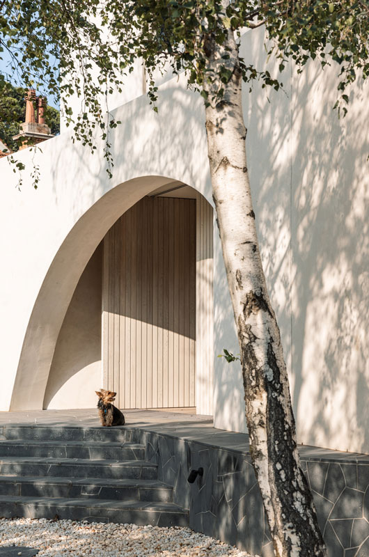
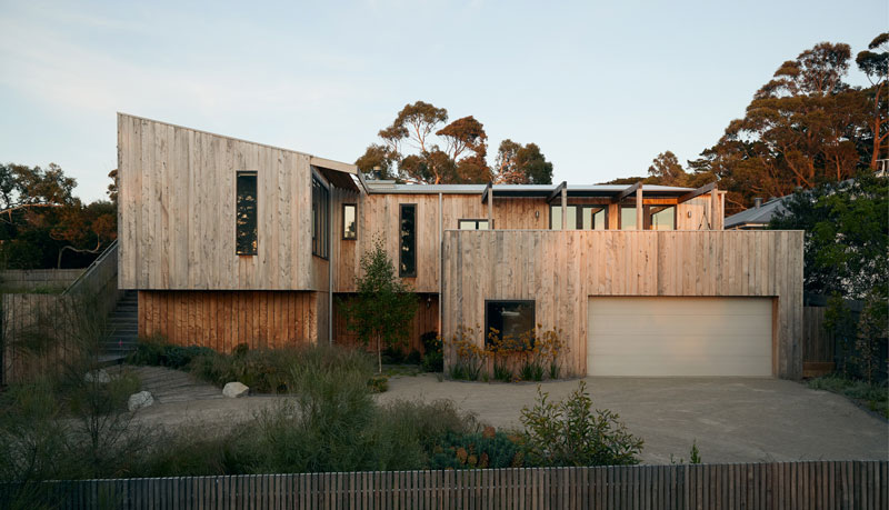
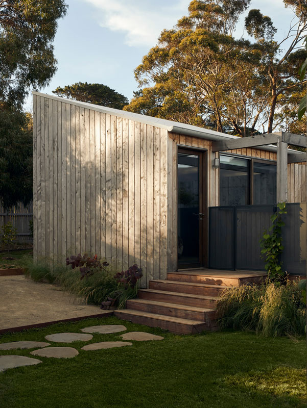
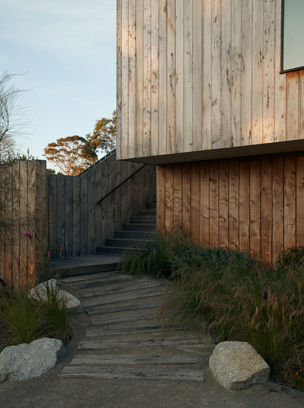
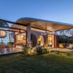
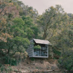
Initially, there was a disconnection between the original house and rear yard due to topography that hindered the ability of the clients to connect to the garden. The new extension establishes itself as the missing link between the two through a gradual vertical transition that navigates occupants from the private bedrooms to the outdoor spaces and garden. The form of the new social spaces to the rear was designed with context in mind, ensuring no adjacent neighbour lost amenity or privacy. With the new extension mostly hidden from the street, glimpses of the playful space beyond peek out from behind the retained federation-period home.

cplusC architectural workshop

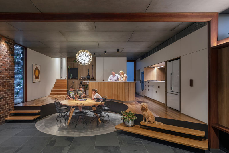
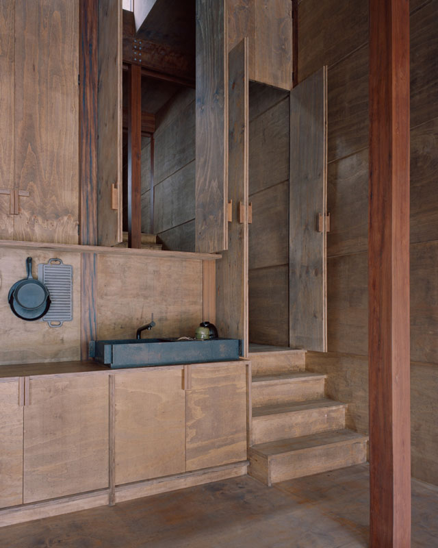
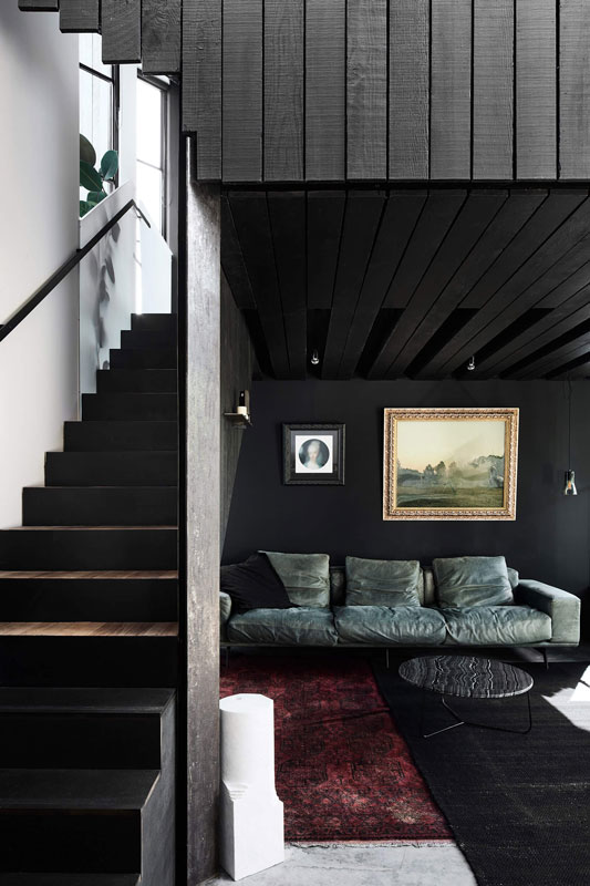
The new program transformed the previously dark and gloomy living spaces in to one light-filled, non-sequential, open plan living area that correlates to the client’s desire to connect with their children. One can be preparing dinner on the kitchen island while still listening to the kids talk about their adventures at school; or enjoy some Sunday afternoon reading on the couch while the rest of the family plays backyard cricket. Thresholds between interior and exterior are dissolved and provide opportunities for the clients to strengthen their family bond and their relationship with the natural environment.

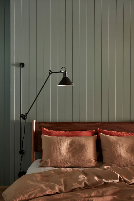
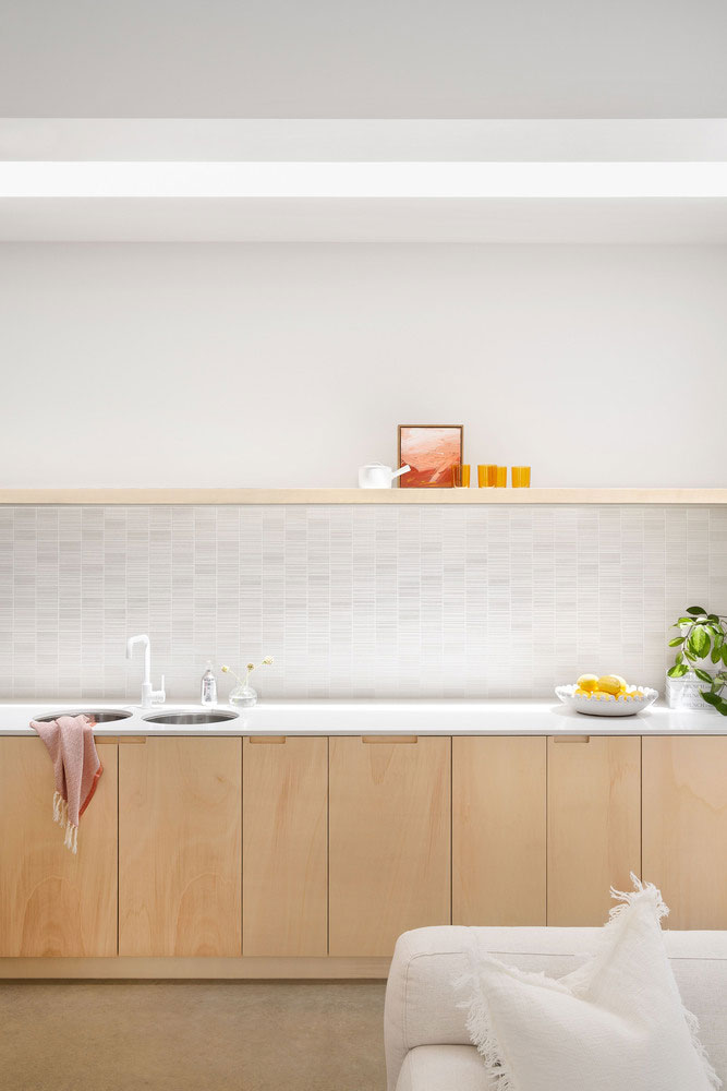
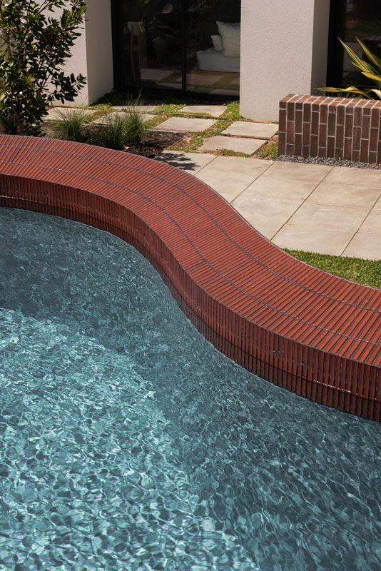
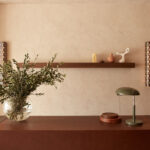
As a significant portion of the new extension revolves around connection between the built form and garden, we worked closely with the landscape designer to develop a solution that softens the threshold between the two. Our role as both architect, builders and on-site documenters gave opportunity for a level of detail resolution not often found in traditional practice. The result is a garden with native plantings and climbing plants that will eventually wrap up and over the master bedroom façade. Collaboration with a furniture stylist & vintage supplier enabled the Mid-Century aesthetic of the new interior spaces to be accentuated.

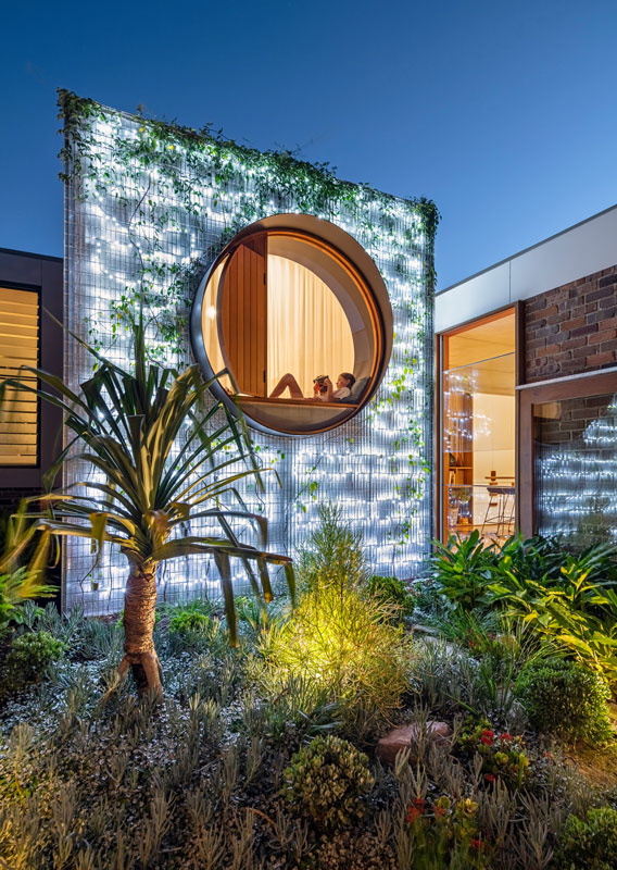
As an environmentally conscious practice, careful consideration in terms of material use is evident throughout Totoro House. For instance, specific calculations were made so that the exterior brass cladding around the circular window could be achieved with only two standardised sheets, with cut-offs incorporated as part of the design, reinforcing the circular motif. Existing materials are also consciously reused to their full potential such as reusing the demolished sandstone foundations in the garden, maximising the material’s lifespan, and reducing site waste. In addition, the design supports the family’s sustainable lifestyle through the installation of a 3kW photovoltaic system and an 8000L rainwater tank to reduce the environmental impact of day-to-day life.

cplusC architectural totoro house

CplusC Architectural Project Details

  • Architects: CplusC Architectural Workshop
  • Area: 227 m²
  • Year: 2019
  • Photographs: Murray Fredericks, Ryan Ng
  • Landscaper: Bell Landscapes

written by : Hana Abdel
12 Sep 2022
published in : archdaily.com

Gallery of TOTORO HOUSE by CplusC Architectural

THE TARANAKI RIFT by Architecture Architecture

taranaki rift architecture architecture

THE TARANAKI RIFT by Architecture Architecture

The Taranaki Rift by Architecture Architecture is an in-depth insight into the very best of Australian innovative architecture.

The design story of the project was defined by the unique ecological environment of the Brunswick area.The Taranaki Rift is an inner-suburban rupture off the east bank of Brunswick, initiated in the early-Turnbullian, due to the expansion of the Goodman van Dyke cluster. This highly unusual feature is the result of intra-plate movement in the sedimentary accretions of the post-Menzian era, resulting in a heterogenous formation of mineral deposits and clays.

Architecture Architecture dramatically reimagined this quaint inner city Melbourne house into a family home with four bedrooms, and a generous open plan living/ dining/ kitchen area that opens up onto the outside deck.

taranaki rift architecture architecture

The existing red brick building was altered dramatically through an innovation series of bespoke architectural insertions. A 3D formed steel door, boxed out floating windows and a metal plate awning are all aspects of the redesign of the Taranki Rift project.

taranaki rift project architecture

The interior was given a greater sense of natural light through a new skylight. Further visual interest is provided via a built timber seat and circular floor set down at arrival lined in metal.

The Taranaki Rift project was a finalist in the residential alterations and additions category at the 2018 ArchiTeam Awards.

taranaki rift architecture architecture
architecture architecture project
  • Words James Lyall Smith
  • Photography Tom Ross

31 Aug 2022
published in: thelocalproject.com.au

Gallery of The Taranaki Rift by Architecture Architecture

taranaki rift interior design

Chandon Australia by Foolscap Studio

chandon australia foolscap studio

Chandon Australia by Foolscap Studio

The Chandon Australia project by Foolscap Studio is an in-depth rejuvenation of a Yarra Valley icon, Domaine Chandon.

The brief was to overhaul the site and create a new brand-immersion across bar, dining, tasting and retail spaces. Inspired by the uplifting ritual of spontaneously popping the cork, Foolscap Studio have celebrated heritage with a fresh affair fit for the 21st century.

Views of the incredible surrounding landscape were a natural starting point for considering the visitor experience, the range of which will traverse loyalists and locals, diehard food and wine thrill-seekers, ‘gramming millennials and new discoverers alike. Fearless application of colour reflects the extraordinary tonal shifts in the environs throughout the seasons.

Budget management required that the existing 1980s industrial structure – a voluminous space between vaulted ceilings and hard surfaces – be retained. As such, subtle acoustic treatment was imperative and the interior architecture was integrated through bold design gestures.

The idea of alchemy was fundamental to the core conceptual approach. The transformation of ordinary base metals into gold: what better metaphor for the magical production of sparkling wine? Foolscap Studio explored the ways in which materials react to the passing of time, to various processes and to each other. The results of the studio’s investigations are reflected in the application of different metals and metal finish treatments.

chandon australia by foolscap studio

The process of transformation in wine making informed the design of each space. ‘Compression/Release’ is revealed in enclosed, intimate spaces – the Tasting Room for example – and airy, exuberant zones, like the Lounge Bar. Open, woven materials are juxtaposed with the solidity of weighty, opaque substances to allude to the duality of density and lightness in sparkling wine.

These ideas were also rendered in a style that pays homage to Chandon’s French heritage, while retaining a youthfulness that speaks to its relatively recent establishment within the Champagne house’s lineage. Banquettes upholstered in aged leather and velvet, with brass light fittings, suggest a Parisian bistro aesthetic.

chandon australia foolscap studio

Foolscap Studio always aim to celebrate and work with local materiality and makers. Spotted Gum timber flooring and joinery adds a soft character and warmth against the remarkable textured patterning of Queensland ‘Dreamtime’ marble and printed textiles by indigenous artists.

A critical component of the brief to resolve – and central to the design and layout of the scheme – was the retail space. Adele Winteridge and her team worked closely with local fibreglass and metalwork manufacturers to realise our product display system, installing bespoke, sculptural joinery, portable plinths and framed, up-lit fibreglass screens for product storage and display.

foolscap studio architects chandon bar

Exceeding key aspects of the client’s brief, which entailed the creation of a unique and dynamic retail experience, their product is now showcased in a creative setting that elevates the retail experience to the highest standard.

The pièce de résistance – a large, ethereal mobile hanging over the central raised banquette – was developed in collaboration with local metal craftspeople. Dynamic, buoyant and delicately weighted, this suspended kinetic sculpture gently bobs to the rhythm of the bar and projects a sparkling patina, a playful take on the unpredictable nature of bubbles.

chandon australia foolscap studio

The Chandon Australia project by Foolscap Studio is ultimately a celebration of the the beauty of master wine making and the moments in life that sparkling wine is associated with. This project is a true champagne supernova and a triumph in interior architecture.

  • Words James Lyall Smith
  • Photography Tom Blachford

published in: thelocalproject.com.au

Gaalery of Chandon Australia Project by Foolscap Studio Architects

Gallery-of-Chandon-Australia-by-Foolscap-Studio-Local-Australian-Design-and-Interiors-Yarra-Valley-VIC-Image-14

Marra Marra Shack by Leopold Banchini Architects

marra marra shake leopold banchini

Marra Marra Shack by Leopold Banchini Architects

Marra Marra Shack tightly follows its site’s sloping contours, teetering downward and opening generously to the nearby creek. Leopold Banchini Architects repurposes local hardwoods and creates a restful home, taking an environmentally and culturally conscious approach to design.

Sited among a distinct location, Marra Marra Shack was approached with a considerate sensibility. Located in Berowra along the same-named creek, the structure combines the rigour of an architectural home with a casual and rural vernacular. In engaging with the site, the home respects its off-grid location and embedded cultural and historical significance.

Built on the land of the Darug peoples, the resulting form respects the area and what lay before, integrating already fallen and milled timber elements in an effort to lessen the home’s overall impact.

With a layered past, the decision to repurpose 200-year-old electrical posts as pillars for the home adds to the home’s diverse narrative. With ceiling and flooring lined by spotted gum timber from the local area and repurposed Turpentine timber from a nearby jetty, the residence’s commitment to a lessened impact is further enhanced. Marra Marra Shack is primarily built from timber whilst a fire-resistant fibre cement sheeting encases the exterior layer of the form.

Accessed from higher ground, the form and the view of the surrounds reveal themselves on descent, with rooms situated to the side and the volume closely engaging the contour of the land. The final destination of the home is the living, dining and kitchen space, which becomes the gravitational centre of the home, where a sculptural fireplace sits suspended from the ceiling. With custom furniture and kitchen joinery built into the slope of the terrain, an oversized moveable glass façade invites engagement with natural light and the surrounds.

marra marra project leopold banchini

Marra Marra Shack is a self-sustaining quiet insertion, tucked away and unassuming. Leopold Banchini Architects captures the spirit of this significant place and treats the addition with due consideration, resulting in a distinct escape.

marra marra shake leopold banchini
off grid cabin marra marra shake
  • Words by Bronwyn Marshall
  • Architecture by Leopold Banchini Architects
  • Photography by Rory Gardiner
  • Build by Urbon Constructions
  • Interior Design by Leopold Banchini Architects
  • Engineering by Cantilever

written by : Bronwyn Marshall
17 Aug 2022
published in: thelocalproject.com.au

Gallery of Marra Marra Shack Project by Leopold Banchini Architects

IN BED Armadale Store by Flack Studio

in bed melbourne by flack studio
in bed melbourne showroom flack studio

IN BED Armadale Store by Flack Studio

Under the guidance of Flack Studio, IN BED has created a haven of calm in the buzzing high-end shopping precinct of High Street Armadale. The linen, homewares and bedding retailer worked closely with Flack Studio to bring an atmosphere of tranquillity into the store – the second location for IN BED, and its first in Melbourne – creating a sense of repose, befitting the brand’s ethos.

Seeking to represent the warmth and comfort of IN BED products while also capturing something of the essence of the place in the new Melbourne store, Pip Vassett, Founder and Director of IN BED, knew that it was essential to work with a quintessentially Melbourne designer – one who could incorporate their love of the city into the core of the design.

Flack Studio’s mastery of mixing together unexpected colours and textures complements IN BED’S own philosophy, “in the way that it is unpretentious but still elevated […] from quality materials that are made to last,” Pip explains.

Moreover, Flack Studio’s residential approach to commercial design – focusing on the experiential qualities of the space and evoking a sense of comfort, luxury and personality – ideally captures both the emotional resonance and functionality of bedding and homewares.

in bed melbourne by flack studio

Visitors connect with the store’s heritage context via the tactile material palette that celebrates history through a contemporary lens. “Material selection is always driven by the location,” says David Flack, Director of Flack Studio. “Working in a heritage precinct [this] is really important.”

Upon entering the store through the curved, brass-handled doors, visitors find themselves enamoured by the mixed terrazzo threshold that heralds the interplay of texture and colour within. The interior walls are brought to life with a textural paint finish, while timber, natural stone and linen all imbue a sense of timelessness and permanence.

in bed flack studio

IN BED Melbourne Store Design

Moving through the store, beautifully crafted joinery with brass and leather detailing draws one further in and not only displays the products for sale but also conveys a sense for how they would feel within the home.

David describes how “IN BED [has] approached the merchandising of the products [so] they almost become a part of the space. You’ve just got a few pieces delicately placed within the shelving, so it doesn’t feel heavy with merchandise.” Further linking each space is the ambient lighting throughout, with Akari lamps and perforated brass wall sconces creating a warm, moody and gentle atmosphere.

With Armadale being the second IN BED bricks-and-mortar location, the flagship store located in Sydney has been honoured here. Yet while the timber joinery and warm Akari lamps link Armadale to its sister store in Paddington, Flack Studio has made sure that this space also stands as a destination all of its own.

“I’m really proud of what this space means for IN BED,” Pip reflects. “It celebrates what’s important to us as a brand – quality, longevity and doing things well and with intention.”

Words by Brett Winchester
Photography by Sean Fennessey & Terence Chin
Interior Design by Flack Studio

written by : Brett Winchester
12 Aug 2022
published in : thelocalprojects.com.au

Gallery of IN BED Melbourne Showroom by Flack Studio

Host House by Splinter Society Architecture

host house by spliter society architecture

Composed Contrast – Host House by Splinter Society Architecture

Inspired by a love of bringing people together, Host House combines existing heritage features with a more contemporary and open occupation of volumes. Splinter Society Architecture balances vertical and horizontal expressions across the site, creating and emphasising contrast and form.

Like many of its neighbours in Brunswick East, Host House retains remnants of its past integrated into the new as a respectful nod to place.

Originally housing a worker’s cottage, the site felt underutilised and, whilst humble in scale, its formal separation across the plan felt limiting within a more modern context.

To integrate the historical elements within the existing, the cottage form is extruded lengthways deeper into the site, maintaining the original silhouette and gesturing to the once formal intent.

As a layering of contrast, the upward addition sees a bold and commanding darker extrusion emerge from the site, adding a level above.

The increased volume proposed by Splinter Society Architecture gives way to an ideal combined living space to generously host visitors throughout the year.

host house project by splinter society

A similar approach to the encasing materiality is utilised internally, seeing a primarily monochromatic series of finishes come together throughout the interior.

The owners’ love of travel and engaging with different people from diverse backgrounds inspired the newly open connectedness of the planning. The kitchen plays an integral role as both a place of entertaining, nurturing and preparation whilst also being a key place to gather.

There is a deliberate sense of drama created from the outset, both in how the old and new traverse and how they are oppositely clad; the old retains its modesty in white whilst the new is expressed in dark. A similar approach to the encasing materiality is utilised internally, seeing a mostly monochromatic series of finishes come together throughout the interior.

splinter society architecture project

The asymmetry of the structure aims to throw the controlled nature of the form off-kilter, adding an element of surprise and, in turn, softening the otherwise imposing form amid the surrounding context.

Retaining the history whilst lessening the waste of the existing home, the structure is repurposed and interwoven with a sustainable approach. Increasing access to natural light and openings allows for greater solar and climate control throughout whilst rough sawn timber and integrated mechanisms ensure a reduced reliance on outside energy sources.

Remaining true to its name, Host House funnels its residents and visitors to the open gathering space. Furthering a connection to craft, Splinter Society Architecture ensures all introduced elements align alongside the home’s original foundations.

host home residential

Words by Bronwyn Marshall
Architecture by Splinter Society Architecture
Photography by Sharyn Cairns
Interior Design by Splinter Society Architecture
Styling by Splinter Society Architecture

written by : Bronwyn Marshall
9 Aug 2022
published in : thelocalproject.com.au

Gallery of Host House project by Splinter Society Architecture

host house interior design

Thomson House by C.Kairouz Architects

thomson house by c.kairouz architects

Thomson House by C.Kairouz Architects

An Updated Compact Home on a Tight Site that’s Big on Personality, Playful Details & Space.

Charming period style meets new world sensibilities in this unique, compact home in Northcote, Melbourne. The Thomson House combines creative ideas, shared spaces, and contemporary character to lift an old cottage into the modern-day, providing a refreshing extension that is light-filled with playful details, functional living & spaciousness.

The extension & retrofit to the quaint heritage home sought to provide an efficient response to the challenging small lot—the program aimed to balance how much to keep and how much to demolish. Maximize space and improve livability with an open, free-flowing floor plan that makes sense when combined with the existing layout.

Architects: C.Kairouz Architects
Area:126 m²
Year: 2021
Photographs: Emily Bartlett
Manufacturers: Colorbond, Dulux, Inlite, Plyco, Smeg, Viccarbe, ABI Interiors, Academy Tiles, Corian, Downdraft, Fisher and Paykel, Highgrove, Nagoya Mosaic-Tile, Prodigg, Safety Net Australia, Stone Ambassador
Project Management: Shepherd Consulting Group
Builder: JRC Builders

written by : Hana Abdel
3 Aug 2022
published in : archdaily.com

Gallery of Thomson House Project by C.Kairouz Architects

Hyde Park House / Robeson Architects

robeson architects
robeson architects

Hyde Park House / Robeson Architects

Situated on a busy street, the Hyde Park House seeks to maximize views of both the leafy Hyde Park across the road and the city skyline, whilst maintaining the privacy of the family.

The challenge was to design a home that was not trying to replicate a character home but was contemporary to suit the needs of the family and fit in with its streetscape, not imposing on it given it would be two-story and the neighbors were single story.

The conceptual response to the site, context, and brief was to split the home lengthways down the middle, with the eastern side sitting on natural ground level with a first floor over and a basement for cars under. This lets us comply with height limitations placed on the property.

In the western half of the home, we decided to keep a single storey and allocate it to the living areas. We lifted this ‘wing’ 0.5m above natural ground level which provided privacy from cars and pedestrians on the street and meant we could create high and interesting ceiling heights and volumes over the living areas and still comply with height requirements.

hyde park house

This raised living wing allowed for better views of the park’s trees while blocking out the busy traffic and cars parked below. Lines of sight were drawn at the planning stage from eye levels of both pedestrians on the street and the occupants sitting at their dining room table, to ensure the living wing was raised at the right height for privacy.

The full height Vitrosca glazing to the dining room slides back into a pocket enabling the dining room to stretch out to the terrace, forming one larger indoor/outdoor room that feels external yet protected. While the dining room faces south to the views, the lounge was located at the opposite end of the living wing to the rear of the house facing north. This enabled us to design glazing and eaves for maximum winter sun penetration and no sun penetration during summer.

The lounge opens onto a large backyard with a raised pool and pool deck.
The pool deck and pool were raised so that when sitting in the pool, you can see straight through the living wing to the leafy views of Hyde Park and beyond. The high ceilings, and tall glazing allowed for this opportunity to pick up the view from even the back corner of the block.

Raising the pool also removed the need for a layer of pool balustrading, as the height of the pool effectively formed this barrier protection. The pool wall is clad in a burgundy Japanese ceramic tile, with recessed landscape lighting to light it at night.

CAPA landscape architects provided concept design for both front and rear garden areas, including the shape of the pool, which is curved, contrasting nicely with the rectilinear building forms.

hyde-park-house-robeson-architects_6

Much has gone into the aspects of the home that cannot be seen, but more importantly make the home feel comfortable.

Thermally broken double glazed windows were used throughout. Minimal windows were placed on the eastern and western facades, with the majority facing north to maximize the home’s energy efficiency.

The upper floor construction was reverse brick veneer which is much better suited to Perth’s temperate climate than the preferred double brick construction that is so prevalent. Behind the charcoal metal cladding were a 30mm layer of foil board and additional insulation batts.

Solar panels on the roof power the home’s electrical needs, including powering the underfloor hydronic heating which is piped through the tile screen on the ground floor and under the timber flooring on the first floor. While in summer ceiling fans in all rooms are utilized to assist in airflow. Openable windows are located strategically to encourage Perth’s ‘freo doctor’ to cool the home in summer afternoons and push out hot air.

Architects: Robeson Architects
Area : 411 m²
Year : 2021
Photographs :Dion Robeson
Manufacturers : Vitrocsa, Artek, Artemide, Grohe, Mutina, Phoenix Tapware, Alti, Artedomus, Brickworks, District, Matt Hayes Art, Metz Tiles, Novas, Temple Fine Rugs, Woodpecker
Lead Architect : Simon Robeson
Builder : Formview Building
Engineering Team : Cenit Engineering
Landscape : Carrier and Postmus Architects (CAPA)

written by : Hana Abdel
26 July 2022
published in : archdaily.com

Hyde Park House Project Pictures by Robeson Architects

Birch Tree House by Susi Leeton Architects & Interior

susi leeton brich tree house

Birch Tree House by Susi Leeton Architects & Interior

Text description provided by Susi Leeton architects & Interior. Our aim for Birch Tree house was to create a gentle sculptural but robust family home set amongst a beautiful restful garden.

The Design Brief was to create a 5 Bedroom home with various family areas maximizing the long north aspect leading towards a beautiful pool. Our approach both internally and externally was to create a dialogue of poetic curved volumes, and light and delicate details as a background canvas for busy family life.

The volumes of space are soft sculptural forms that overlap and intersect creating workable family zones. Natural light and soft materials were selected to create a chiaroscuro of light and shade.

The finishes were deliberately refined and tonal. The texture is the main player. Natural limestone, oak timber floor, polished plaster walls, and linen curtains were the understated palette.

The walls being polished concrete create a shimmering effect throughout every space. Furniture was selected for its sense of design and comfort. The beautiful cane chairs allowed views through to the pool – a delicateness along with the 3-legged Bronze table, providing a fineness to the deliberately thick and solid external walls.

The gardens and the interface were of the utmost in the design. The inside became outside. The arches with eucalyptus sticks placed above provide shade to all the north windows, interface between the pool, and most importantly a sense of romance with the grape vines starting to grow over.

The interior design was deliberately subtle and refined, where texture and soft light were the major qualities. Our aim was to create a sculptural response in a beautiful restful garden. The inside became outside.

Finishes and forms merge to form a background for living. By analyzing the typology of domestic living and family zones, we aimed to create a beautiful flow of space to enhance harmony, bringing family together.

Living zones are on the Ground Level and flow out to gardens and terraces; Bedrooms and kids’ Living are on the First Level and open to balconies and juliette balconies, giving extended views across.

Expansive spaces and windows flood the spaces with abundant light. Birch Tree house challenges conflicting notions of modesty and luxury in an understated manner. Gentleness was key.

susi leeton designer project

Natural light and soft materials were selected to create a chiaroscuro of light and shade. The finishes were deliberately refined and tonal. The texture is the main player. Natural limestone, oak timber floor, polished plaster walls, and linen curtains were the understated palette. The walls being “Marmorino” create a shimmering effect throughout every space.

Our aim was to reflect an understated house behind the large curved and inviting front entrance and oversized generous front door. We were inspired by the sculpture of Brancusi and the soft powdery finish of his marble sculpture.

The walls being soft and gentle in form create ease of movement throughout the house. Therefore, the texture was most important while the materials are refined and subtle. Reflecting generosity and gentleness of space was our aspiration.

  • Architects: Susi Leeton Architects & Interior
  • Area : 962 m²
  • Year : 2020
  • Photographs: Felix Mooneeram, Nicole England
  • Manufacturers: Hub Furniture, Loom Rugs, Poliform, Signorino, Bellevue Imports, D+C Design, Daniel Barbera, Don Currie Carpets, Earp Brothers, Euroluce, James Richardson Corp., Lacanche, Lights n’ Tracks, Manon Bis, Mary Noall, Pitella, ROYAL OAK FLOORS
  • Quantity Surveyors: ZNT
  • Landscape Implementation: Colombo
  • Builder: Visioneer Builders

written by: Hana Abdel
22 July 2022
Published in: archdaily.com

Gallery of Birch Tree House Project by Susi Leeton Architects & Interior

brich tree house pictures

Familiar Warmth – Wood Street by Insider Outsider

wood street insider outsider architecture

Familiar Warmth – Wood Street by Insider Outsider

Insider Outsider follows the natural contours of Wood Street site and, together with builders Loreco, establishes a design language that is both contemporary and appropriate to the area.

Nestled into Flinders amongst other established homes, Wood Street is its own unique address while also offering itself as a considered insertion in place. Looking to connect to the existing story and style of the area, the proposal emerges as a contemporary interpretation of coastal living, specifically within a suburban context.

With consideration of the neighbouring properties, openings, sightlines and the overall orientation comes together as an interactive element of the surrounding and existing pieces, ensuring optimised comfort for the owners from within.

wood street project by insider outsider

Surrounded by landscape design by Katie Westle, the home intentionally feels as though it has been in place for years, with native plantings populating the garden and adding to the story of the home as a low maintenance and sustainable proposition.

By allowing façade elements to open and close, the home is naturally ventilated and located to optimise solar gains throughout the year. By reducing the embodied energy through considered material selections and a reduced reliance on outside energy, the home achieves a 7.5 star NatHERS rating.

In capturing solar energy, water and by reducing emissions, Wood Street celebrates how when sustainable systems are integrated as a core part of the design, they can also guide the resulting design, avoiding feeling like an additional or notional series of elements.

wood street project

Insider Outsider focuses on an embedded warmth and similar tones to ensure thee home feels like a welcoming embrace, once inside.

The surrounding exterior timber that encases the form connects back to some of the original homes in the area and to a known coastal aesthetic. However, through a heightened level of detail and execution, it also acts to crisply outline a cohesive overall form.

Needing to function as a coastal home as well as be a suitable addition within its township required a balancing of priorities; consequently, the home is spread over two levels and focuses on simplicity.

In both how the home could be built and in its resulting form, by stripping the unnecessary, a foundational base is created as the stage for the coming chapters for its owners.

Through combining a fresh modern approach with more traditional nods, Wood Street sits comfortably within its context, texturally expressive in the process.

insider outsider architects
  • Words by Bronwyn Marshall
  • Architecture by Insider Outsider
  • Photography by Willem-Dirk Du Toit
  • Build by Loreco
  • Interior Design by Insider Outsider
  • Styling by Kim Kneipp
  • Landscape Design by Katie Westle

written by : Bronwyn Marshall
21 July 2022

Gallery of Wood Street Project by Insider Outsider

insider outsider project features