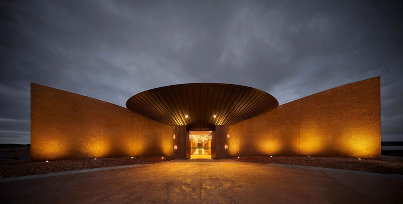
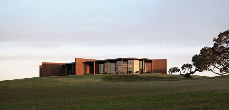
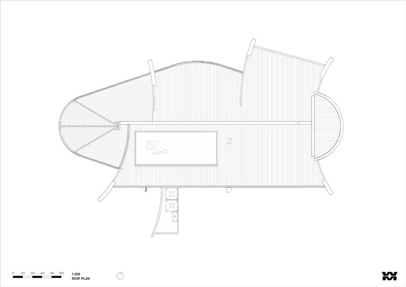
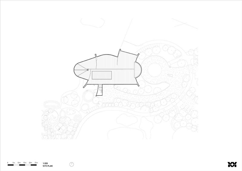
Melbourne-based architecture firm Wood Marsh has completed a clubhouse with curved blade walls and inverted zinc roof in Melbourne, Australia. Named Lonsdale Links, the project responds to the gently undulating terrain of the adjacent golf course and prehistoric Australian coastlands, Lonsdale Links has been conceived as “a reminiscent of a relic in the landscape”.
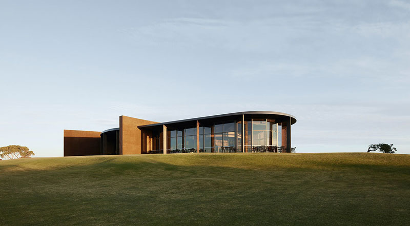
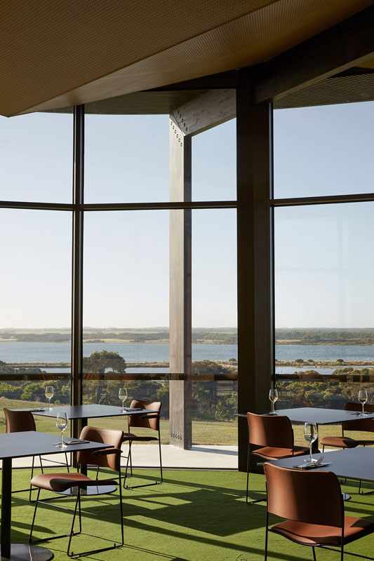
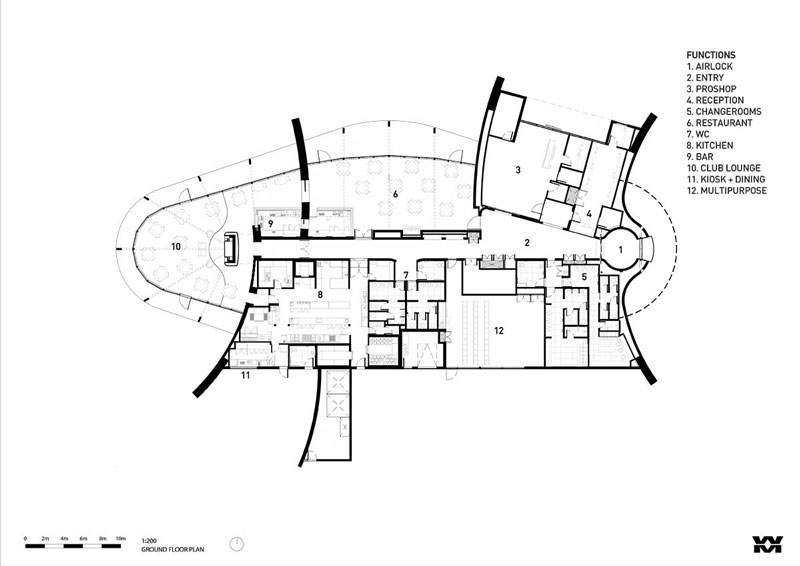
The program of clubhouse includes the golfers’ lounge, restaurant, commercial kitchen, pro shop, multi-purpose space, members change rooms, kiosk and supporting amenities. Inside, the studio divided into zones programmatic requirements for efficient use. The contours and softened shapes of the clubhouse connect with the site and as a natural extension, its design is intentionally considered in the round, encircled by the links golf course. Positioned on the crest of a hill, the building can be experienced from various sightlines, emerging above the trees as golfers navigate the course.
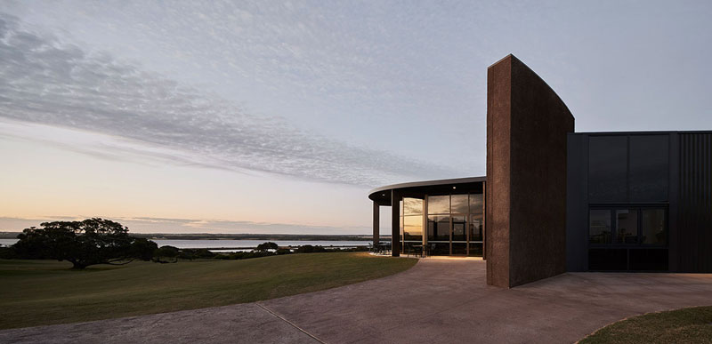
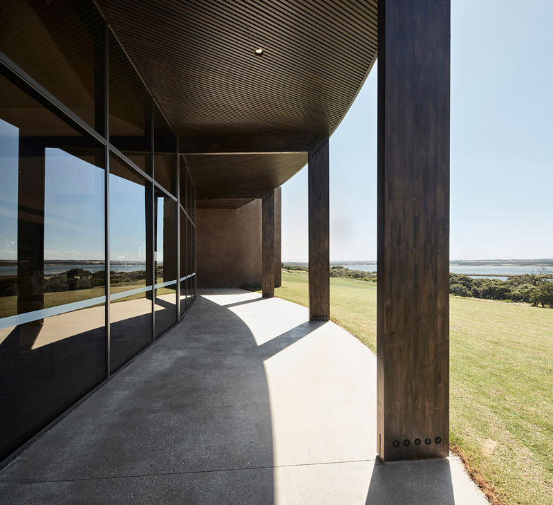
In response to its coastal conditions and the prevailing winds that come off of Bass Strait, the building is firmly anchored to its site.
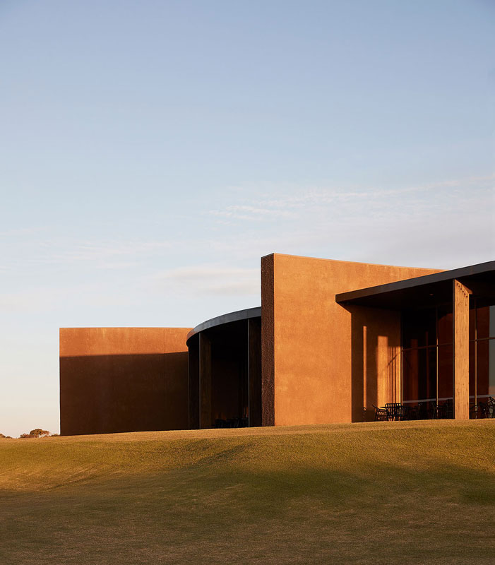
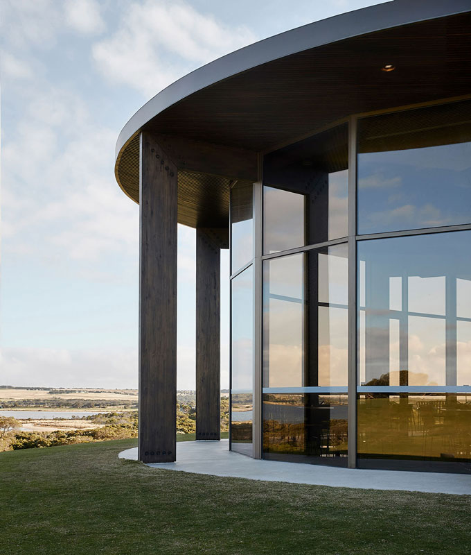
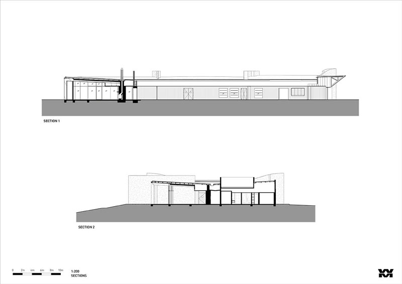
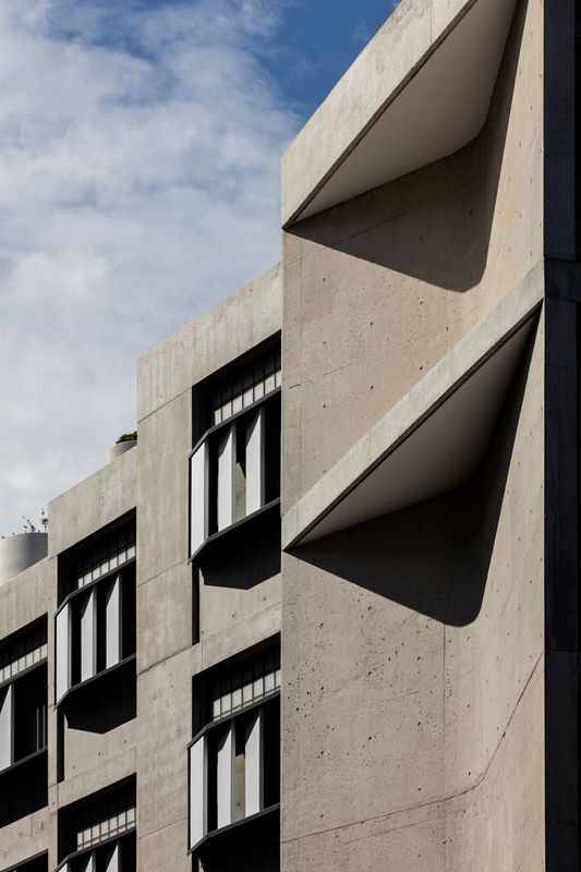
Instilling extreme robustness, the structure is grounded by a series of curved blade walls embedded in the landscape, finished in a highly textured render. Expansive dark laminated timber beams radiate from the spine of the building emphasising the non-rectilinear form.
The natural tonality is influenced by warm colours native to the rural setting, particularly the bronze glazing which reflects the evening light. The finishes have a raw weathered quality that creates a sense of permanence in its coastal context.
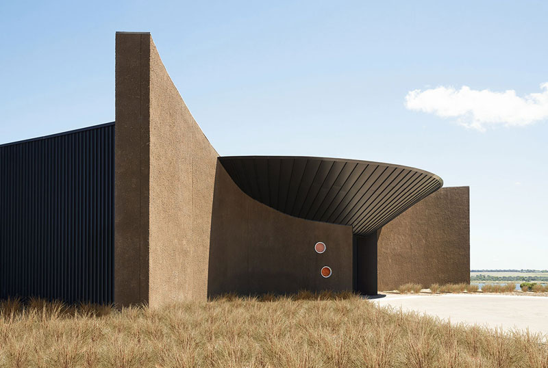
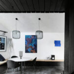
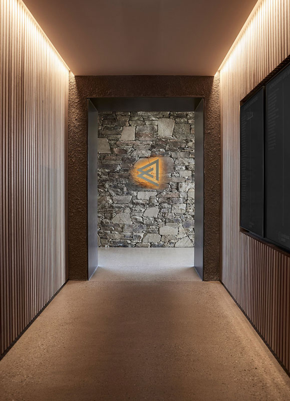
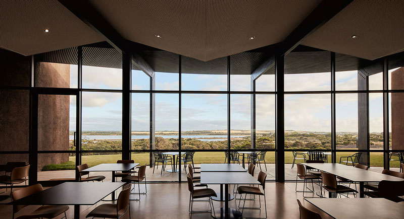
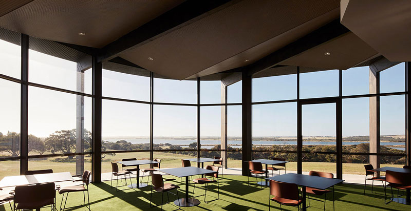
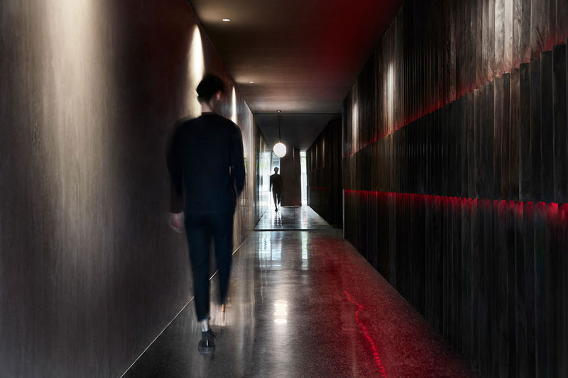
The entry experience is created in the interstitial space between two monumental, rendered arching blade walls, concealing the building’s mass and distinct views upon approach. The sculptural qualities of the blades, and gently sloping inverted zinc roof, converge to draw visitors through the threshold. Four circular orange lights punctuate the walls to further activate the portal. Beyond the entry walls, a timber-lined corridor gradually leads guests to the restaurant or the golfers’ lounge, containing expansive, framed views towards Lake Victoria, the golf course, and the rural coastal landscape beyond.
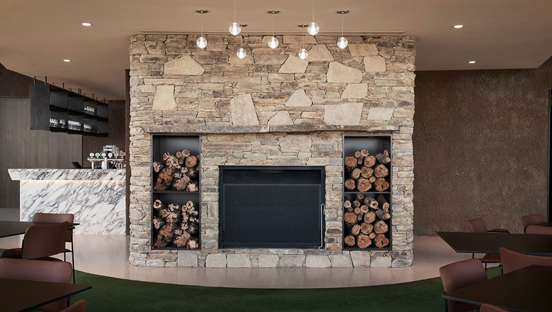
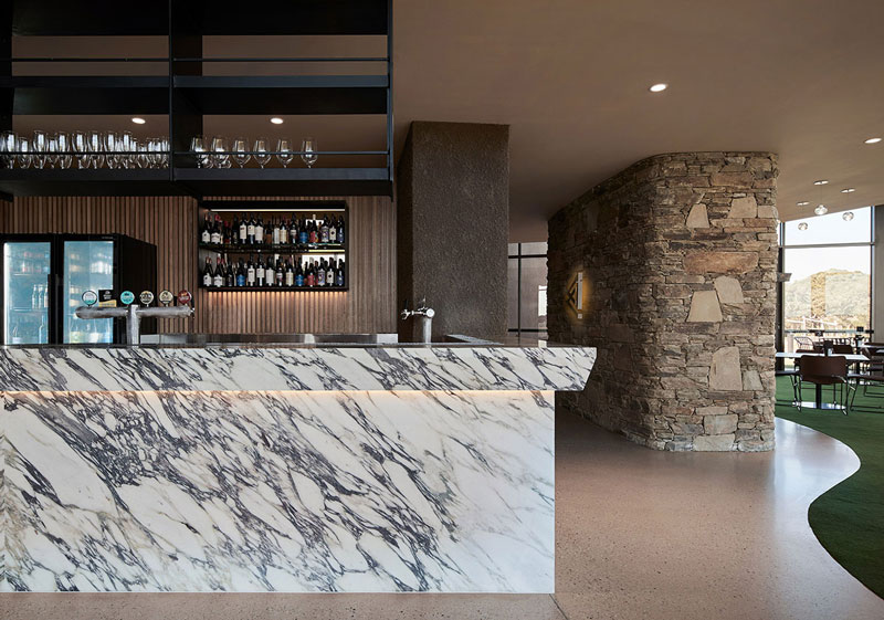
The structural elements of the building are a continuous expression internally and combine with the interior finishes to create a contemporary interpretation of the clubhouse typology. A central dry-stack stone fireplace features as the focal point to the lounge, from which the laminated timber beams and folding acoustic ceiling radiate in a sweeping profile. Vibrant green carpets provide a visual connection to the fairway and a playful addition of colour to the naturalistic material palette. Flexibility is offered to the operation of the lounge and restaurant by way of an oversized timber-clad door, which serves to combine or separate both spaces as required. Lonsdale Links is both a destination and a sculpture within the landscape overlooking the premier golf course and rural views beyond Lake Victoria.
Its unique positioning and architectural execution have attracted increased membership and greater community interface.
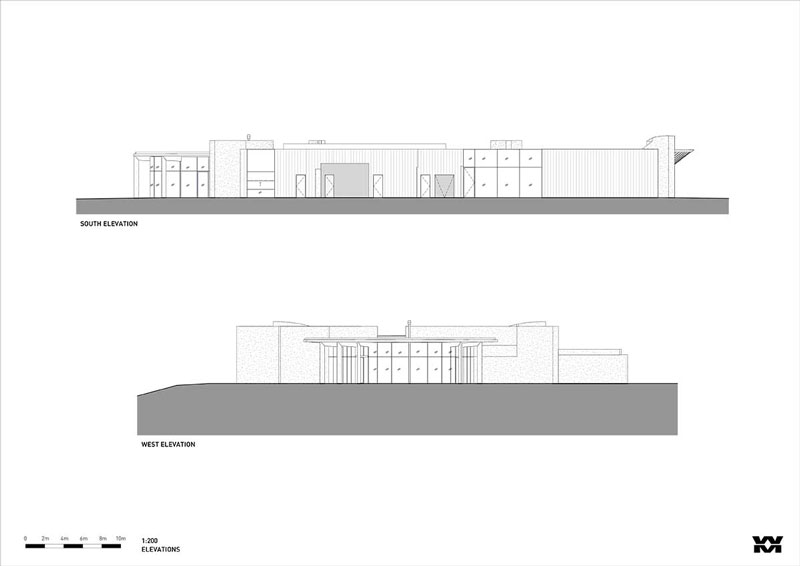
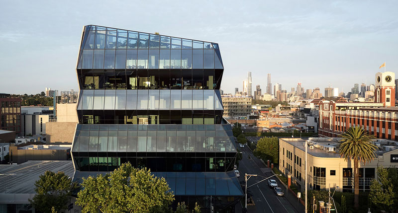
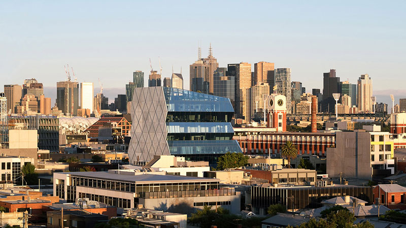
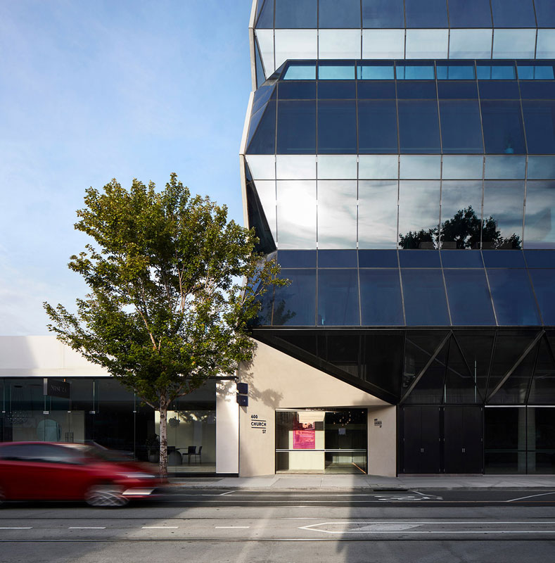
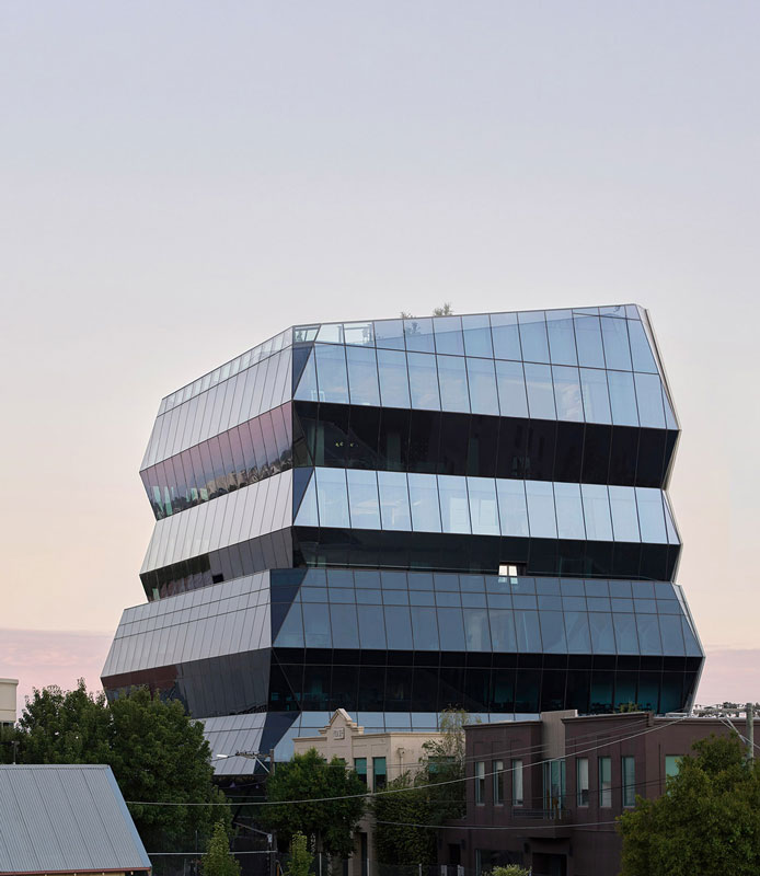
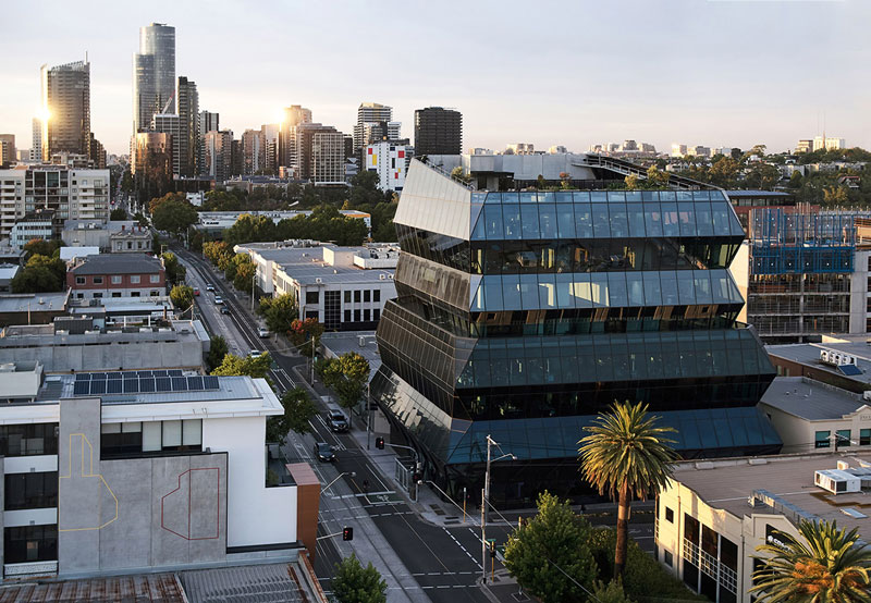
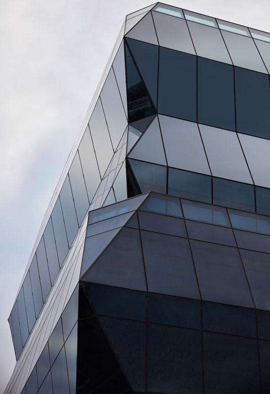
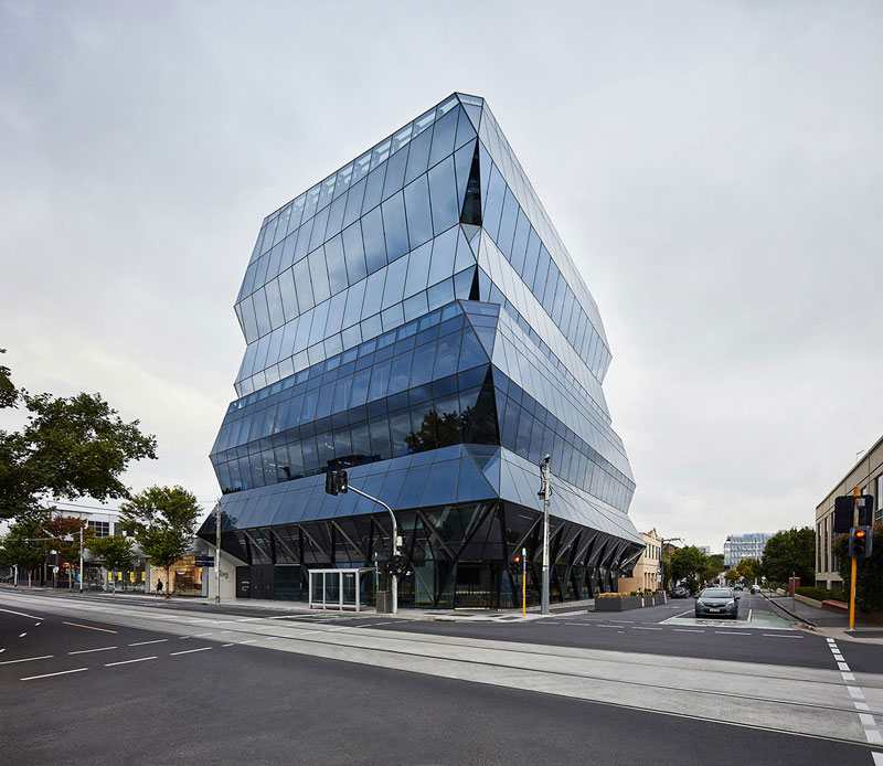
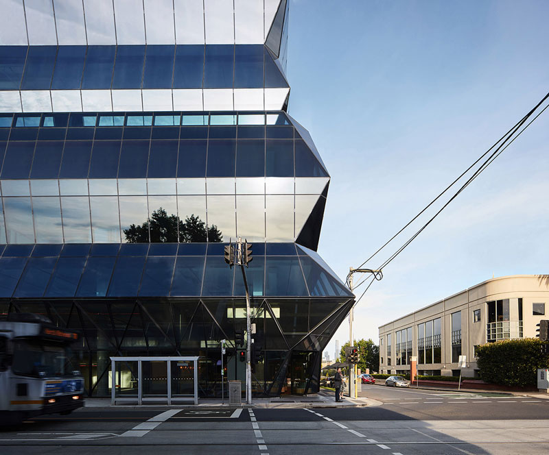
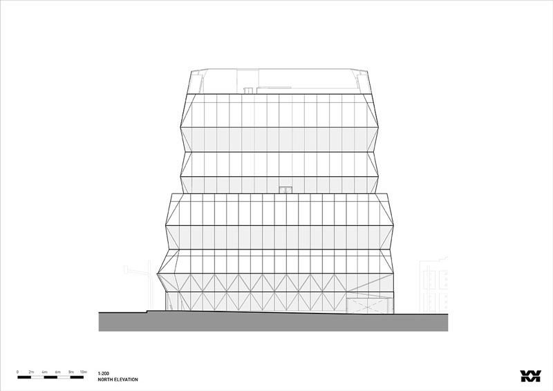
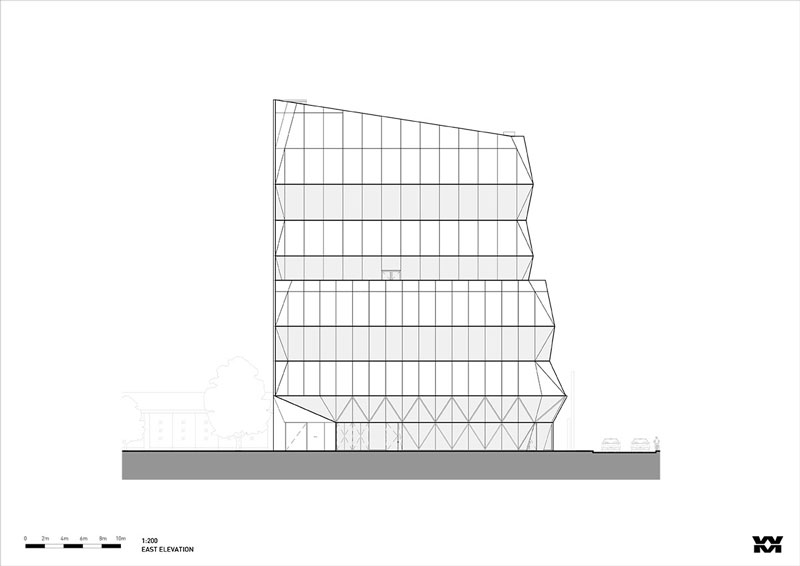
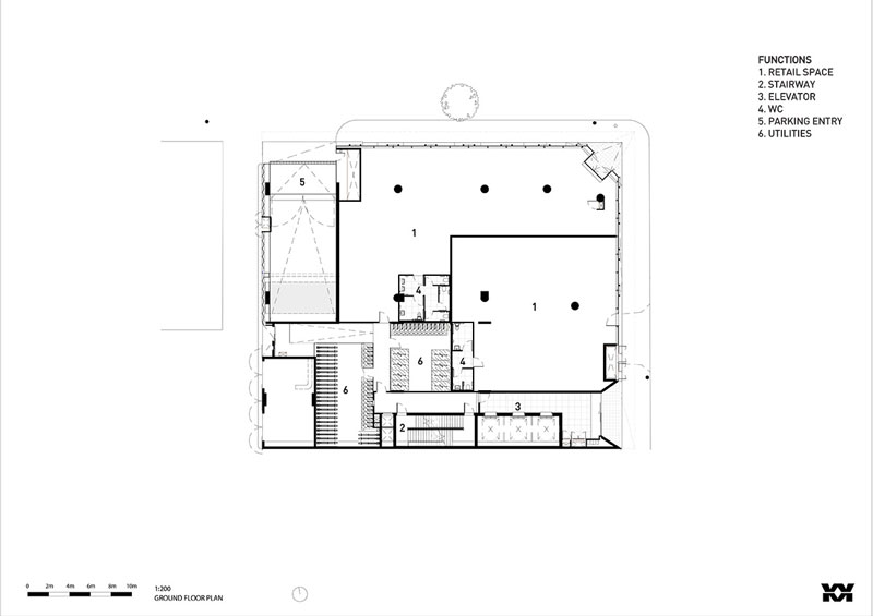
Wood Marsh has completed a commercial building at 600 Church Street in Australia. Named Church Street, the new commercial building, sitting in contrast to the industrial grit of Cremorne, reinforces its corner allotment, boldly ascending as a monolithic crystalline glass formation.
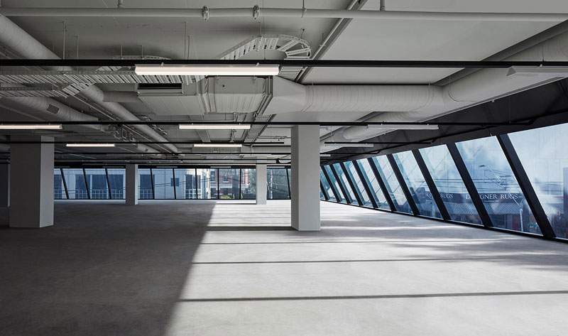
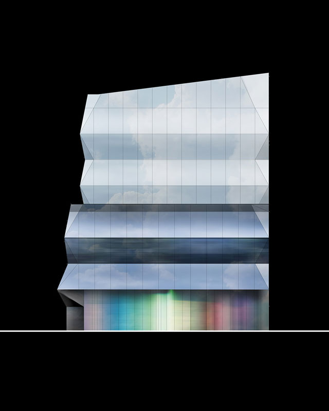
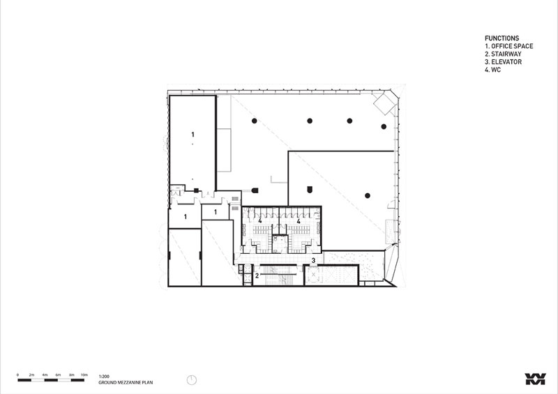
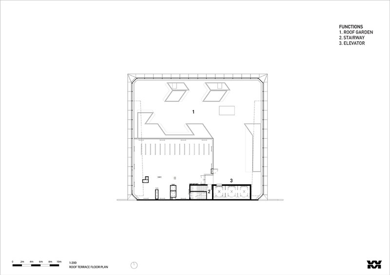
The building’s outer skin is wrapped with a glass shell creating ambiguous interplay with scale. Inspired by “the area’s raw and textured industrial past”, the futuristic form and materiality offer a contrast with its surrounds, accentuating the building’s refined and polished nature. The building’s program contains retail and hospitality at ground level, and office tenancies above, leading upward to a roof terrace. The inclining and reclining façade elements deliberately obscure the floor plates they intersect with and act to obfuscate one’s sense of the building’s scale.
Secondary to the building’s form is the unexpected fine articulation at the ground level where the building intercepts an adjacent laneway.
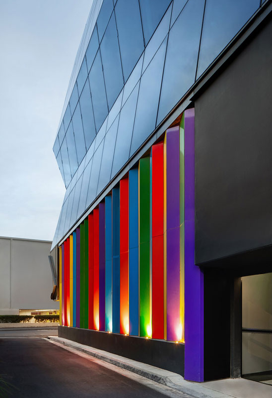
A palette of multi-coloured panels arranged in a concertina pattern picks up on the angles of the facade and connects conceptually to the brilliant refractions within a gemstone. The installation casts reflective light on the narrow pathway, invigorating an otherwise mundane laneway and providing a level of passive surveillance when illuminated at night.
The measured angling of glazing at ground level limits distracting reflections and the overhang over the footpath functions as a street-level awning. The building entry is defined by the glazed façade lifting to reveal a concrete background.
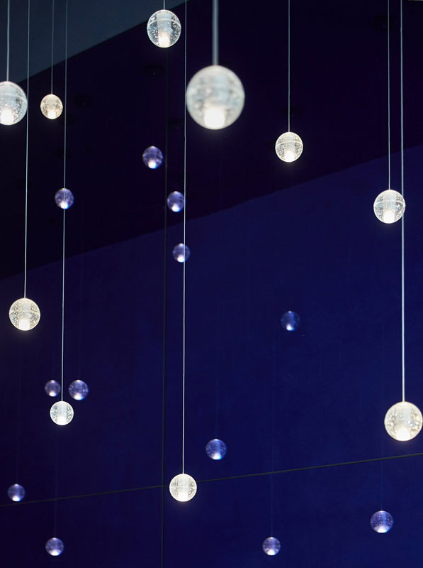
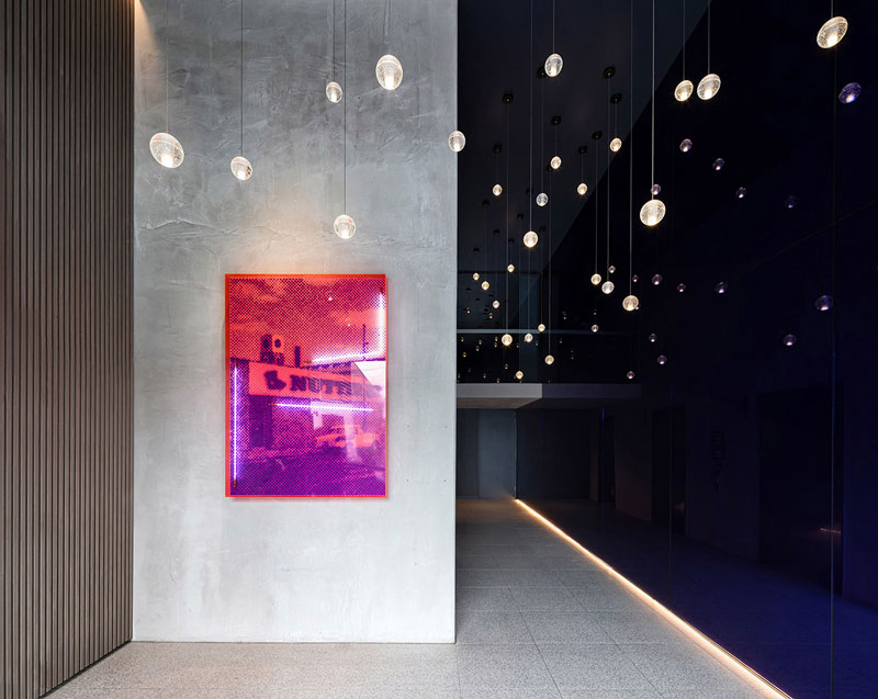
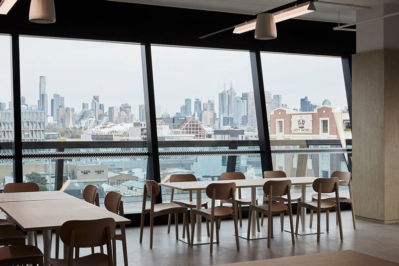
The external materiality is echoed in the lobby with bright blue mirror extending throughout the double-height space. Spherical glass pendants suspended at varying heights feature as a dramatic installation whilst also providing a sense of spatial intimacy. “Church Street aims to bring an enhanced level of amenity to the workplace,” said Wood Marsh.
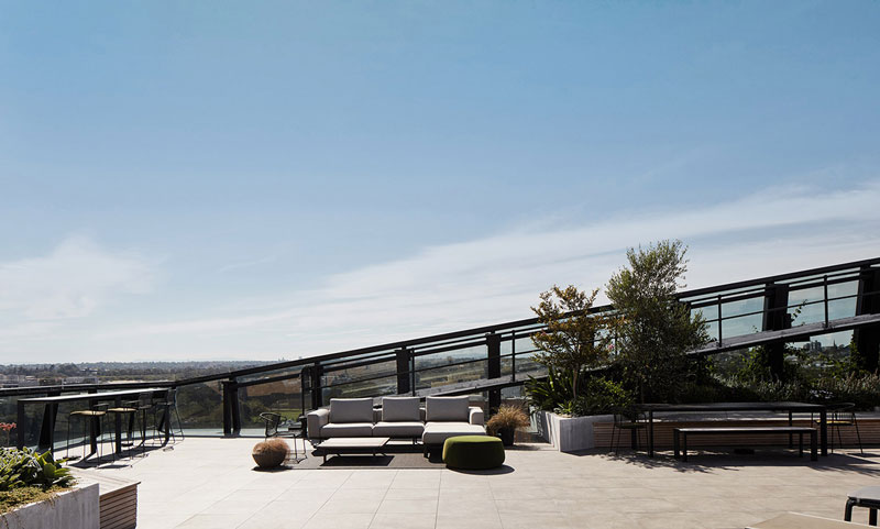
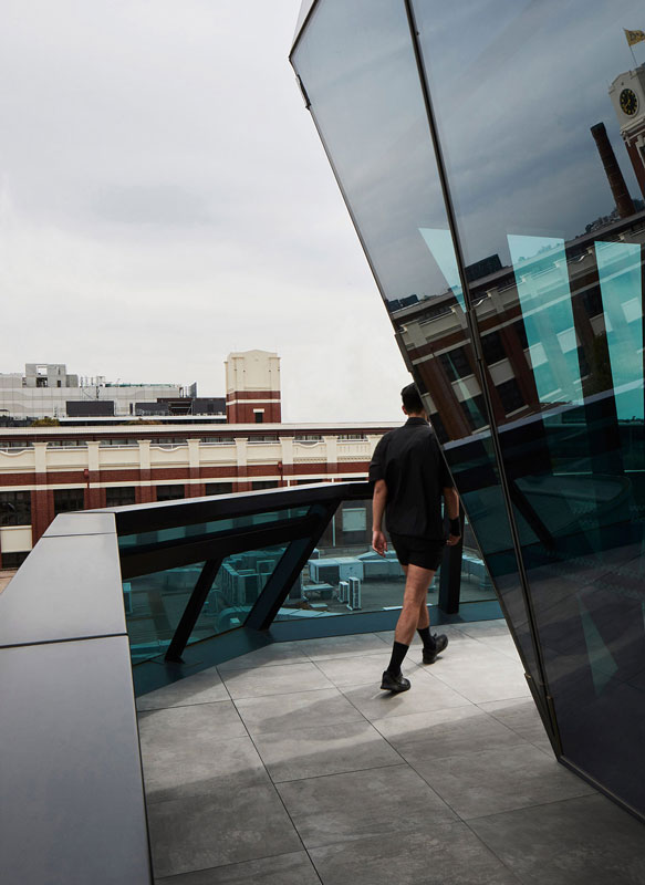
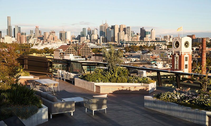
“The building features a first of its kind multi-level bike stacker system and enhanced change rooms, to genuinely promote cycling as an alternative mode of transport. With landscaping by TCL, the roof is a social space encouraging connection between staff while offering visual connection to the city skyline,” added the studio.
As the faceted glass bands ascend, the subtle shift in tonality responds to a gradual progression from the building’s industrial base, upward toward the sky.
The tonal transition occurs at a height approximate to that of the surrounding suburban buildings. Above, the glazing is lighter and the building further set back. In the resulting interstitial space, a balcony encircles the building for use by the Level 4 tenancy.
Church Street positions its eight stories as an abstract sculptural object offering both contrast and balance to its unique industrial setting.
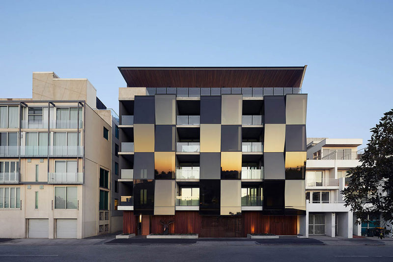
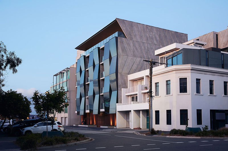
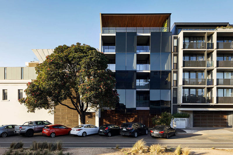
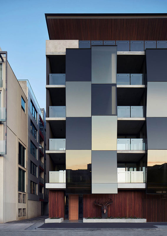
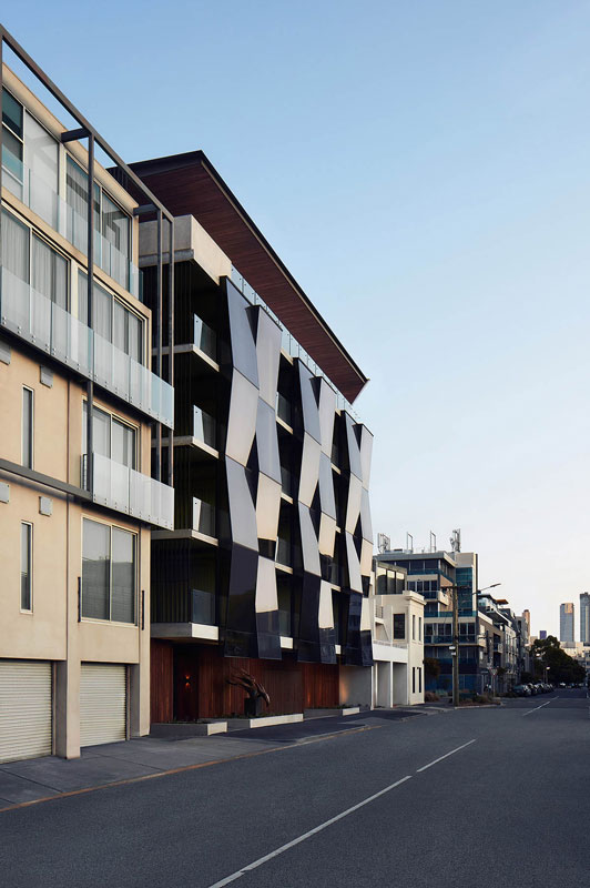
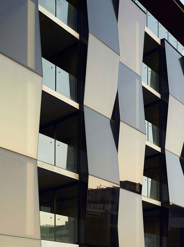
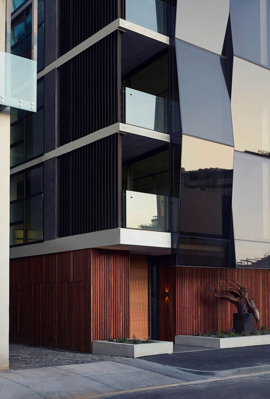
Wood Marsh has completed Alumuna Residences that feature bronze, folded mirrored glass façade in Port Melbourne, Australia. Named Alumuna Residences, the residences are situated on a challenging L-shaped site and are activating its dual street frontage to the adjacent neighbourhood.
The design of the residences creates “a sculptural and dynamic façade” reflecting composed glimpses of the neighbouring context. As the architects explained, ideas of visual abstraction created through a singular material and its interplay with light, offer a multitude of experiences along the streetscape.
With the majority of the building’s form contained inboard, the approach is to achieve as much movement as possible on the two narrow facades – one on Johnston Street and the other on Rouse Street.
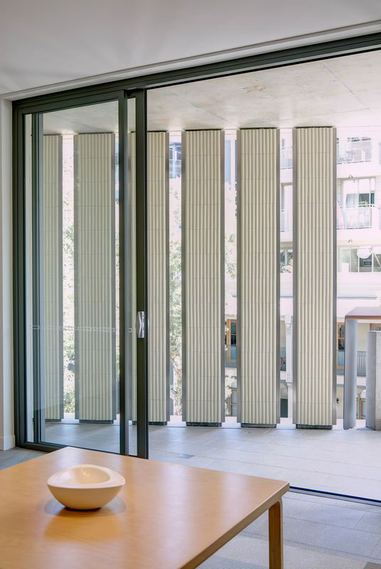
The project takes cues from ideas of kinetic sculptures and the facades present as a dramatic concertina whose appearance is constantly changing through the day.
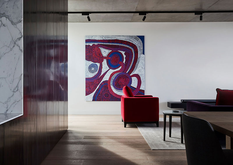
The two façades are monochromatic studies in natural materials; concrete, timber, black steel and bronze mirrored glass. Book-matched by recessed timber cladding flanking the ground and penthouse level, the glass building appears to float between.
Across the four apartment levels, the glazed façades subtly angle back and forth to create a play with reflectivity and refraction, with sightlines from outside distorted and intentionally obscured. Entering through the natural timber-clad ground level, residents are welcomed into an immersive and atmospheric lobby. The deliberately theatrical sense of entry references the concertina of the façade and immediately draws the focus deeper into the building.
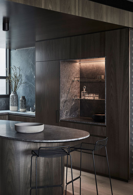
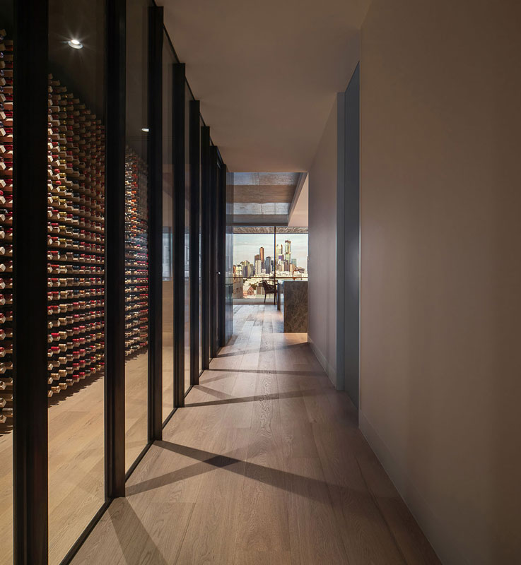
The custom abstract art installation along the primary linear wall adds a sense of texture in its form and depth through the patina of its dark bronze materiality and the warm glow of the amber accent lighting. The bronze carries through the foyer, creating a sense of transition leading to the apartments.
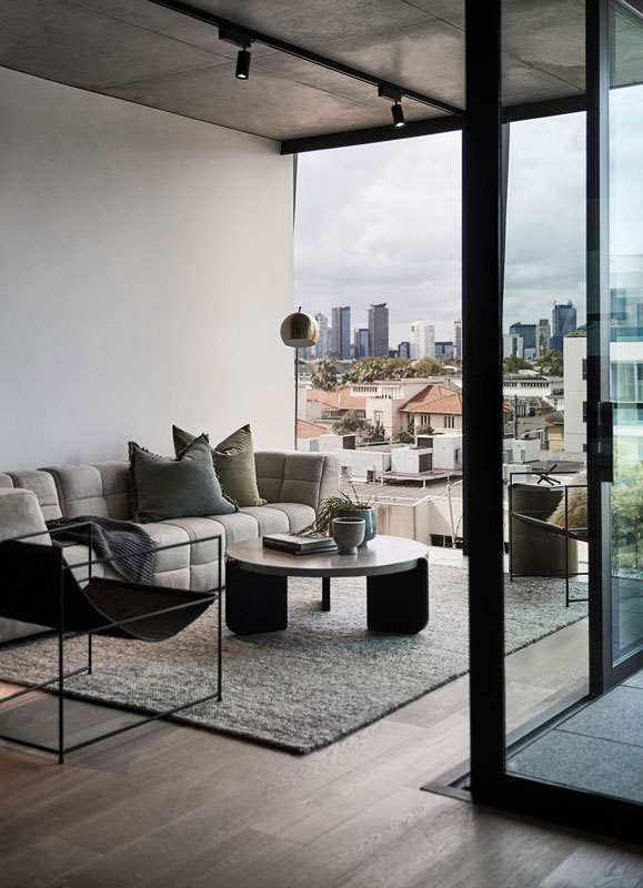
Counteracting the dynamism of the facade, the peaceful interior experience is emphasised by curving details that support movement through space.
Natural materiality continues inward, with marble kitchen bench elements sitting sculpturally upon light timber flooring. Highly detailed joinery and storage offer concealment of supporting elements, emphasising a sense of refinement within.
Sitting above the boutique apartments is the Penthouse, finished in an elevated palette of darker timber and natural stone finishes.
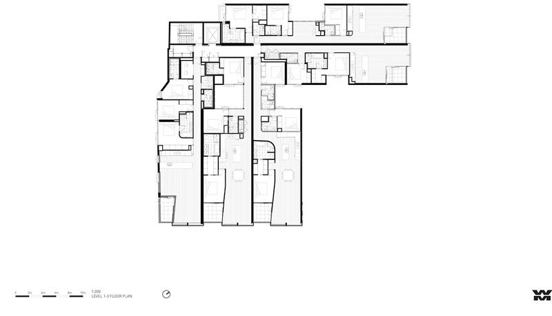
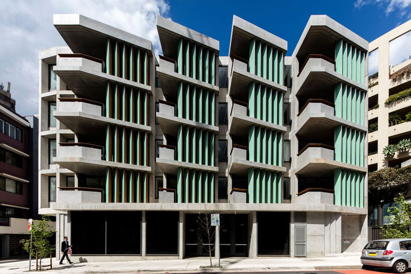
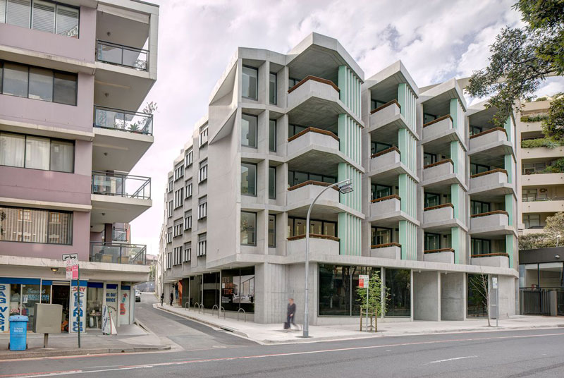
In high-density Surry Hills, The Surry apartment block continues a pattern of renewal in this part of inner Sydney as well as an architectural pattern immediately discernible as Candalepas Associates’ work: rigorous, disciplined design with a surprising touch that lends a welcome sense of joy and artistry.
Off-form concrete has become Candalepas Associates’ signature. Usually smooth in finish, it is a brave move in a country like Australia, which is not known for the quality of its off-form work. Many – probably most – of the examples of smooth off-form that you see around town have been touched up with a skim coat or cement paint to hide the bubbles, blotches and other blemishes that are the hallmark of our local product. However, Candalepas Associates seems to have discovered how to get it right.
In many respects, The Surry apartment block in Sydney’s Surry Hills is a typical Candalepas project. They are usually easy to pick – and not just because they employ off-form concrete or because they are consistently fine examples of architecture; the work is always very rigorous and disciplined. But, as well, each project includes a surprising touch that, although not easily explained in a functional or practical sense, adds to the joy and artistry of the work. Angelo Candalepas is a disciple of beauty and romance who is prone to bouts of poetry and classical piano, and it seems important to him that, in the practice’s work, there is always something of the sublime or idiosyncratic to lift us above the mundane. Sometimes, the work veers into austerity – but then a touch of colour, the warmth of timber, or another element of craftsmanship brings back a human feel. All the work appeals to our senses, responding directly to the scale and movement of the body.
In its bones, Candalepas Associates’ work is classically European and would happily reside somewhere in one of the nations fronting the Mediterranean. It is designed to age gracefully and assumes that it will be around for many years. Materiality is at the core and is expressed deliberately as a major part of the aesthetic.
In 1995, Candalepas Associates won a national design competition for what became known as the Pyrmont Point Apartments (completed in 1998) in Sydney. Drawing on the architecture of traditional Greek villages, it is a heavily rusticated and expressive building that was a significant departure from the standard developer-driven unit designs of the time. This project not only set up Candalepas for 25 years of apartment design evolution; I believe it also had an influence on the expectations and quality of the commercial apartment market going forward. It was probably this building that introduced the external sliding/folding shutter that has become a must-have for modern apartments, just as spa baths and bidets once were.
Architects: Teeland Architects Area: 300 m² Year: 2020 Photographs: Emma Bourne Manufacturers: Miele, Astra Walker, FLOS Architect: David Teeland, Kim Jong Sook Country: Australia
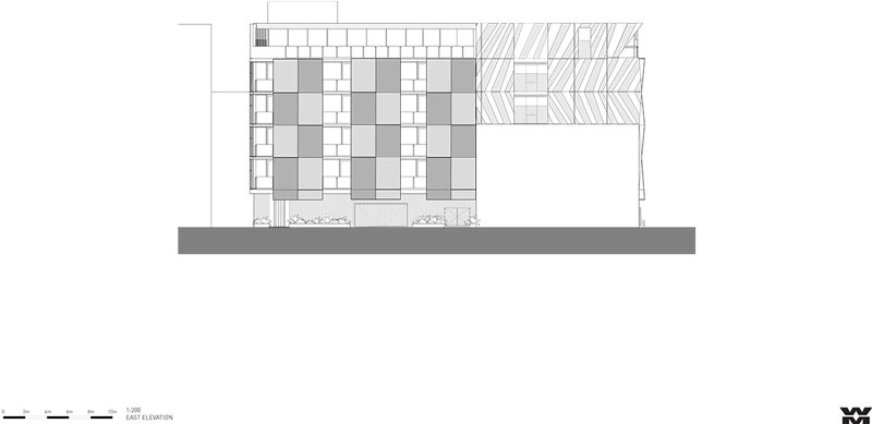
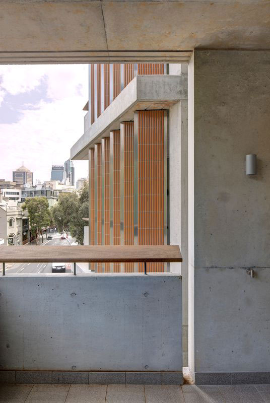
The Surry continues the pattern of renewal of this old rag-trade quarter of inner Sydney, where existing warehouses have been transformed into New York-style loft apartments, while underutilized sites are cleared for new multiresidential buildings that squeeze out every square centimetre of developable space. On the whole, the transformation has been positive and this is now a desirable place to live for the young and mobile as well as a few stylish downsizers. The Surry exemplifies urbane city planning, with the building form reinforcing the street edge and an internal courtyard carved out to create an L-shaped plan that maximizes light and cross-ventilation to the apartments. The street level is activated by commercial tenancies facing busy Elizabeth Street. The apartments’ entry and foyer is tucked around the corner in quieter Butt Street, where an impressively scaled steel security door leads into an austere lobby of concrete and terrazzo that steals southern light from the courtyard above.
Above the commercial tenancies, on one side of the “L,” are four levels of studio, two- and three-bedroom units. In the two-storey, two-bedroom crossover units on the other part of the “L,” facing Butt Street, the bedrooms on both the north and south facades have access to natural light.
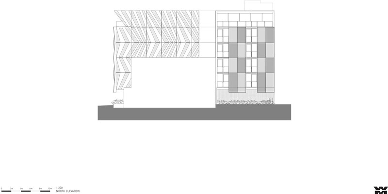
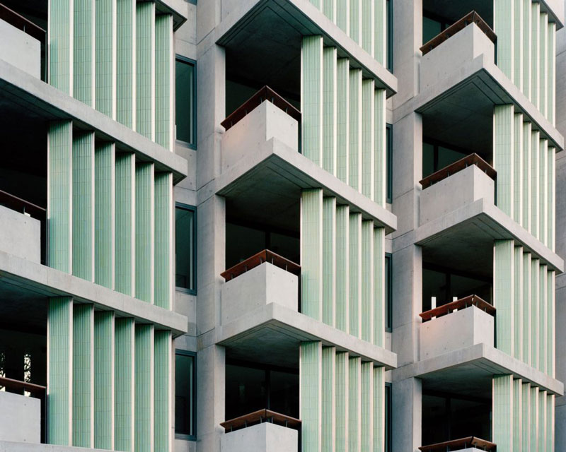
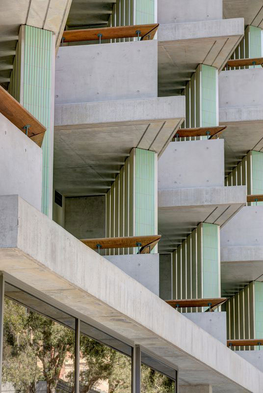
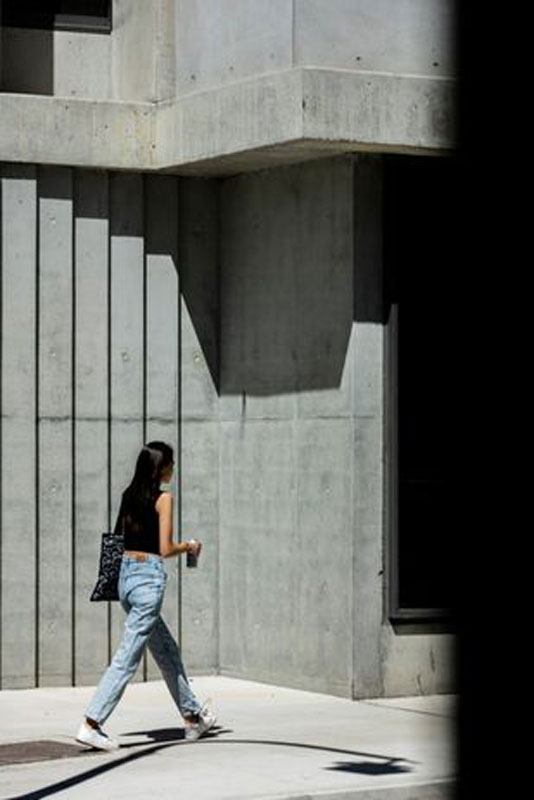
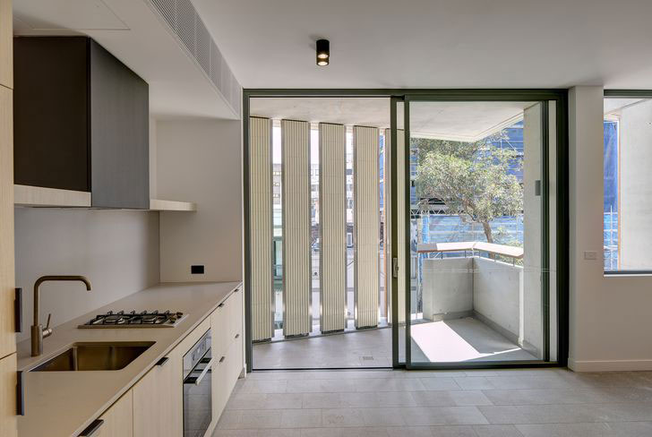
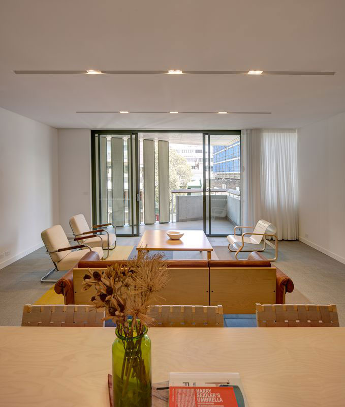
The Elizabeth Street elevation has a stepping profile that turns to the best view: north along Elizabeth Street and toward the city skyline. The divisions nicely mimic the scale and rhythm of the typical Sydney terrace house rows that once occupied this part of Elizabeth Street. The balconies include triangular blades clad in turquoise and tangerine ceramic tiles (the surprising touch), and a large, flat, timber leaning rail that lifts them above the ordinary.
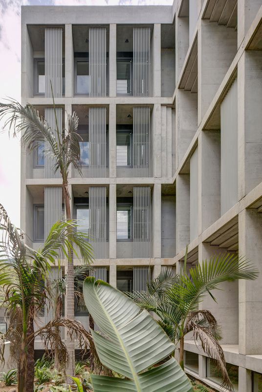
Along the northern facade, to Butt Street, light is introduced at high level with glass bricks (in a nod to the warehouse architecture that once made up much of this suburb). In the tight matrix of apartments looking at each other across narrow streets, sliding screens and blinds are an important device to maintain privacy. The screens showcase the architect’s careful approach to bespoke detailing. These are very compact inner-city apartments where the maximum number of residences and bedrooms possible within the envelope controls has been realized. In less skilful hands, the development could easily have been claustrophobic and overworked. Perhaps a couple of the two-bedroom Butt Street apartments are a little squeezy, and the three-bedroom apartments might have been better left as two, but it gets all the basics right: good orientation, good natural light, good cross-ventilation (only the studio apartments are single orientation), good privacy, good acoustics. And this is ultimately why these dwellings are successful and very livable.
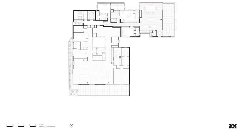
A communal roof terrace caps off the building, with the same long views to the city horizon, and facilities that mean the space will be used (barbecue, sink, toilet and landscaping). It has a welcome sense of openness that balances the tightly planned apartments below.
The interior design of The Surry, by Lawless and Meyerson, is respectful, with a reserved palette in varying tones of white, black and grey. It leaves room for the inhabitants to personalize their spaces as they see fit. The play of light on walls that have deep reveals, bending forms and stepping profiles enlivens the grey concrete that could be relentless if left flat and undetailed. Candalepas understands the craft of making in-situ concrete buildings – the reality of form joints and tie bolts, the opportunities for texture – as well as the limitations of a material that you only get one go at. The practice also utilizes the finer scaled detailing of timber rails and screens, sliding aluminium panels and ceramic tiles to counter the larger expanses of raw concrete.
In Sydney, the importance of densification – and doing it right – cannot be overemphasized. The days of low-density greenfield development in an ever-expanding city footprint are not sustainable and should be behind us. Apart from Potts Point and Elizabeth Bay, there are few traditional examples of high-quality, high-density apartment neighbourhoods in Sydney. What we see in Potts Point, in particular, is a coherent and dignified streetscape where each building responds to the street alignment and respects the adjoining building, so that access to natural light, ventilation and privacy is secured and views are shared around. In this typology, the fundamentals of light, ventilation, privacy and acoustics determine the success of the development. The rest is really just style.
This high-quality urbanism is now spreading to Surry Hills and The Surry provides exactly the sort of template for infill development that local councils and the state government should be promoting.
Clinton Murray Architects Completes Levo’s House In Hawthorn, Australia
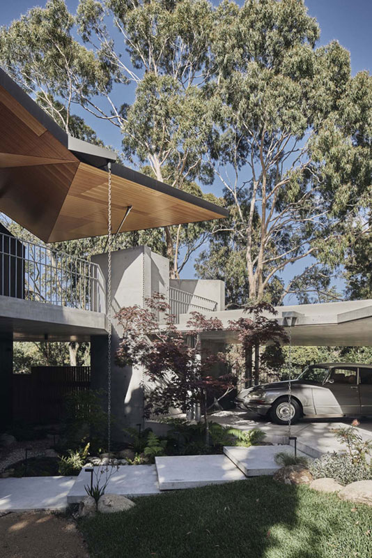
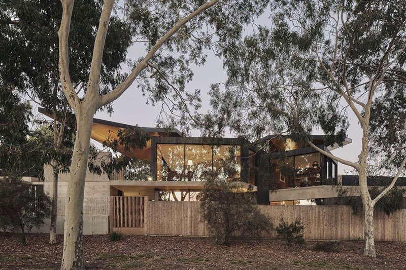
Victoria-based architecture studio Clinton Murray Architects has completed a private residence that allows the passersby to see through and into the building from the street in Hawthorn, Australia. Called Levo’s House, the 300-square-metre house was designed to create an entirely new way of living for clients.
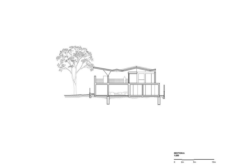
While the ground floor entirely offers privacy, seclusion and retreat, the upper floor is visible from the street with its folded roof structure.
The architects placed living areas on first floor living to offer a window into their lives.” We’ve witnessed people stopping to chat to our clients, a pleasant contrast to the barriers other properties present to the street,” said Clinton Murray Architects.
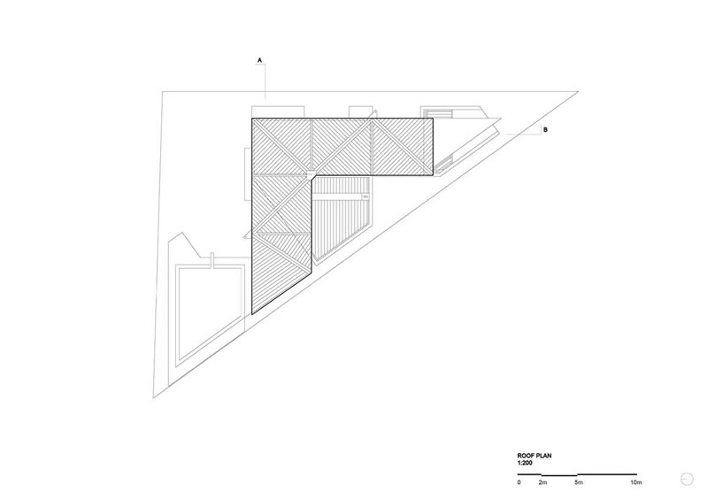
“We studied and referenced key planning controls to arrive at our design solution.” The key design component of the project is its ‘pitched roof’ and it had an adaptable triangular geometry of the site into a folded y roof that reads as lightly as possible.
“We worked closely with an extraordinarily creative (old school!) engineer from Canberra Ken Murtagh to create a roof that mystifies!,” added the studio. According to the architects, the project’s site was a difficult site – small and triangular – in a difficult street in terms of heritage and highfalutin.
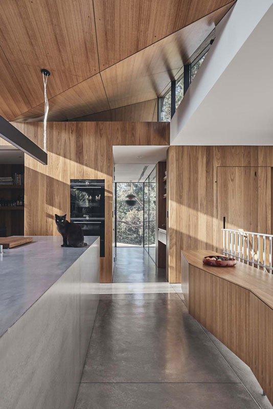
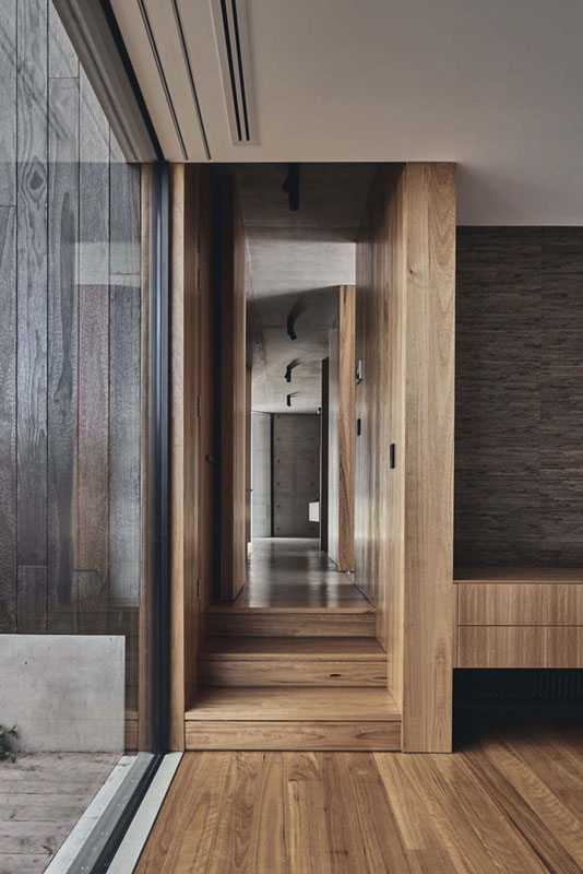
However, the architects used the strict planning guidelines to their advantage and honoured their clients desire to live in the treetops but retreat at night to their private world at ground level. From street level, the house is marked with concrete planes and slabs, while irregularly-designed pitched roof gives a clue to show what kind of program elements take place on the upper level. It is almost a separate structure from the ground level.
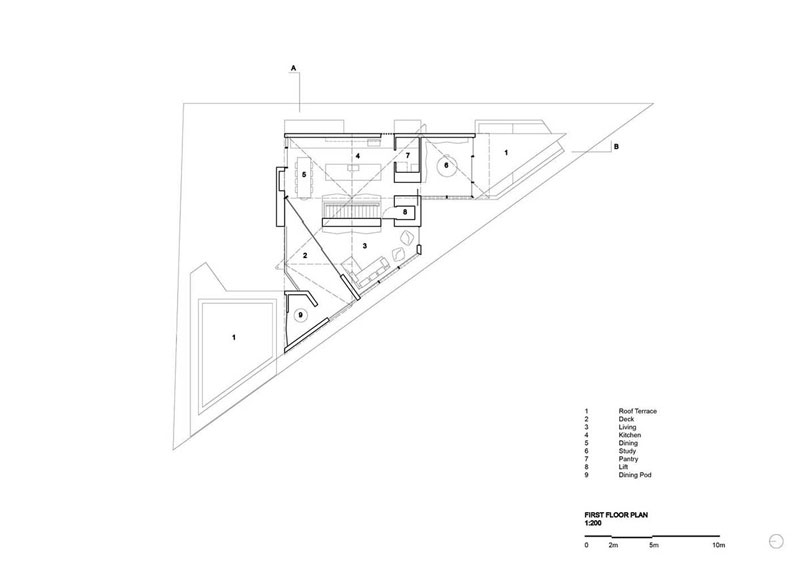
On the first plan, the architects placed a deck, living areas, kitchen, dining, study, pantry, lift and dining pod. When visitors see the house from the park level, the upper structure looks like it is floating with closed modules.
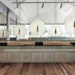
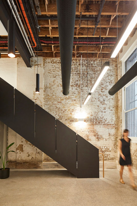
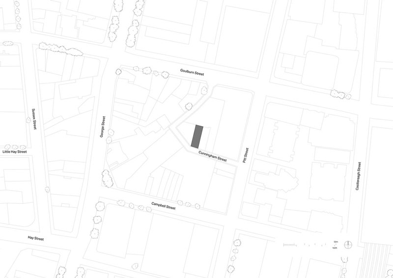
Make Architects Adds Copper-Clad Staircase To A New Boutique Office In Haymarket
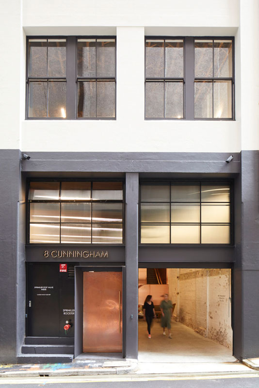
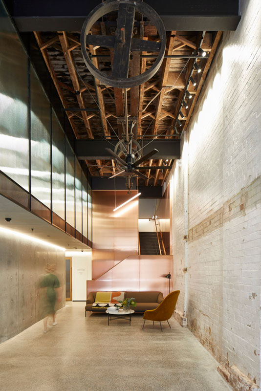
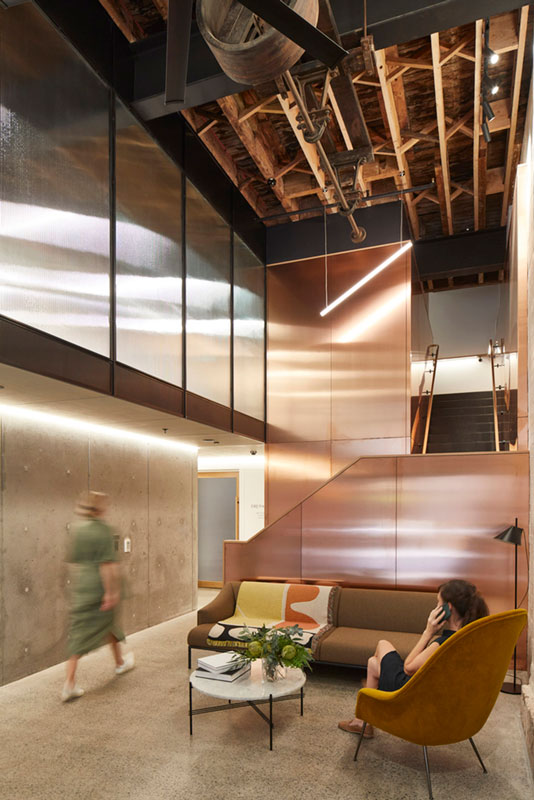
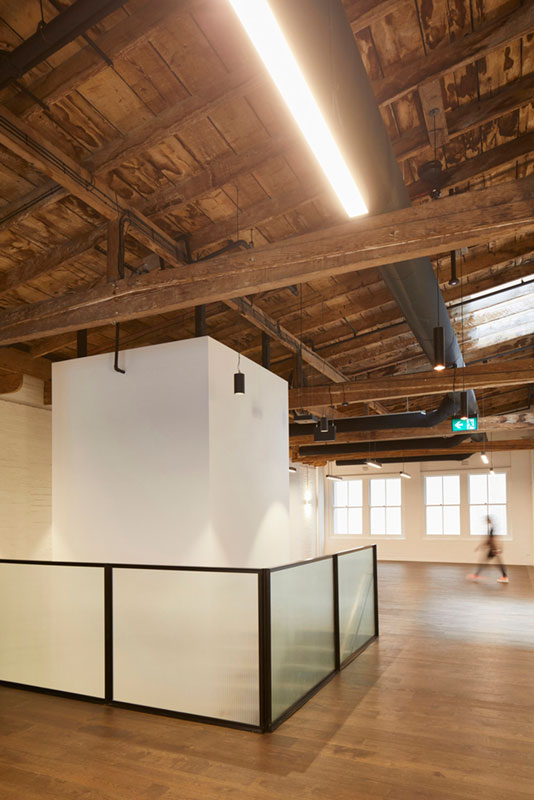
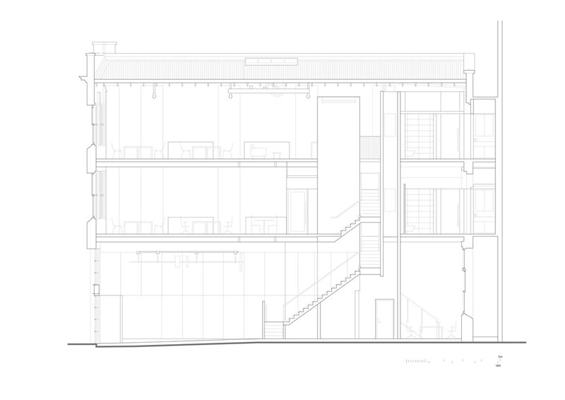
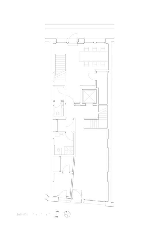
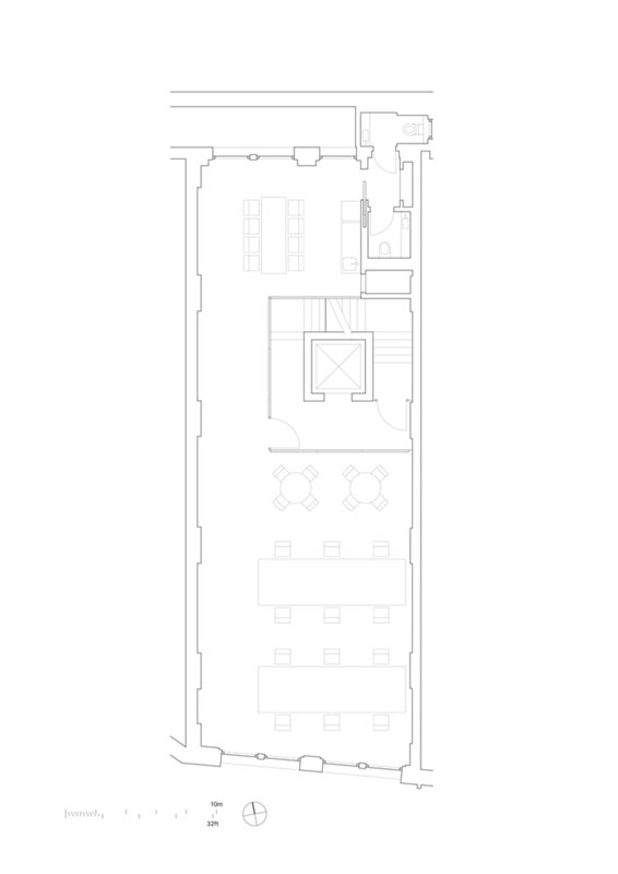
Make Architects has added a copper-clad staircase to a new boutique office in Haymarket, Australia. Named Haymarket Boutique Office, the 413-square-metre office space was converted from a former chocolate factory in the Haymarket district of Sydney, Australia.
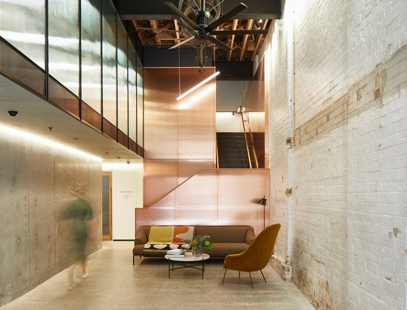
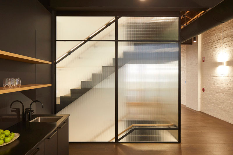
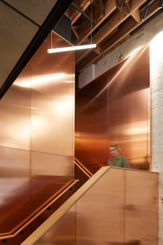
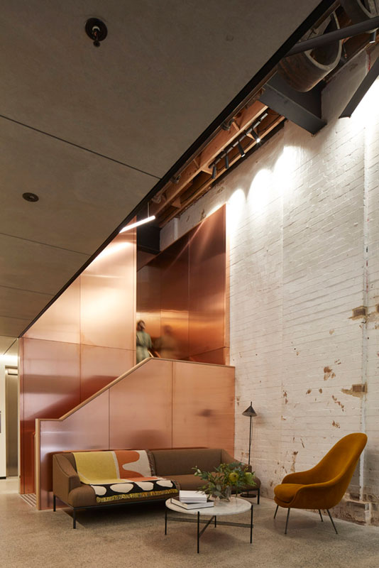
Combining old and new elements elegantly in the interiors, a copper-clad staircase acts as the main element of design, which connects the ground, first, and second floors. It entirely appears as a polished copper box with the stair inserted; at the first floor the copper transitions to glass and steel to maximise light. A tucked-away lift serves all floors, including the mezzanine.
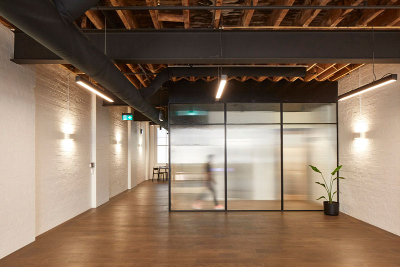
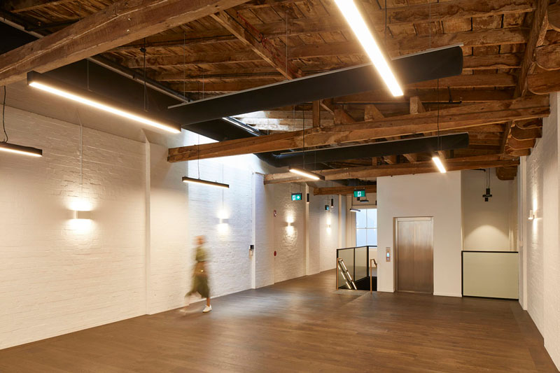
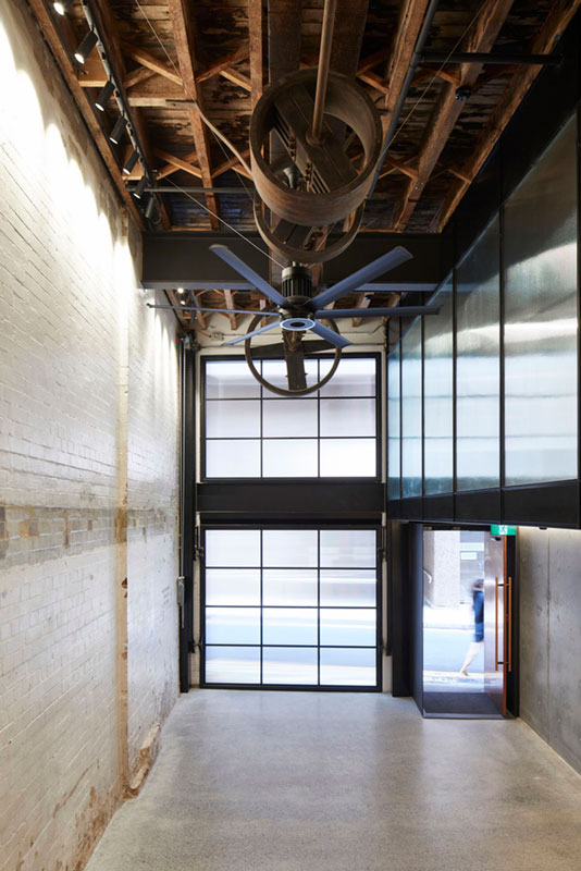
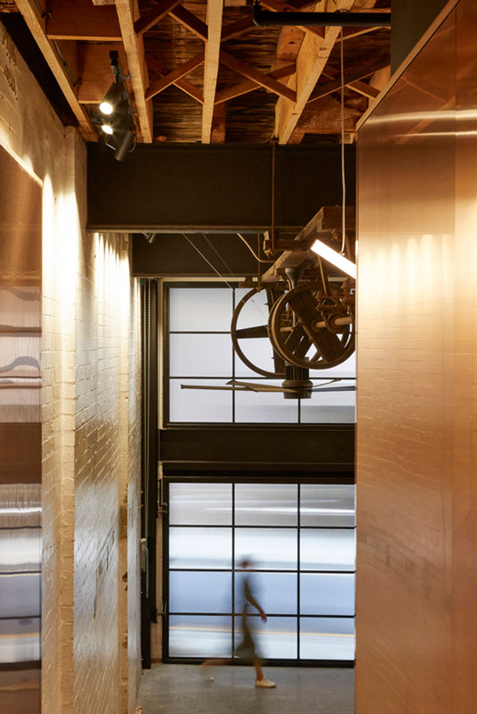
The original building was built in the early 1900s, in this transformation, the architects are inspired by the character of the building and they have retained as much of the original fabric of the three-storey building as possible, by maintaining the steel beams, timber flooring, exposed brickwork and original hoists.
However, they used new materials in the interiors such as copper, concrete and terrazzo – all sourced from within Australia – were chosen to contrast with the old. The studio painted the brick facade, and a new copper and steel portal door formed the main entrance.
They replaced the original roller shutter entrance with a bespoke double-height reeded glass and steel door that slides up vertically to sit behind an asymmetrical reeded glass window above, allowing the entrance lobby to open out and engage with the street. “When shut, the glass becomes a warmly illuminated lightbox at night,” as the studio explained.
Upon entering, the building opens up from the portal door and narrow laneway into a double-height, naturally lit entrance space that highlights the original brick and timber ceiling hoists. Taking details from its historic past as a former factory, the ground floor had an extremely high ceiling so the studio has added a new mezzanine level to increase the lettable floor space. The mezzanine is visible from the lobby below by a full-height reeded glass window which floods the space with natural daylight but also provides animation from the movement of people.
The mezzanine level has also its own dedicated stair in painted folded steel connecting to the ground floor. “As the copper box extends upwards the materials change into steel and glass for the movement and light to be visible through the building,” added the studio. “A lift has been installed to connect all floors including the mezzanine but is tucked away to encourage tenants to use the stairs.”
The studio kept the office floorplates minimal, exposed brick walls have been left, and they only painted white where needed with subtle wall and hanging lights highlighting the structure.
They sued new engineered oak floorboards on the first and second floors, which enable the original boards to form the exposed ceilings below. “Where new openings have been formed for circulation, the existing timber structure has been reclaimed and repurposed throughout the building as ceiling panels or to reinforce the structure,” the studio explained in it project description. Make Architects was founded by Ken Shuttleworth in 2004. Make Architects has offices in London, Hong Kong and Sydney. Make Architects recently completed a retail space with 110m-long vaulted passageway in Melbourne.
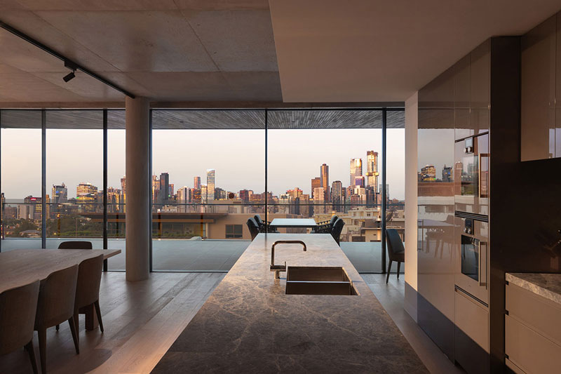
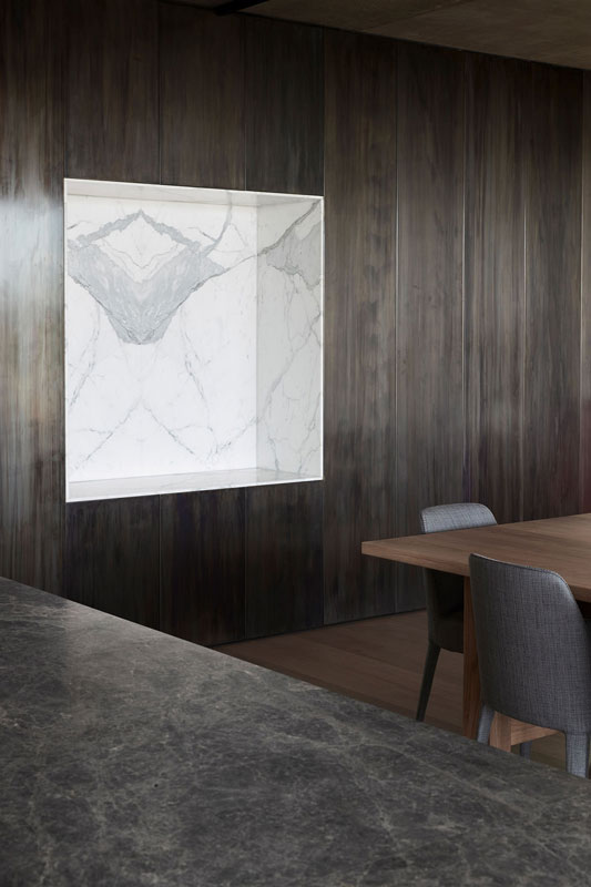
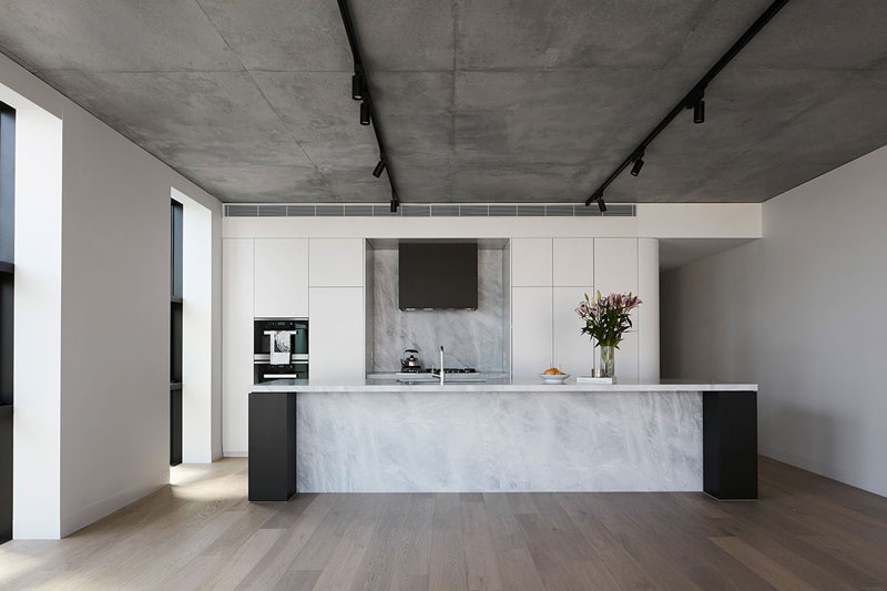
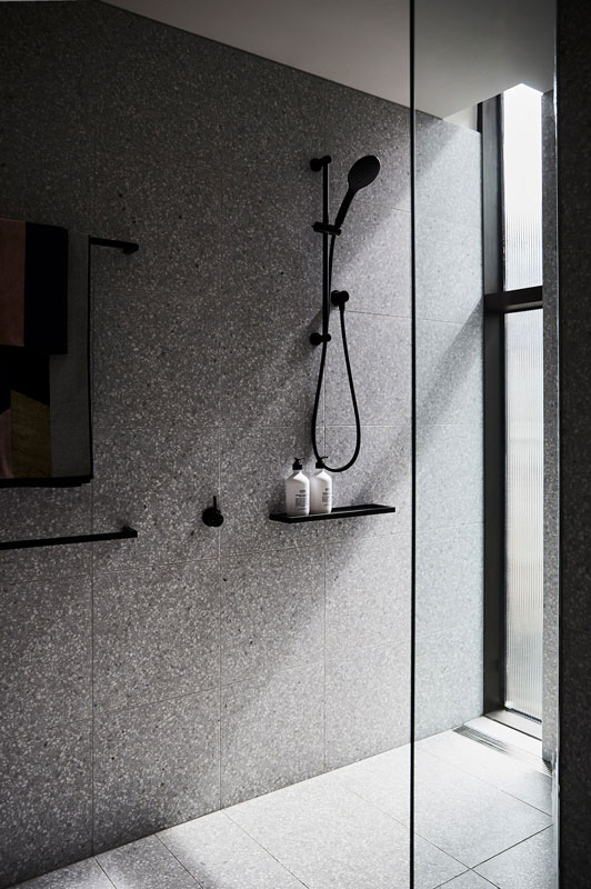
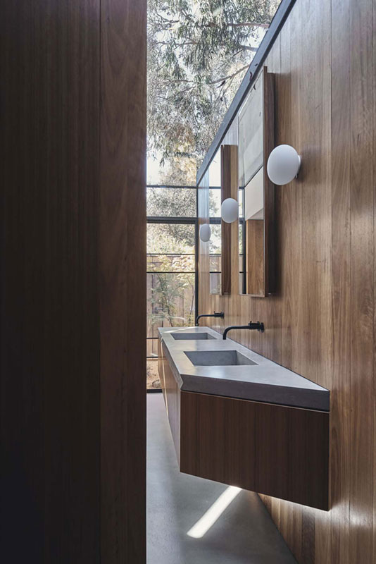
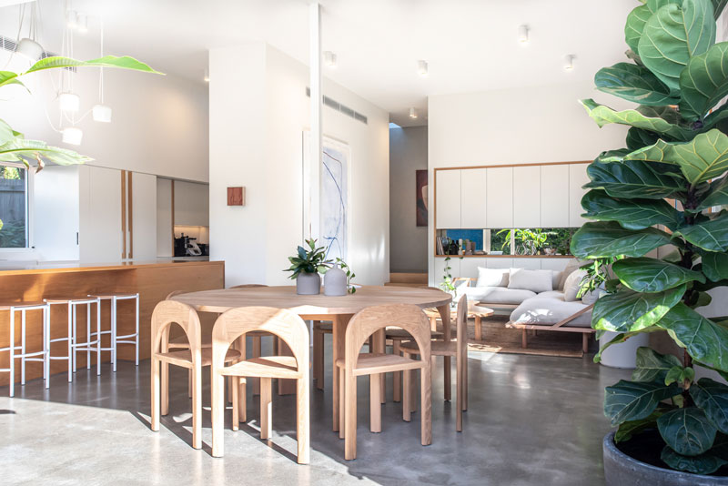
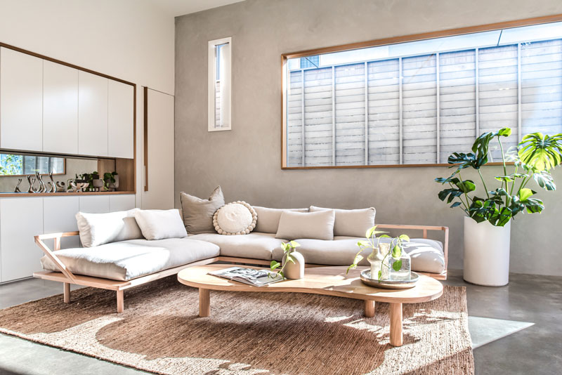
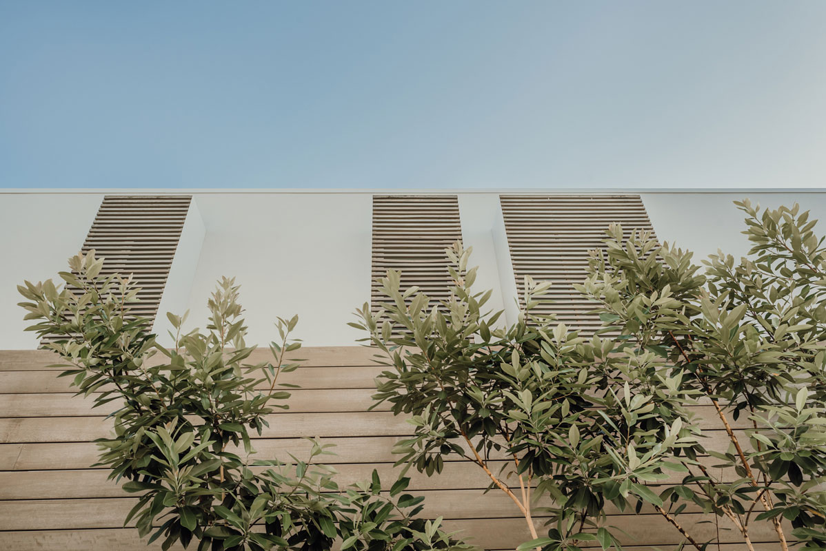
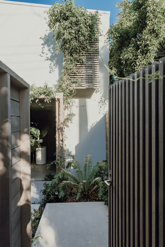
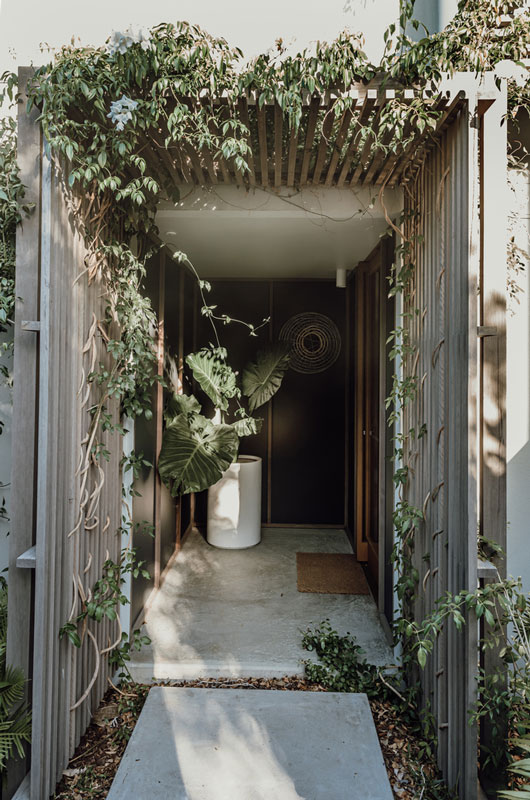
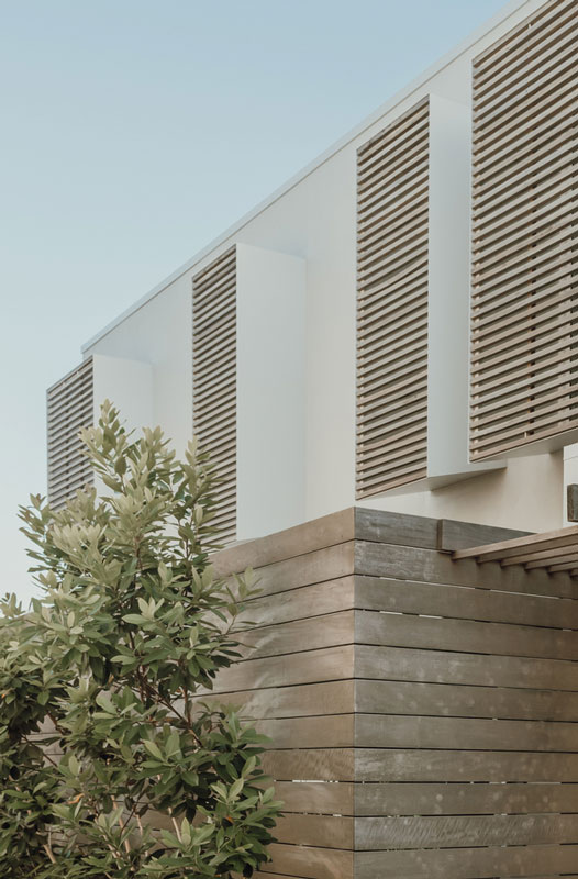
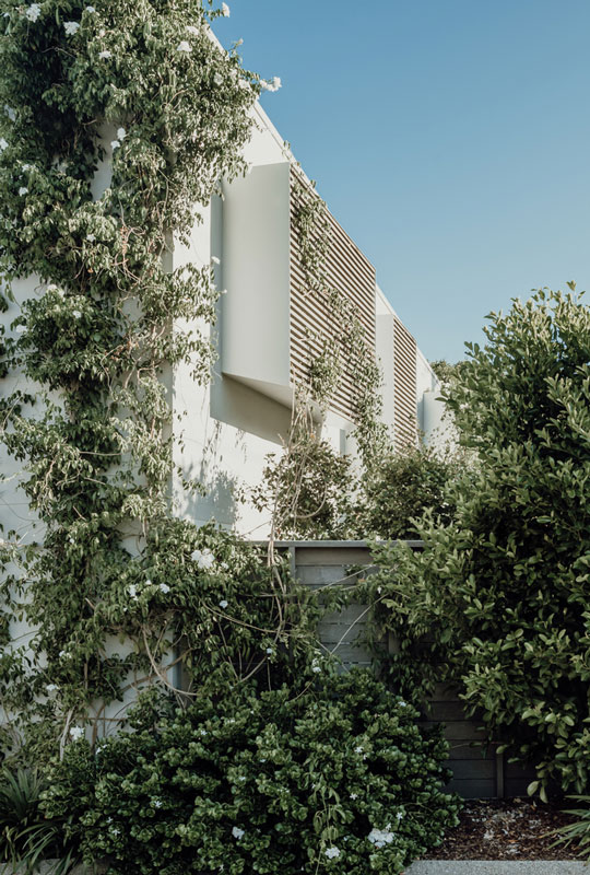
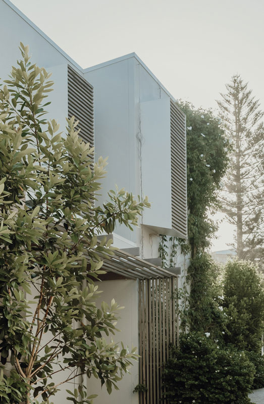
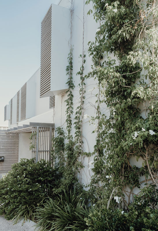
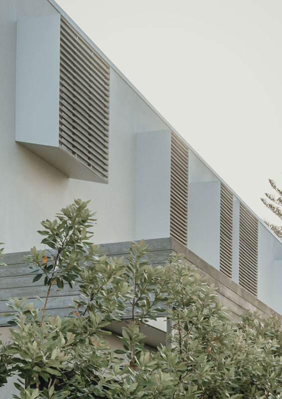
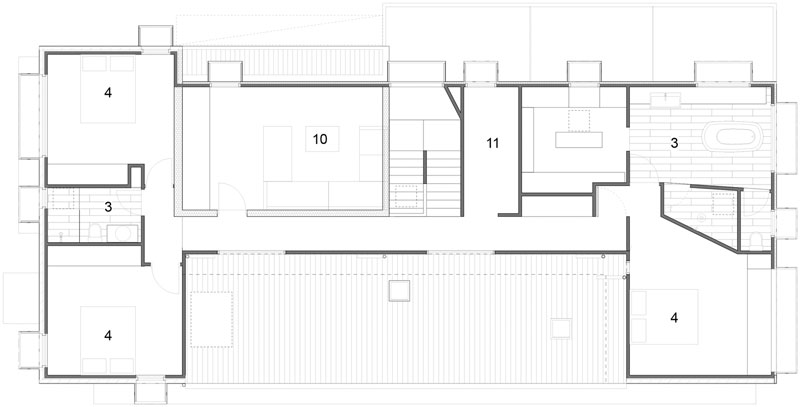
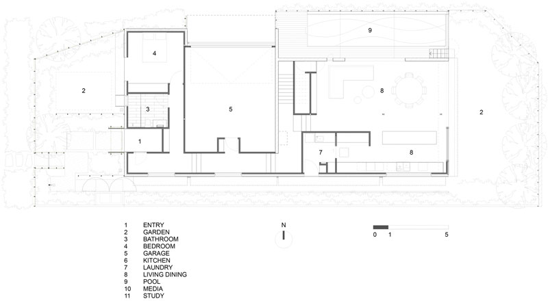
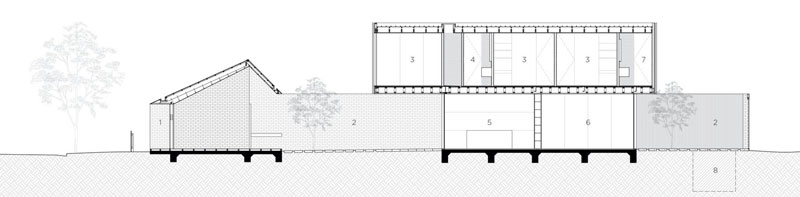
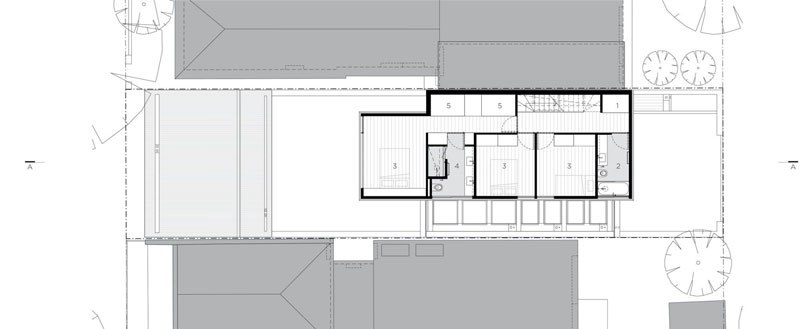
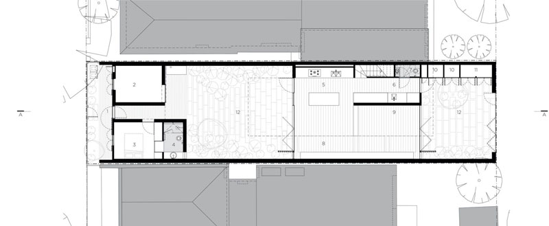
Text description provided by Teeland Architects. Sunshine Beach House is a contemporary home inspired by the sun, surf, sand, and waves. The house has been designed for a young family of surfers with an active beach lifestyle. The ground floor kitchen and living areas open onto the garden and pool. The family can move seamlessly from house to garden, pool to the beach, and back again.
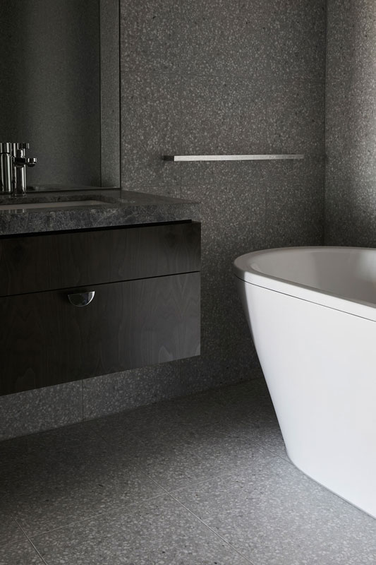
Bedrooms and bathrooms are located on the more private upper level. A refined material palette of local hardwood and white sand cement reflect the character of the local beach environment and coastal landscape. On a practical level, the materials employed are robust in nature, to withstand sand, salt, and water coming off the ocean and little feet.
Contemporary interpretations of the traditional Queenslander metal window hoods and hardwood screens have been used to provide protection from the hot sun and summer rains.
Our architecture practice is enamoured with the beauty of the beach and ocean. The delightful balance of repetition and variation found in the waves and sand dunes are echoed in the design of the house.
Sunshine Beach Project Details
Architects: Teeland Architects
Area: 300 m²
Year: 2020
Photographs: Emma Bourne
Manufacturers: Miele, Astra Walker, FLOS Architect: David Teeland, Kim Jong Sook
Country: Australia
written by : Paula Pintos 7 Mar 2021 published in : archdaily.com
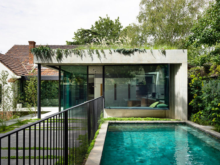
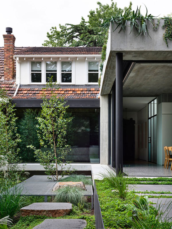
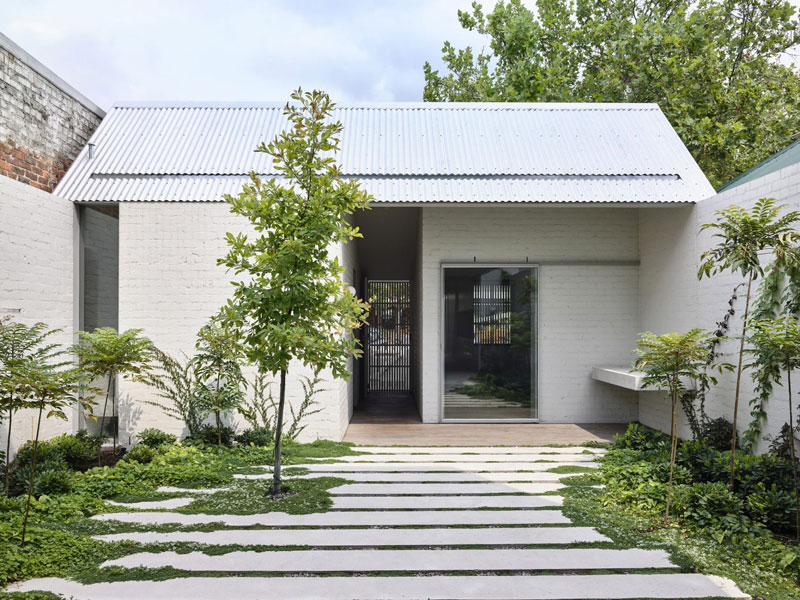
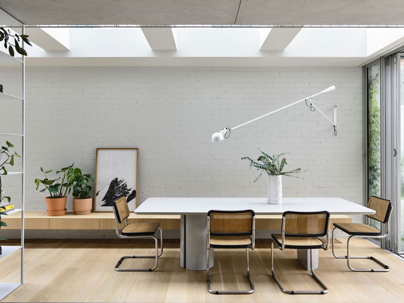
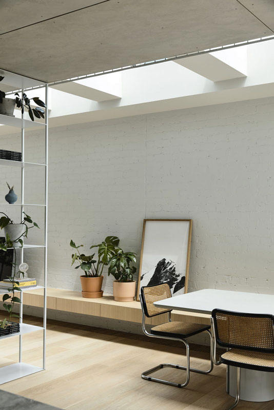
Malvern Garden is a ‘modernist relic’ of concrete and glass forms the heart of this renovated 1930s heritage home by Taylor Knights, where sanctuary means lush gardens and open, airy spaces secreted away in a busy Melbourne suburb.
The way we live our lives has changed considerably over the past century, yet our cultural notions of the “home” have remained broadly the same: a refuge for ourselves and our families and a repository for the objects that we value that represents elements of who we are. The concept of the home as a refuge dates back at least to the Victorian era, with a growing awareness that individuals and their children needed protection from the chaotic metropolis. The advent of modernism at the turn of the twentieth century, however, introduced a contradictory tendency, that of prospect: the home became a place from which occupants could apprehend the world and connect with nature.
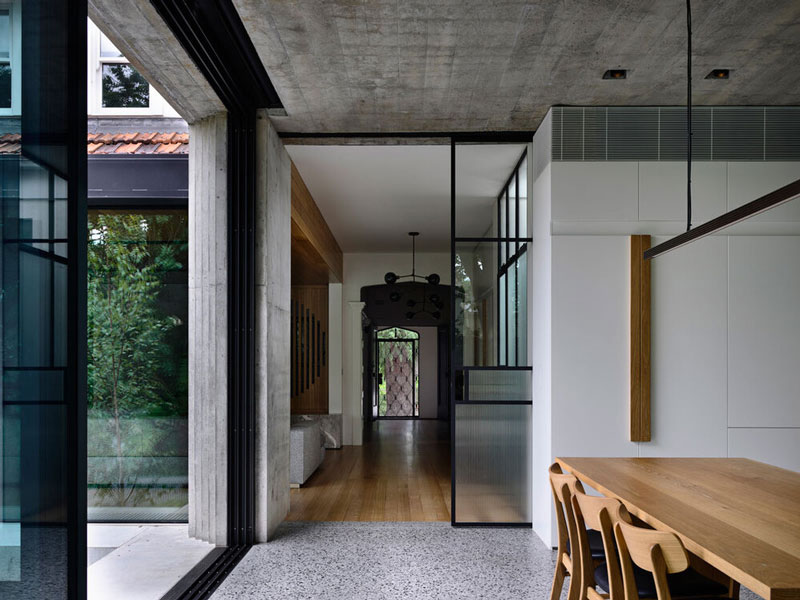
Designed by Taylor Knights, this elegant renovation of a 1930s heritage home in a leafy pocket of Melbourne is at the intersection of these two competing inclinations: it is a sanctuary, hidden from the street with a multitude of different spaces to inhabit, and it is a glazed pavilion that dissolves into a lush garden, saturated with light and air.
Positioned on a steeply sloping site that falls from west to east, the original house was comprised of a series of cellular rooms with a discrete kitchen at the east end, high above the garden below. The brief for this young professional couple and their (soon-to-be) three children was to reposition the living areas to provide better connection to the garden beyond and to update the heritage fabric to suit the demands of a modern, growing family. The bedrooms upstairs – remnant of a 1980s renovation – were to be reconfigured, with new bathrooms and ceilings to take advantage of the volume within the existing attic space.
The lower ground was to be updated to accommodate visiting family members and friends in a manner that provided them with privacy and separation from the rest of the house. A home office would be accommodated within the mix, enabling both parents to work part time or work from home as required.
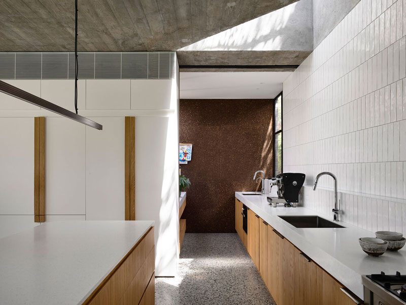
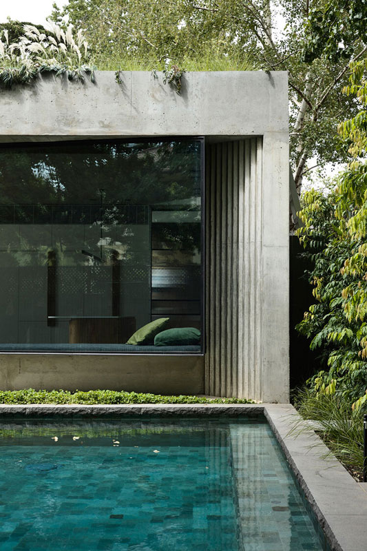
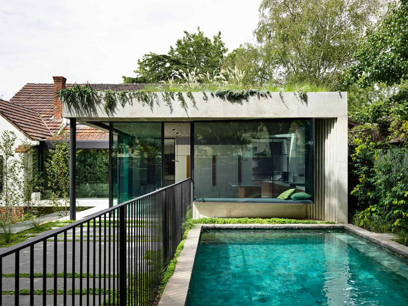
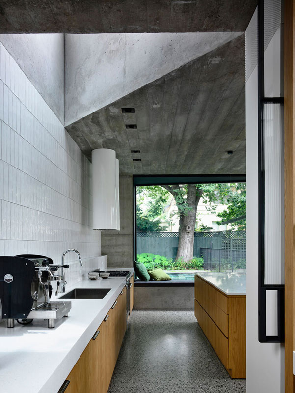
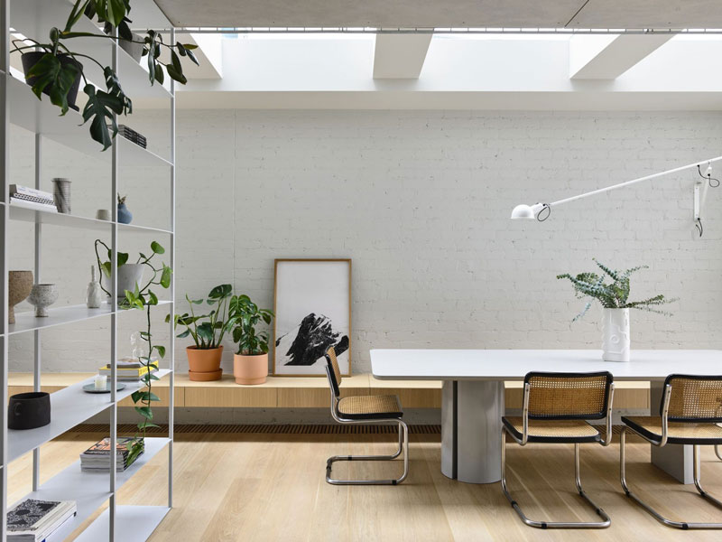
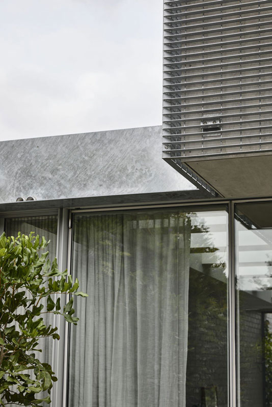
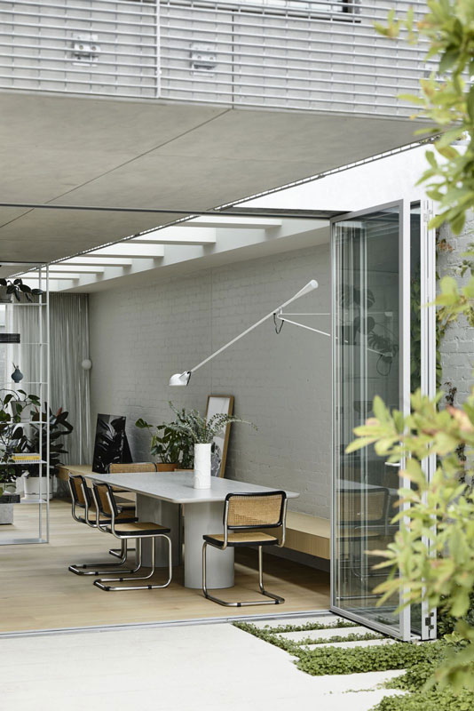
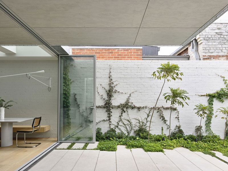
The key design strategy was to reposition the kitchen and dining areas in a new pavilion-like structure at the north-western corner of the site. Projecting out from the highest point of the land, the addition could open directly onto the garden at grade and benefit from an abundance of eastern and northern light over the course of the day. Formally, the pavilion appears almost as a modernist relic – a glazed volume sandwiched between two off-form concrete slabs, with native grasses shimmering over a concrete parapet. Stepped ziggurat mouldings in the opposing cast concrete corners of the pavilion conjure references to Venetian modernist Carlo Scarpa, while a deep aperture in the concrete ceiling of the kitchen nods to Le Corbusier’s late modernist experiments with béton brut.
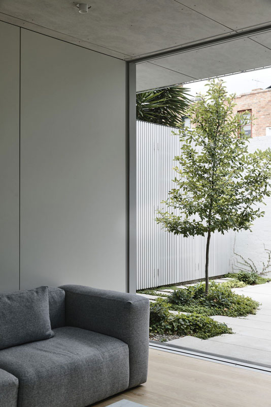
Simultaneously, the pavilion responds directly to the language and geometry of the existing heritage house, referencing its corbelled brick eaves and the heavy, textural and crafted quality of its brick and render facade. Heavy and light, textural and abstract, the pavilion represents tendencies toward both the notions of “refuge” and “prospect,” which can be modified though the opening or closing of the pavilion’s glazed corner.
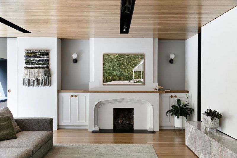
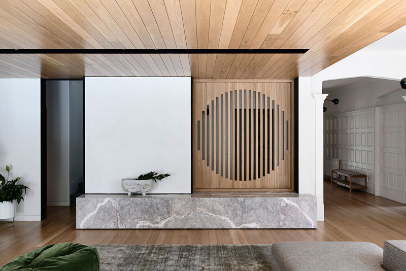
In both the formal composition and materiality of the house, a tendency towards reduction is paired with careful detailing. A single fixed pane of glazing adjacent the pavilion illuminates the living space with northern light, and provides an elegant transition between the new and existing structures, allowing the pavilion to be read against the field of Marseilles terracotta tiles on the existing roof. Internally, concrete, American oak, steel and glass predominate, complemented with neutral terrazzo and marble. Taylor Knights was at pains to provide material consistency throughout the house, using American oak boards as formwork for the pavilion’s concrete ceiling, for instance, in a textural echo of the adjacent living room’s timber ceiling.
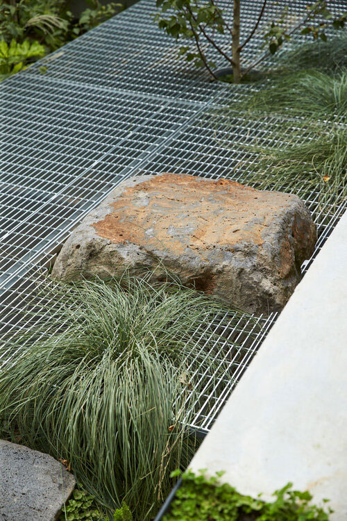
According to director James Taylor, the landscape is conceived of with equal importance, spatially and experientially, to the architecture throughout their projects. At Malvern Garden House, much of the magic lies in the relationship between the two. From the first step through the front door, the visitor is greeted by a view out onto lush and varied vegetation. Landscape architect Ben Scott has provided a scheme of zoned planting that offers a birch forest canopy to the ground floor windows, a fern garden to the lower ground and a dichondra-covered terrace at the upper level. A galvanized steel platform hovers in-between, providing a permeable place to sit among the tree tops and native grasses, while a whimsical steel slide offers a fast way to make your way to the bottom. Internally, window seats in the kitchen and children’s playroom orient themselves to the yard and allow the inhabitants to sit out “in” the garden from within, and a concealed courtyard that opens onto the main ensuite provides a bathing experience among the ferns. Carefully considered and deliberately executed, this thoughtful renovation provides a sanctuary that facilitates respectful engagement with the natural world.
Austral Bricks 140-millimetre 150 Series standard grey block; off-form concrete
Internal walls
Austral Bricks 140-millimetre 150 Series standard grey block
Windows
Vitrocsa double glazing; custom steel windows by Tescher Forge
Doors
Custom steel and glass doors by Tescher Forge
Flooring
Existing Tasmanian oak floors; Hanson Construction Materials concrete
Lighting
Douglas and Bec Y Chandelier 04 in ‘Blackened Brass’; Allied Maker Aperture Sconce in ‘Blackened Brass’ with glass in ‘Opal’; Apparatus Cloud 19 Chandelier from Criteria; Rakumba Capital pendant by Archier from Cafe Culture and Insitu; Great Dane Caché Pendant; LPA Lighting and Energy Solutions Visi downlights; Ambience Lighting Flow adjustable downlights; Artefact Industries T-Mini adjustable track lights; Flos UT Spot lights from Euroluce
Kitchen
Miele integrated dishwasher, built-in fridge-freezers and microwave oven; Ilve 90- centimetre Quadra Series cooker with teppanyaki plate from E and S; Qasair Albany rangehood from Condari; Hisense stainless steel bar fridge; LG microwave oven; Oliveri sinks from E and S; Gessi Oxygene gooseneck kitchen mixers from Abey; Phoenix Tapware Vivid Slimline sink mixer
Bathrooms
Apaiser Sublime freestanding bath and Lotus basins; Kaldewei Vaio Dual Oval bath from Reece; Corian Serenity basins; Catalano Sfera toilet suites and Vitra Moetropole under-counter basin from Rogerseller; Astra Walker Icon tapware and accessories in ‘Charcoal Bronze’; Stormtech 100 Range linear drainage systems
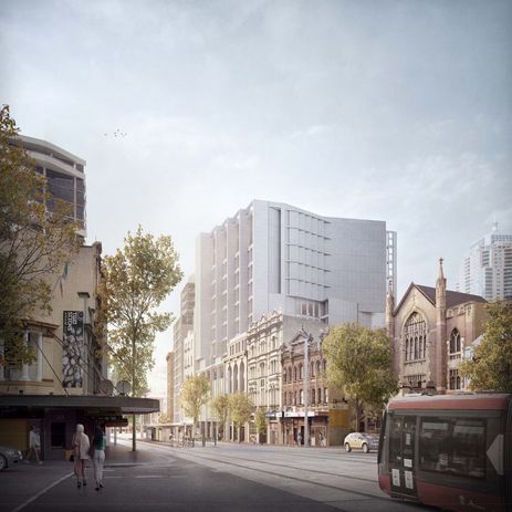
Candalepas designs addition to mid-century Sydney church
Candalepas Associates has designed the redevelopment of a the largest mid-century church building central Sydney, which will include a mixed-use tower addition above the existing building. Located on George Street in Haymarket, St Peter Julian’s Catholic Church was originally designed by architect Terrence Daly who undertook a large body of work for the Catholic Church in NSW. A City of Sydney heritage review found that the George Street church “may be his finest work.”
The church’s George Street facade is divided into five equal bays. Candalepas Associates’ design for the mixed-use addition extends “celebrates original Terrence Daly design” and “provide cohesive presentation to George Street,” according to a heritage impact statement prepared by Urbis.
The redevelopment will also include upgrade to the sacristy, interview parlours, meeting rooms, six domiciles with a refectory, a recreation room, a private chapel and a roof garden.
The commercial addition will rise nine storeys above the existing building.
St Peter Julian’s Catholic Church was constructed in 1964 and is one of four – and the largest – church buildings constructed in central Sydney in the post World War II period. In 2008, it was refurbished by PMDL Architecture and Design.
A development application for the project is currently exhibited on the City of Sydney website.
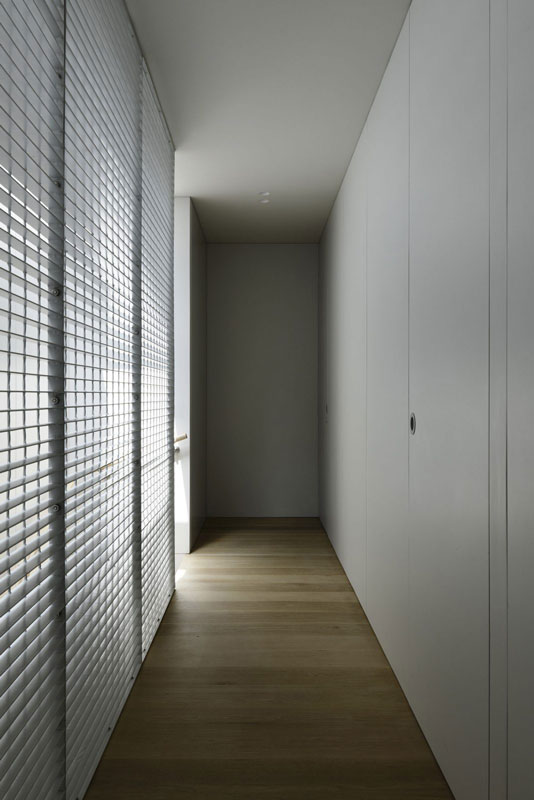
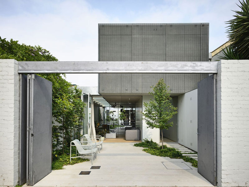
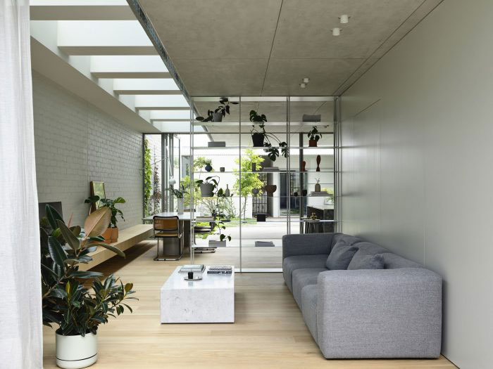
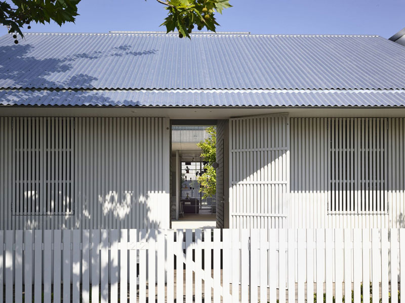
An abstracted terrace: Fitzroy North House 02 by Rob Kennon Architects
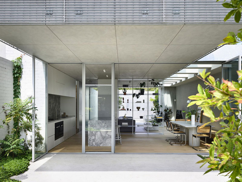
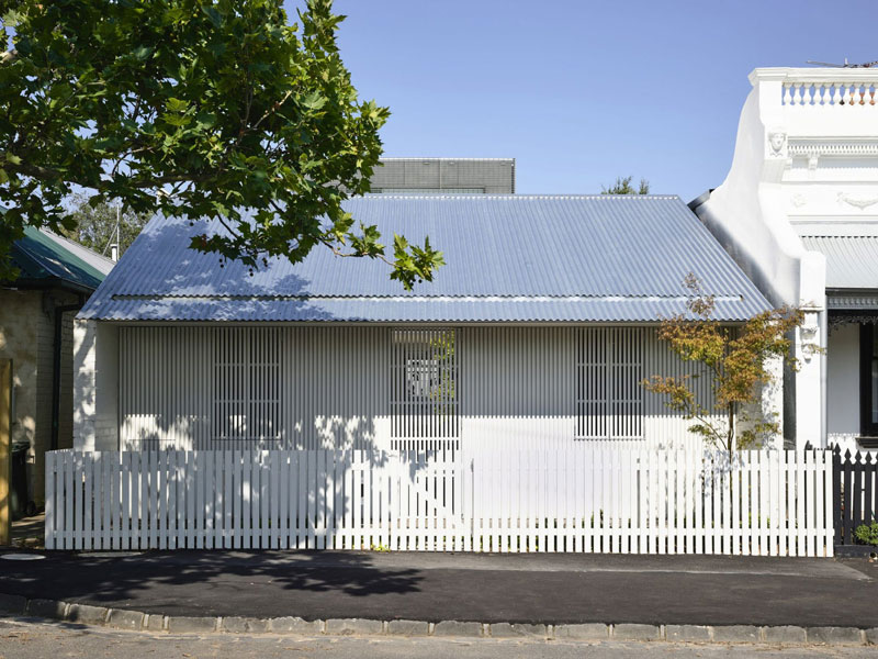
In a quiet street in Melbourne’s Fitzroy North, this curious family home by Rob Kennon Architects, appearing as an abstracted worker’s cottage from the street, conceals an open design shaped by two verdant garden courtyards.
At some point during the past five years, Melbourne-based Rob Kennon Architects began using project locations to refer to the houses designed by the practice. The earlier projects retained their more descriptive titles – such as the Sugar Gum, Datum and Stepped houses – but newer builds have become known simply by their neighbourhoods: The Malvern, Northcote and Brunswick houses, to name just a few.
This is not, it could be argued, an inconsequential shift in taxonomy. Rather, it speaks to a self-assuredness in the practice’s built projects. What’s in a name? This new naming convention conveys an openness to multiple readings and an associated commitment to design priorities that defy easy categorization. Fitzroy North House 02 is the second in a series of houses by Rob Kennon Architects situated in that suburb. It is also a play on the Victorian terrace house, a house within a garden, a nod to Scandinavian modernism and (at least by my reading) a reinterpreted gatehouse.
That last point needs clarifying. In terms of scale, materiality and location, the project couldn’t be further from a typical English manor house estate, yet the basic configuration of Fitzroy North House 02 is one of a gatehouse and main residence. What appears from the street to be an abstracted terrace house that continues the proportional and formal logic of the neighbouring properties is actually a much smaller building at the edge of the property, housing a workshop space and guest bedroom with powder room.
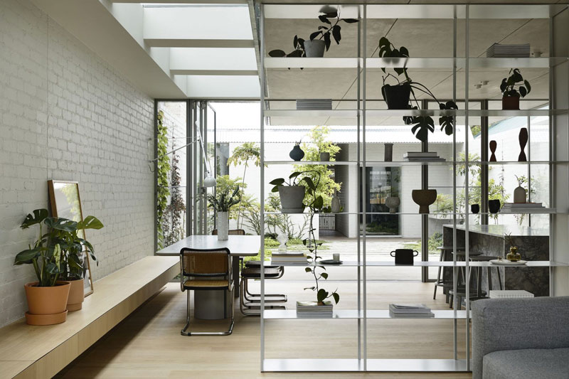
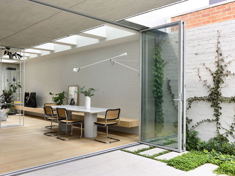
This cottage-like structure frames the main entry to the property, and protects from the street the garden and open living spaces of the main house behind it. While the gatehouse was not a deliberate reference point for the architects, the entry’s function as such becomes clear from inside the main garden. Breaking down the symmetry of the street elevation, the workshop and guest bedroom open up to the walled garden and central living space. Full-height, glazed bi-folding doors have been carefully detailed to maximize connections across the site. The ground-floor kitchen, dining and living area is offered protection by a wire-mesh-clad upper level that looks back over the gatehouse-like entry and in behind the parapets of the neighboring residences.
The architect has thoroughly dismantled the typical massing of the Victorian terrace house in favor of a subtly fortified garden room, a move that has added a tremendous amount of light to the internal and external spaces of the house. Beyond the fine timber battens and beautiful details, including the open shelving system that creates a floating field of precious objects, Fitzroy North House 02’s configuration manages to challenge assumptions about what might be possible on a narrow site. Perhaps there’s also something in the unexpected inclusion of a workshop within a project of this size – another gesture that contributes to the personality of the house while also prompting one to speculate on the possibilities for such a space and all the things that might one day be made there.
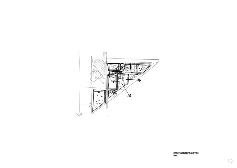
Fitzroy North House 02 invokes a quality of openness, not only in the experience of the completed structure itself but also in the architect’s initial sketch. In just a few lines, Rob Kennon’s early drawing sets out the basic massing of the project, and degrees of transparency and connection between living spaces and gardens, while also resisting representation of stylistic details and features beyond a gabled roof at the street edge. Adding to the intriguing nature of this quick diagram, the notes around it are just unclear enough to invite more thought. Returning to my earlier interpretation of the gatehouse entry, I couldn’t help but note the positioning of human figures outside the walled garden. To this end, the last half of the word “workshop” could conceivably be misread as “stop,” with the lines of vegetation and sunlight behind the gabled cottage becoming signs of activity and movement concealed and protected from the world outside.
It’s useful to talk about the openness of Fitzroy North House 02 and its ability to entertain multiple stories and interpretations because it moves the conversation beyond questions of style and finish alone. While the house is undoubtedly a beautiful piece of contemporary architecture, some of its most captivating moments revolve around the openness of its diagram and the clever way it refrains from establishing a singular explanation of its architectural forms.
written by : Alexandra Brown 19 Feb 2021 published in : architectureau.com