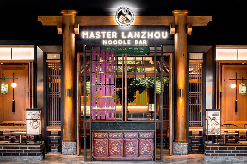
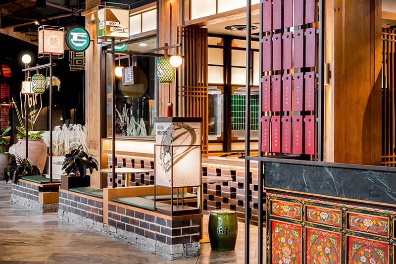
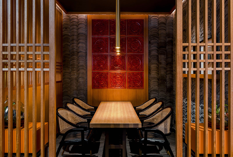
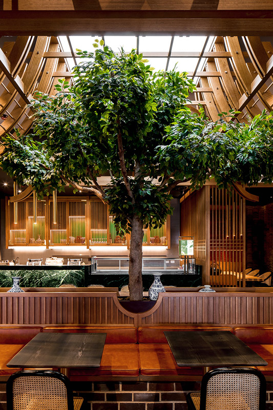
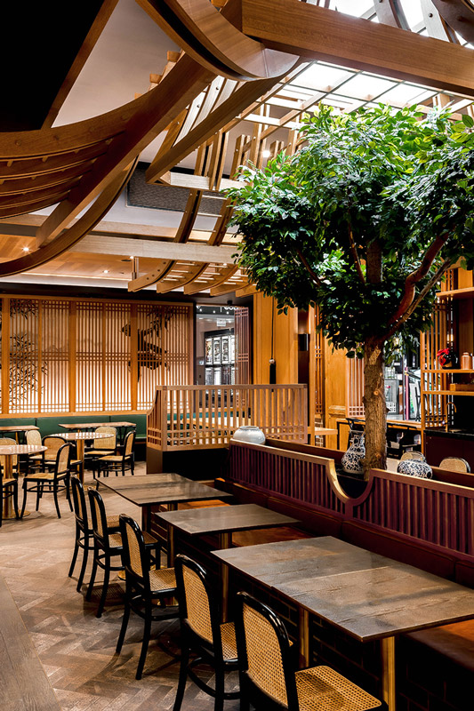
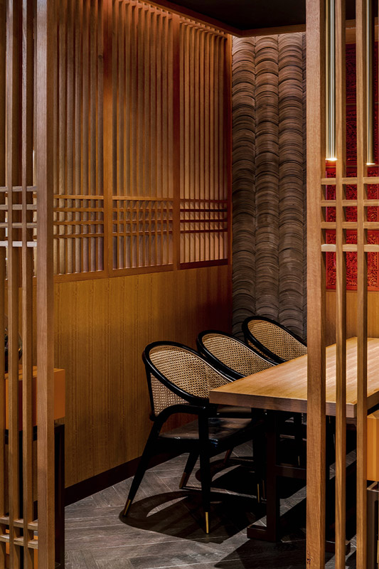
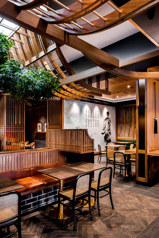
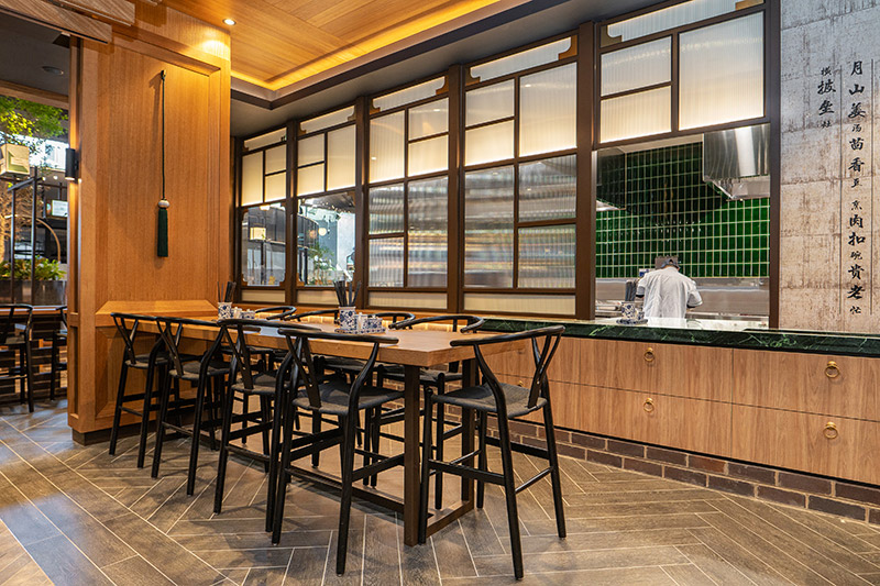
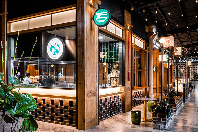
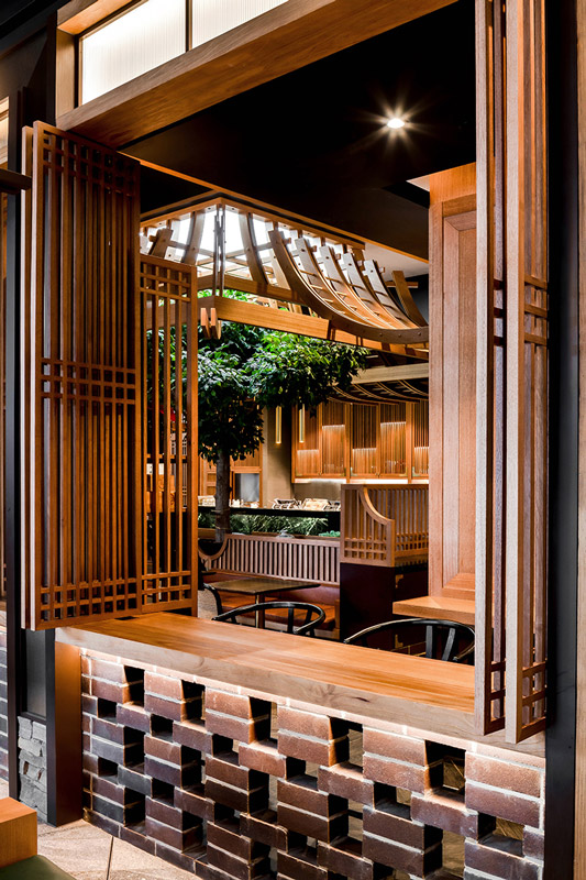
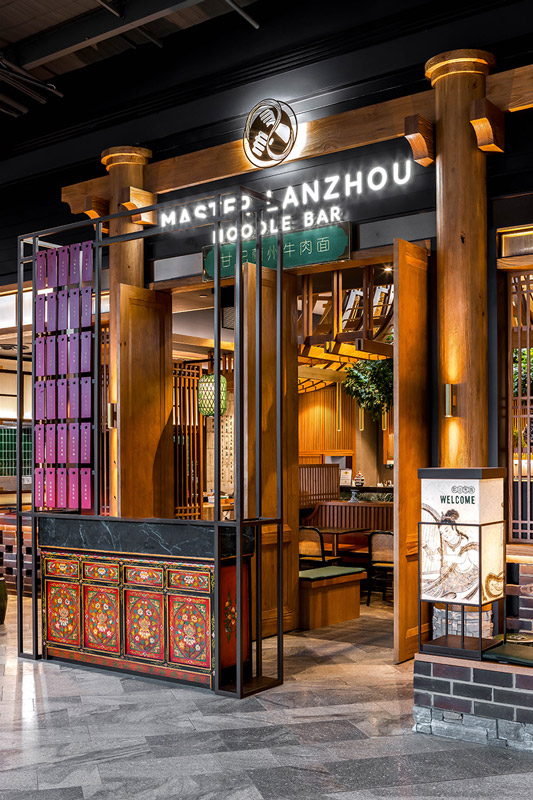
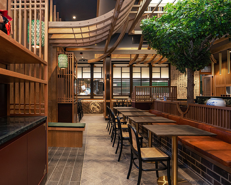
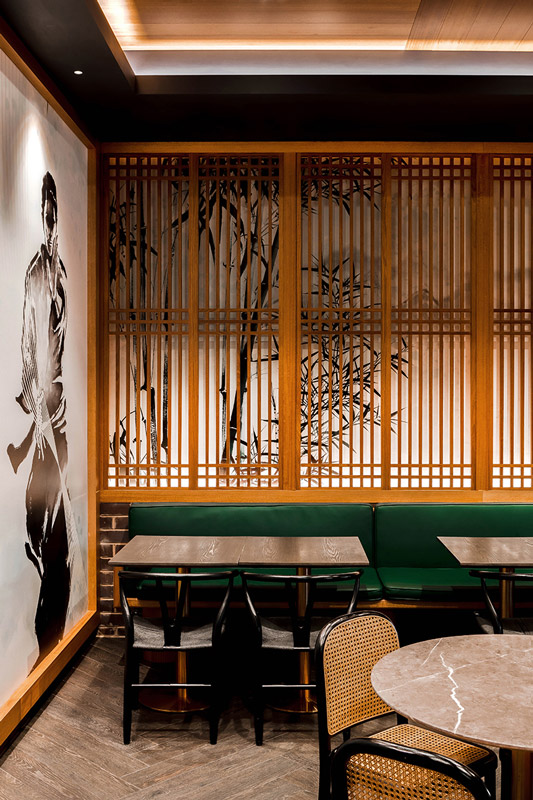
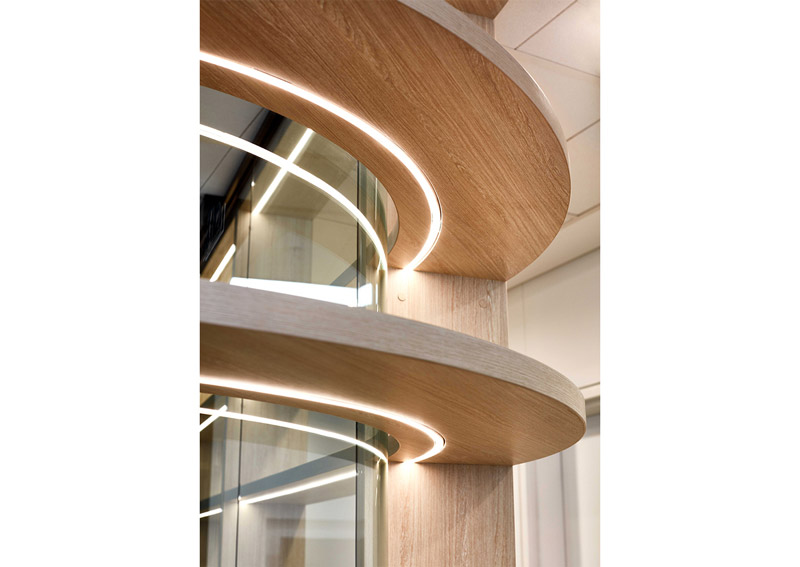
Text description provided by ElvinTan Architects. Master Lanzhou Beef Noodle Bar at Westfield encapsulates a contemporary approach to the celebration of traditional North-West Chinese culture and its famous hand-pull noodle. Inspired by traditional courtyard house, the design seamlessly blends an undeniably Chinese imperial elements, imbuing the space with sleekness and elegance, punctuated by unexpected but humble oriental detail.
At Master Lanzhou, honesty and nostalgic creates an evolving customer experience. It successfully juxtaposes styles and cultures, allowing each to shine, creating an immersive experience. No style dominates and the combination fits seamlessly together. The courageous design results in a unique and evolving guest experience, where each space intrigues and delights. Inspired by the echoes of the past, guests will feel a modern take on a long history, that will be visible everywhere.
Master Lanzhou Noodle Bar at Westfield Doncaster will be an intricately detailed, cinematically coherent space with the visual and the gastronomic entertainment of the guest in mind.
MACDONALD ROAD HOUSE BY PHILIP STEJSKAL ARCHITECTURE
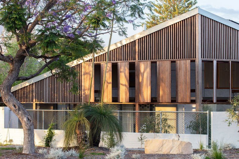
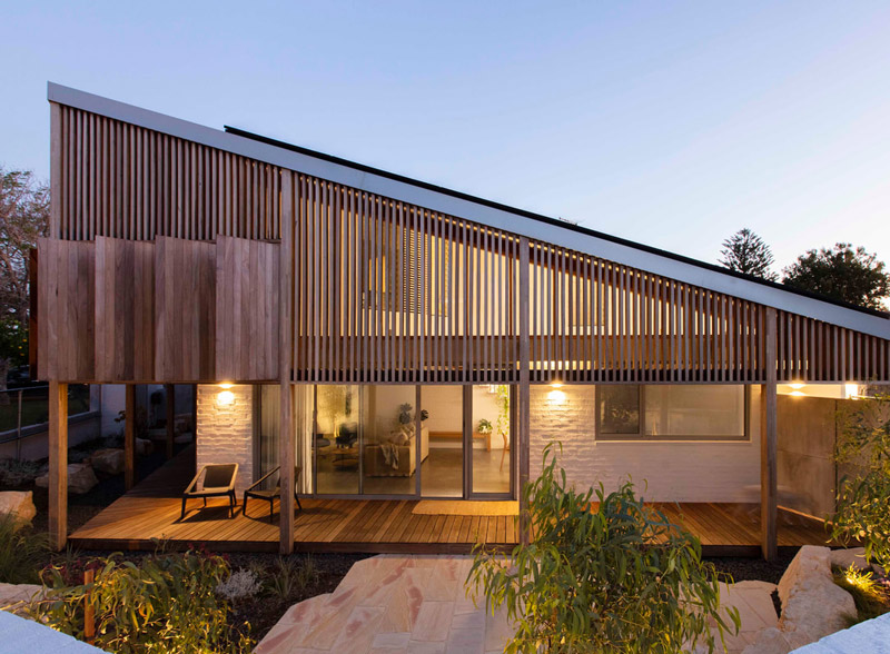
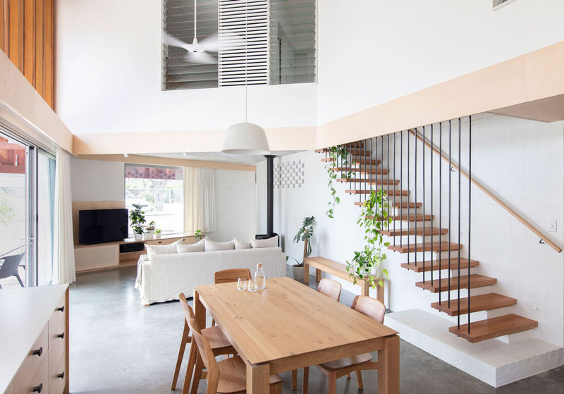
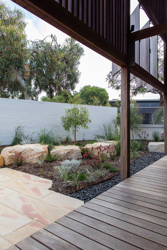
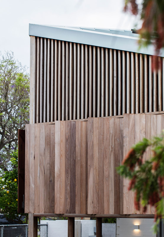
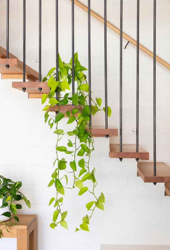
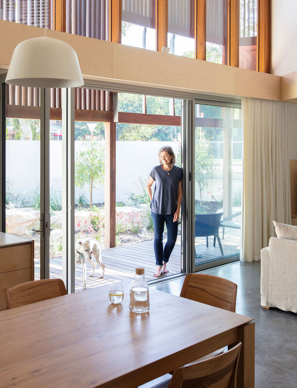
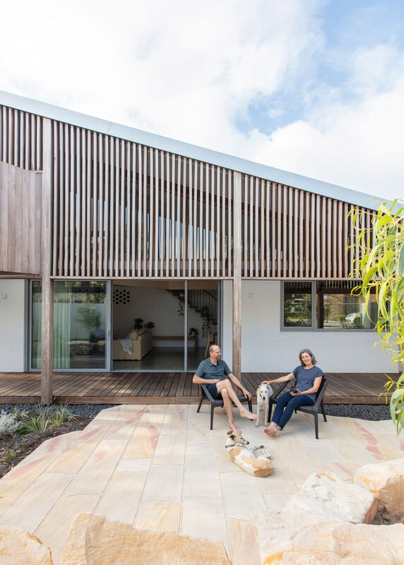
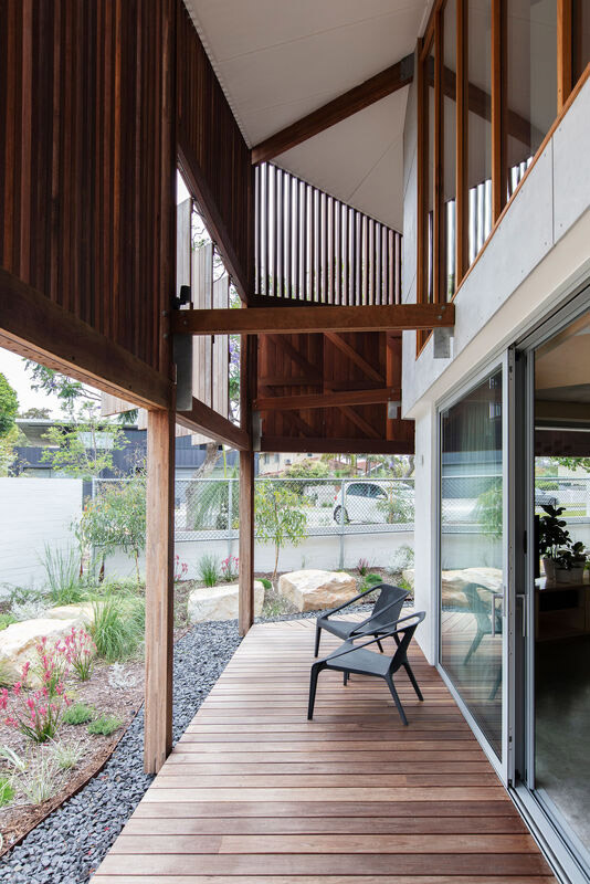
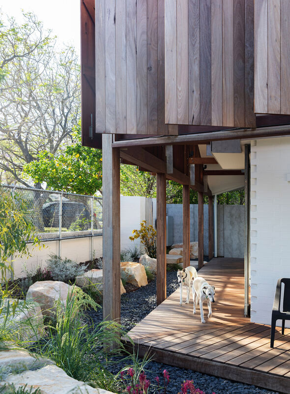
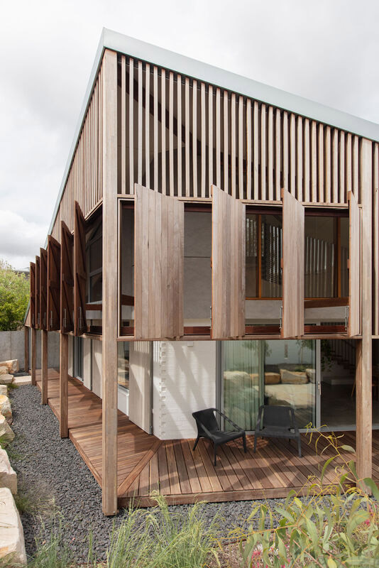
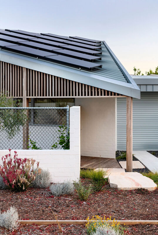
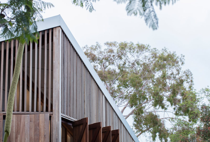
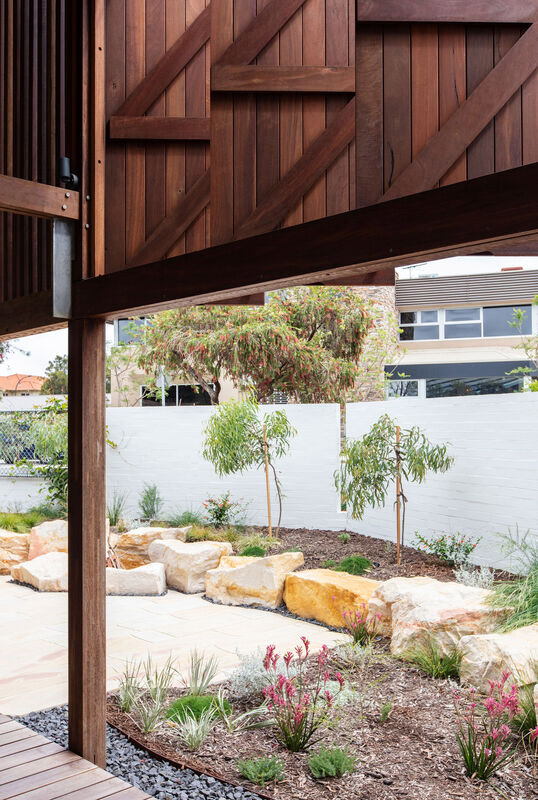
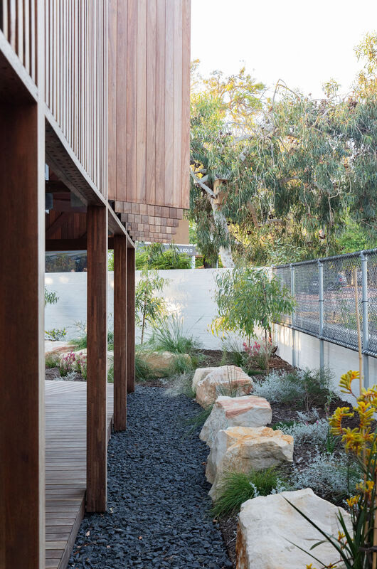
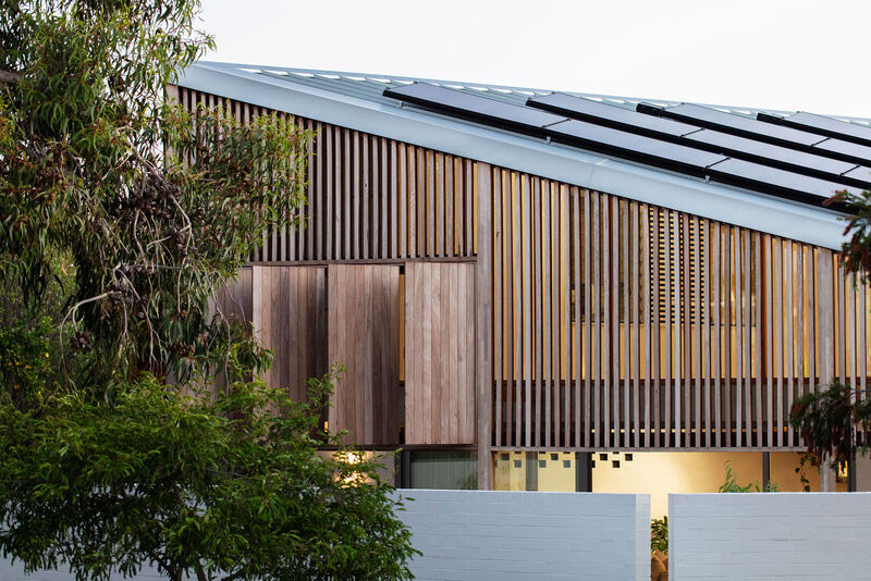
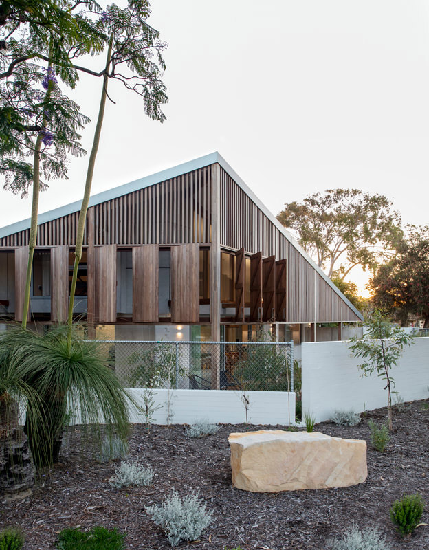
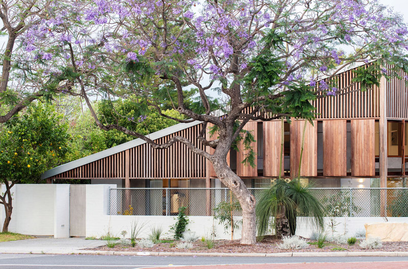
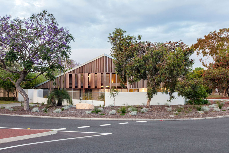
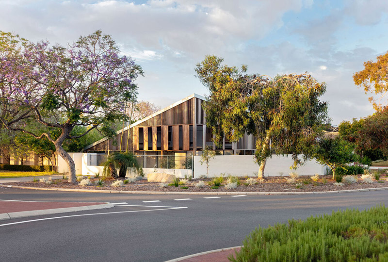
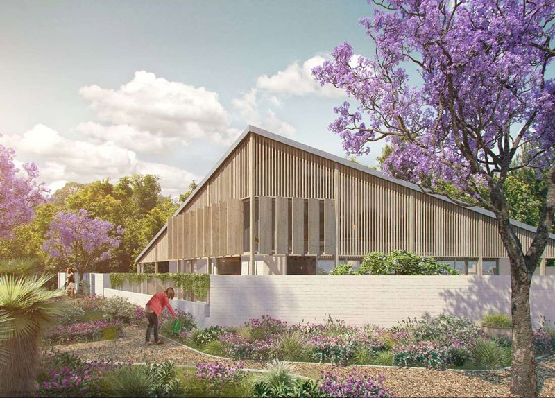
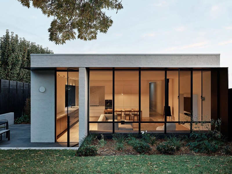
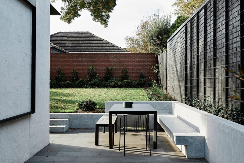
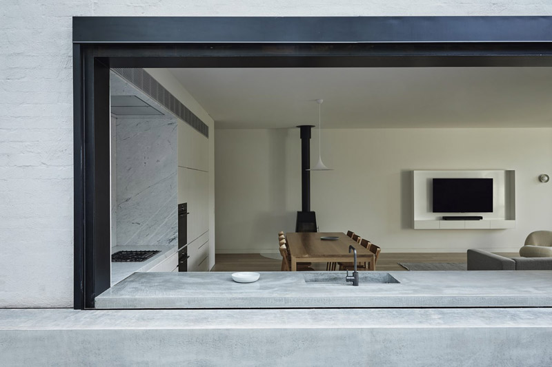
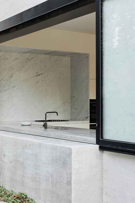
Text description provided by Philip Stejskal Architecture. A new house in Applecross for a couple whose children have left home, yet plan to return often. One that will allow them to age in place, with all the amenity of their previous house.
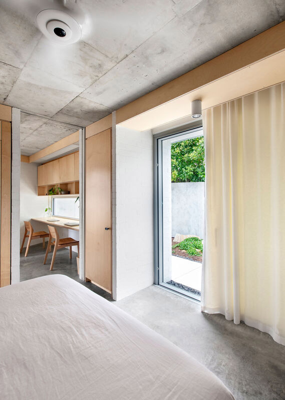
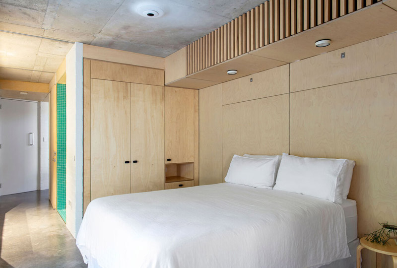
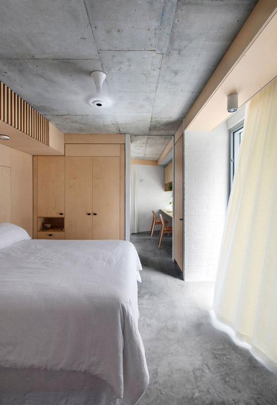
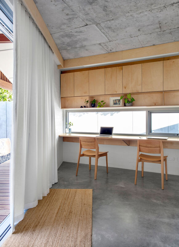
Situated on a busy round-about at the southern end of a bustling suburban centre, our clients’ wish was for connection to, yet also privacy from, this activity node.
Coupled with their desire to down-size and ours to create a graduated streetscape around the corner – the design developed as a predominantly single-storey building incorporating a mezzanine for additional bedrooms. This configuration enables a central peak to address the intersection, with tapered edges respectful of low lying neighbours.
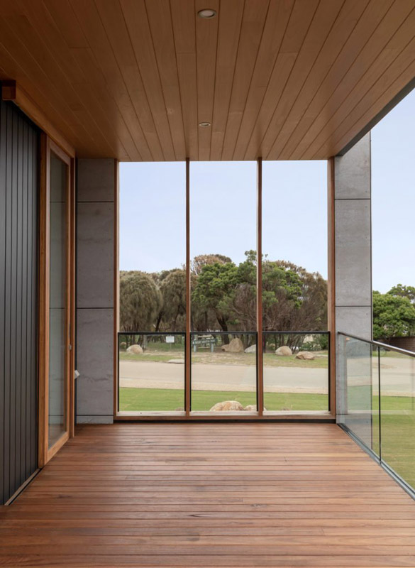
A verandah is attached to northern and eastern elevations to manage climate, with a standing seam cladding profile envisaged for the distinct roof form.
Project Details
2016 – 2020 (COMPLETED)
Project Team: Louise Allen, Philip Stejskal, Julia Kiefer, Jaime Mayger
Building Photography: Bo Wong
Model Photography: PSA
Builder: Portrait Custom Homes
Landscape Architect: Annghi Tran Landscape Architecture Studio
Awards
WA Architecture Awards – The WALLACE GREENHAM Award for Sustainable Architecture 2021
Award for Residential Architecture House (New) 2021
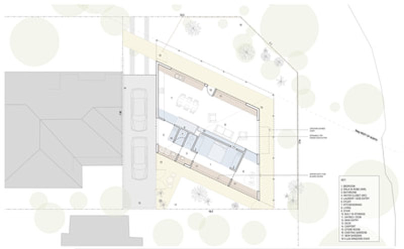
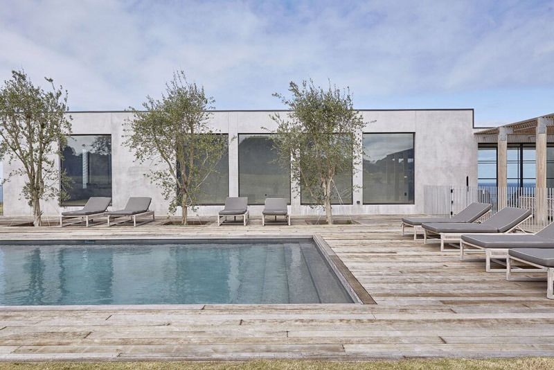
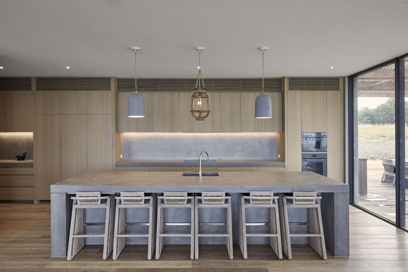
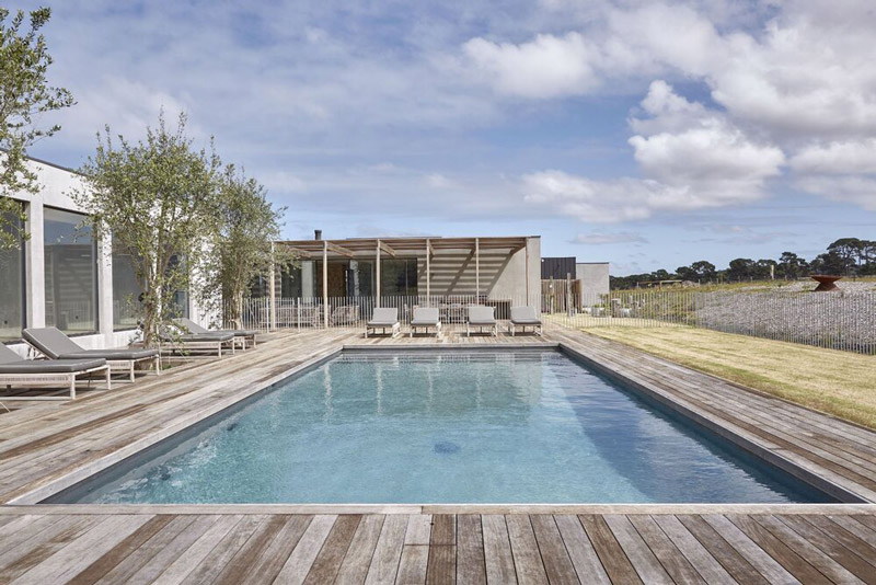
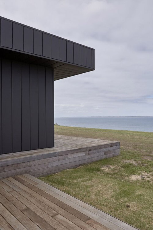
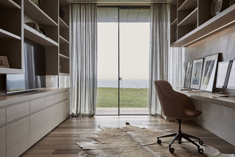
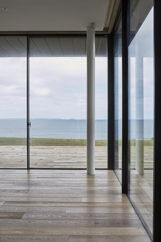
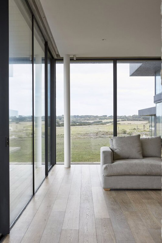
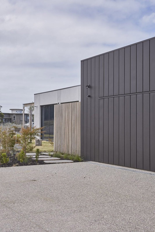
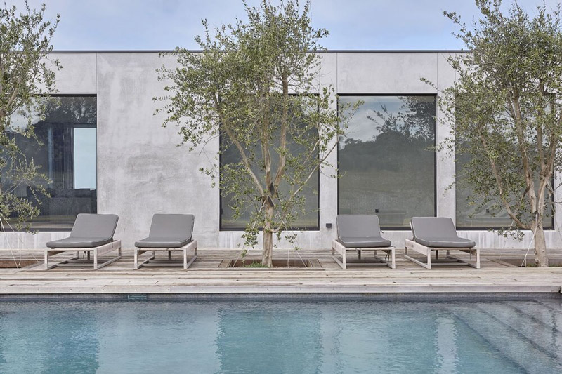
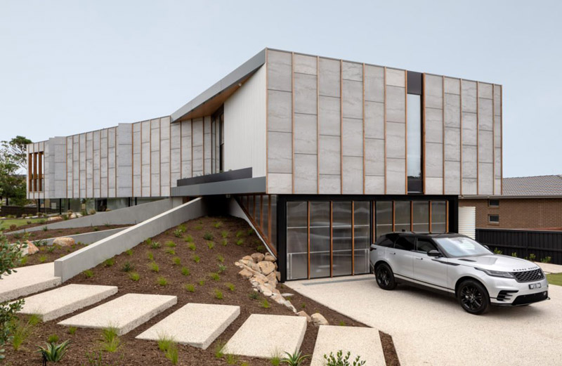
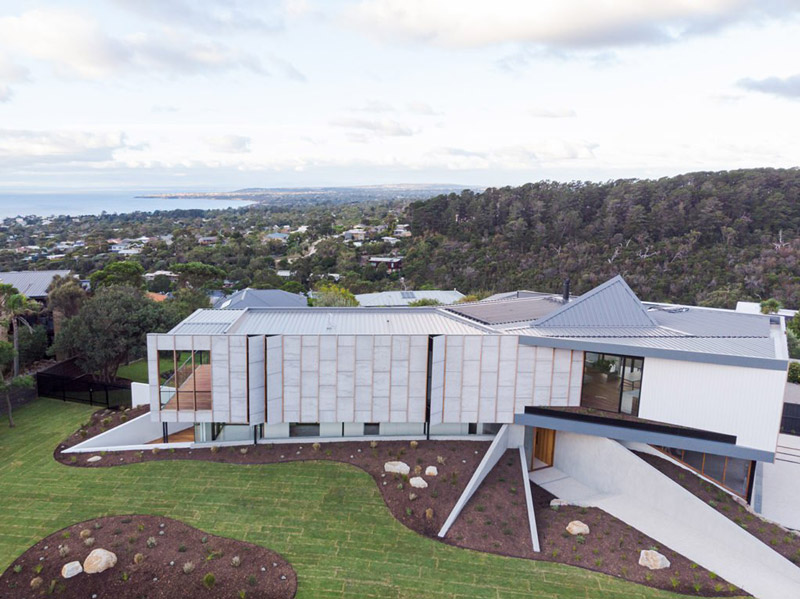
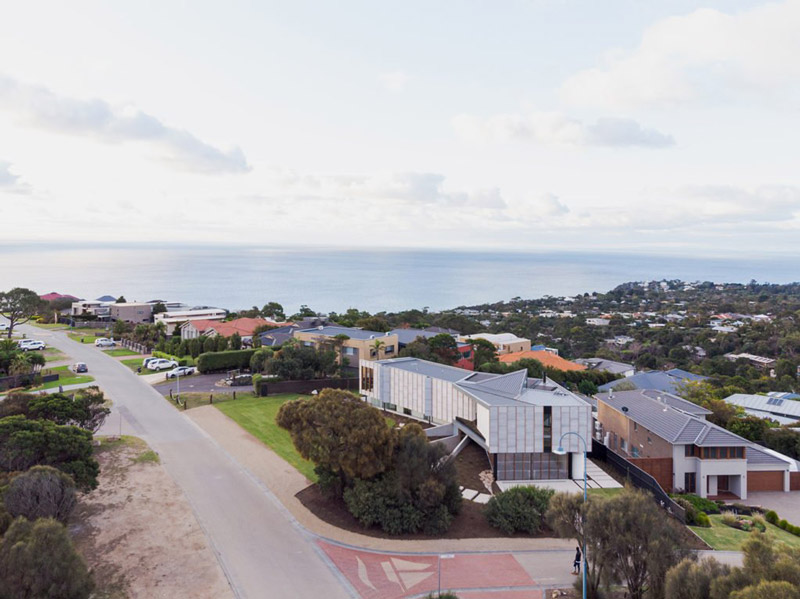
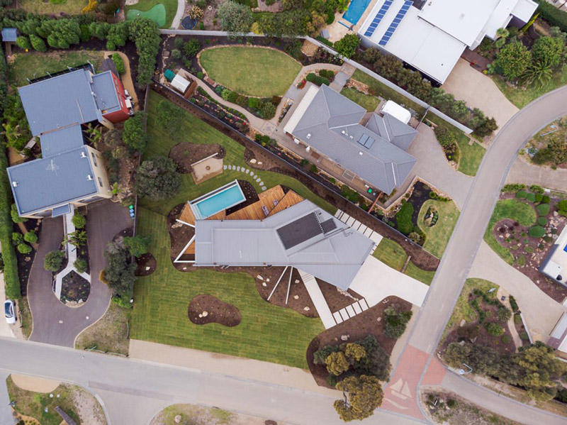
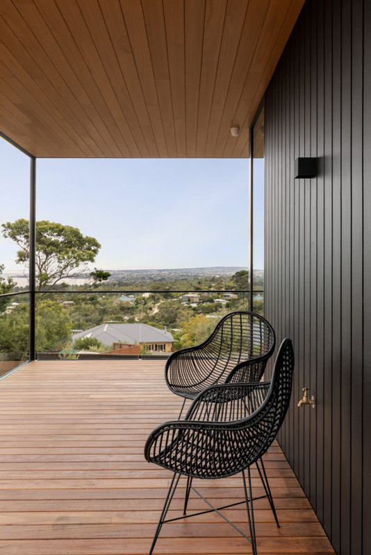
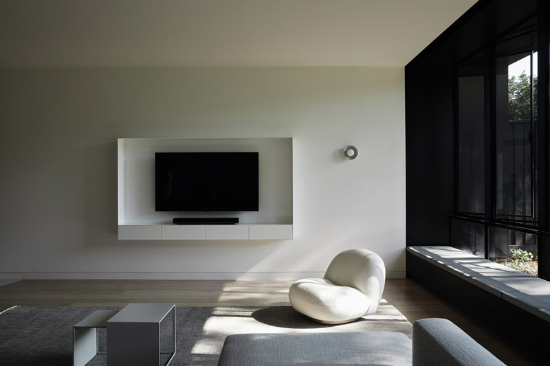
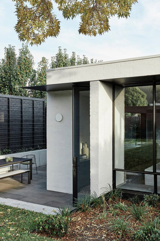
Text description provided by Borland Architecture. This contemporary farmhouse (Shoreham House) on the Mornington Peninsula is robust to withstand the harsh environment, yet soft, comfortable and beautifully detailed.
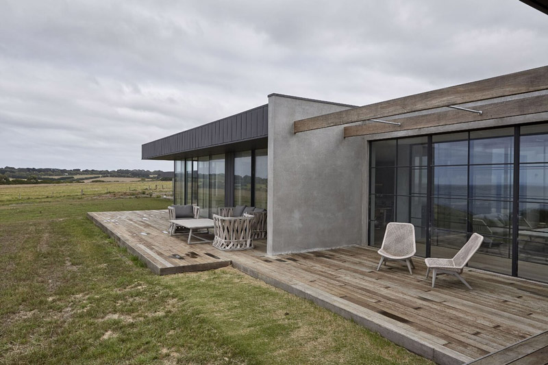
Designing a new house on a greenfield site requires a great deal of forethought and care, but designing a new house on a site as beautiful as this takes design considerations to a different level. Views of the ocean needed to be maintained from the road, meaning the positioning of the site and the height of the home were especially critical.
Through 3D modelling, we were able to determine that the best site was as close to the water as possible, ensuring the building’s form hugged the natural landscape.
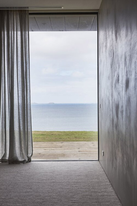
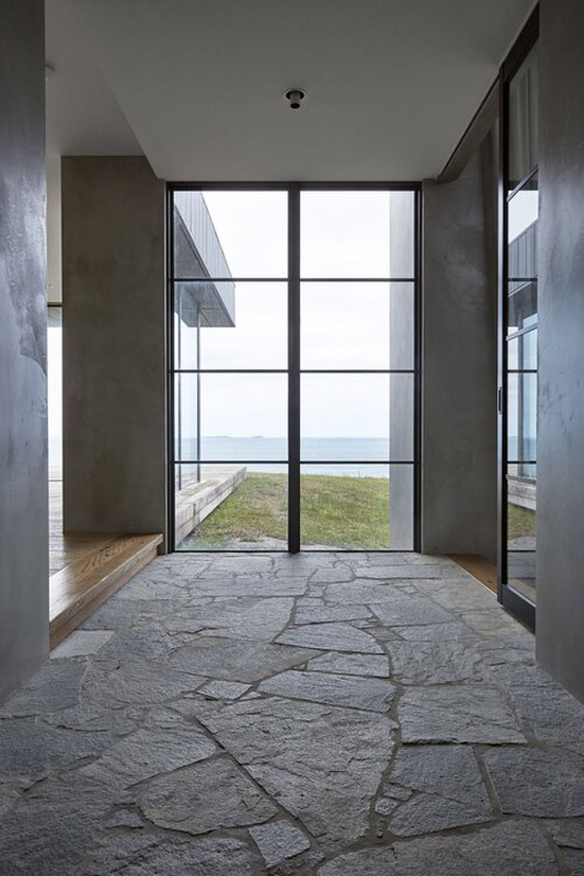
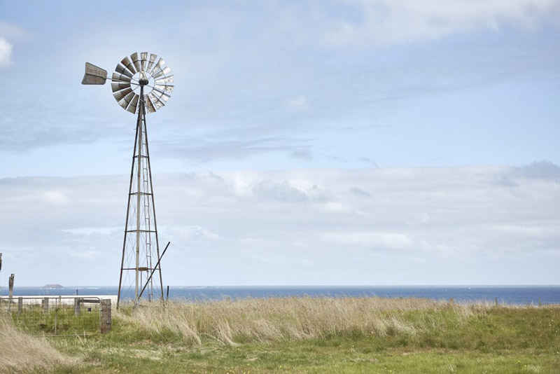
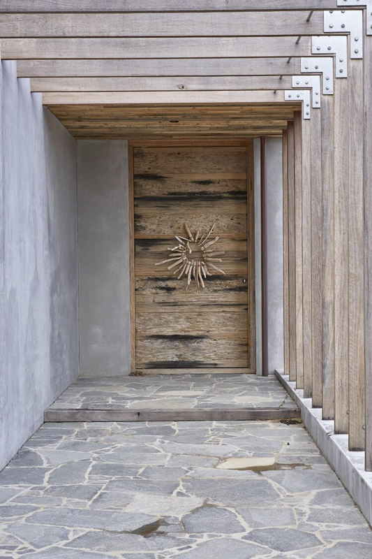
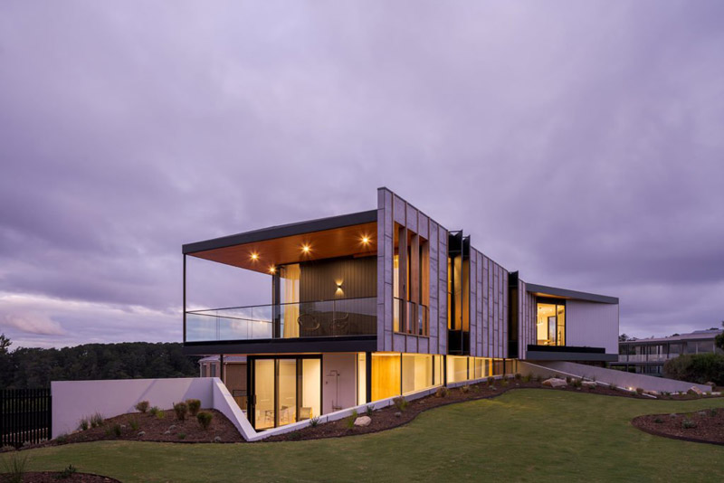
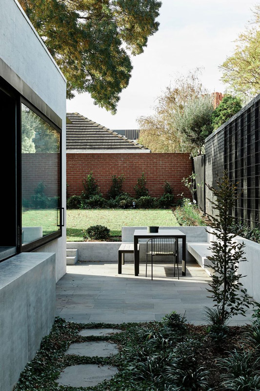
We carefully considered the journey to and through the home. Firstly, the new laneway from the road to the home was designed as a meandering pathway that introduces visitors to key features like the reconditioned windmill and the newly constructed stables. Upon approaching the home, the ocean view is deliberately concealed by monolithic concrete walls which symbolise the robust structure needed to withstand this exposed environment. It’s only upon being invited through the huge driftwood door that the visitor is rewarded with their first framed view of the ocean.
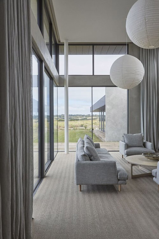
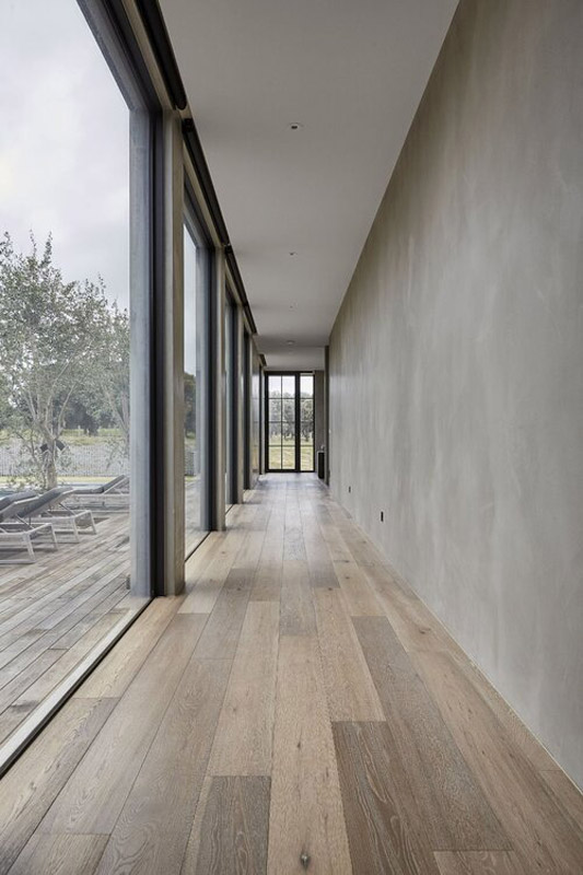
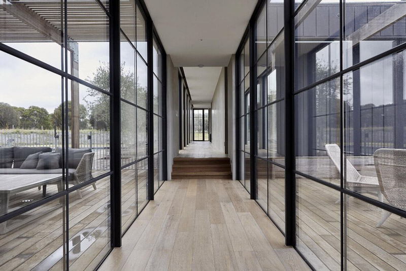
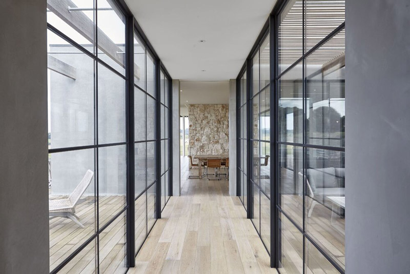
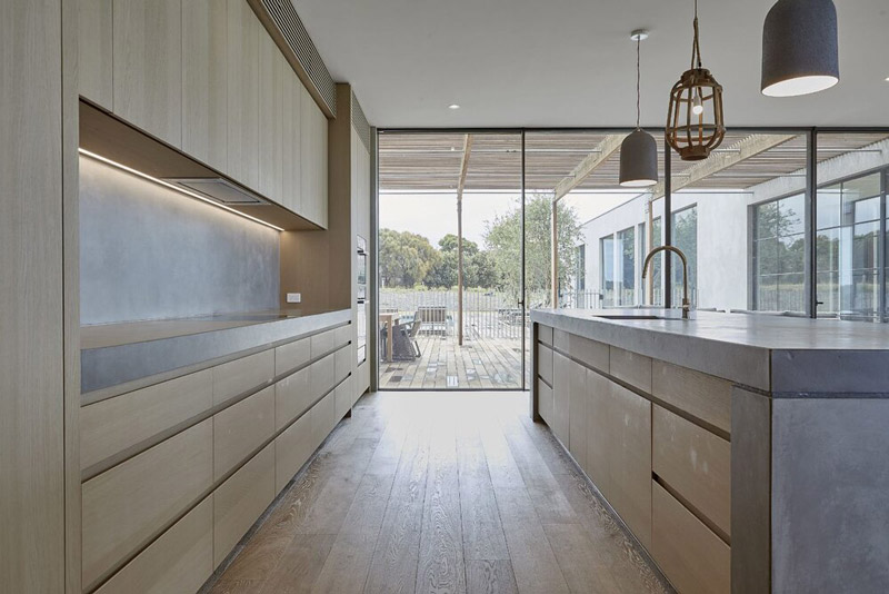
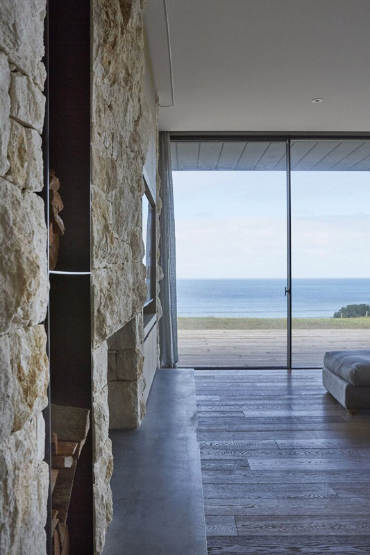
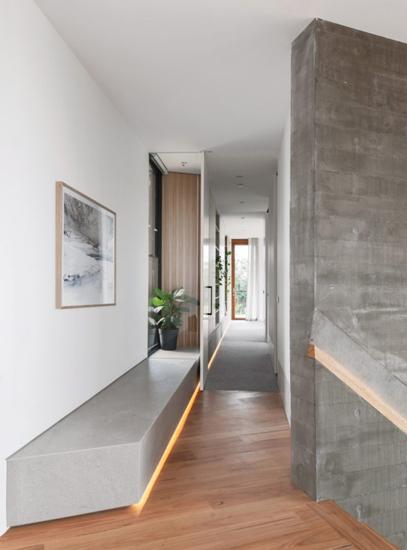
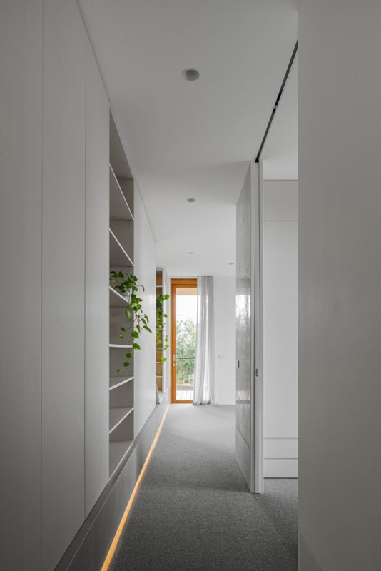
The program of the home is laid out in a linear fashion, stepping up and staggering outwards as it rises to match the natural terrain with almost all rooms facing the water. As a consequence of this arrangement, access to each part of the home is via a wide corridor which changes direction at the edge of each building block. This change of direction coupled with a change of scale and materiality in each segment allows the visitor a new view and spatial experience at each turn.
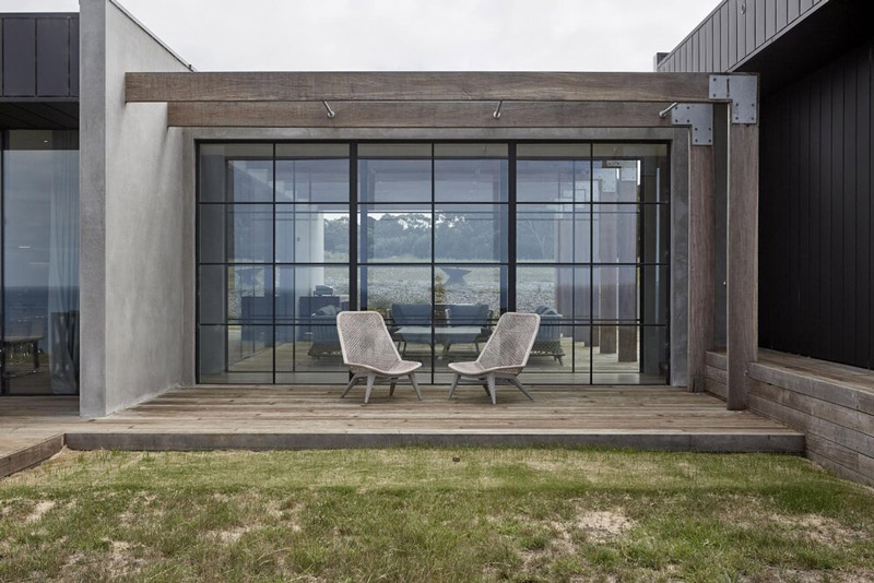
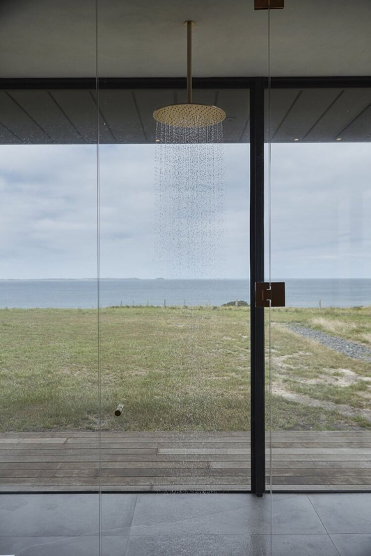
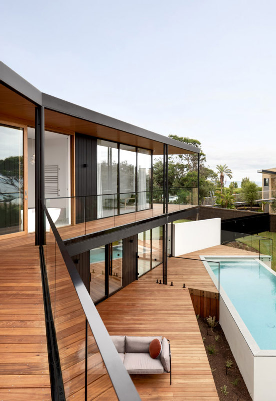
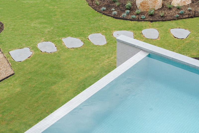
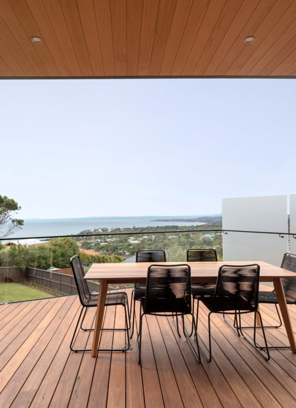
With the ocean side of the home being largely south facing and exposed to the elements, it was critical to create a calm counterpoint. We did this by placing the alfresco seating area and pool on the north side, sheltered by the stepping form of the building. Even this zone has uninterrupted ocean views through huge glazed walls.
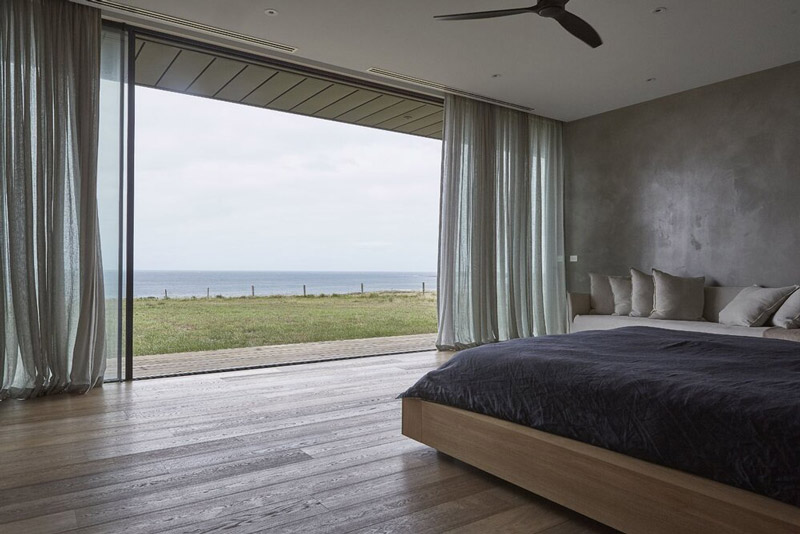
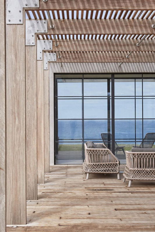
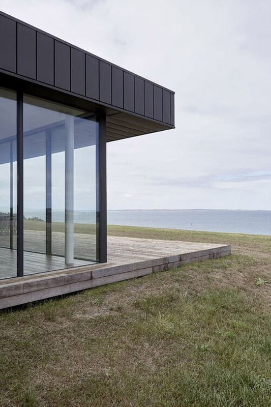
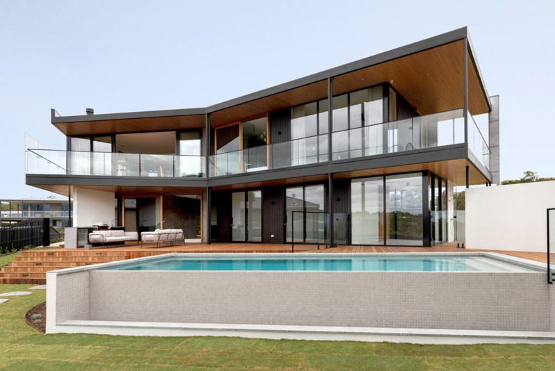
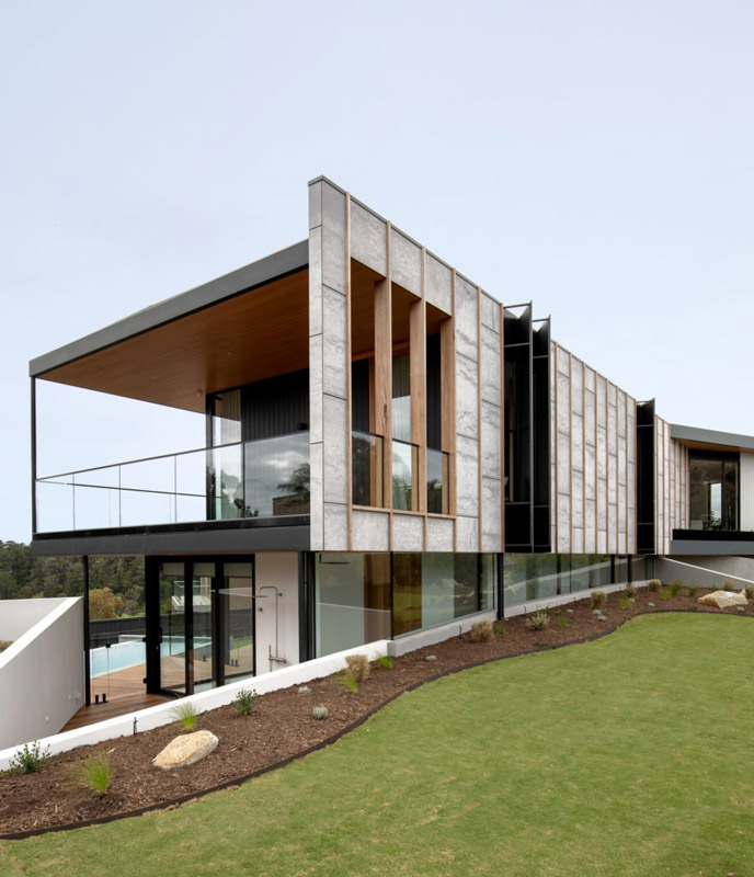
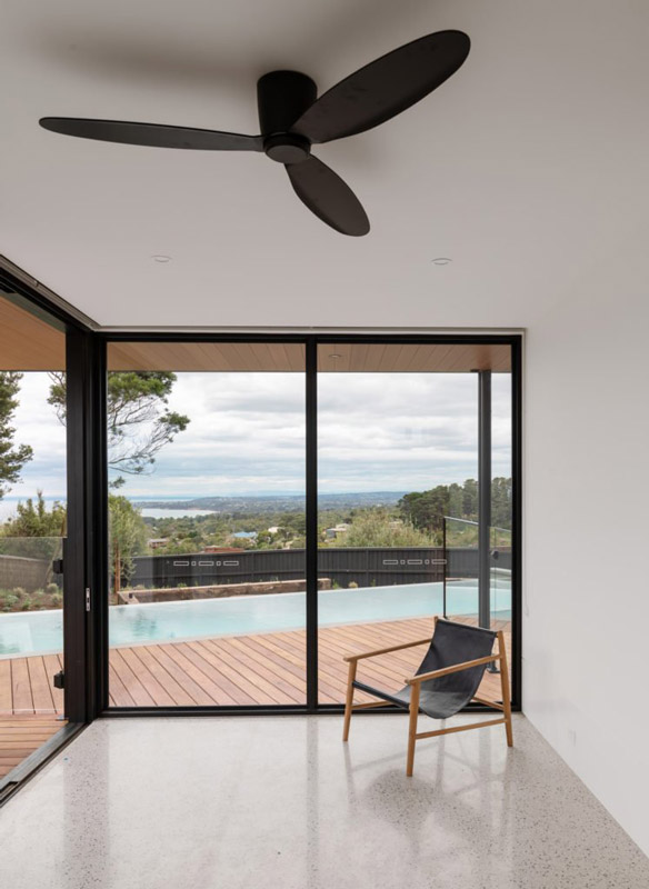
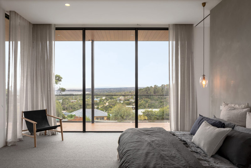
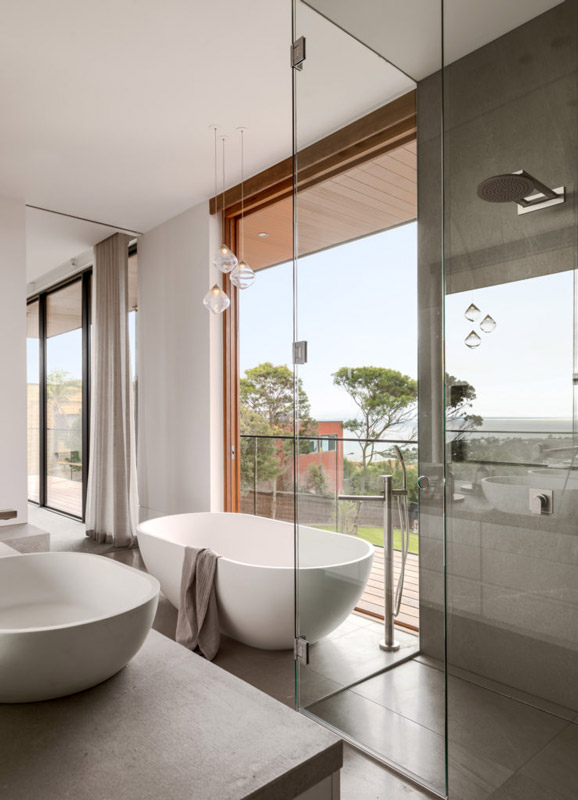
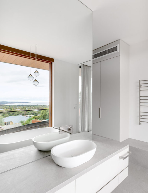
Text description provided by Megowan Architectural. A continuation in thought, form, detail, region and team of the Two Angle House. Sited on a ridge across from a reserve in Mount Martha, the Three Angle House is the formal extrusion of the intersection of a solar orientation and the three primary views found onsite. Designed for a couple who were looking for a seachange from city life, the main living spaces and master suite were lifted to the first floor to maximize views out to Mornington and the bay (north), Mount Martha Reserve and Point Nepean (west) and the distant Melbourne CBD (southwest).
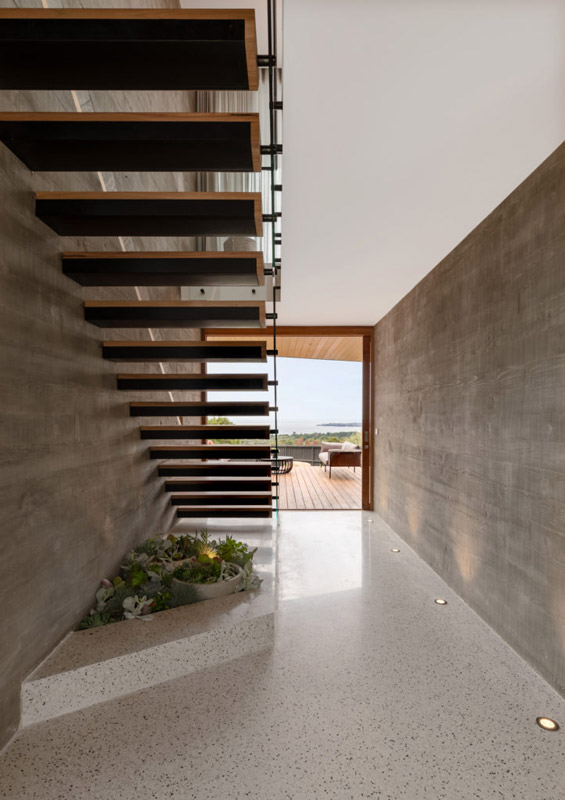
The entry of the house was burrowed into the earth and designed to reveal the principal northern view across the bay. Two board formed concrete walls focus the eye through a large glazed blackbutt sliding door which perfectly picture frames a breathtaking view across Jullul Bay. A Blackbutt and steel stair cantilevers off one of the board formed walls and lands between the master suite and living areas on the first floor.
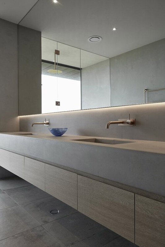
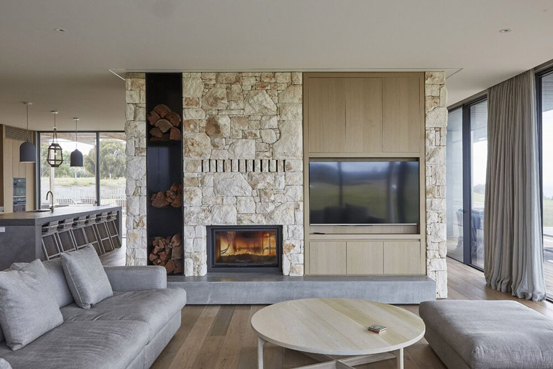
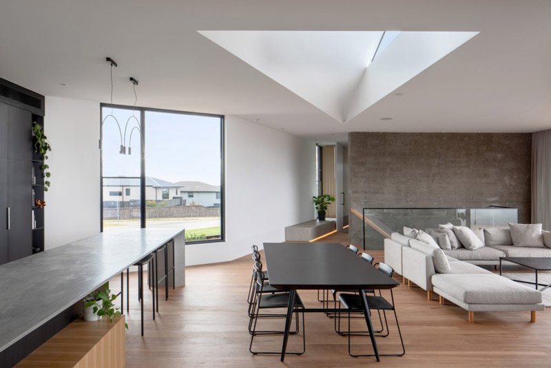
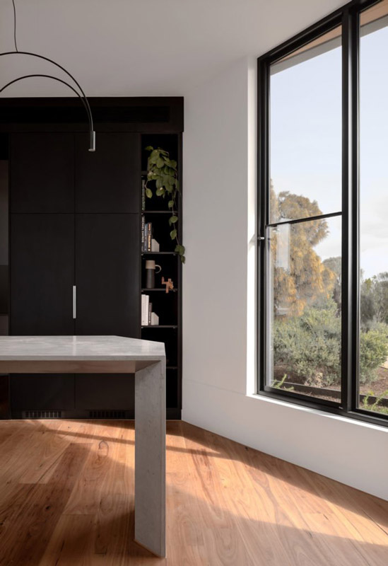
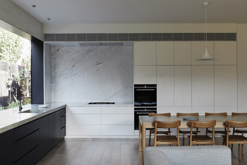
The living, dining and kitchen areas are all aligned to the main view to the north. Blackbutt and concrete details are intentionally justaposed throughout the space. A blackbutt handrail was recessed into the boardformed concrete wall. Blackbutt timber soffits, flooring, decking and sliding doors add warmth to the key spaces. Concrete walls, cast in place concrete kitchen benchtops and hearths, raw fibre cement panels and polished plaster provide tactility and imperfection to the spaces.
The master suite is designed as an elegant wing of the home featuring large expanses of porcelain, extensive custom joinery, polished plaster and wool carpet, all while remaining connected to the striking views and outdoors.
The ground floor features large outdoor living spaces, a beautiful infinity edge pool and additional bedrooms designed for extended stay visitors from overseas.
Text description provided by Outset Design Architects. Works to this classic sandstone villa were completed in two stages; refurbishment of the existing house and the contemporary rear extension. Renovations to the existing villa (St Peters 3) had to be designed and constructed within a tight time frame to suit the needs of our clients. Once settled in their home, design, documentation and finally construction were undertaken for the extension at the rear of the property.
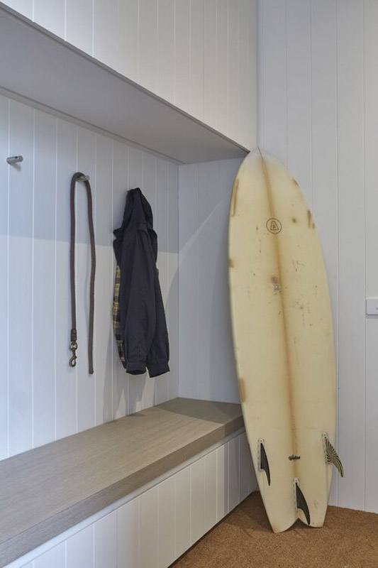
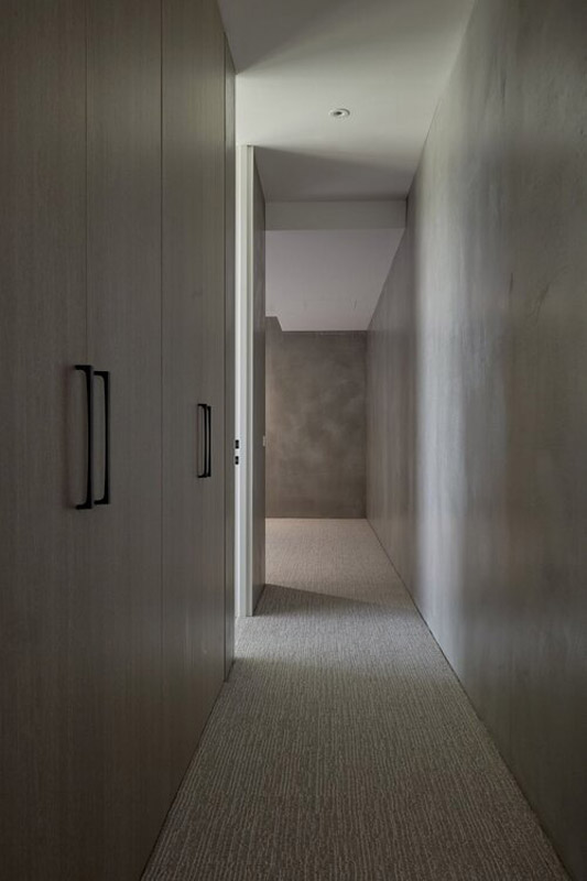
Our brief was to provide a comfortable and inviting home to suit their young family, with a classic pallet of finishes and textures. The home features four generous sized bedrooms, the main bedroom suite complete with large dressing room and ensuite. Accessed off the central hallway are a second bathroom and powder room, as well as the laundry, mudroom and gym.
he rear addition comprises a dining, kitchen and butler’s pantry which wrap around a central courtyard, filling the space with light. This abundance of natural light combined with lush external landscaping, create an almost seamless connection between the inside and outside spaces. The large kitchen opens onto a covered alfresco area overlooking a pool and layered landscaped garden by Greenwell.
Project Details
Completed December 2020
Build Size: 240 sqm
Site Size: 730 sqm
Architects: Outset Design
Landscape Design and Construction by Greenwell Landscapes
A Crafted Extrusion – Brighton Garden House by Wellard Architects
Continuing a focus on craft, Brighton Garden House extends the relevance of its Edwardian-era origins to one of calm and simplified contemporary life. Wellard Architects draws on the existing proportions of the home to extend in a controlled and rhythmic manner, to openly embrace the rear landscape space.
Within its Brighton milieu, the original home stands appropriately generous and grand, responding as an extension to its foundations and formal symmetry. Maintaining a purposeful engagement with the streetscape, the new effort sits behind the original façade, with key heritage detailing retained and celebrated. The new then sits sensitively to the rear, opening to create connections between inside and out – with visual and ventilated access – immersing the home in amongst its gardens.
Wellard Architects draws on principles of simplicity and restraint to conjure a new volume that sensitively engages with its surrounds, poised timelessly in place.
Through large and generous openings, glazed apertures provide visual connections between the inside and out and ensure a feeling of enclosure.
As a collaboration between builder Locbuild and landscaping by Renata Fairhall Garden Designs, Brighton Garden House draws attention to the relationship between the built and the natural. Through large and generous openings, glazed apertures provide visual connections between the inside and out and ensure a feeling of enclosure.
The encasing garden not only provides a welcomed buffer between the home and the neighbouring properties, but it reinforces a feeling of disconnect and protection within the site boundary. Linking the original heritage home is a large, timber floored corridor that extends into the new structure and binds the two eras together. This spine centres the home and allows the various ancillary spaces to direct flow and movement throughout the house, with key visual links outwards to various landscaped settings.
A key feature of the home is its ability to embrace natural light, existing almost like a living element within the structure. The new rear volume enables a more connected and fluid living to transpire, reflecting a modern-day condition whilst providing a balance to the more formal and divided planning of the original home. Whilst the older detailing is retained, the new pavilion also gives similar attention to the handmade, as craft is expressed through concealment and the absence of ornateness. The sharp crispness of the new form sits as an evolved iteration of the former, while reaching out further and deeper into the site. A neutral palette of soft and subtle finishes ensures a continued endurance, referencing a time-worn approach over a response to trends.
By deepening the form of the home into the site, Brighton Garden House sits immersed in place, as Wellard Architects emphasises an enduring ambiance of refinement and longevity.
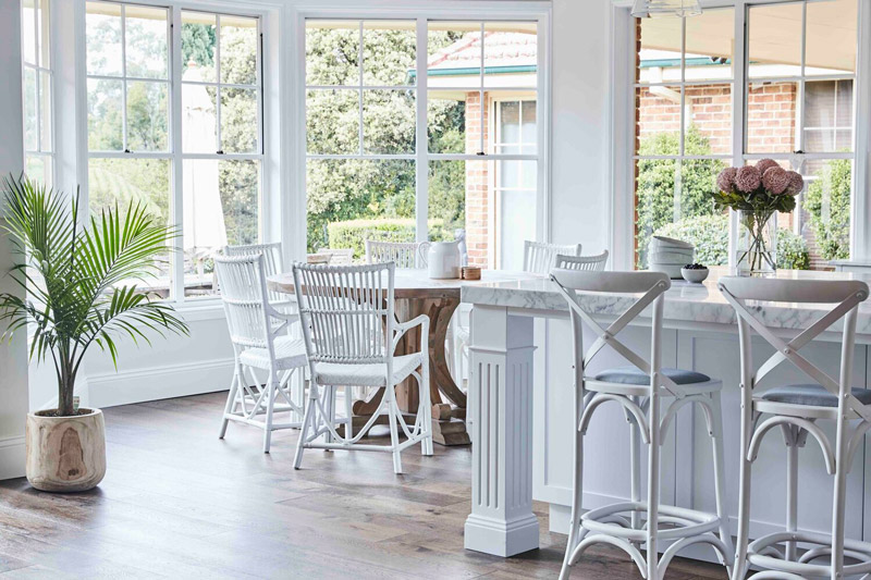
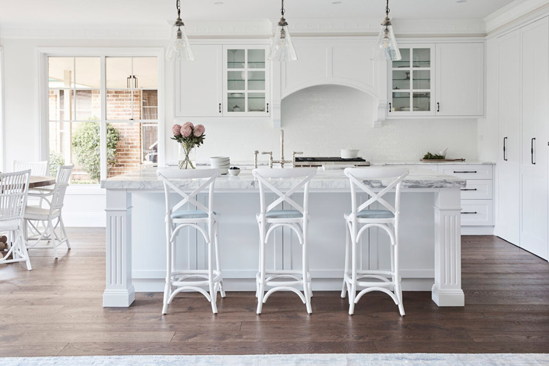
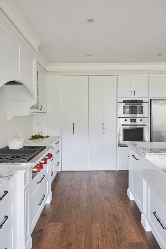
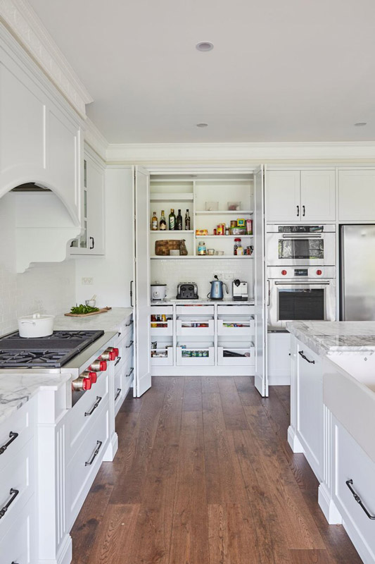
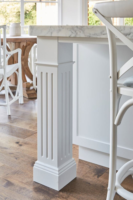
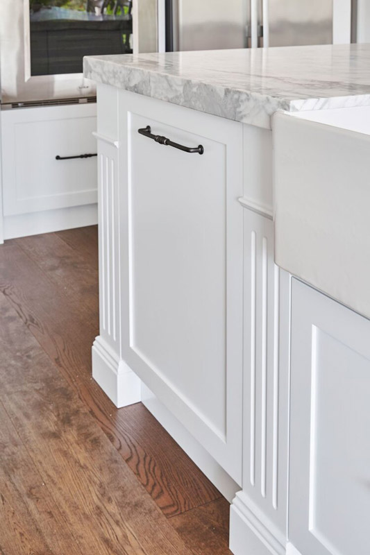
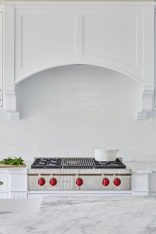
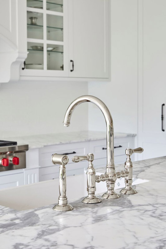
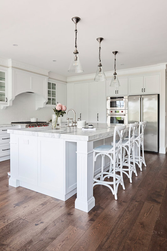
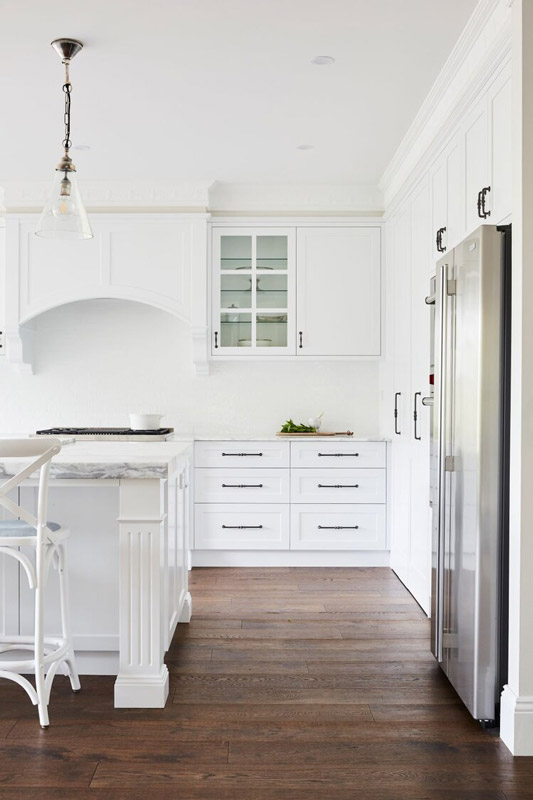
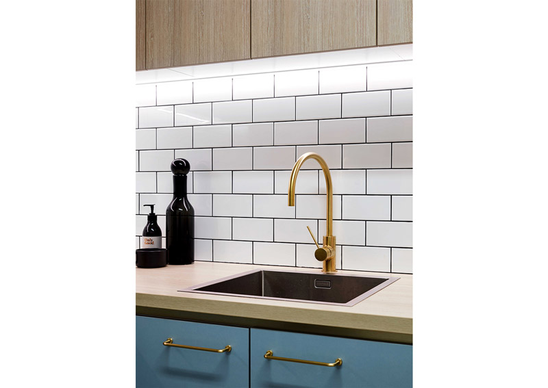
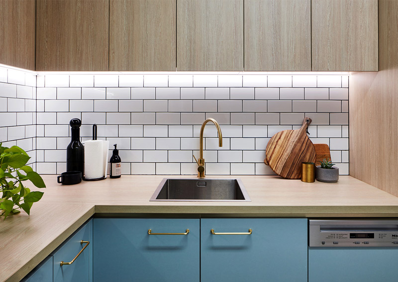
ALL-WHITE HAMPTONS by Home By Belle Interior Design
Text description provided by Home By Belle Interior Design.
Kitchen renovation
“Our clients came to us with a clear brief, to design a bright, white and airy Hamptons kitchen that was both fluid and functional. The pared-back palette lets the craftsmanship and meticulous attention to detail shine.”- Sarah
PROJECT HIGHLIGHTS
Crisp white cabinetry, polished Statuario marble benchtops, and white subway tiles establish the super clean palette.
Highly detailed custom joinery features decorative capping to top cabinets and ornate rangehood corbels, cornices and skirtings.
Equipped with bi-fold doors for a seamless look, the butler’s pantry offers ample, cleverly integrated storage.
RENOVATION DETAILS Duration: 8 weeks
Scope of work: Half-home renovation of kitchen and living spaces. Kitchen included flooring, painting, custom joinery and installation of appliances, finishes and lighting.
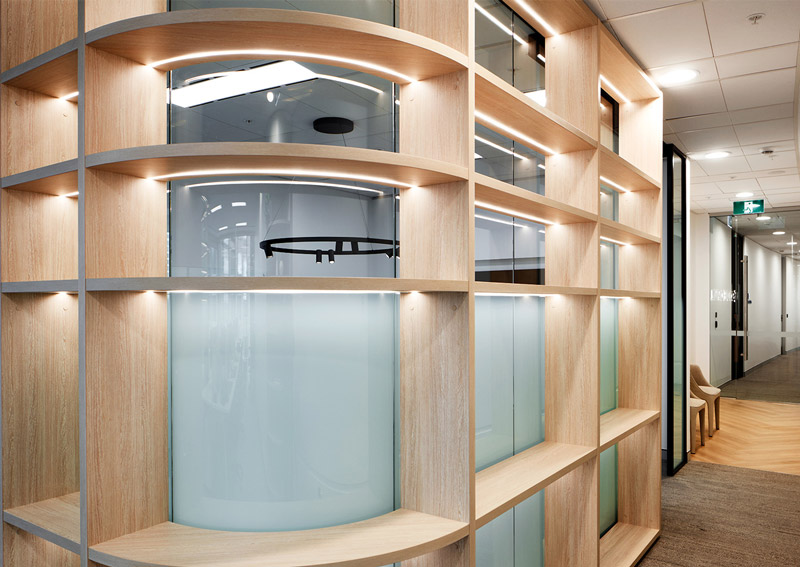
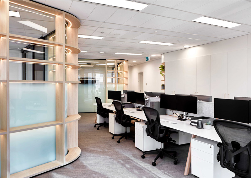
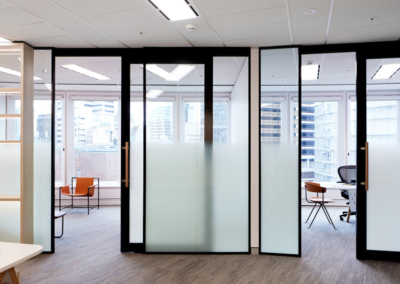
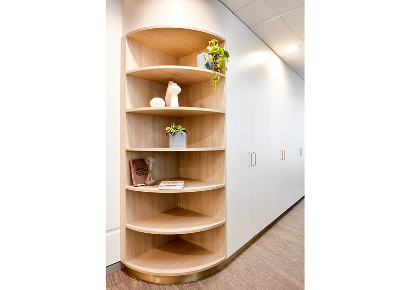
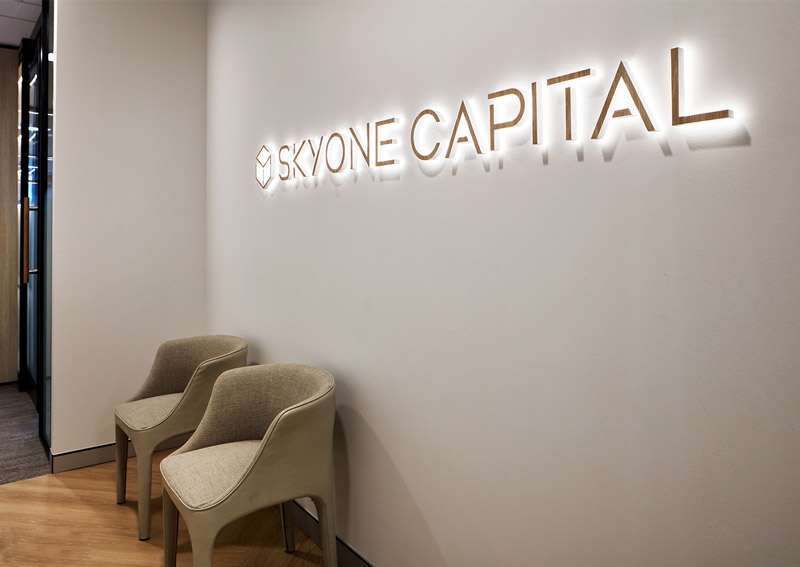
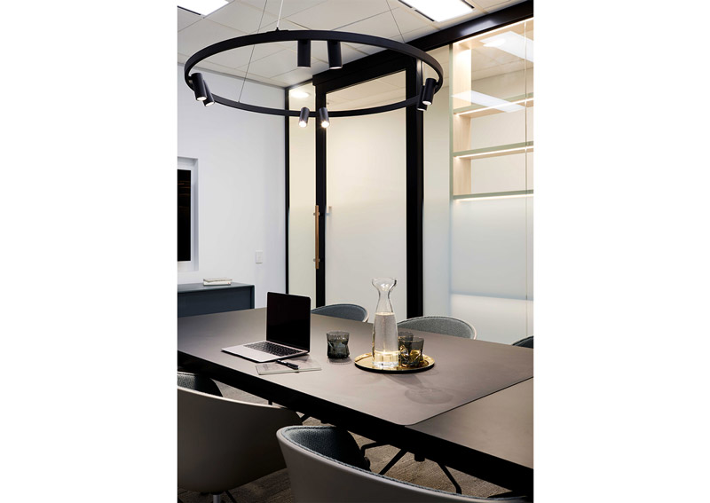
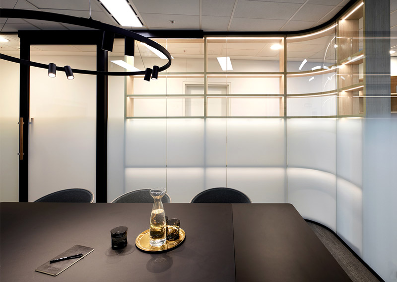
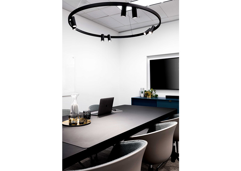
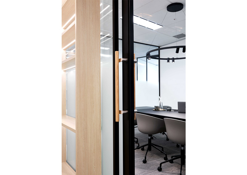
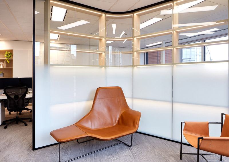
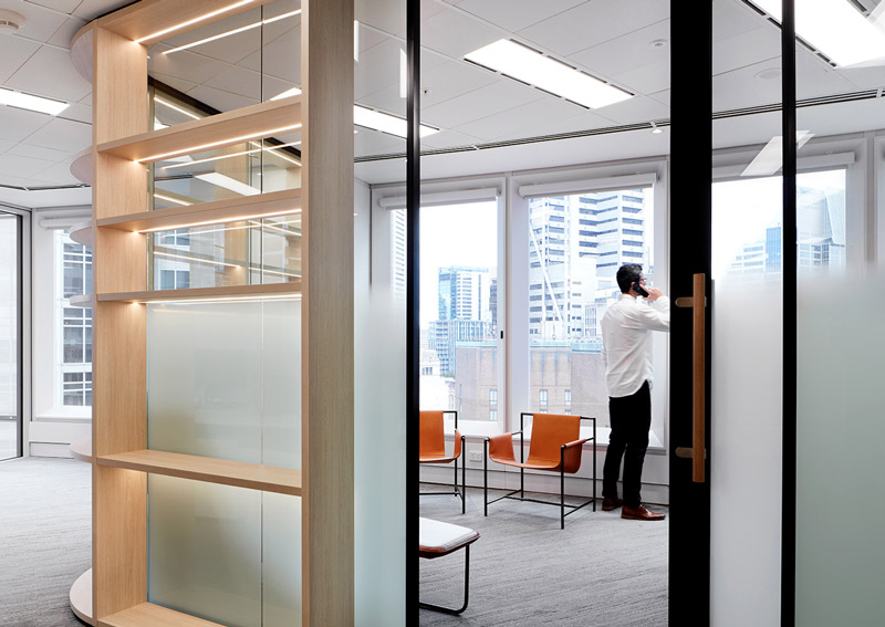
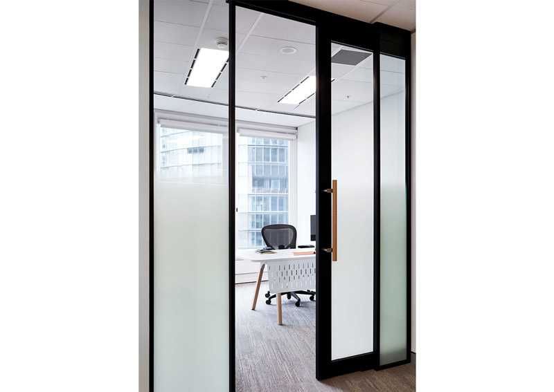
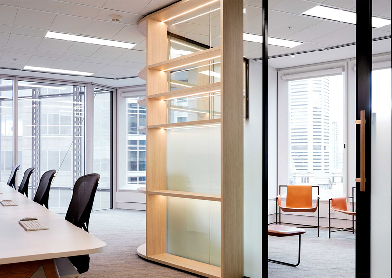
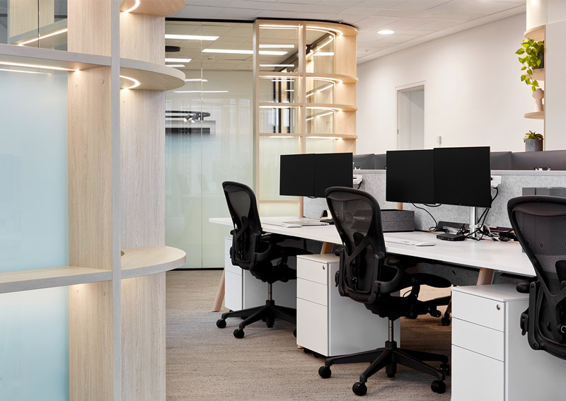
Text description provided by Vie Studio. Skyone Capital is a multi- family office firm based in Sydney CBD that focuses on creating investment opportunities to selective clienteles, especially meeting the financial needs and services for affluent families.
The brand puts emphasis on lateral thinking, logical problem solving by exploring all possible outcomes and solutions for entrepreneurs. This attitude is reflected in the text based logo which reinforces Skyone Capital’s simple intention of building a trusted and secure community for these families.
To affirm Skyone Capital’s vision, a choice of navy and sky blue colour tones have been selected as the brand’s dominant colours giving it a stable and confident persona. The overall interior styling and spatial planning design features a selection of prestige, luxe furniture and furnishings with the predominance use of timber and brass. Collaborating with Morphos, these materials have been careful selected to style the light filled 145sqm office workspace to give it a modern and sophisticated touch.
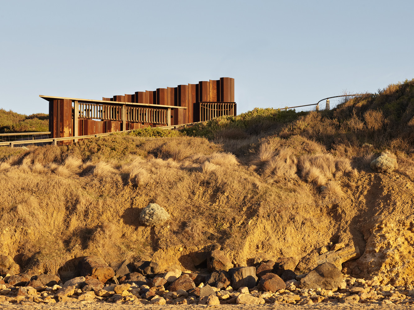
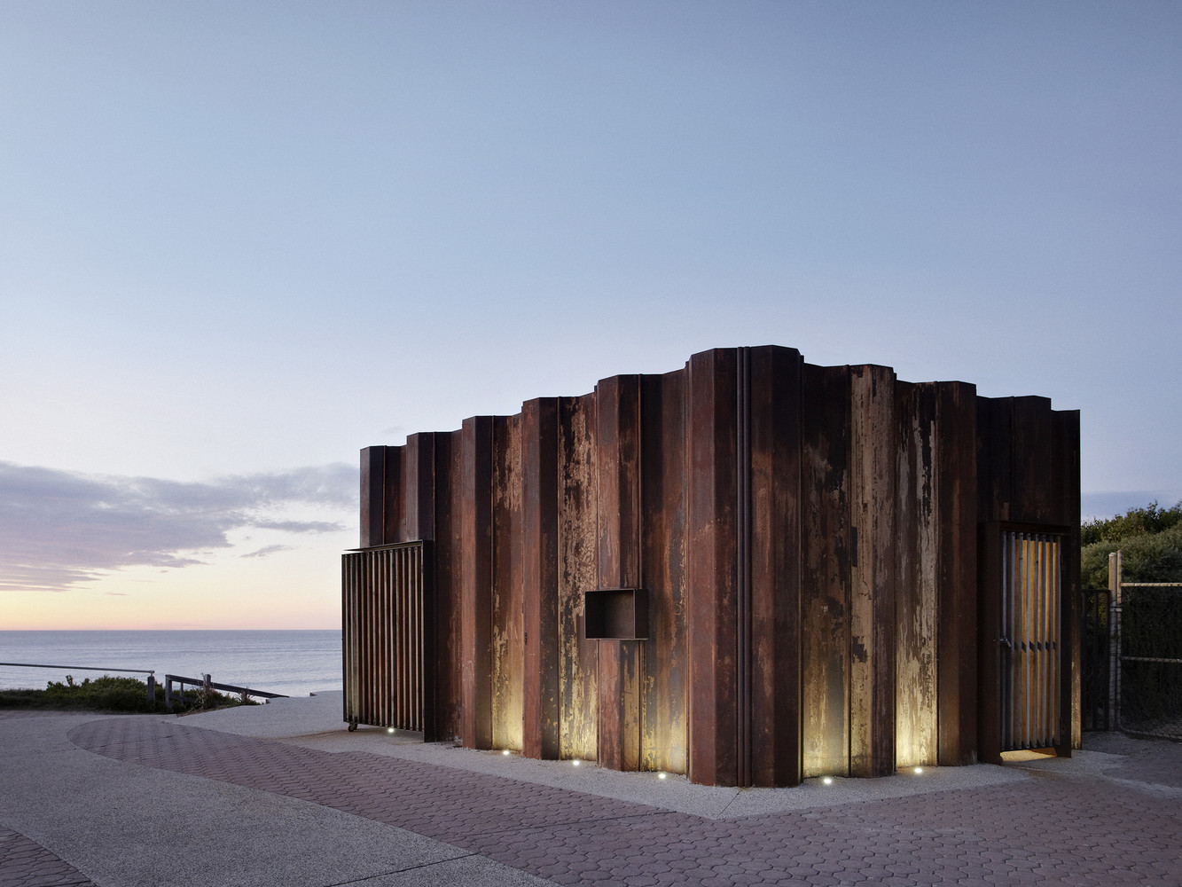
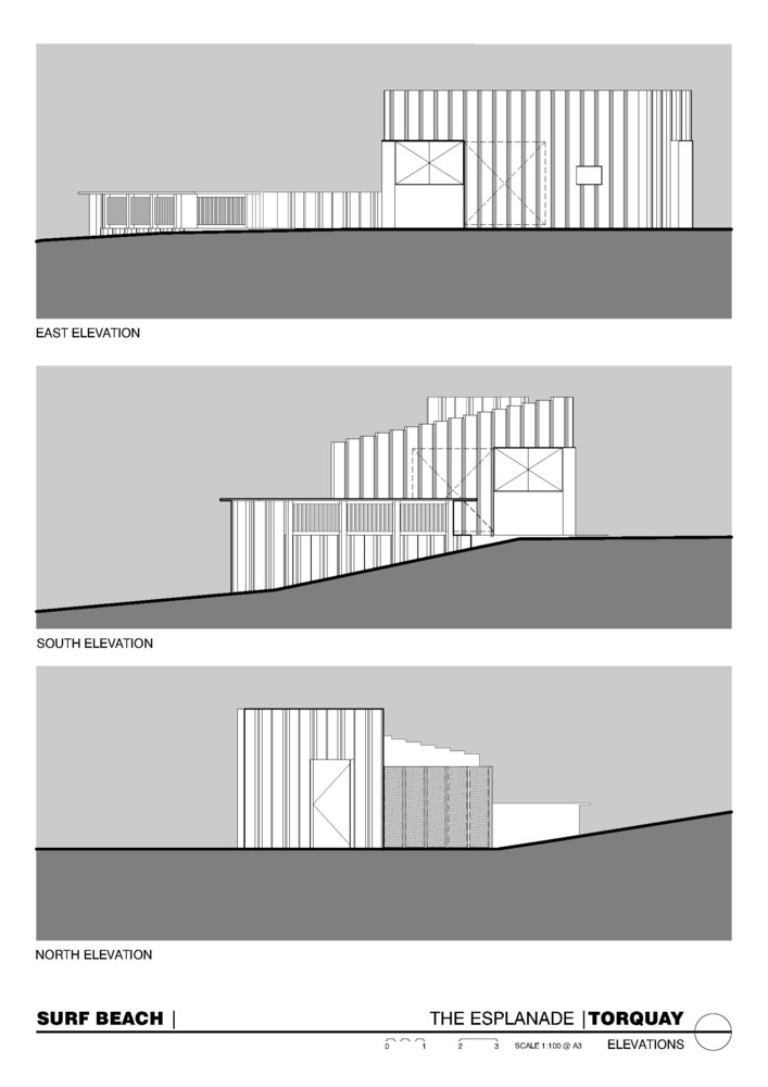
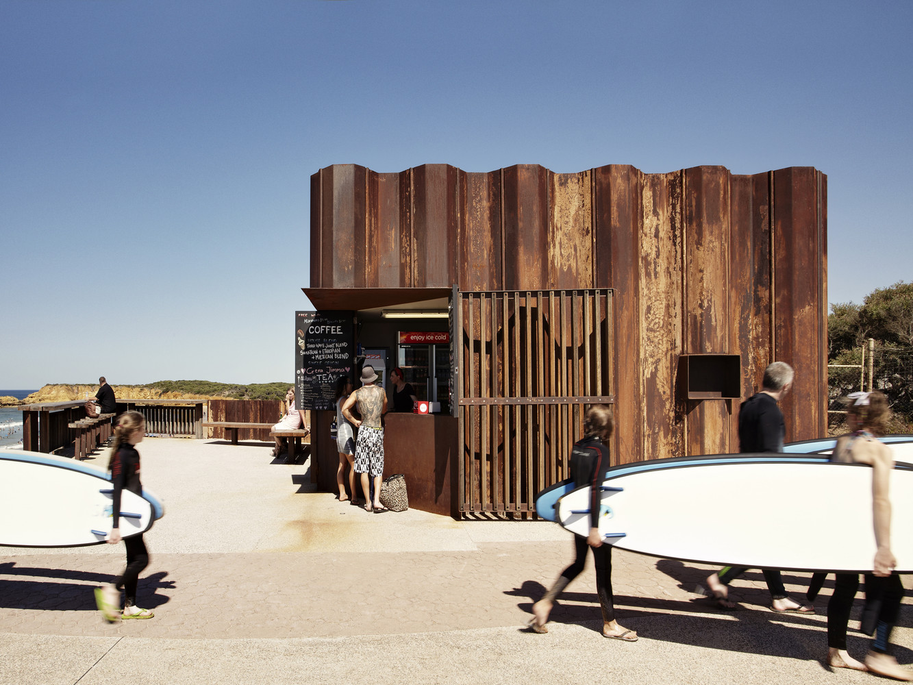
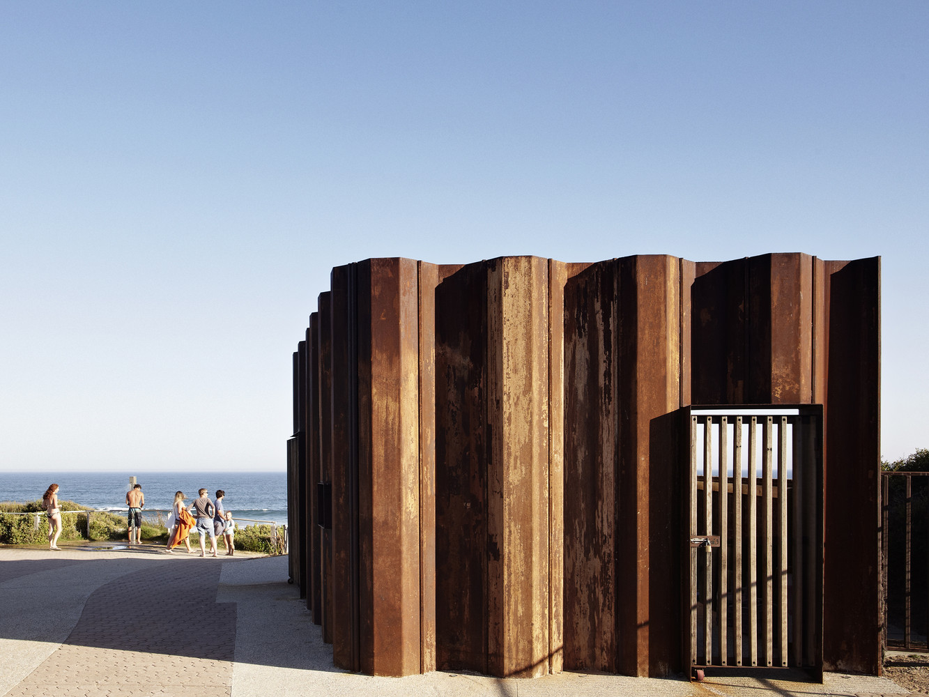
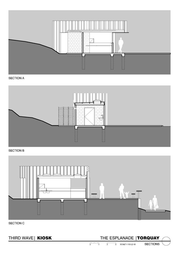
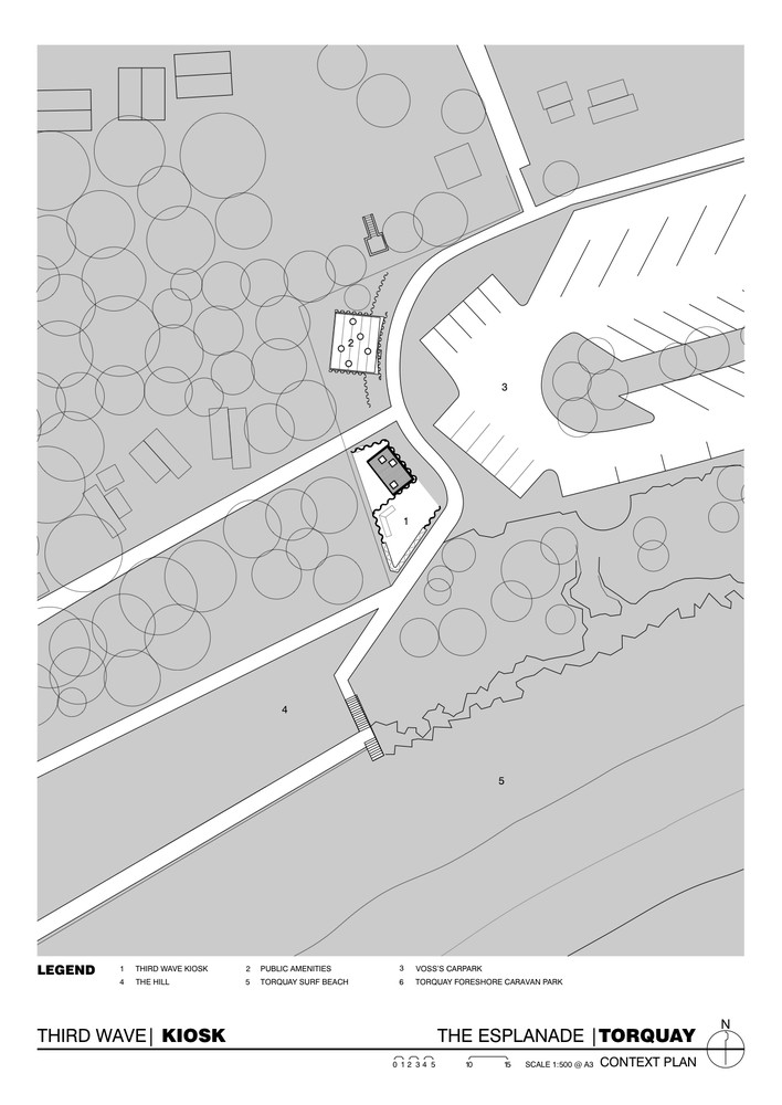
Text description provided by Tony Hobba Architects. Central to the design of the Third Wave Kiosk is reverence for its environmental setting; engagement with beach culture; resilience to natural forces and energetic youths; and attention to modest and elegant simplicity.
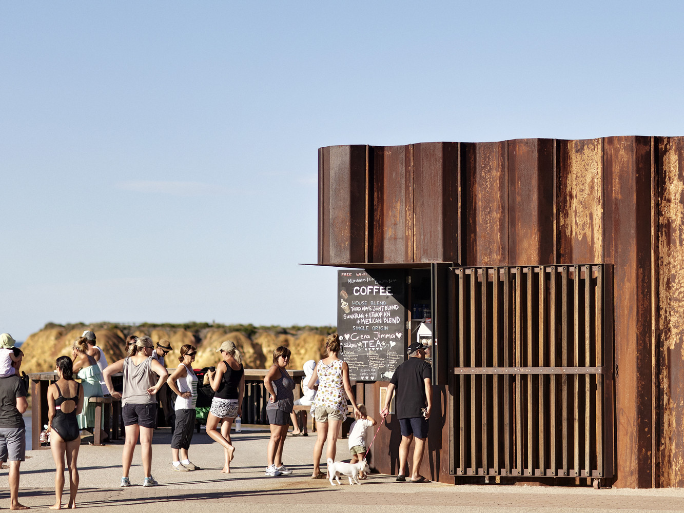
The brief was to design a new public facility at Torquay Surf Beach that contained a new kiosk, toilets and change rooms that would be open year round, service an assortment of recreation users and provide an important beachside destination.
Due to the site’s high level of local, regional and international use throughout the year, together with its visual prominence along this section of coastline, the design of the project recognized the need to adequately service community, recreation and tourist requirements whilst sensitively integrating and respecting the local coastal environment and adhering to the Victorian Coastal Strategy.
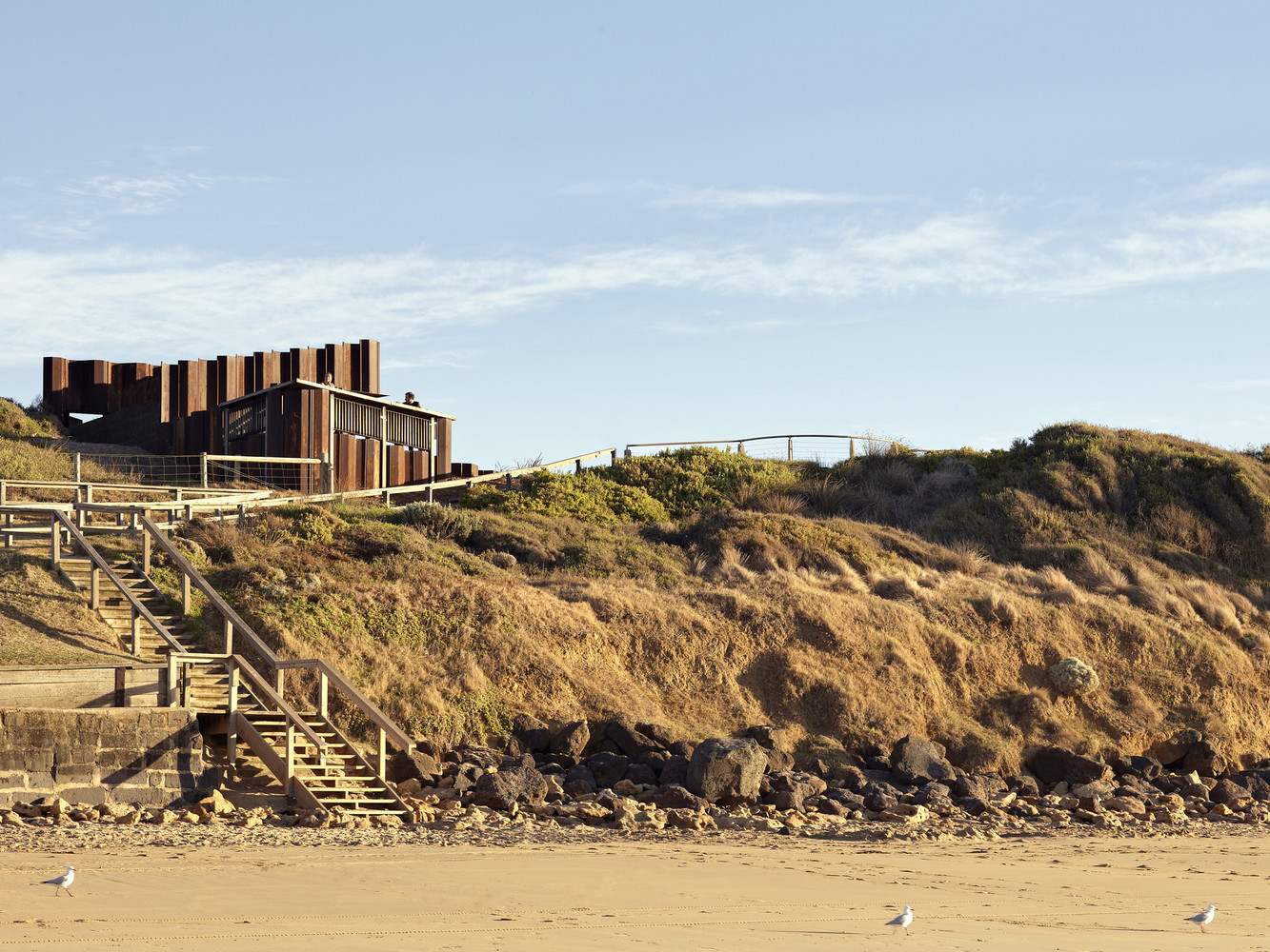
The building is positioned adjacent to the nexus of pedestrian circulation, between the main car park and beach access path, to guarantee maximum foot traffic; and is visible from the beach and water’s edge as it gently emerges from the primary dune.
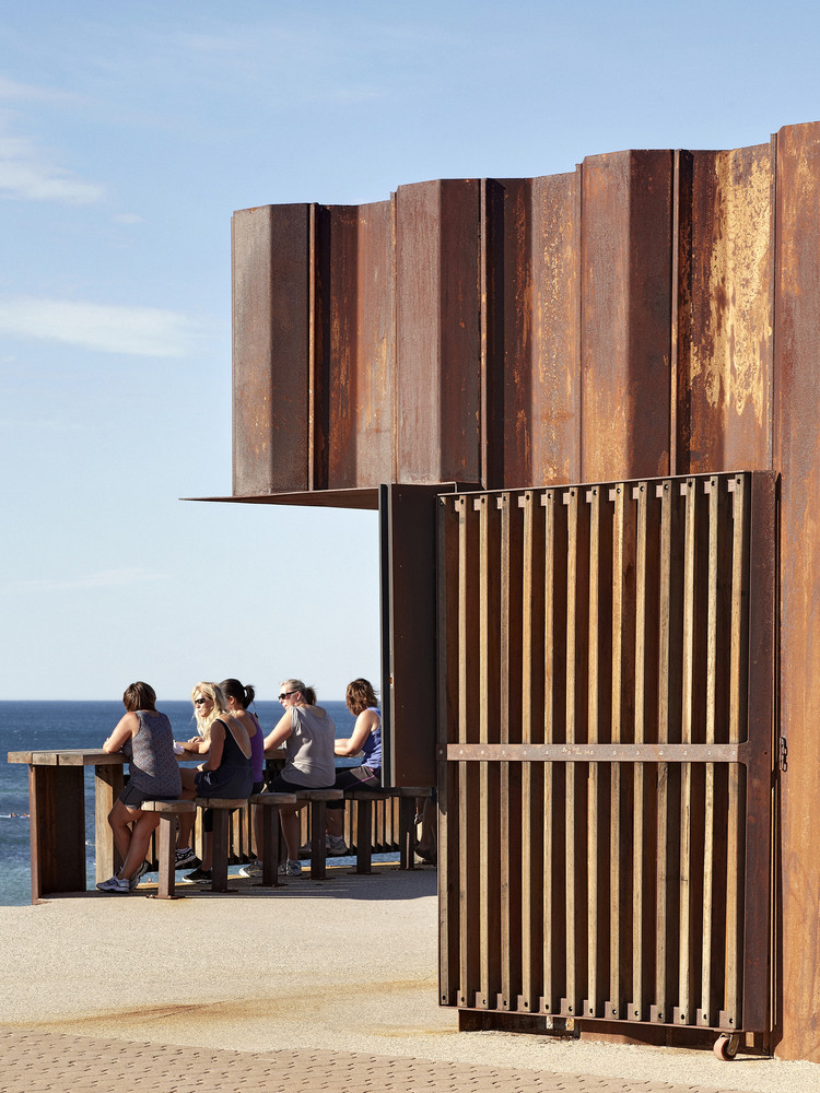
In order to engage beach goers, an elevated lookout and alfresco seating area (65m2) has been provided adjacent to the Kiosk which not only overlooks the beach but doubles as an easily identifiable landmark and meeting point. At only 20m2, the compact kiosk kitchen and servery caters for 1-3 staff depending on seasonal demand. A 25m2 service court out the back caters for additional storage, deliveries and a few empty milk crates keenly commandeered during smoko.
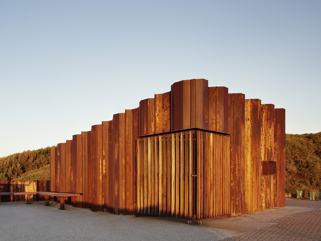
The height and profile of the building has been designed to respond to the prevailing coastline undulations and windswept vegetation, and uses these natural inflections to inform its final folded appearance. The form therefore takes on a sculptural quality which blends in with the surrounding environment and shrouds the utilitarian function of the working core.
This is accentuated through its use of coastally identifiable materials and colours by using recycled sheet piles typically used for seawall, bridge and pier construction to be the predominant exoskeleton and expression of the building. These sheet piles have intentionally been left in their original condition to emphasize the reddish brown and yellow oxides of weathered steel and harmonize with the colour of the surrounding cliffs.
This system of construction proved extremely efficient, both structurally and financially, as the sheet piles were used as permanent retaining walls for the alfresco terrace and lookout; provided permanent formwork for the building slab; and extended up as the primary structure and facade of the building. It appears that this is the first building in Australia to utilise the material in such a way, with the added bonus of reducing the projects embodied energy.
With sustainability and re-use integral to the outcome, the recycled sheet piles were procured from the 2010/2011 Victorian floods where they were last used for flood protection works along the Murray River to assist in mitigating the devastating water damage experienced by the local river communities during this extreme rain event.
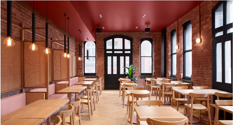
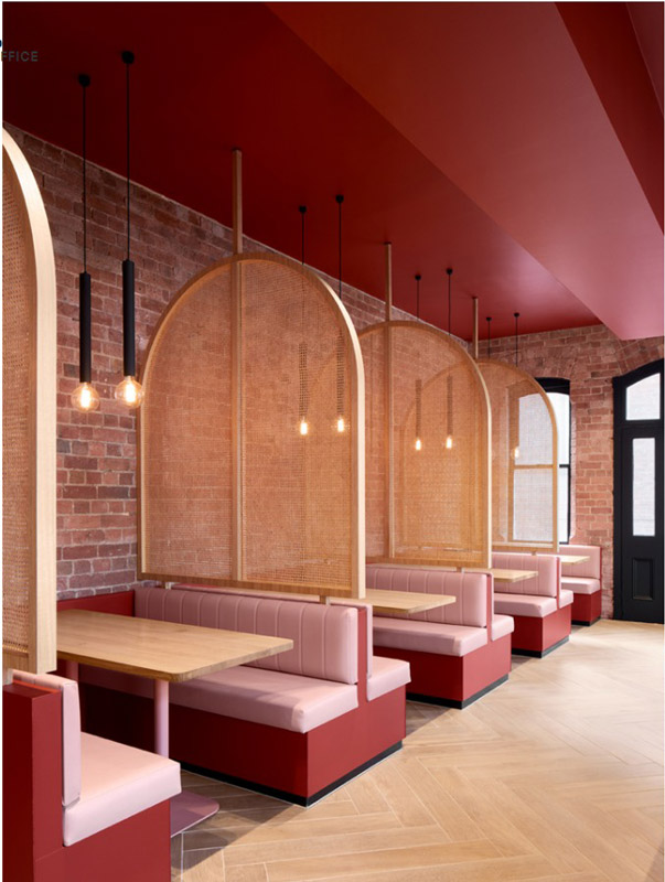
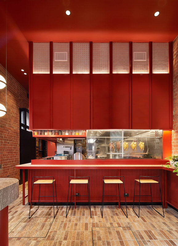
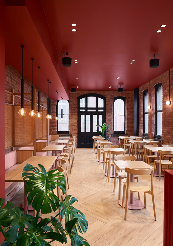
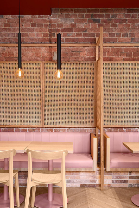
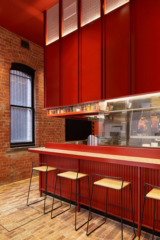
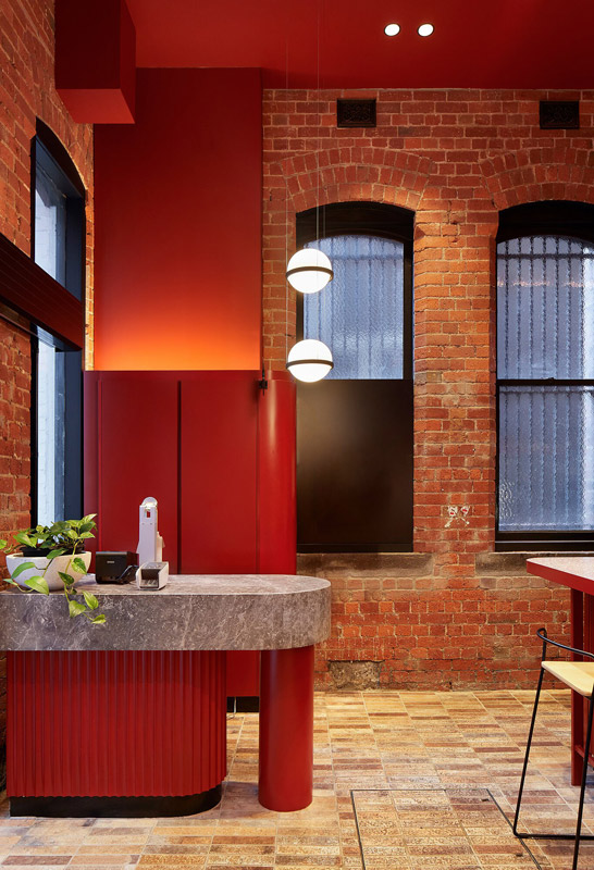
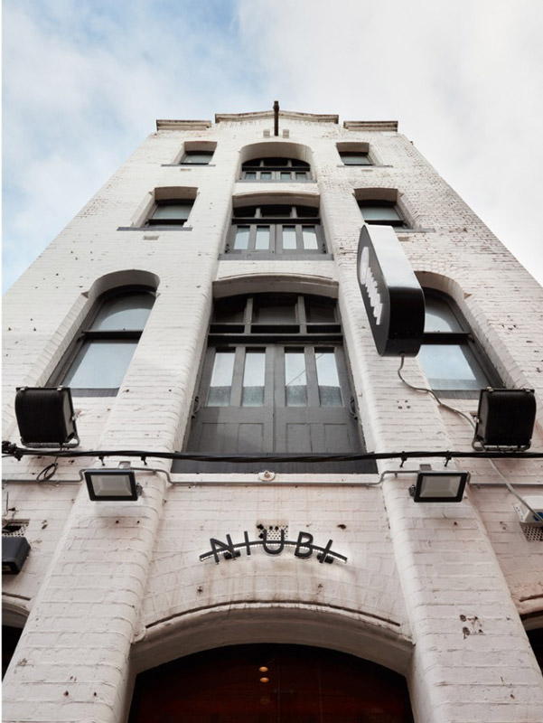
T-A Square architecture is a full service, award-winning architectural studio renowned for its multi-residential projects & its balanced understanding of design and commercial considerations. Niubi is a contemporary Asian restaurant showcasing the very best of south-east Asian dishes.
With its chic, slick and ultra-contemporary interior, the venue has been noted as one of the “most worthy for the gram”! Its pastel pink booths, wicker dividers, and bold red feature ceiling creates an aura of warmth.
It is the bold use of colour that characterises the space. bright red used throughout represent luck and happiness, while the pastel pink of builtin banquettes was included to give a sense of youthfulness and freshness