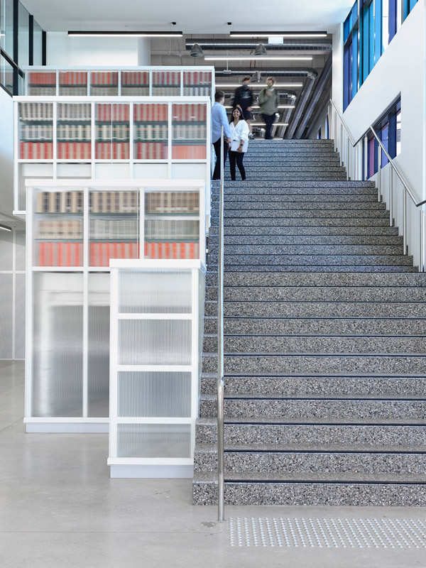
La Trobe University Library by Kosloff Architecture
Text description provided by Kosloff Architecture architects. The library typology has changed tremendously over the past 5 years. We worked closely with the leadership group of the library to create an interior that supported a conceptual shift from ‘collection’ to ‘connection.’ This project fundamentally involved the reworking of an existing shell to create a new library for the community of La Trobe University, Bendigo.
Spread across three levels, the scope included an entry gallery, consultation rooms, ASK La Trobe information pods, postgraduate lounge, board room and integrated display of the seminal ‘Sandhurst’ book collection (the main book collection is elsewhere in the building. The client was keen to challenge the concept of a traditional library. We embraced the possibility of a new typology with a focus on facilitating community ‘connection’, rather than just spaces for book ‘collection.’
Working within an existing shell is always highly challenging. The project budget was extremely constrained for a fitout of this nature and scale, and a clear hierarchy of investment needed to be established in order to deliver the functional aspects of the project without detracting from the overall concept. Rather than seeing this as a problem, we chose to see this as an opportunity to leave parts of the interior undefined and full of possibility, suggestive of a future imbued with optimism.
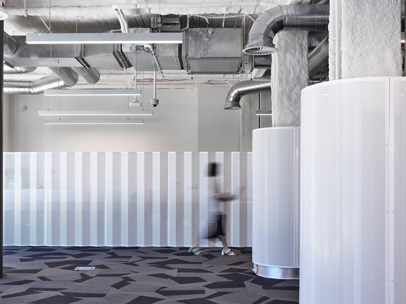
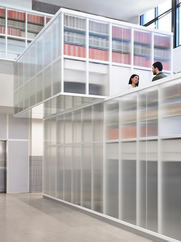
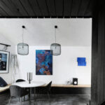
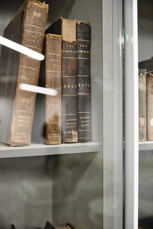
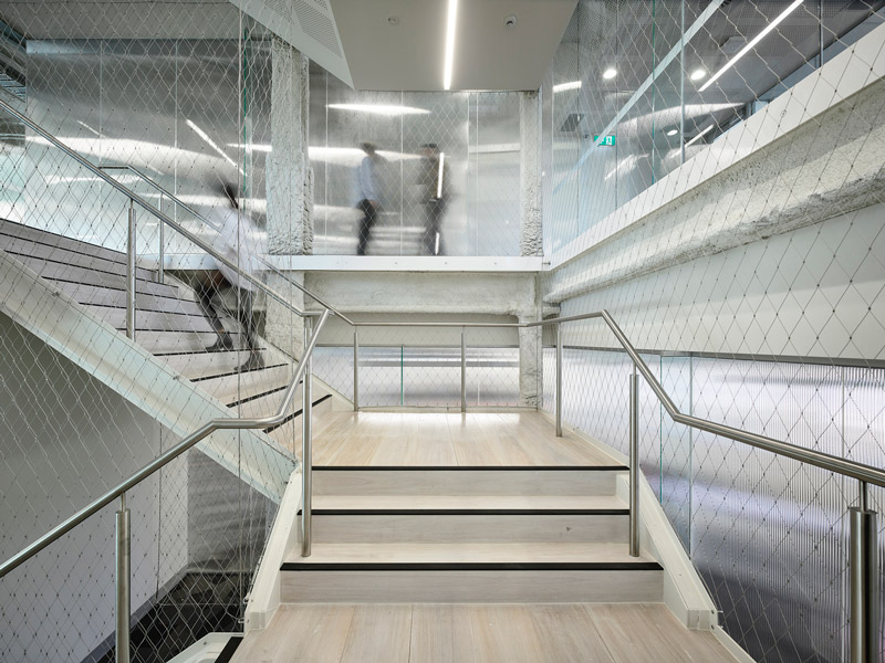
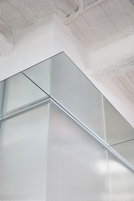
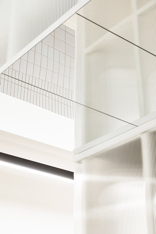
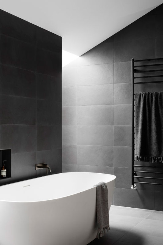
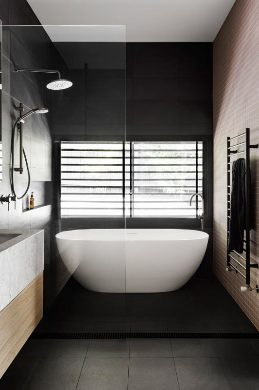
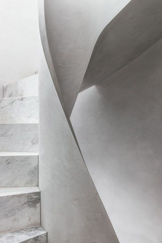
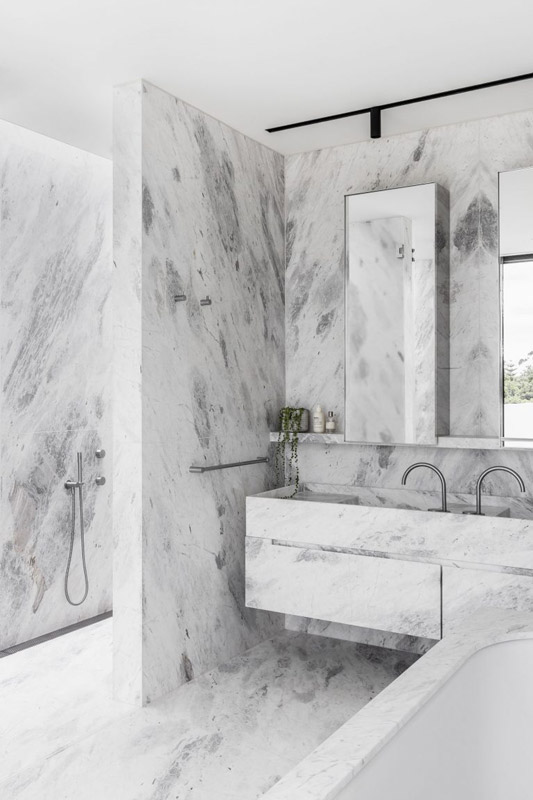
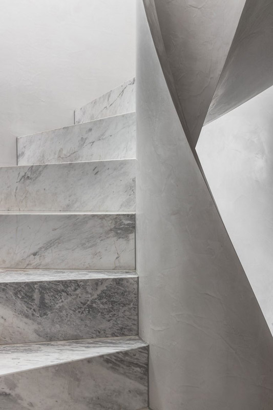
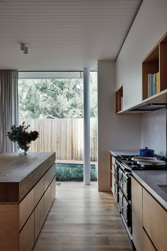
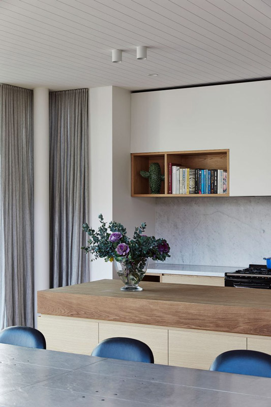
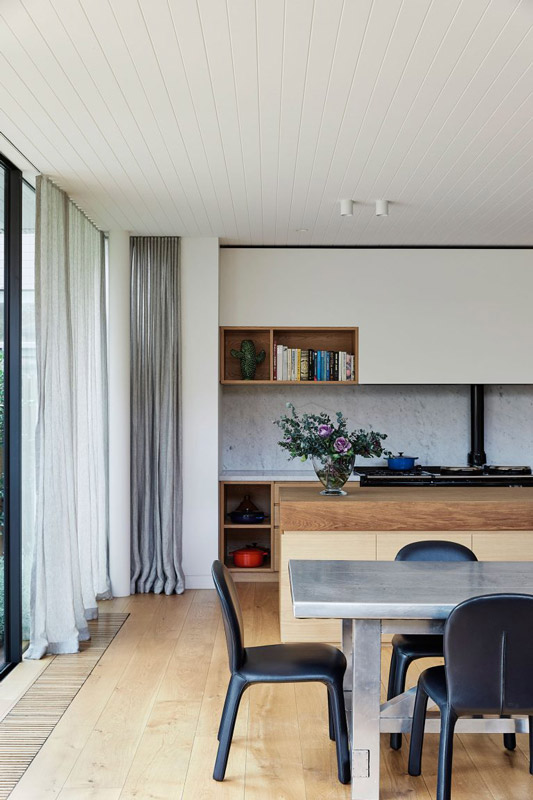
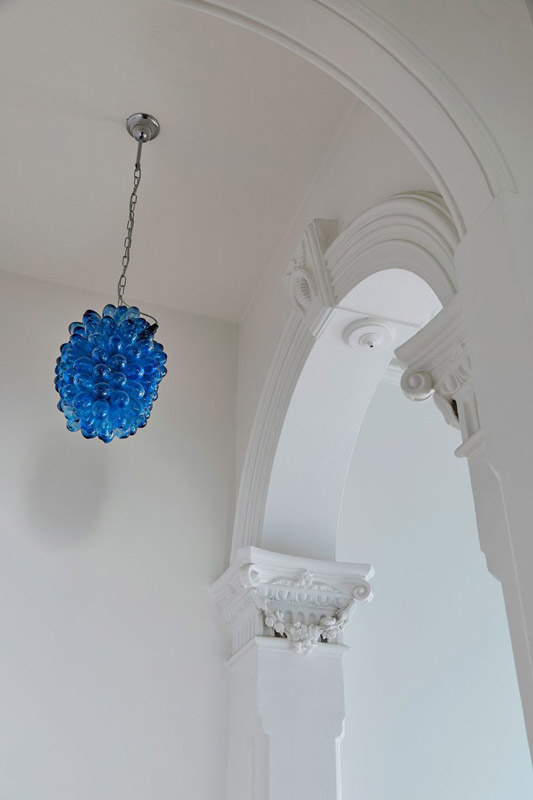
Our aesthetic approach was to leave key elements such as the existing ceiling infrastructure and vermiculite coated steel structure untouched and unadorned. The new architectural interventions were treated as installations clearly distinguishable from the shell, with autonomous objects separated from the ceiling and floating from the floor. Cascading pods adorn the grand stair from the main entry, formed by semitransparent, glass structures that house the secured book collection.
Their blurred spines contribute the only colours of the space, reimagining them as artefacts surrounding the central stair that links the levels. Arrangements of clear, mirrored, and reeded glass create a kaleidoscope of reflection and transparency throughout all levels, blurring the figures of occupants as they make their way up through the interior. It felt fitting to us that a newly defined library space might literally be a reflection of itself.
La Trobe University Library Project Details
WODONGA, AUSTRALIA
Architects: Kosloff Architecture
Area: 3150 m²
Year: 2021
Photographs: Derek Swalwell
Client: La Trobe University
City: Wodonga
Country: Australia
written by : Hana Abdel 12 Jan 2022 published in : archdaily.com
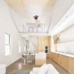
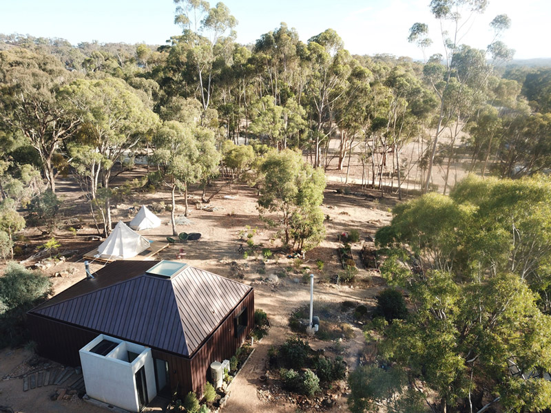
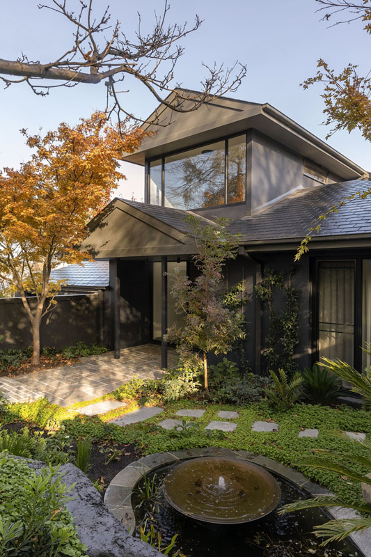
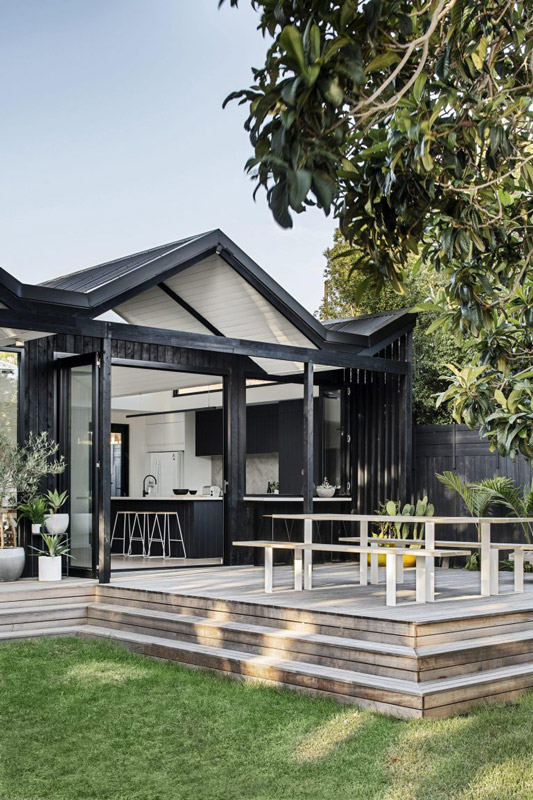
Adam Kane Architects designed Yandoit Cabin as an eco-home for an artist to live and work within the surrounding gumtrees. Situated in north-west of Melbourne, the house is tucked into the bushland and carefully composed of a series of grids. Yandoit Cabin locks these together with low-maintenance materials to create a form that works with the surrounding environment. Crucial to the build were self-sustainable factors allowing for off-grid living and minimal impact on the site.
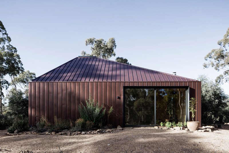
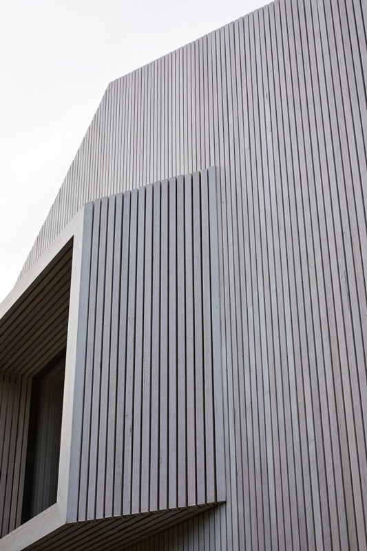
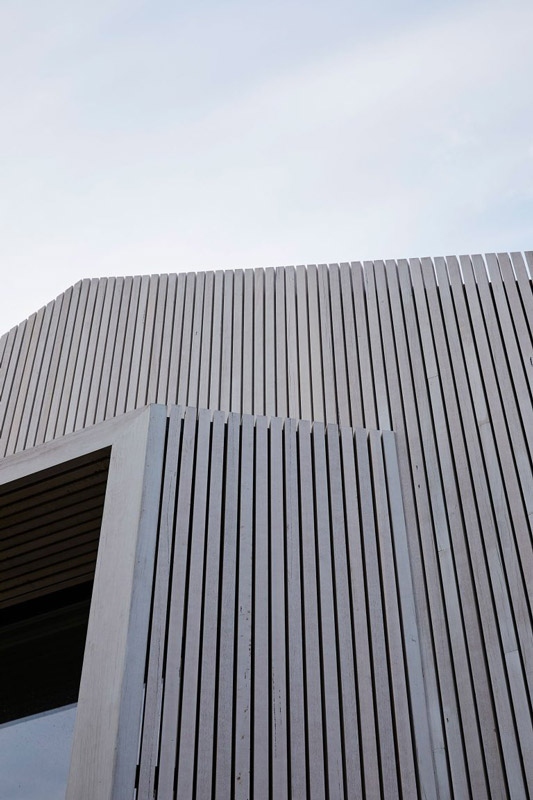
The materiality of the external cladding is accentuated by the simplicity of the form, while the burnt umber tones of the building complement the natural palette of the surrounding bush. The metal cladding reflects and absorbs the light and patterns of the sky, enhancing the aesthetics of the cabin. The result is a building in constant flux – with revolving reflections of the transition from day to night, the home becomes a piece of sculpture accentuating its environment.
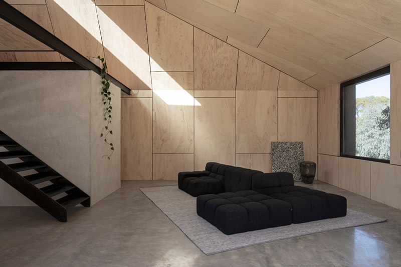
The sculptural qualities continue with the asymmetrical shape, that sees the cabin sit sympathetically yet confidently within the gum trees. The south side of the building is dominated by a block of concrete that begins to format the space, with the block visually grounding the house and giving strength to the metal façade. Functionally, this concrete mass acts as the entrance to the house, and creates a separate area concealing the bathroom and private courtyard.
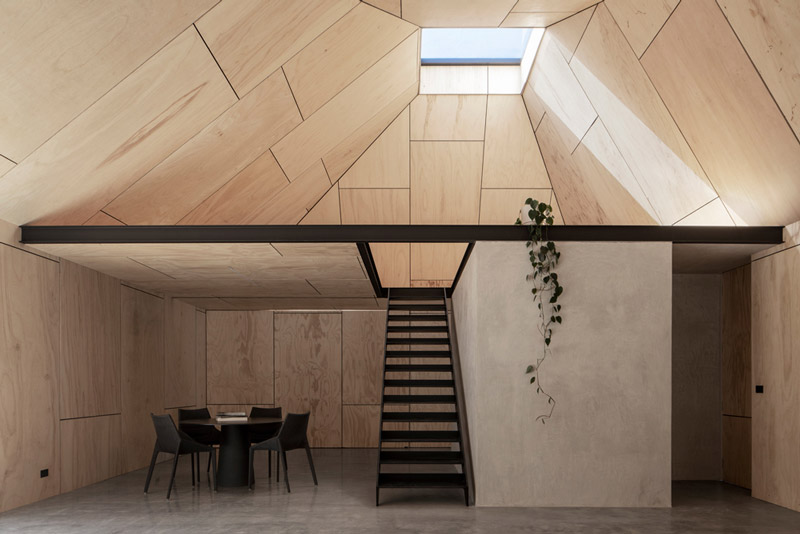
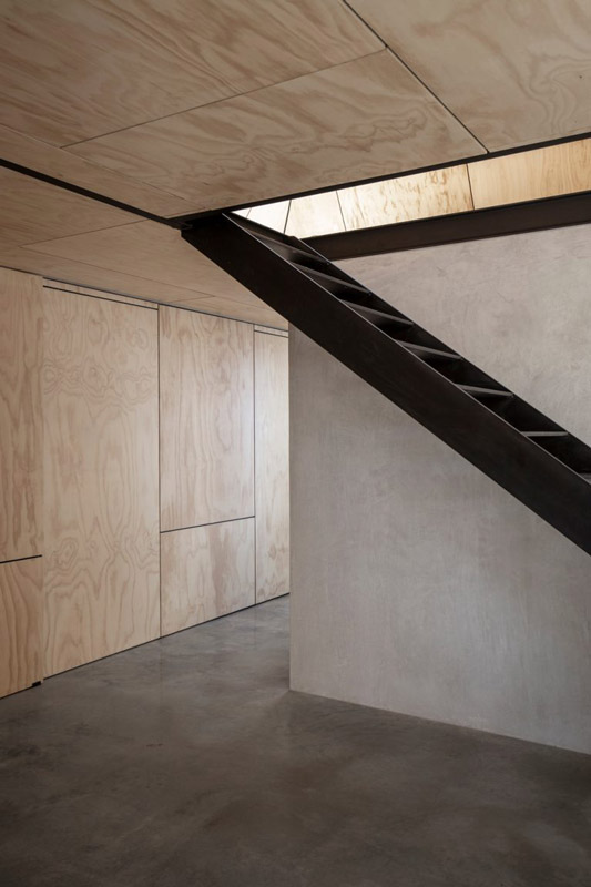
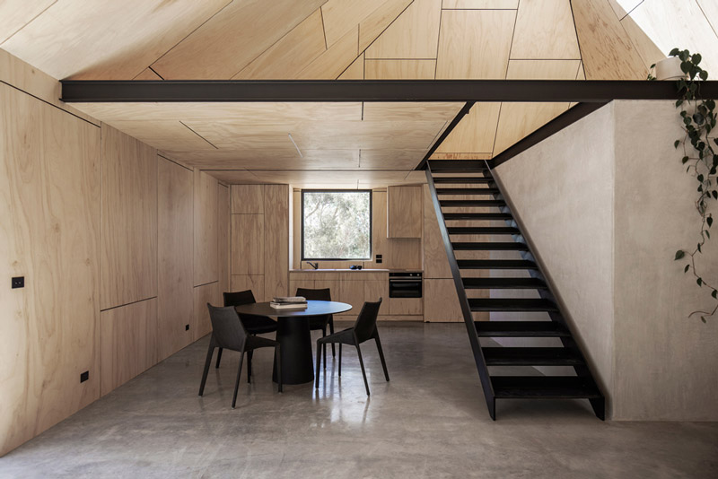
In the living area, the grids of white-washed plywood can be opened to reveal the kitchen, laundry, and storage. The clever use of timber concealment ensures the space is clutter-free, creating a peaceful environment allowing the artist to reflect on the environment just outside. The minimal interventions are highlighted by concrete walls, floors, and sharp black steel accents.
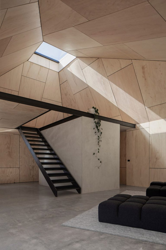
While the project is to an extent closed off from the external landscape, with only a select few openings, it is strongly connected with nature. A skylight dominates the centre of the internal irregular forms, as the angles of the ceiling converge towards light that rushes inwards.
A bedroom in the mezzanine sits below the asymmetrical roofline, accentuating the height of the interior living space. Contrasted with the sense of enclosure and protection, the beam of sun from the skylight becomes an intense beacon providing connection with the outside world, while the strategically positioned windows frame views of the bush outside.
The orientation of the cabin ensures passive solar heating and cross ventilation are maximised, taking advantage of sunlight for heat and lighting. The use of concrete floors and walls generates thermal mass, meaning only a wood-burning fireplace is needed to heat the home. With the design ensuring the home functions sustainably off-grid, durable minimalist materials prevent the demand of constant upkeep in the wild weather conditions.
Minimal of impact yet remarkable in effect, the Yandoit Cabin is a sculptural reminder of the beauty of the natural world and to need to preserve it.
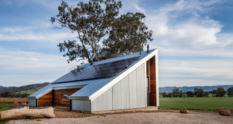
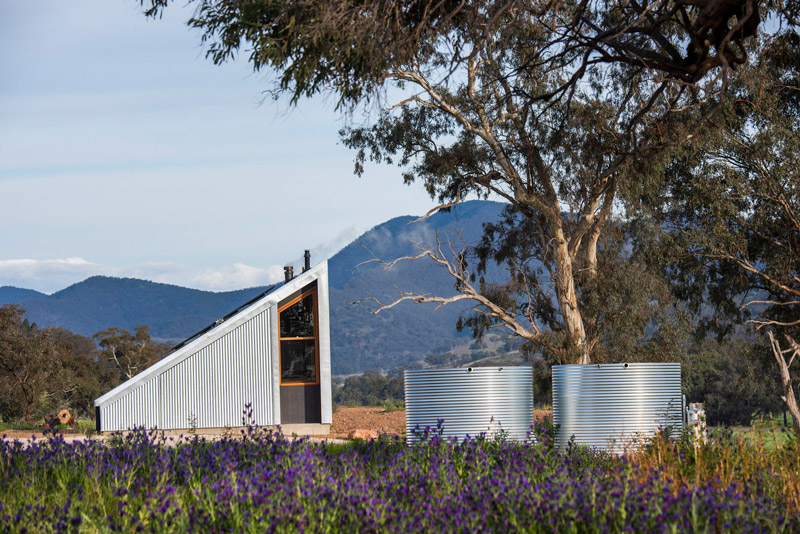
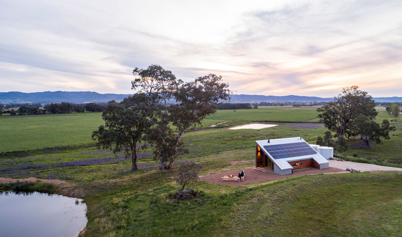
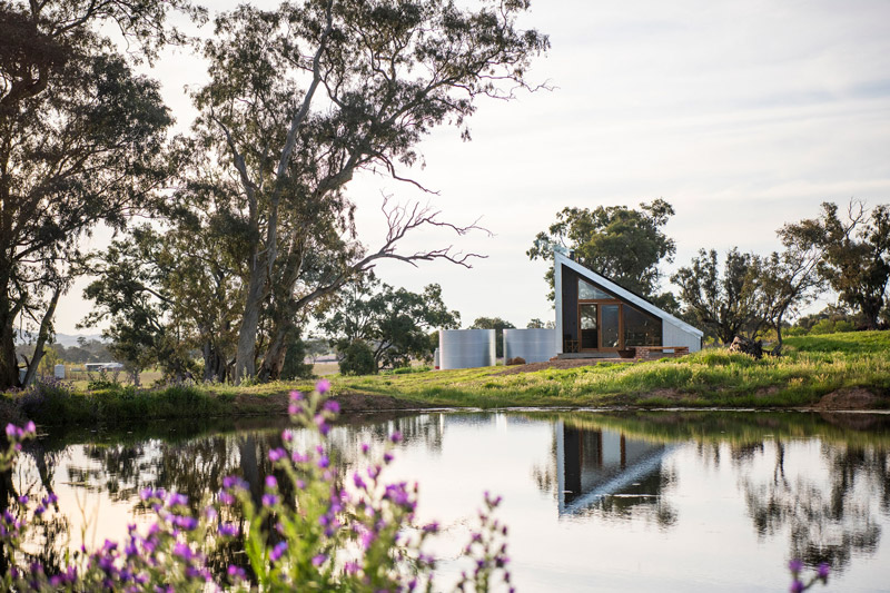
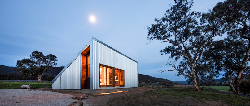
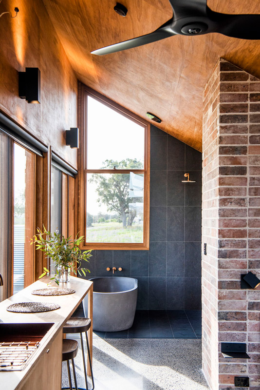
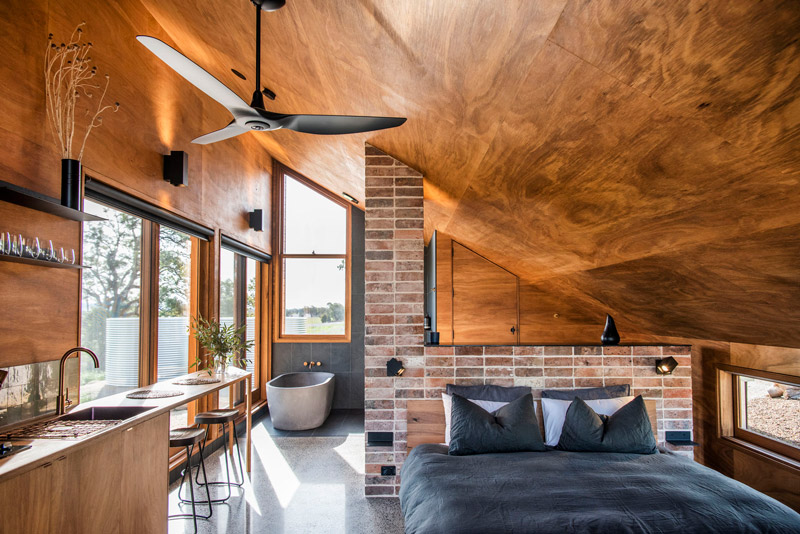
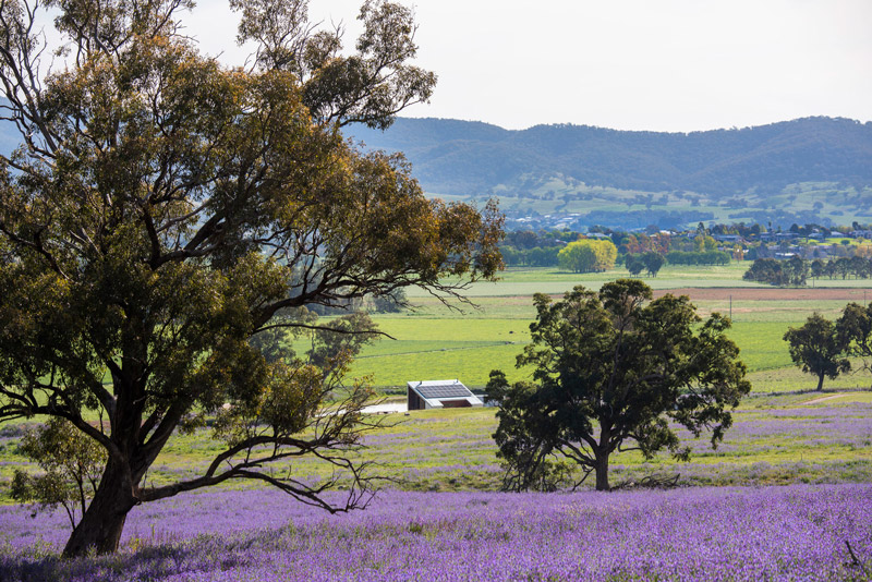
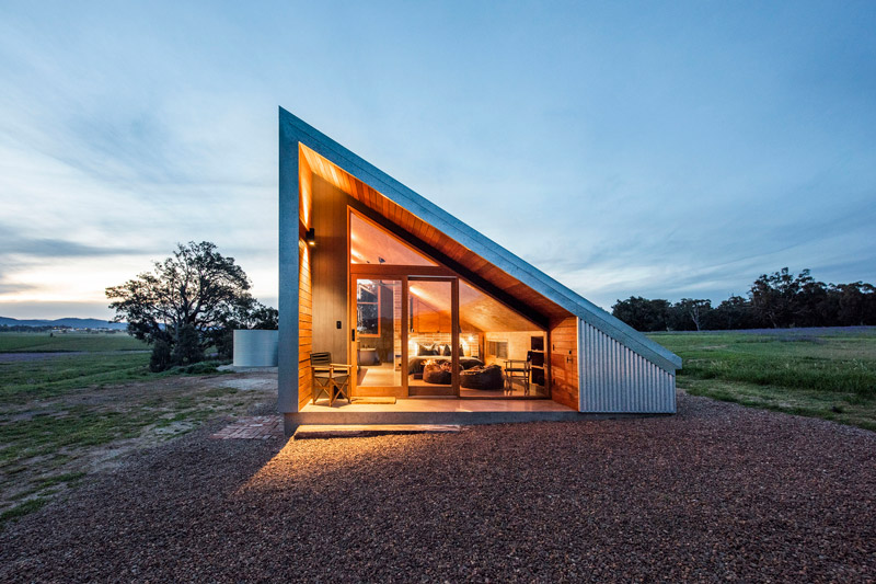
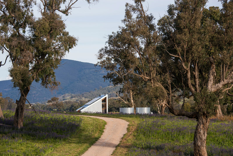
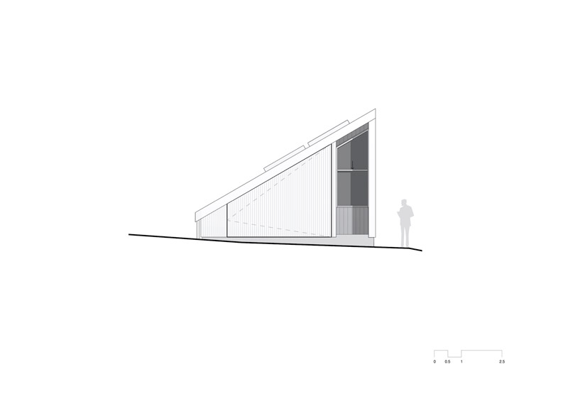
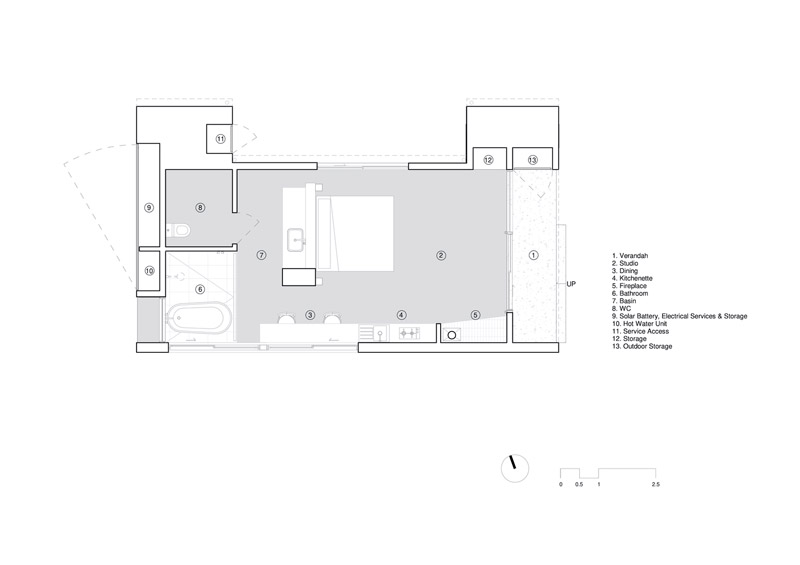
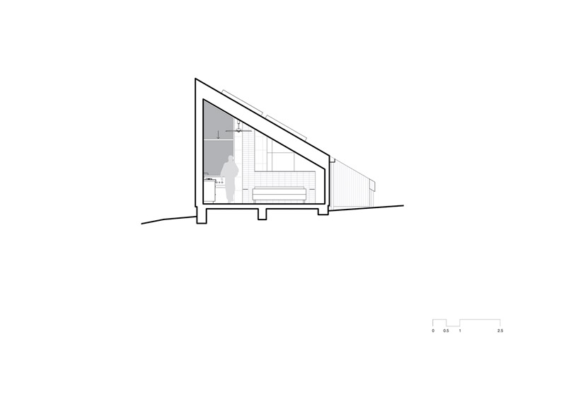
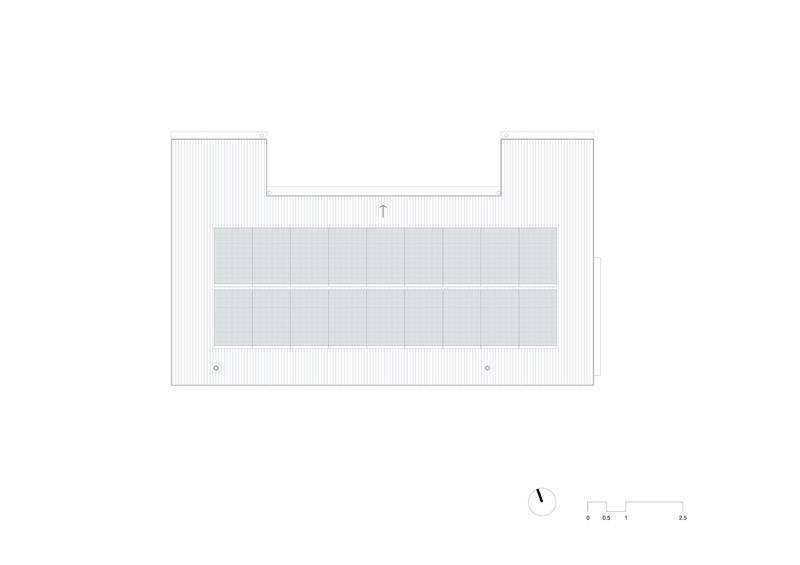
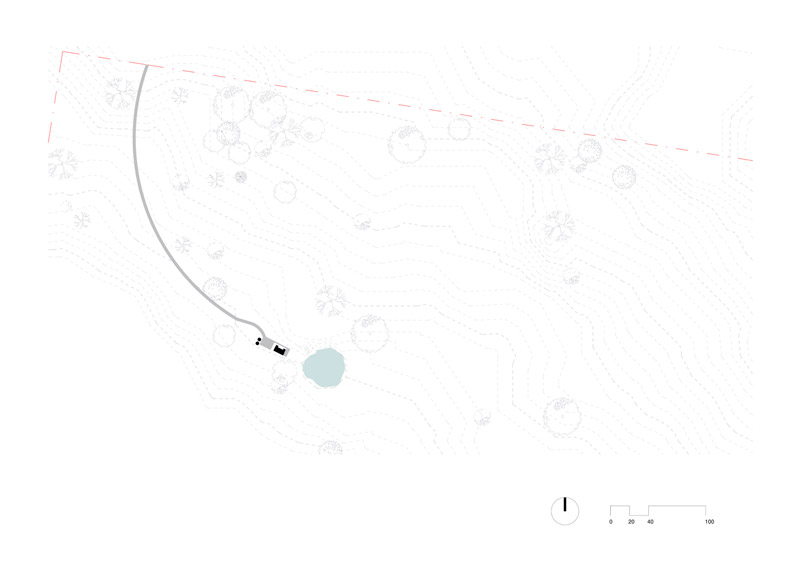
Text description provided by Cameron Anderson architects. CAARCH was engaged by the client to design a small boutique accommodation offering on a rural property close to the town of Mudgee. Gawthorne’s Hut was born in the midst of the NSW Drought to assist the landowner to develop a diversified income for the property that was until now 100% reliant on a traditional cattle breeding and grazing model. The project’s intent was to create a unique and sustainable tourism experience that responds directly to the history and context of the property.
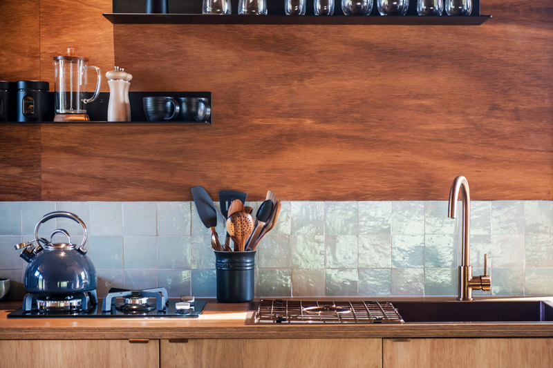
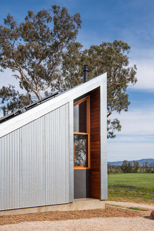
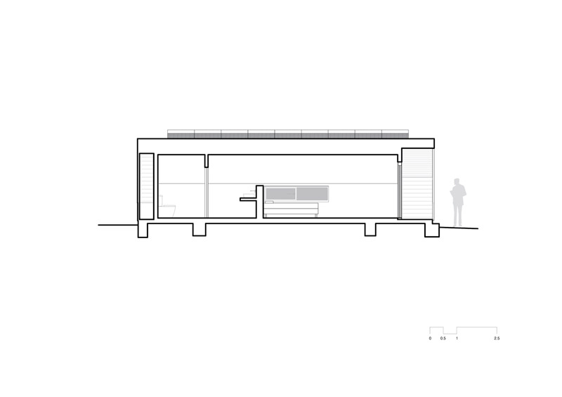
The angled galvanized clad shell and rich timber-lined interior reference the predominant rural vernacular of hay sheds and outbuildings and in particular the existing hay shed that was destroyed by a storm in 2017. The angled roof form of galvanized steel is both a reference to the relic of the existing shed and also the client’s desire to accommodate the solar array on the building. The angled form is emphasized internally through a blackbutt lined ceiling which also frames the valley views to the East.
The recycled bricks have been meticulously repurposed from the only surviving part of the original cottage on the property, the fireplace. The recycled brick wall within the space is a tongue-in-cheek reference to the existing chimney while also allowing services to come down from the ceiling and provide a degree of separation to the bathroom.
The stack bond coursing emphasizes the fact that the bricks are no longer load-bearing. The overall material palette is warm & inviting, with natural black-butt timber used extensively inside & outside. Gawthorne’s Hut is named after the historical owner of the property Benjamin Gawthorne, the recycled bricks coming from the remains of his original cottage.
The property demonstrates to guests the opportunities of building smaller footprints and incorporating sustainable design elements. Incorporated in this project is an off-grid solar system and battery storage, 40,000 Litres of rainwater storage, Double glazed blackbutt windows and doors, thermal mass via a polished concrete slab, gas hot water, efficient bathroom fixtures, and passive solar shading via the Western buffer created by the services enclosure.
Stage 2 will see the addition of shading to western and southern glazing however the client is looking to assess the thermal performance over 12 months first before completing the works. Critical to the project is the concealment of the services so as to not detract from the picturesque rural setting and visitor experience. Great effort has been taken to conceal services out of sight with large galvanized clad door to the Western façade opening to reveal storage.
At only 40sqm in area, the minimal footprint of Gawthorne’s Hut was designed to make the most of the open-plan interiors & bring the landscape in. The orientation maximizes the views to the East & South. Openings have been orchestrated to prioritize certain views of the Mudgee Valley, such as that from the bath & the narrow window allowing a view from the bed.
Gawthorne’s Hut has taught us that sometimes the smallest interventions have the ability to make the biggest difference.
Gawthorne’s Hut Project Details
Architects: Cameron Anderson Architects
Area: 62 m²
Year: 2020
Photographs: Amber Creative
Manufacturers: Big River Group, Boral, Lysaght, Black Lab Solar, Stoddart
Builder: Callander Constructions
structural Engineer: Barnson PL
written by : Hana Abdel 9 Jan 2022 published in : archdailmy.co
Hawthorn House by Rosstang Architects and Fiona Jack Interiors
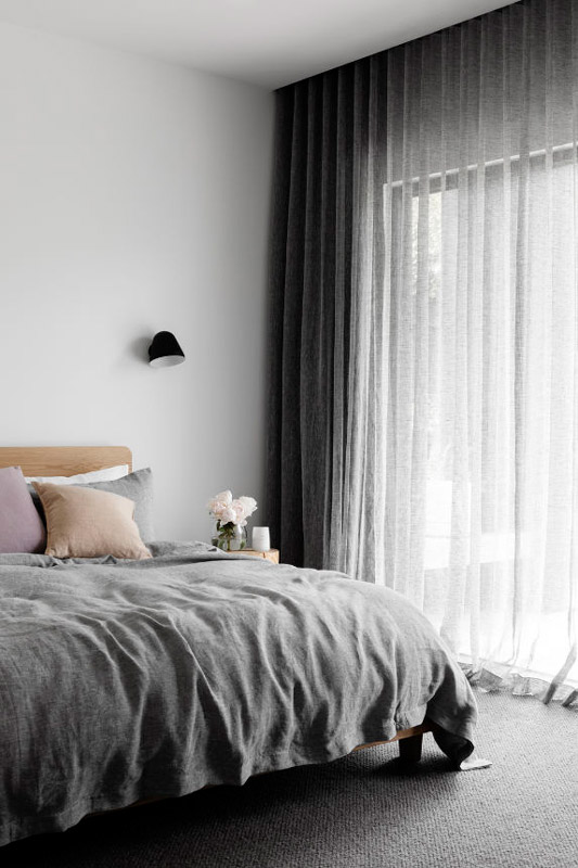
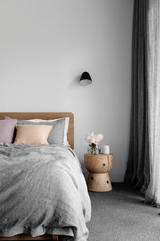
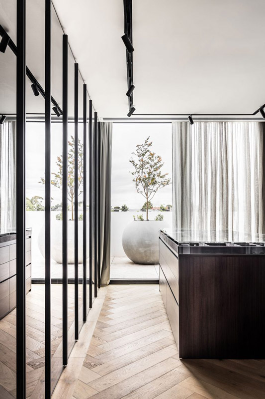
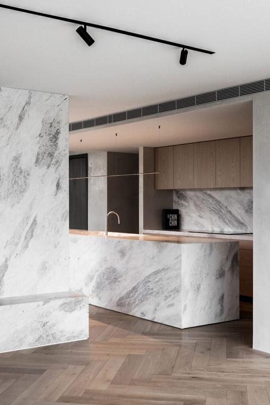
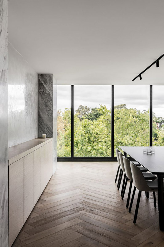
Located in the inner east of Melbourne, Hawthorn House sees the reimagining of an existing family home, opening up to its newly crafted rear garden and layering in integral connections internally to reflect its owners. As is much the case with homes over time, the existing bones needed refreshing and being brought into a contemporary relevance, while still retaining elements of the original. Hawthorn House differs from most, however, in that its front face to the street has less of a presence, concealing the main structure of the home behind a high wall. Its unique frontage instead offers a sense of discovery and incites curiosity as to what awaits beyond, and a directive journey unfolds as one enters into the home. Combining forces, Rosstang Architects and Fiona Jack Interiors apply a layered approach, integrated the old in with the new.
On its treelined street, there is an air of mystery behind Hawthorn House as it sits concealed and set back from its neighbours by comparison. Upon approach, a garden is set at the front of the site, buffering the transition between public and private, while also creating a focused and secluded place of respite. Built by Henry Netherway Builders, the home is instilled with a sense of calm and restfulness, both from its initial moments and then carried through into the remainder and rear elements. Engaged to add a new life and vitality to areas that felt tired and worn, the team was tasked with what was referred to as ‘sparking joy’, seeking to elevate the home to reach its unfulfilled potential.
A similar sensibility is carried through into the interior, with concealed and revealing elements tucked into various spaces throughout. Doors throughout are also obscured, both creating separate zones and adding a similar feeling of surprise and discovery internally. A combination of low and high ceilings then creates moments of compression and release, emphasising a closeness and sense of intimacy while also encouraging a togetherness through openness. Warm and textural finishes are combined with smoother and more polished ones, creating a balance and continuing a diversity at the same time. Unexpected in its reveal and approach, Hawthorn House is a carefully composed sum of parts. Rosstang Architects and Fiona Jack Interiors work together to allow the home unfolds as a series of parts in a meaningful journey through space.
HAWTHORN, VIC, AUSTRALIA PHOTOGRAPHY: Hilary Bradford ARCHITECTURE: Rosstang Architects INTERIOR DESIGN: Fiona Jack Interiors BUILD: Henry Netherway Builders WORDS: Bronwyn Marshall LANDSCAPE: Kate Seddon Landscape Design
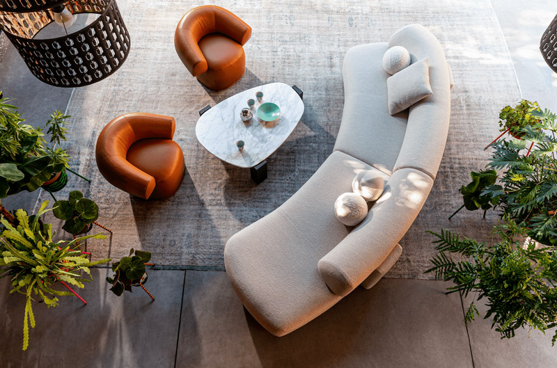
Shaped by Passion – Moroso Exclusively Available at Mobilia in Melbourne
Forming an exclusive national partnership shaped by a shared love of design, Australian company Mobilia has teamed up with Italian furniture brand Moroso. Delivering considered and authentic pieces, the collaboration coincides with the opening of Mobilia’s flagship showroom in Melbourne in 2022.
Based on like-minded principles, Mobilia and Moroso have combined to form an exclusive partnership, championing creativity and purposeful interior insertions. “We admire Moroso as a progressive, family-run company with a passion for art, design and supporting both established and emerging designers,” explains Mobilia Founder Salvatore Fazzari. “Moroso is known for its ground-breaking collaborations, a number of which have helped to launch the careers of some of the most respected designers today.”
Founded in 1952, Moroso continues to pioneer within the design industry, solidified by the company’s artisanal approach to collaboration, manufacturing and creativity. Moroso Art Director Patrizia Moroso notes how the international brand is looking forward to working with Mobilia.
“In a way, we consider this a new beginning as well,” she says. “Our collaboration with Mobilia started in Perth six years ago, so we are looking forward to creating a tighter partnership and synergy that spans across Australia.”
Consciously creating high-end pieces, the partnership between Moroso and Mobilia feels natural for the two companies, bringing international design to an Australian audience. “We are, of course, eagerly awaiting the new showroom in Melbourne and the next steps we will take together,” Patrizia adds.
The new Melbourne showroom on Church Street will feature classic Moroso pieces alongside some of new releases yet to be shown within Australia.
The Newest Moroso Collection at Mobilia
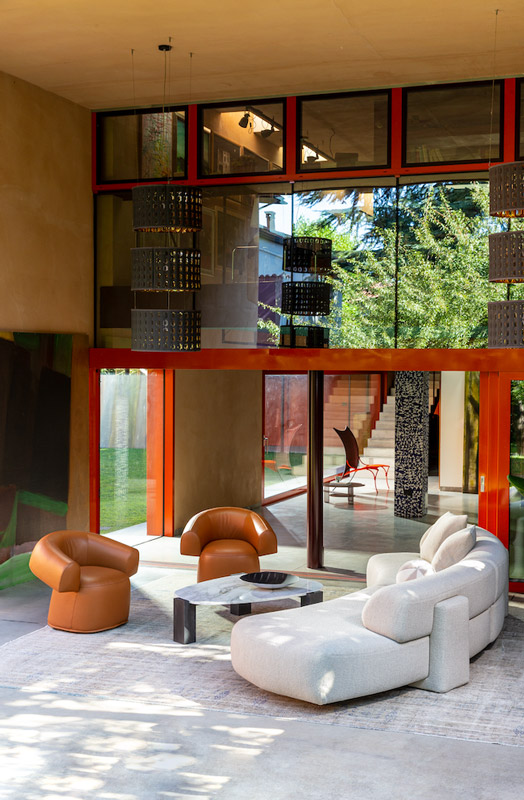
Salon Nanà by architect Annabel Karim Kassar is the newest Moroso collection to be featured at Mobilia.
Sofas with generous silhouettes, square coffee tables and adorned side tables make up the curated selection, which is inspired by the late 19th century, as well as the Mezze piece – “a low traditional mattress used in Oriental houses, in living rooms and majlis types of seating,” Patrizia explains.
“Salon Nanà is a way of fuelling our desire for experimentation and our impulse to blend styles and atmospheres,” she says. “The collection features a flexible modular seating system that can adapt to various situations, two different collections of side tables, all of which are inspired by Moroccan tradition.
” The collection explores different styles in a contemporary and refined manner, connecting worlds in a way that feels organic.
Another featured Moroso collection is Pacific by Patricia Urquiola; designed to feel like a cocoon, the focus is placed on bold patterns, shapely curves and soft upholstery.
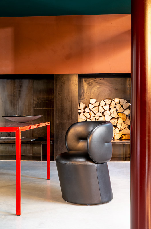
Moroso has also announced More-So – a new internal aspect of the company that is dedicated to innovation and design experimentation, “an intermediate space between prototyping and industrial production,” Patrizia explains, “which includes the development of one-of-a-kind or limited-edition furnishings and objects dedicated to an audience of design enthusiasts.”
The idea behind More-So is to enjoy exploration, to push boundaries and revel in the possibilities of design, underpinned by a desire to improve efficiency and increase sustainability in production. “It is a bold step,” says Patrizia, “and one that introduces a curatorial framework that is open to dialogue and exchange with cultural sectors like architecture, philosophy and technology.”
Having worked with some of the world’s most reputable brands, Mobilia recognises Moroso’s ability to create objects that blur the lines between design, fashion and art.
“The diversity, innovation and quality of Moroso’s collections is why we feel the brand is so well-received in Australia and we are very much looking forward to representing the company at a national level,” Salvatore says. Moroso will be available exclusively in Australia through Mobilia from January 2022.
Moroso Exclusively Available at Mobilia in Melbourne
Forming an exclusive national partnership shaped by a shared love of design, Australian company Mobilia has teamed up with Italian furniture brand Moroso. Delivering considered and authentic pieces, the collaboration coincides with the opening of Mobilia’s flagship showroom in Melbourne in 2022.
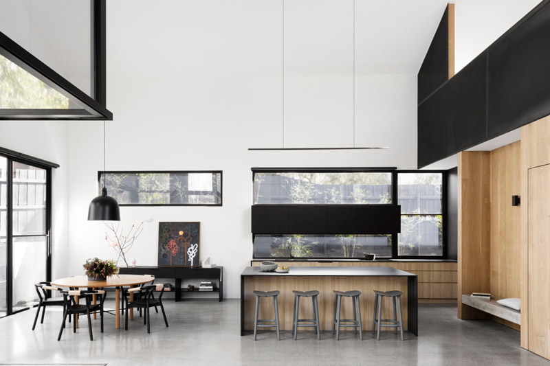
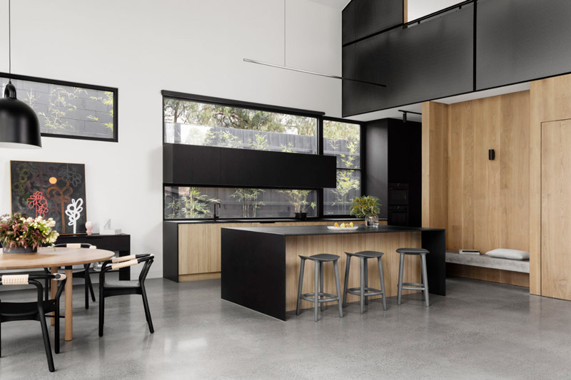
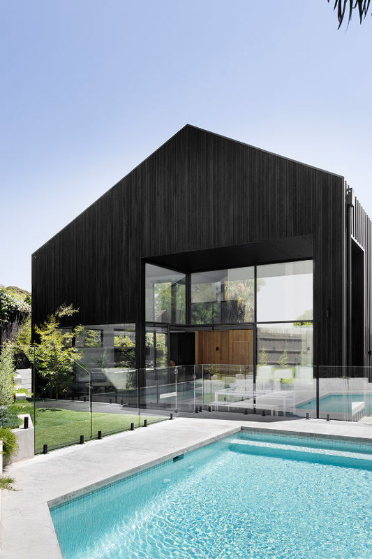
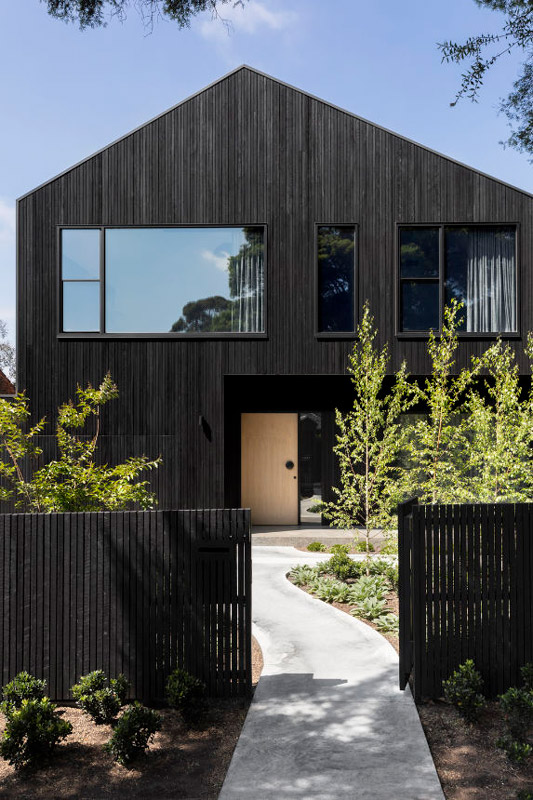
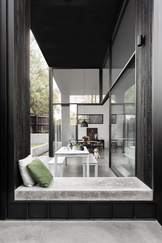
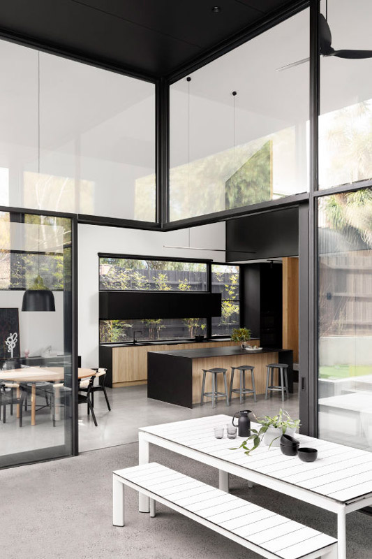
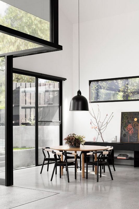
The building and interior design for Urban Barn was carefully conceived to contrast the typical residential typology within its suburban context. Situated in Melbourne’s leafy suburb of Camberwell, the Urban Barn brings bold materiality and form to the streetscape.
The client brief included an understanding that traditional design parameters should not constrain the creative process, as a young vibrant family they wanted a striking, edgy home that reflected their lifestyles and personalities.
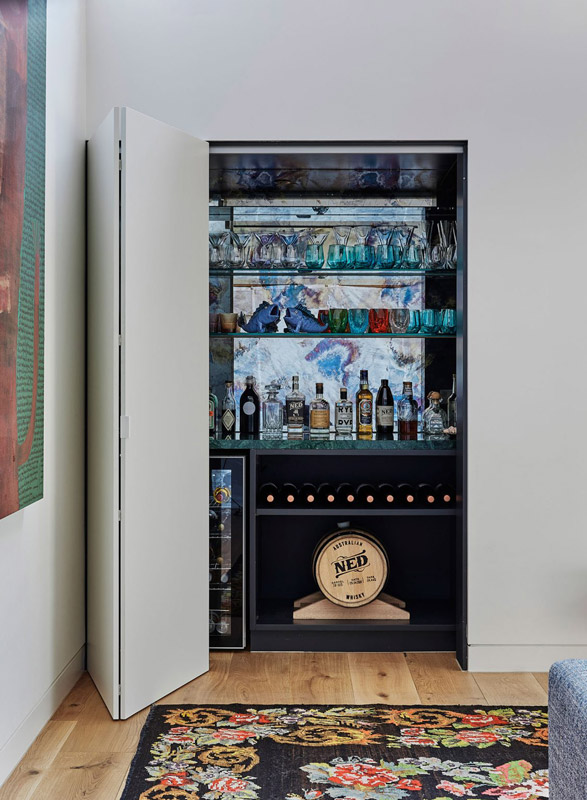
Following on from the establishment of the barn like exterior, the interior configuration was designed around a central box structure which conceals many functional details including the staircase, pantry, bar and a powder room with a nine meter high glass ceiling.
Moody interior passageways invoke curiosity and intrigue before opening up to awe inspiring volume and natural light.
Design of the Urban Barn was not limited by precedence or conventional parameters, this opportunity to think outside the square allowed us to create an unexpectedly beautiful and highly functional building.
The building and interior design for Urban Barn was carefully conceived to contrast the typical residential typology within its suburban context. Situated in Melbourne’s leafy suburb of Camberwell, the Urban Barn brings bold materiality and form to the streetscape.
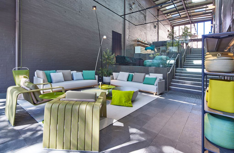
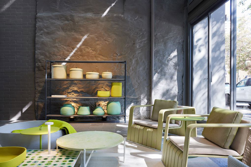
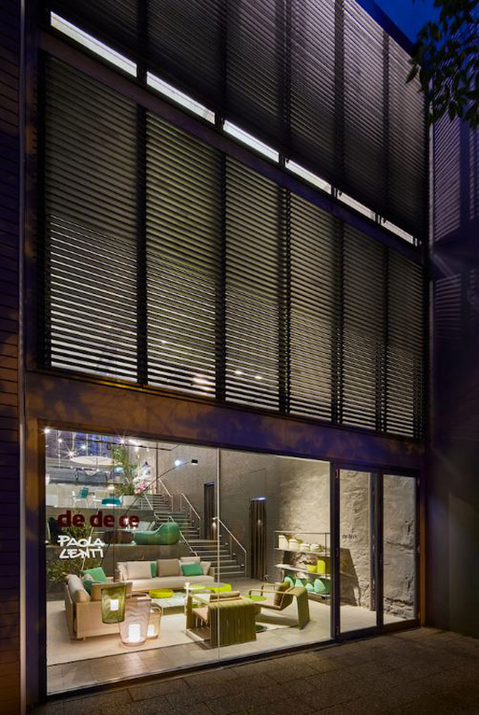
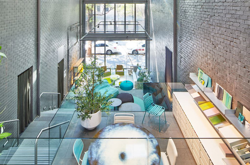
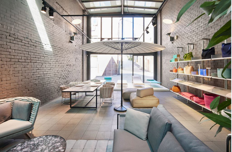
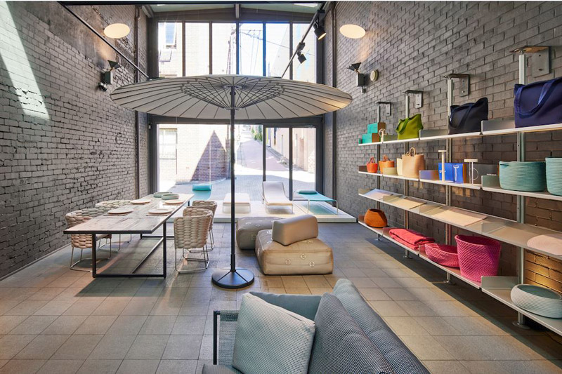
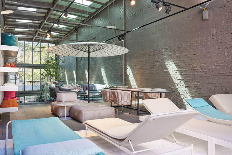
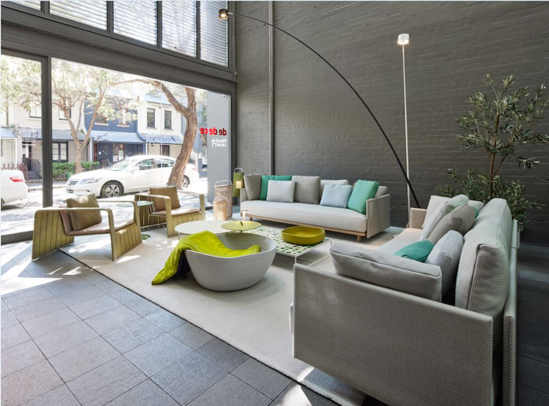
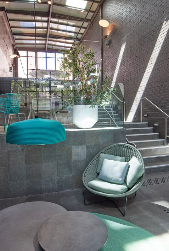
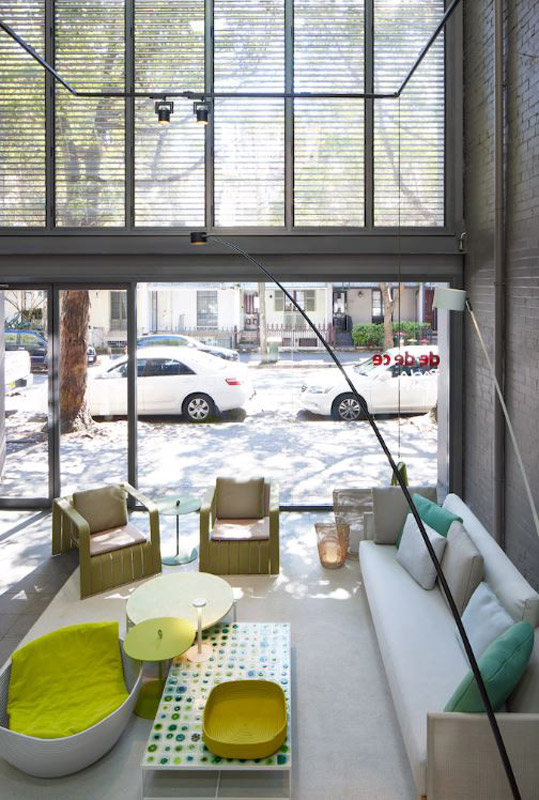
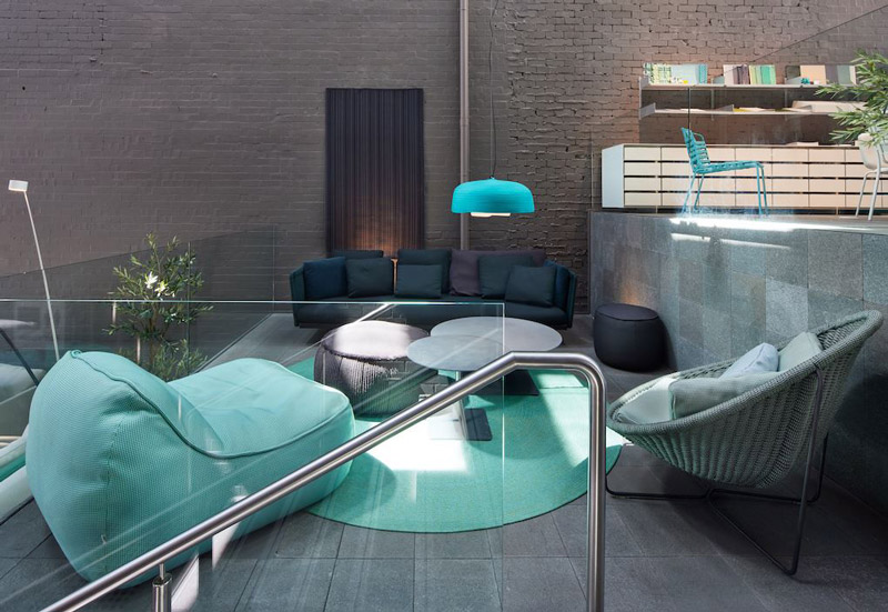
dedece has opened the newly dedicated Paola Lenti Showroom in Sydney. Exclusively housing Paola Lenti’s outdoor and accessory collections, the showroom features a refreshing layout, coupled with a visually dynamic charm that radiates from each piece. “We are so excited to be able to welcome visitors into our new Paola Lenti Showroom,” says John Engelen, dedece Founder. “We are maintaining the highest levels of hygiene and covid safe protocols, our staff are all fully vaccinated with social distancing and mask wearing expected.” The showroom – which is situated only minutes away from Sydney’s beaches – is divided across four split levels that climb up through the site.
The open-air atrium features large windows and painted brick walls; the space invites patrons to wander through the curated selection of Paola Lenti pieces. Pops of colour speak to a vibrant palette whilst the latest furniture and accessory pieces are presented for the upcoming summer months. Immersed within the space, the collections embody the effervescent essence of Paola Lenti. Bold use of colour and a light-filled, open-air interior allows the space to welcome passers-by within.
Continuing to provide the world’s most iconic furniture brands to the Australian design and architecture market, dedece continues to curate authentic and exceptionally crafted pieces, including lighting, furniture and accessories. The Paola Lenti Showroom in sydney is a natural step for dedece, celebrating quality and durable design.
A play on the traditional roofline silhouette, Pleated House sees a contemporary expression of materiality and form combine to create a sense of the familiar. Christopher Megowan of Megowan Architectural speaks to their process.
Infusing a sense of the familiar, Pleated House is a direct expression of its form and function combined. A play on the traditional residential typology, the roofline is expressed rather than concealed. The internal vaulted ceilings then fully encase this void to create a feeling of vastness, and to maximise the internal experience.
Built by Kieron Christ for a well-travelled plumber and design-conscious couple, the play on form was inevitable. Christopher Megowan speaks to their approach to the extension to the existing one-storey dwelling, and the references to its context.
He says, “it’s an homage to the folded roof forms familiar to mid-century modernism (Donald Wexler, Barry Berkus and Pierre Koenig) and the iconic bathing boxes which dot Port Phillip Bay.”
Key Pleated House Project Features
which comprises the pleat, is formed by a process of applying heat, which allows for the material to become malleable. These folds and peaks allow for windows and additional glazing to be added throughout.
Christopher says, “the six different shaped clerestory windows were a key strategy to addressing the day lighting issues inherent in a south-facing rear yard.” By creating increased opportunities for surface area to carve into, the allowable amount of controlled natural light increased also.
The trough part of the pleat was also essential, and Christopher adds, “the central valley of the roof form was centered on the existing entry to the home, thus framing a view to the family (and dog) sized rear yard.”
As a nod to the existing weatherboard features of the home, the decision to use a ship-lapped cypress timber was deliberate. The charring, which as Christopher says, “was done by one of the clients in the backyard during the construction,” allows for a delineation between the existing and the new elements of the build.
Christopher adds, “the charred time was chosen to relate but contrast to the existing where the cladding was brought into the veranda structure and garage extension to create a link yet still differentiate between old and new.”
There is a sense of modesty and familiarity in the materiality and its application, which adds to the inherent character.
as Christopher says, “barely visible from the street,” the extension was envisioned as a light-filled open plan space, where functionality could be altered as needed. He adds, “the grooved ceilings and kitchen joinery create a link between the interior and the external cladding, where the ribs in the ceiling highlight the folding roof forms overhead.”
A combination of charred cypress and silvertop ash allow for a neutral palette that connects the existing to the extension. The interconnection of patina and aging of materiality was also key to the direction of materiality for the exterior.
While the cypress was aged and distressed manually, the silvertop was selected to, as Christopher says, “allow to great to a neutral silver” over time.
Pleated House is essentially a play on contrasts, but with subtle connections through materiality, old and new and geometries. With a relatively loose brief, and a willing client, Megowan Architectural was able to experiment with form and materiality.
As a studio, Christopher describes them as being “not married to any one particular style or language”, which then, “allows us to respond to client’s briefs and adapt our aesthetic to fit context.” Being flexible themselves has allowed for this play on form, as an expression and commentary on a familiar residential silhouette and reflect a sense of imbued personality.
HIGHETT, VIC, AUSTRALIA PHOTOGRAPHY: TOM BLACHFORD WORDS: BRONWYN MARHSALL
Gallery of Pleated House Project by Megowan Architectural
A play on the traditional roofline silhouette, Pleated House sees a contemporary expression of materiality and form combine to create a sense of the familiar. Christopher Megowan of Megowan Architectural speaks to their process.
Drawing inspiration from the adjacent curated landscape, Alexandra Penthouse is a project that combines generous volumes and plays on spatial unexpectedness to create a home of lofted proportions. Dita Studio utilises controlled restraint and an emphasis on quality and nuanced texture in imagining the resulting enviable abode.
Crowning the upper floors of the development it sits above, Alexandra Penthouse is located in Melbourne’s inner east, in Kew. Matching adjacent properties in grandeur and through a similar sense of scale, the resulting proportions of this penthouse offer a matching assortment of spatial interrelationships.
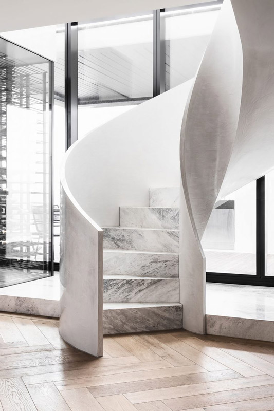
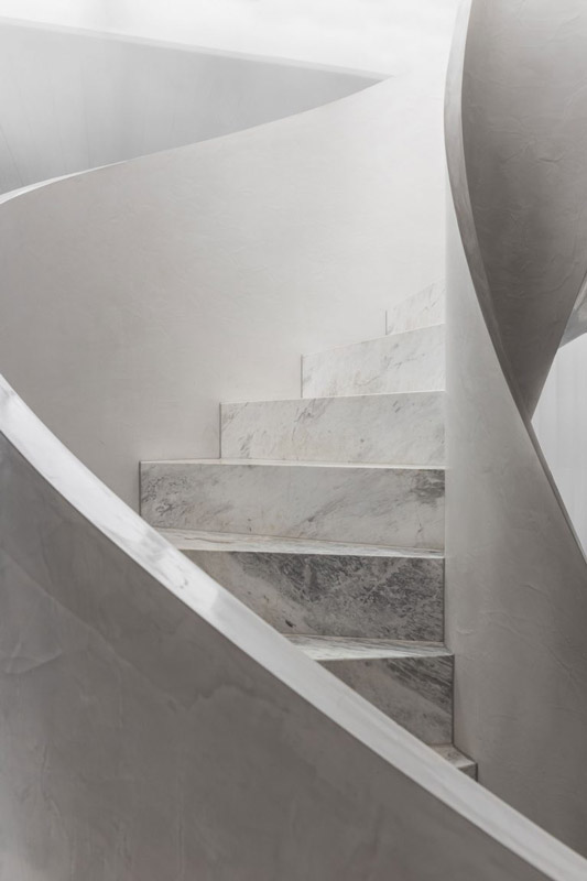
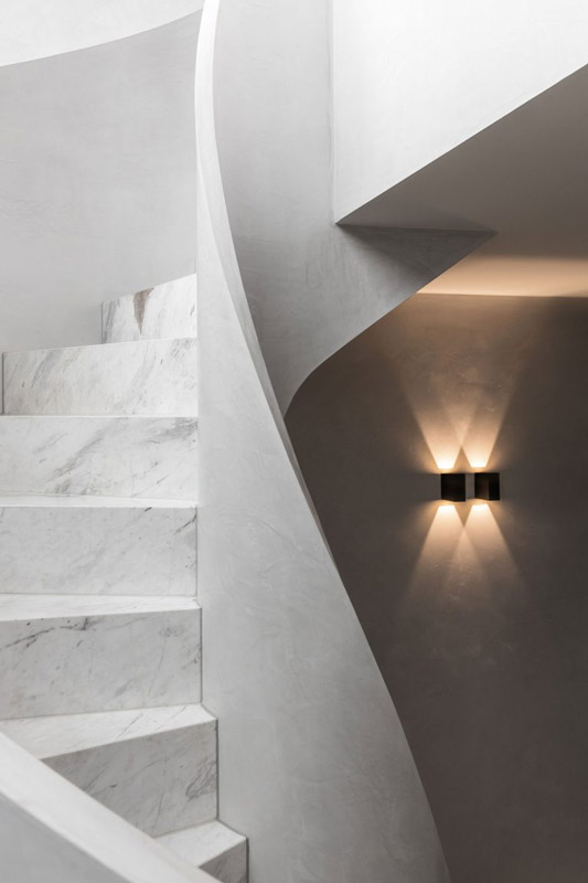
Greeted upon entry is a sweeping stone and plaster clad helical stair that directs the eye upward. The feature element is an invitation to explore the multiple levels as well as emphasising the volumes and their height.
As a response to the surrounding landscape by Jack Merlo Landscape Design, an open and connected approach internally is defined by curated and formal lines and a deliberately restrained palette. Dita Studio appoints an elevated and detailed approach to meet the equally lofted lived experience of this impressive abode.
Built by owner and developer Franze Developments, Alexandra Penthouse is conceived together with structural engineering by Brogue Consulting Engineers.
Emphasised by large spanning openings and connected vistas between internal and external views, the free-flowing nature of the resulting floor plan offers a natural fluidity. Contrasted against the very linear approach, circulation is expressed more in sweeping motions, highlighted most predominantly by the vertically connecting stair feature at the entry, acting as both a notional sculpture and an animated element to engage with.
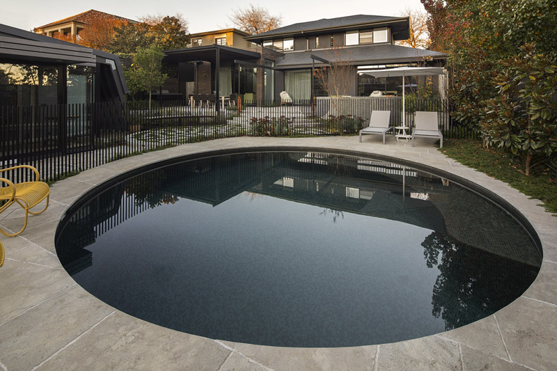
Only connecting to its outdoor space, full-height steel doors open to the southern courtyard, private pool and garden spaces.
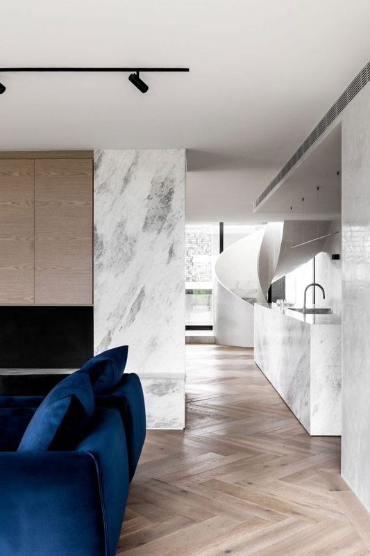
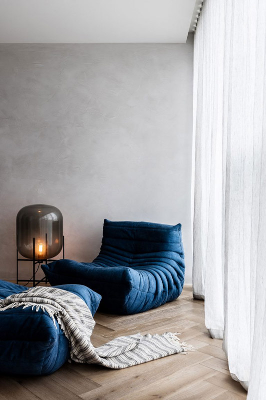
A sense of clarity and precision connects the select and restrained materiality, where a minimal palette is given depth through veined stone and timber elements. Combined with textured plaster white walls, the restricted palette reflects the intended simplicity for the interior, connecting and opening to the outside.
As is the movement internally, the thresholds between in and out are designed in a way that enables the penthouse outer edges to open to the surrounding landscape and curated elements, extending the footprint of the home.
Nuanced accents of rich navy blue are integrated throughout, layering in texture and to break the otherwise monochromatic palette.
Through its boldly minimal approach, the resulting spaces of Alexandra Penthouse project offer its residents an endlessly illuminated home that truly embraces its outpost. Dita Studio has optimised the enviable siting and access to the elements, creating a beautifully textured home, openly welcoming an interplay with light and shadow.
Gallery of Alexandra Penthouse project by Dita Studio
Drawing inspiration from the adjacent curated landscape, Alexandra Penthouse combines generous volumes and plays on spatial unexpectedness to create a home of lofted proportions. Dita Studio utilises controlled restraint and an emphasis on quality and nuanced texture in imagining the resulting enviable abode.
St Kilda West by Lucy Clemenger Architects and Studio Stamp
As a collaborative effort, owner and interior designer Sophie of Studio Stamp worked closely with Lucy Clemenger Architects to carefully bring the old and new together, refreshing the previous and ensuring the new retained a shared warmth and soul. Both a renovation and extension effort, St Kilda West aims to connect across time and ensure the existing character is brought forward, while the expression of openness is felt throughout the home. Needing to accommodate social gatherings and entertaining, ensuring the rear connected living zone could naturally flow out onto the landscaped deck and yard was an important decider for how the home functioned.
The resulting series of spaces aim to create a continuum of expression throughout the home, capturing the personalities of its custodians and allowing for personalisation over time.
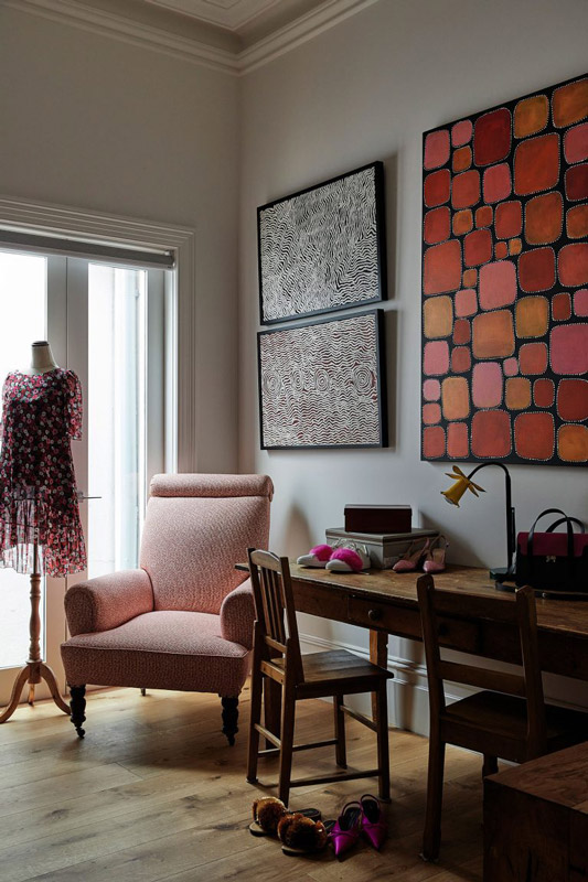
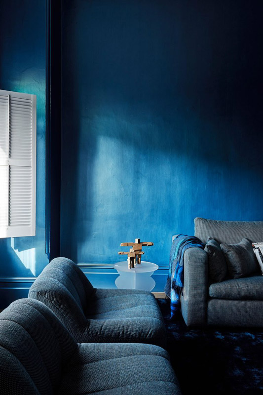
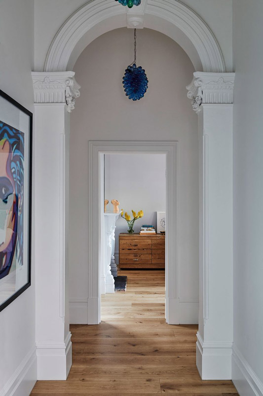
Built by Morcon Developments, St Kilda West sits with direct access to Jacoby Reserve, and optimising this connection formed an integral part of the brief. Originally built in the 1890s, the Federation-era home needed to be retained, celebrating its features while also elevating it to feel connected and as an extension of the proposed addition. Through the infusion of colour, curated lighting, artwork and furniture, the two eras of the home feel equally expressive and connected. Marking the transition between the two, a concealed stair and power room sit at the threshold, while the master suite is quietly tucked away on the upper level.
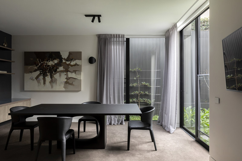
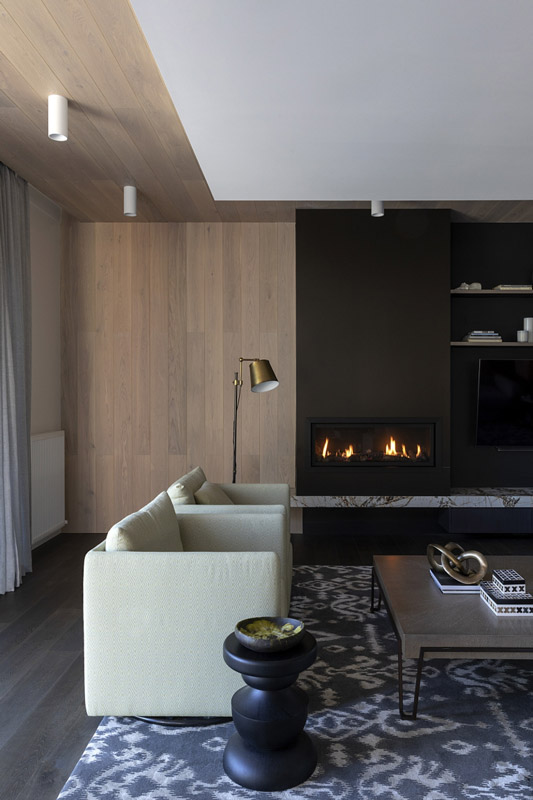
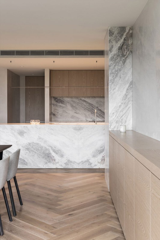
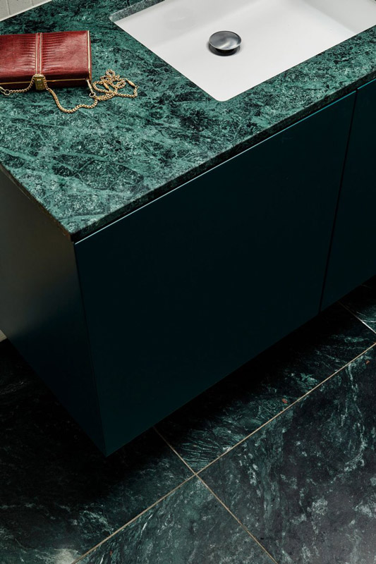
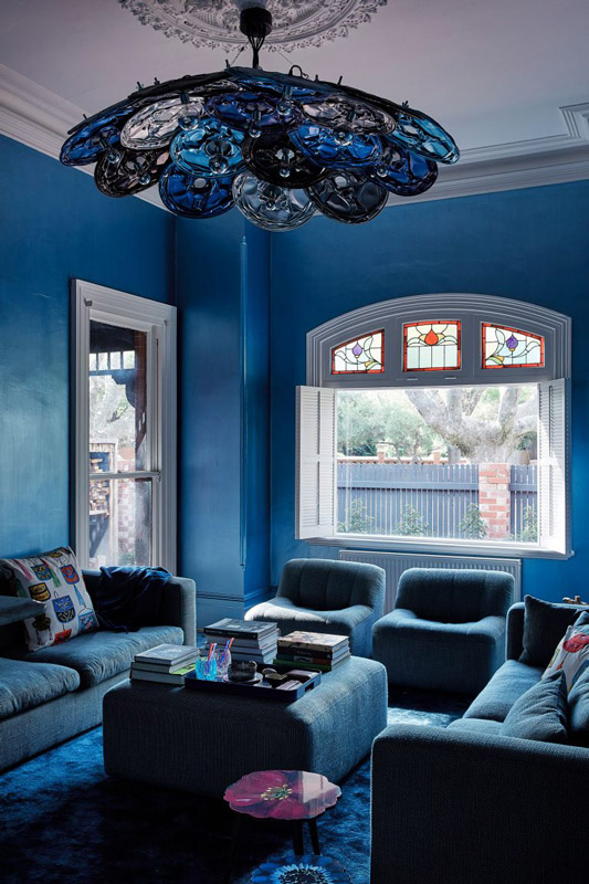
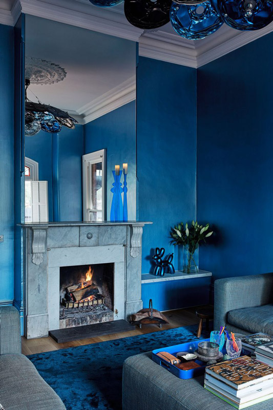
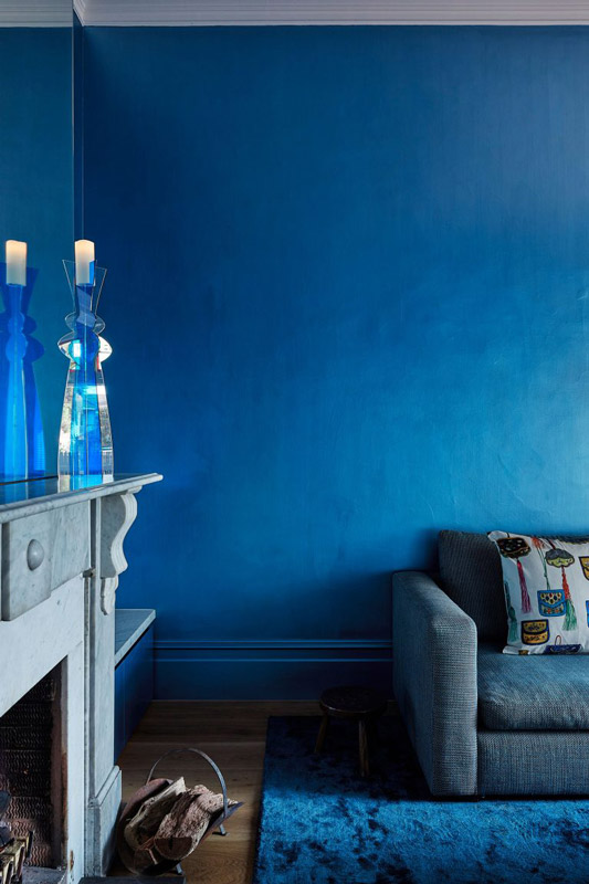
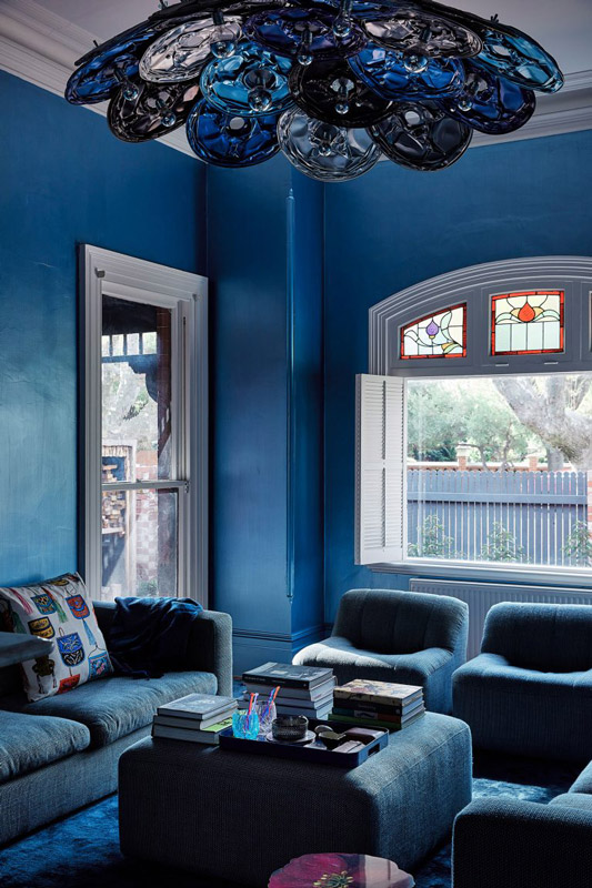
Needing to accommodate a dedicated home office, master suite and robe on the upper level, an open living, dining and kitchen area sit comfortably below. The clear and open volume on the lower levels allows for visual and audio access throughout the space, while allowing for flexibility as needed. A consistent underfoot timber runs throughout and connects the old and new, while terracotta, natural stone and green tiles further add warmth. Unlike the muted nature of the rest of the home, an immersive, rich layering of blues encases the formal living room in the heritage portion of the home, as its own destination away from the pull of the shared living area. Through a shared love of timber, the team combines with restraint to ensure a fresh overarching contemporary feel is experienced throughout.
Drawing on the character of the existing and the clean lines of the new, Lucy Clemenger Architects and Studio Stamp’s St Kilda West emerges with charm and personality, openly connected and welcoming of its residents and occasional influx of visitors.