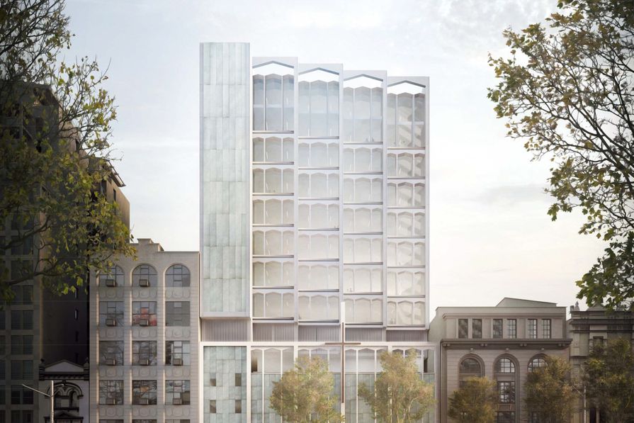
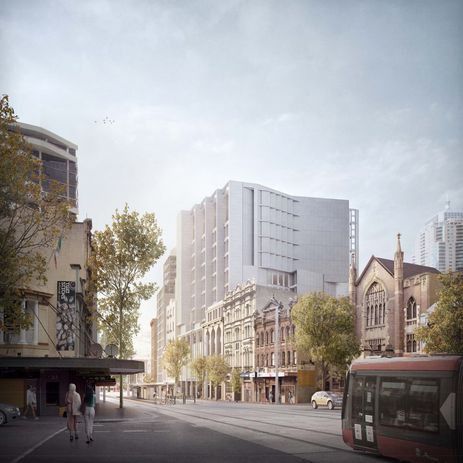
Candalepas designs addition to mid-century Sydney church
Candalepas Associates has designed the redevelopment of a the largest mid-century church building central Sydney, which will include a mixed-use tower addition above the existing building. Located on George Street in Haymarket, St Peter Julian’s Catholic Church was originally designed by architect Terrence Daly who undertook a large body of work for the Catholic Church in NSW. A City of Sydney heritage review found that the George Street church “may be his finest work.”
The church’s George Street facade is divided into five equal bays. Candalepas Associates’ design for the mixed-use addition extends “celebrates original Terrence Daly design” and “provide cohesive presentation to George Street,” according to a heritage impact statement prepared by Urbis.
The redevelopment will also include upgrade to the sacristy, interview parlours, meeting rooms, six domiciles with a refectory, a recreation room, a private chapel and a roof garden.
The commercial addition will rise nine storeys above the existing building.
St Peter Julian’s Catholic Church was constructed in 1964 and is one of four – and the largest – church buildings constructed in central Sydney in the post World War II period. In 2008, it was refurbished by PMDL Architecture and Design.
A development application for the project is currently exhibited on the City of Sydney website.
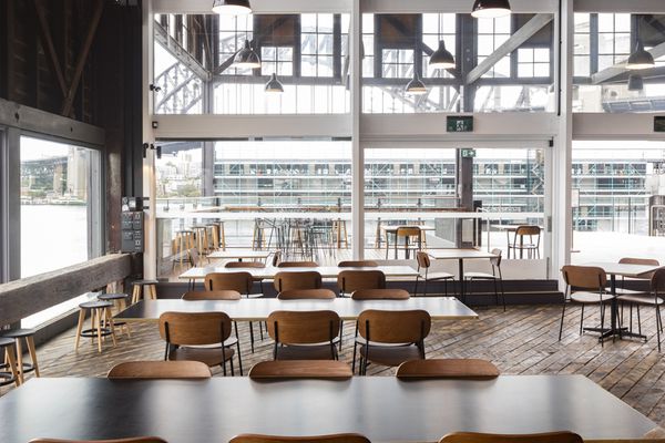
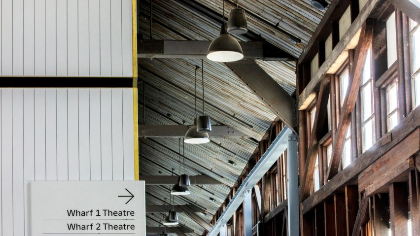
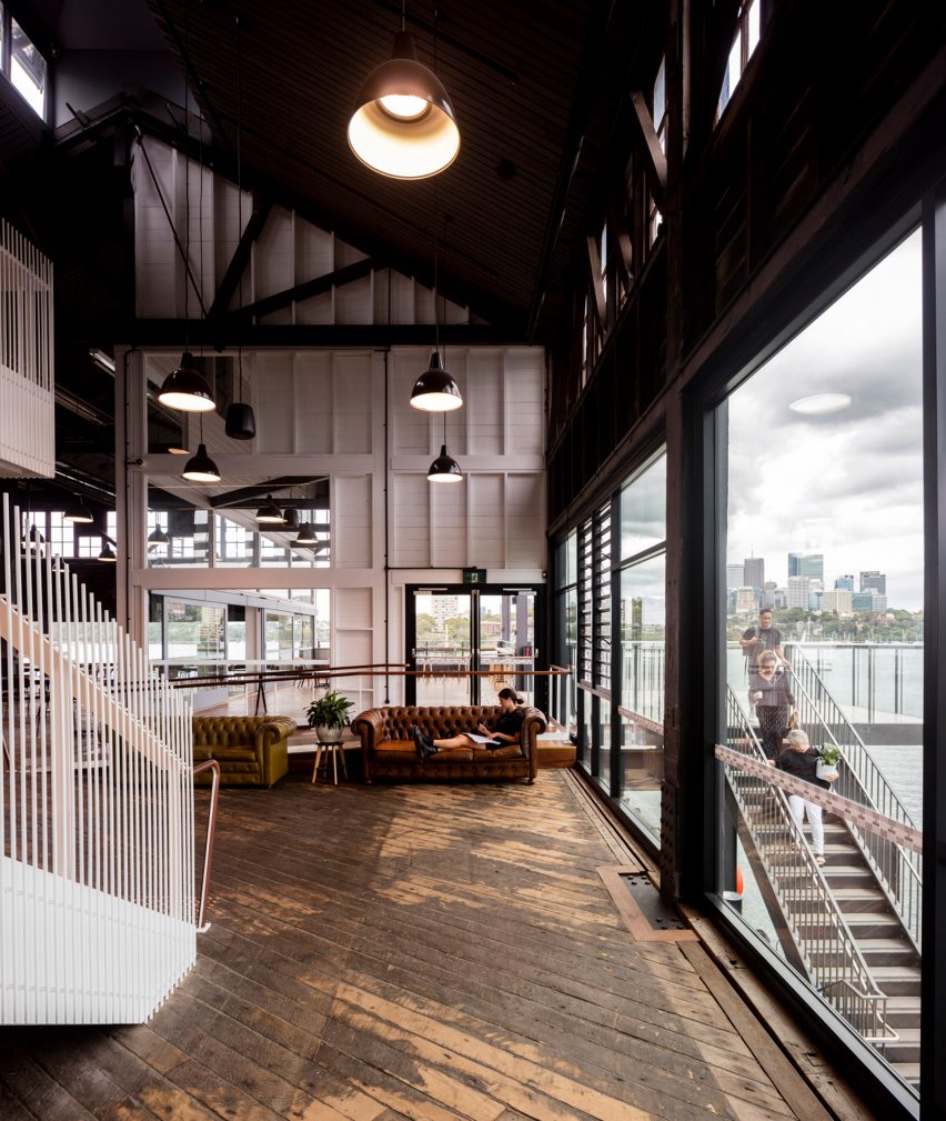
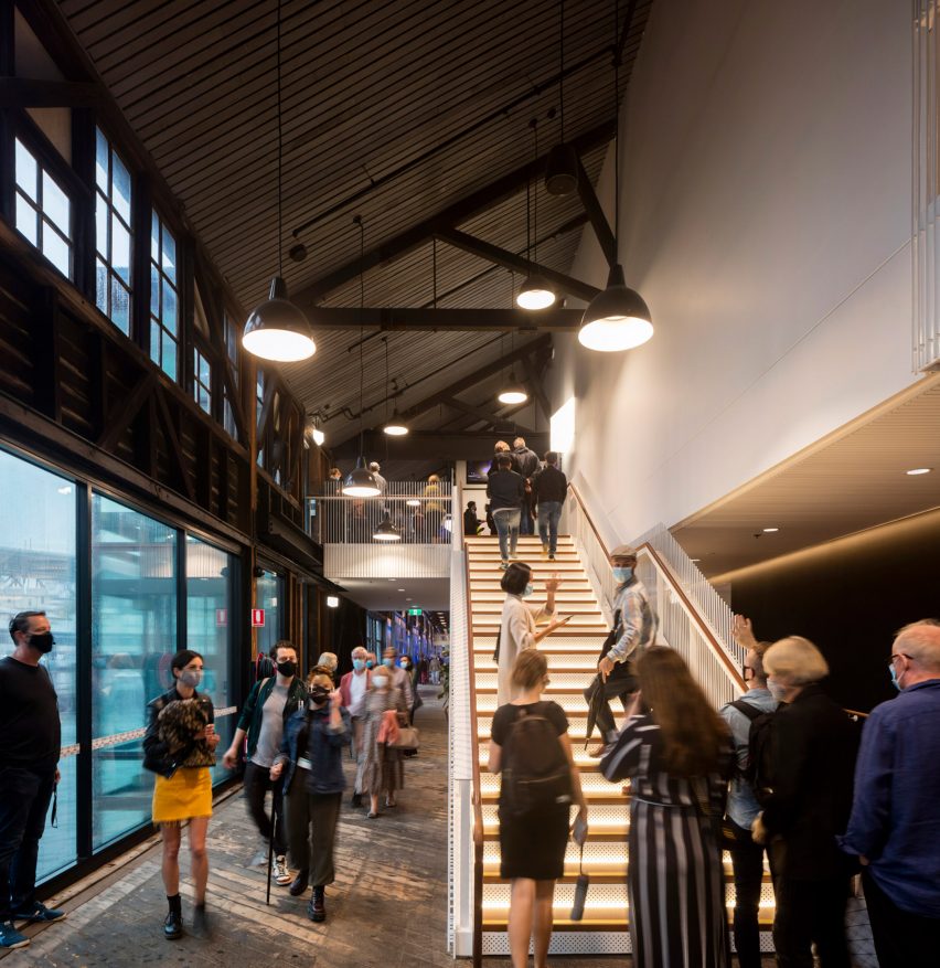
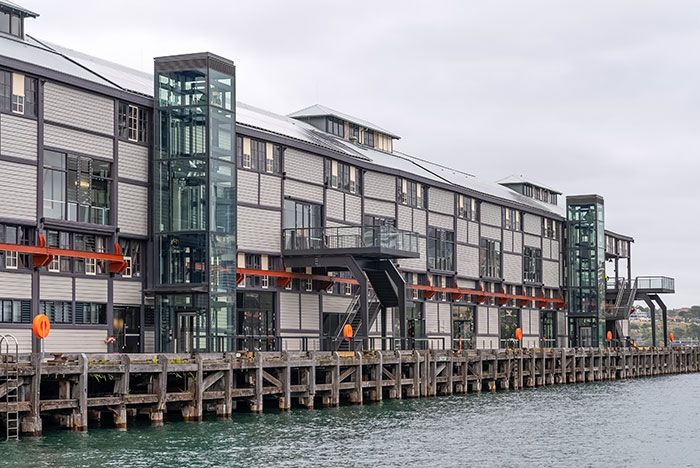
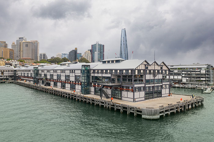
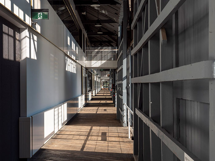
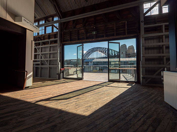
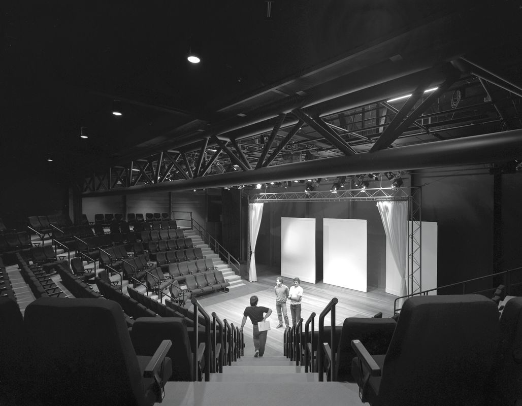
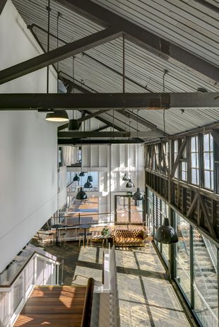
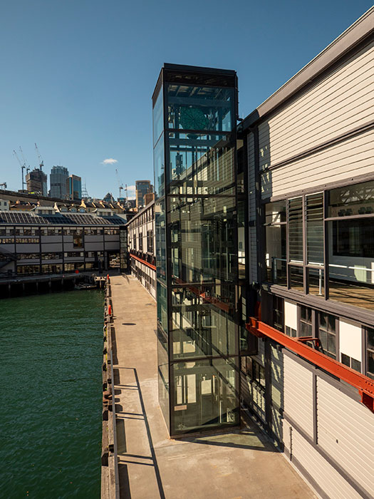
Sydney Theatre Company’s Walsh Bay wharves reopened
Sydney Theatre Company has reopened its facilities at the Walsh Bay wharves after a $60 million redevelopment designed by Hassell.
The project was undertaken to modernize the theatre spaces in wharves 1 and 2 with flexible seating arrangements and improved access across the facility.
Housed in historic timber wool stores, the buildings were first transformed into theatres in 1984 by architect Vivian Fraser in association with the NSW Government Architect J. Thomson. The project was jointly awarded the Sulman Medal in 1985, and in 2008 it won the 25 Year Award for Enduring Architecture.
The latest renewal project also included the return of the Theatre Bar at the End of the Wharf which has views of the harbour; the addition of Neilson Family Gallery, a multi-purpose space overlooking the bar; improved backstage areas for artists including dressing rooms, rehearsal rooms, breakout spaces, music/vocal coaching rooms and recording booth, a dedicated wing room and increased ceiling height in the workshop, which allows larger sets to be built on site.
The renewal allows the company to house the entire theatre-making process under one roof.
Glenn Scott, Hassell principal, said, “The Hassell team is honoured to have worked with STC over the last eight years from the initial briefing phase helping develop the ‘all-under-one-roof’ philosophy, through detailed design and construction to witness its successful reopening. The STC Wharf Renewal Project is a rare, culturally important, heritage project that is a huge responsibility for a design team to work on – we are delighted with the outcome, and proud that STC can continue their ground-breaking theatre at The Wharf well into the future.”
The consultant team also included Charcoalblue (theatre consultant), Tropman and Tropman Architects (heritage architect), Arup (building services, fire engineering, sustainable design), Taylor Thomson Whitting (engineer) and MBM (quantity surveyor).
The first performance in the redeveloped theatre will be Playing Beatie Bow. Sydney Theatre Company is first venue to play to return to 100 percent audience capacity since the pandemic shutdowns.
The redevelopment project is part of $139 million project to redevelop the Walsh Bay Arts Precinct, designed by Tonkin Zulaikha Greer, which includes upgraded spaces for the Australian Theatre for Young People and Bangarra Dance Company, a new 450-seat auditorium for the Australian Chamber Orchestra, and a new waterfront square between two piers. The NSW government announced its completition in December 2020.
written by : ArchitectureAU Editorial 11 Mar 2021 published in : architectureau.com
Sydney Theatre Company’s Walsh Bay wharves reopened
Sydney Theatre Company has reopened its facilities at the Walsh Bay wharves after a $60 million redevelopment designed by Hassell.
The project was undertaken to modernize the theatre spaces in wharves 1 and 2 with flexible seating arrangements and improved access across the facility.
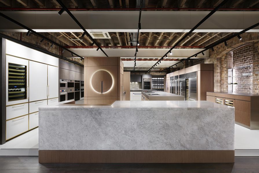
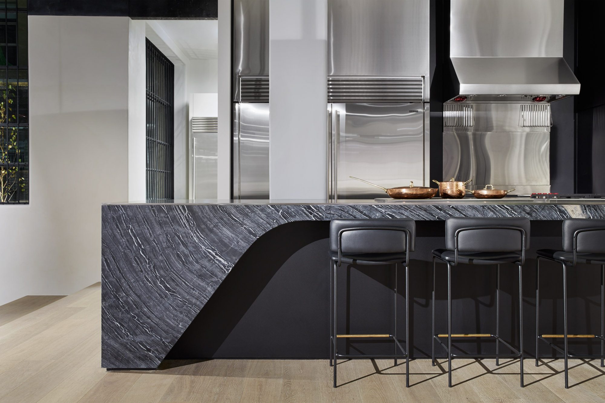
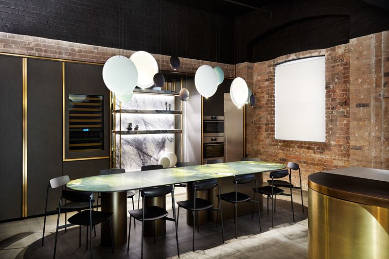
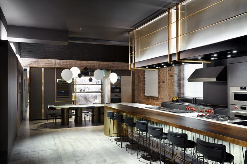
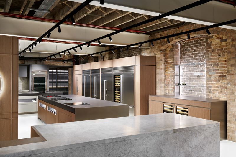
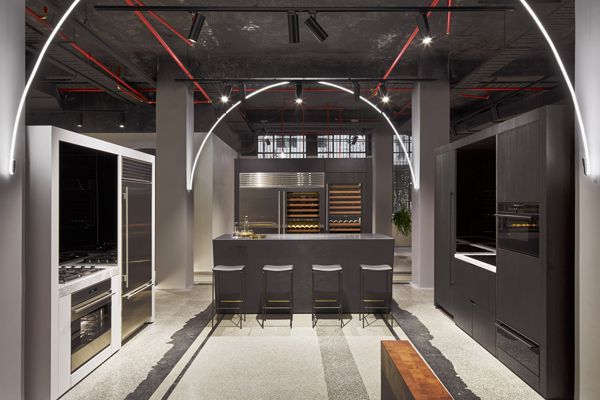
Sub-Zero and Wolf launches experiential Sydney showroom
Sub-Zero and Wolf has launched a new design hub and showroom in Sydney’s Surry Hills designed by Adele Bates.
Showing off the design possibilities of the Sub-Zero and Wolf range, the space is intended to inspire architects and designers, as well as consumers.
“The location and the building itself were critical to the design of the showroom,” said Sub-Zero and Wolf’s Australian managing director, Andrew Mumford. “Heritage elements were so important to perfectly complement the heritage of the Sub-Zeroand Wolf story. Designer Adele Bates interpreted the brief so effectively, creating an inspirational space for consumers andthe design community that differentiates and highlights the diverse Sub-Zero and Wolf design styles.”
The showroom is zoned into two distinct spaces. Upon entry, visitors are welcomed into an open-plan retail space housing the extensive range of Sub-Zero and Wolf appliances.
An inconspicuous fluted glass door to the rear of the showroom provides a portal to the demonstration kitchen and dining area. The darker tone of this inviting, functional space creates a soothing, sophisticated atmosphere and marks a distinct shift from the bright retail showroom.
Brushed brass, timber and mirror give the space an identity more akin to restaurant and bar design. The dining area doubles as a meeting space for the showroom, with a custom designed long dining table and a concealed prep kitchen. The demonstration area is dominated by the extensive form of the kitchen island, overhung by custom rangehoods featuring bespoke brass metalwork.
written by : ArchitectureAU Editorial 9 Mar 2021 published in : architectureau.com
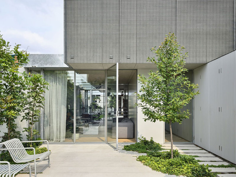
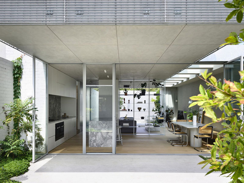
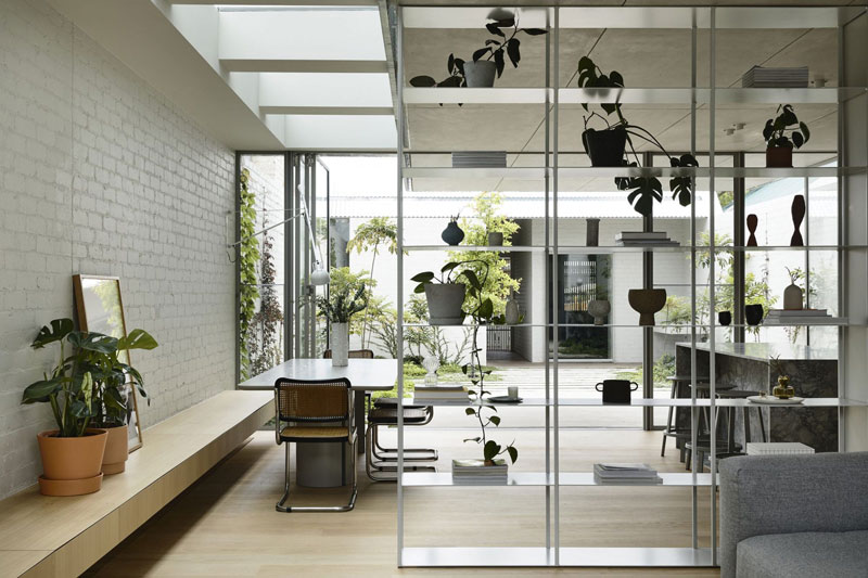
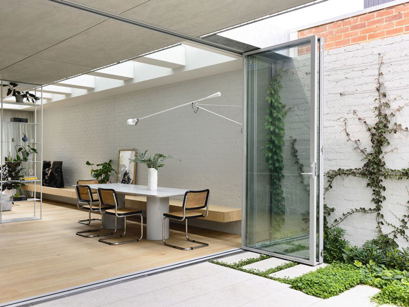
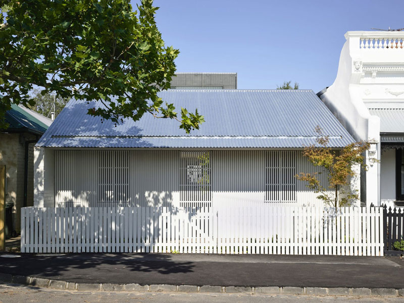
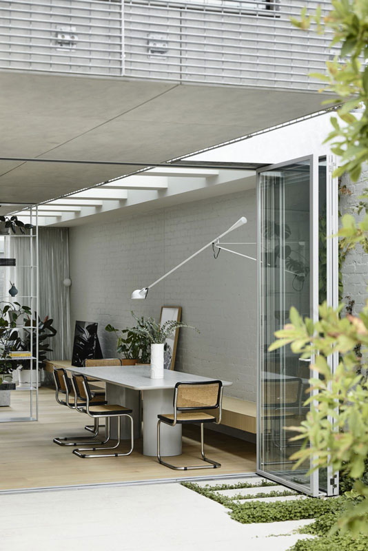
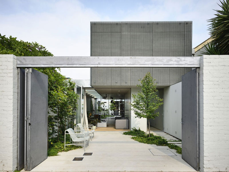
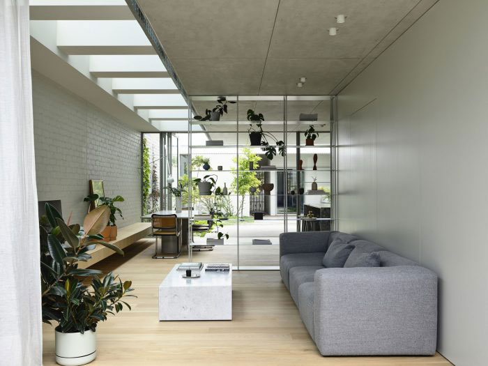
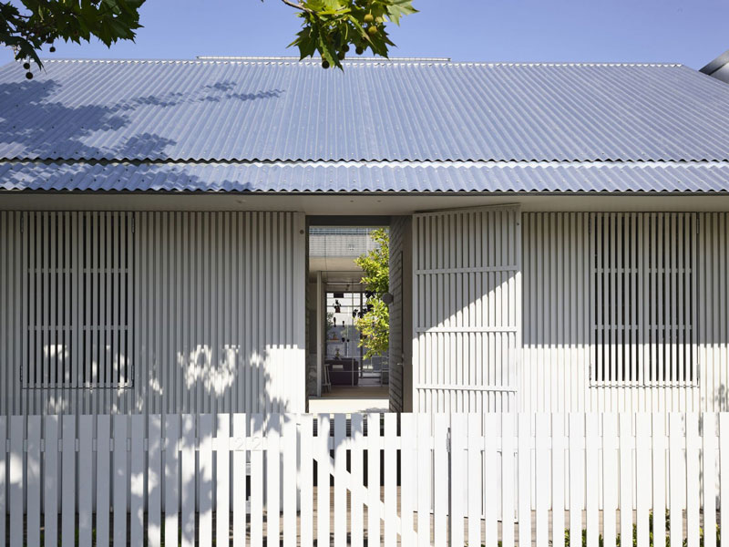
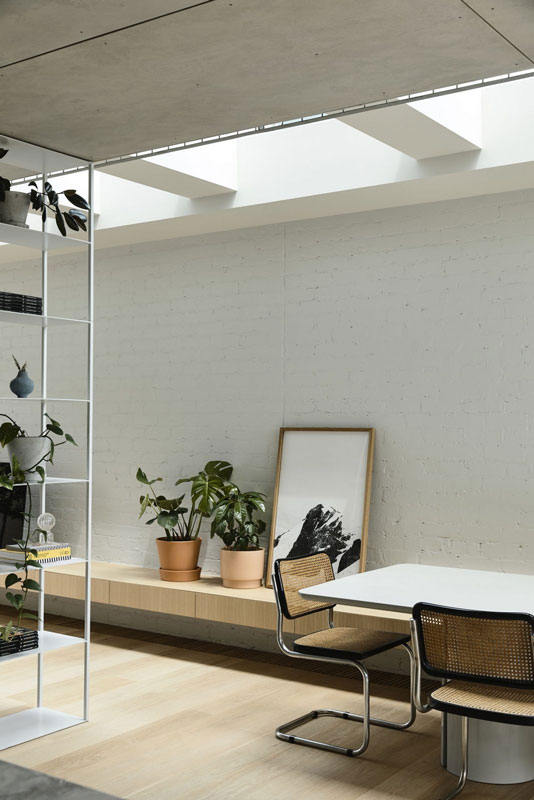
An abstracted terrace: Fitzroy North House 02 by Rob Kennon Architects
In a quiet street in Melbourne’s Fitzroy North, this curious family home by Rob Kennon Architects, appearing as an abstracted worker’s cottage from the street, conceals an open design shaped by two verdant garden courtyards.
At some point during the past five years, Melbourne-based Rob Kennon Architects began using project locations to refer to the houses designed by the practice. The earlier projects retained their more descriptive titles – such as the Sugar Gum, Datum and Stepped houses – but newer builds have become known simply by their neighbourhoods: The Malvern, Northcote and Brunswick houses, to name just a few.
This is not, it could be argued, an inconsequential shift in taxonomy. Rather, it speaks to a self-assuredness in the practice’s built projects. What’s in a name? This new naming convention conveys an openness to multiple readings and an associated commitment to design priorities that defy easy categorization. Fitzroy North House 02 is the second in a series of houses by Rob Kennon Architects situated in that suburb. It is also a play on the Victorian terrace house, a house within a garden, a nod to Scandinavian modernism and (at least by my reading) a reinterpreted gatehouse.
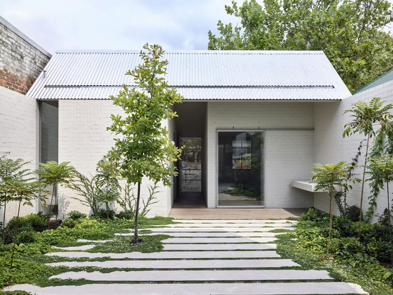
That last point needs clarifying. In terms of scale, materiality and location, the project couldn’t be further from a typical English manor house estate, yet the basic configuration of Fitzroy North House 02 is one of a gatehouse and main residence. What appears from the street to be an abstracted terrace house that continues the proportional and formal logic of the neighbouring properties is actually a much smaller building at the edge of the property, housing a workshop space and guest bedroom with powder room.
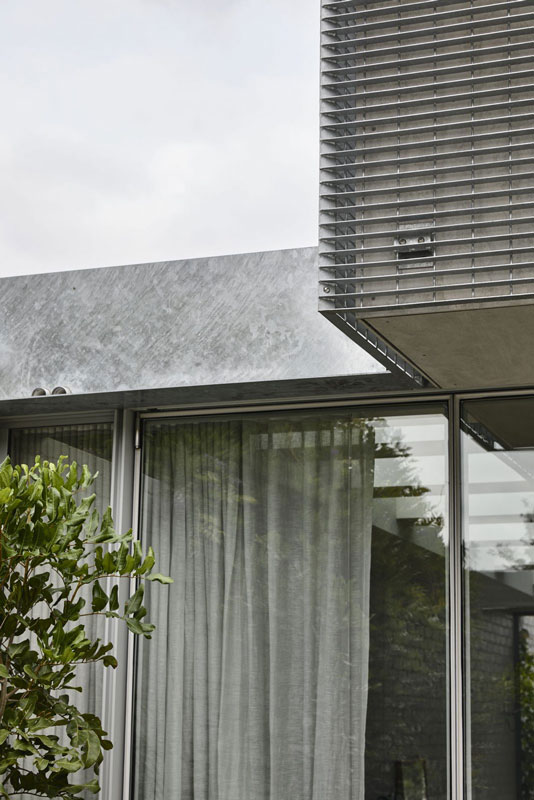
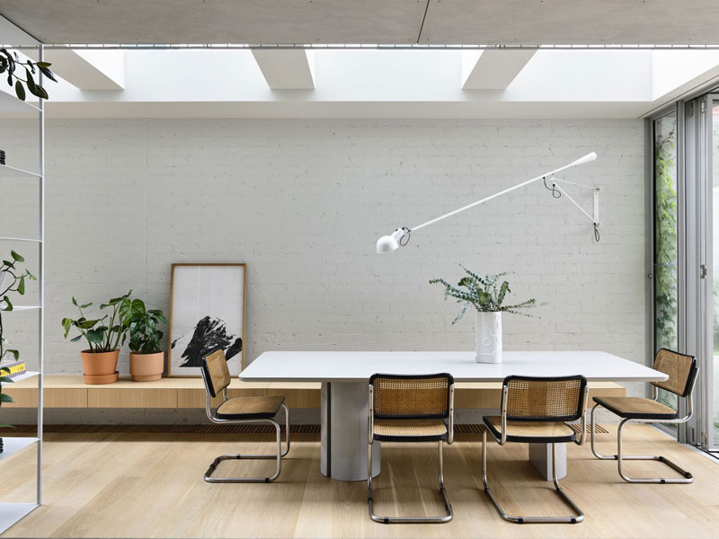
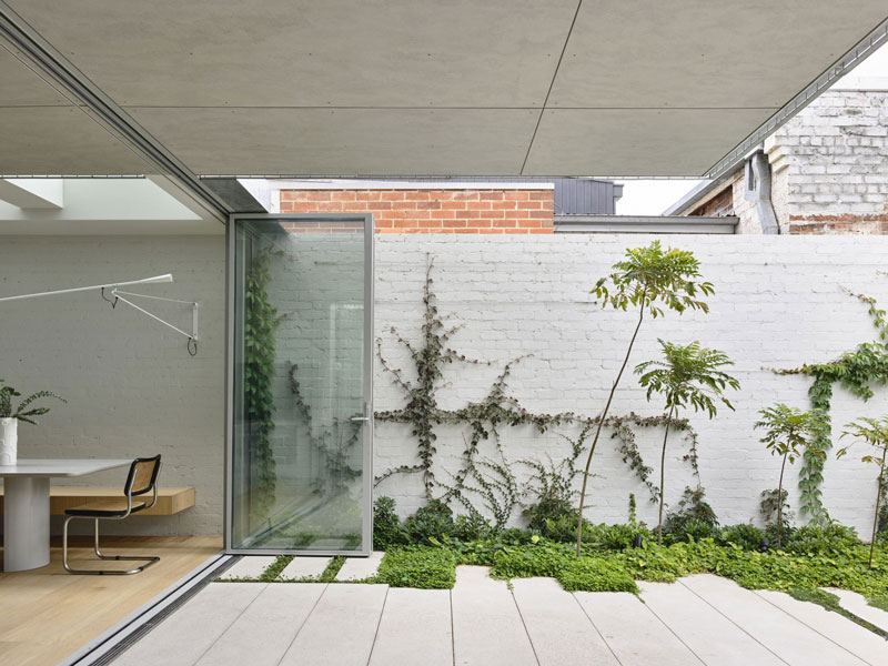
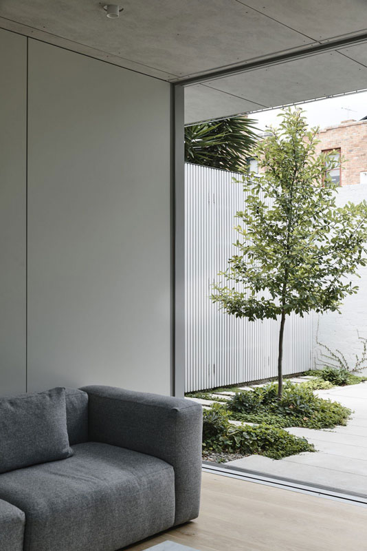
This cottage-like structure frames the main entry to the property, and protects from the street the garden and open living spaces of the main house behind it. While the gatehouse was not a deliberate reference point for the architects, the entry’s function as such becomes clear from inside the main garden. Breaking down the symmetry of the street elevation, the workshop and guest bedroom open up to the walled garden and central living space. Full-height, glazed bi-folding doors have been carefully detailed to maximize connections across the site. The ground-floor kitchen, dining and living area is offered protection by a wire-mesh-clad upper level that looks back over the gatehouse-like entry and in behind the parapets of the neighboring residences.
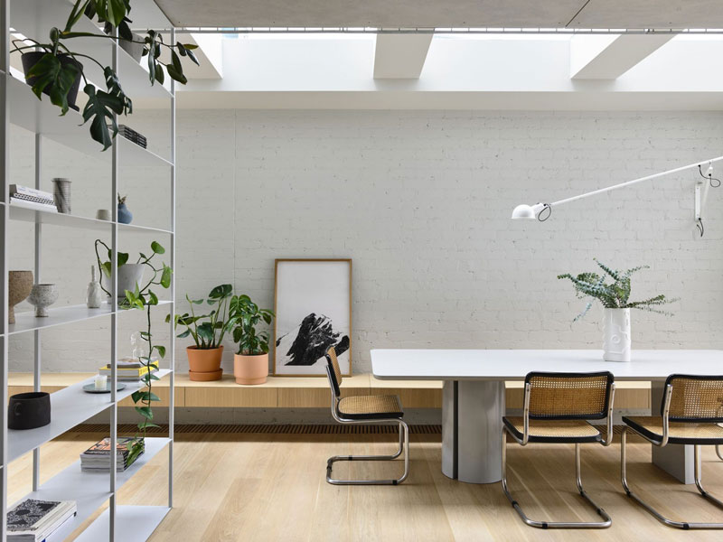
The architect has thoroughly dismantled the typical massing of the Victorian terrace house in favor of a subtly fortified garden room, a move that has added a tremendous amount of light to the internal and external spaces of the house. Beyond the fine timber battens and beautiful details, including the open shelving system that creates a floating field of precious objects, Fitzroy North House 02’s configuration manages to challenge assumptions about what might be possible on a narrow site. Perhaps there’s also something in the unexpected inclusion of a workshop within a project of this size – another gesture that contributes to the personality of the house while also prompting one to speculate on the possibilities for such a space and all the things that might one day be made there.
Fitzroy North House 02 invokes a quality of openness, not only in the experience of the completed structure itself but also in the architect’s initial sketch. In just a few lines, Rob Kennon’s early drawing sets out the basic massing of the project, and degrees of transparency and connection between living spaces and gardens, while also resisting representation of stylistic details and features beyond a gabled roof at the street edge. Adding to the intriguing nature of this quick diagram, the notes around it are just unclear enough to invite more thought. Returning to my earlier interpretation of the gatehouse entry, I couldn’t help but note the positioning of human figures outside the walled garden. To this end, the last half of the word “workshop” could conceivably be misread as “stop,” with the lines of vegetation and sunlight behind the gabled cottage becoming signs of activity and movement concealed and protected from the world outside.
It’s useful to talk about the openness of Fitzroy North House 02 and its ability to entertain multiple stories and interpretations because it moves the conversation beyond questions of style and finish alone. While the house is undoubtedly a beautiful piece of contemporary architecture, some of its most captivating moments revolve around the openness of its diagram and the clever way it refrains from establishing a singular explanation of its architectural forms.
written by : Alexandra Brown 19 Feb 2021 published in : architectureau.com
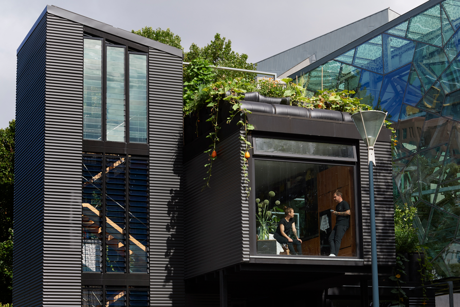
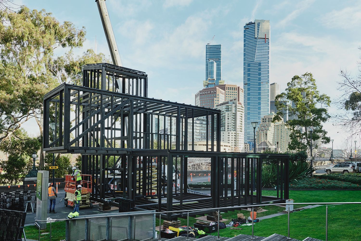
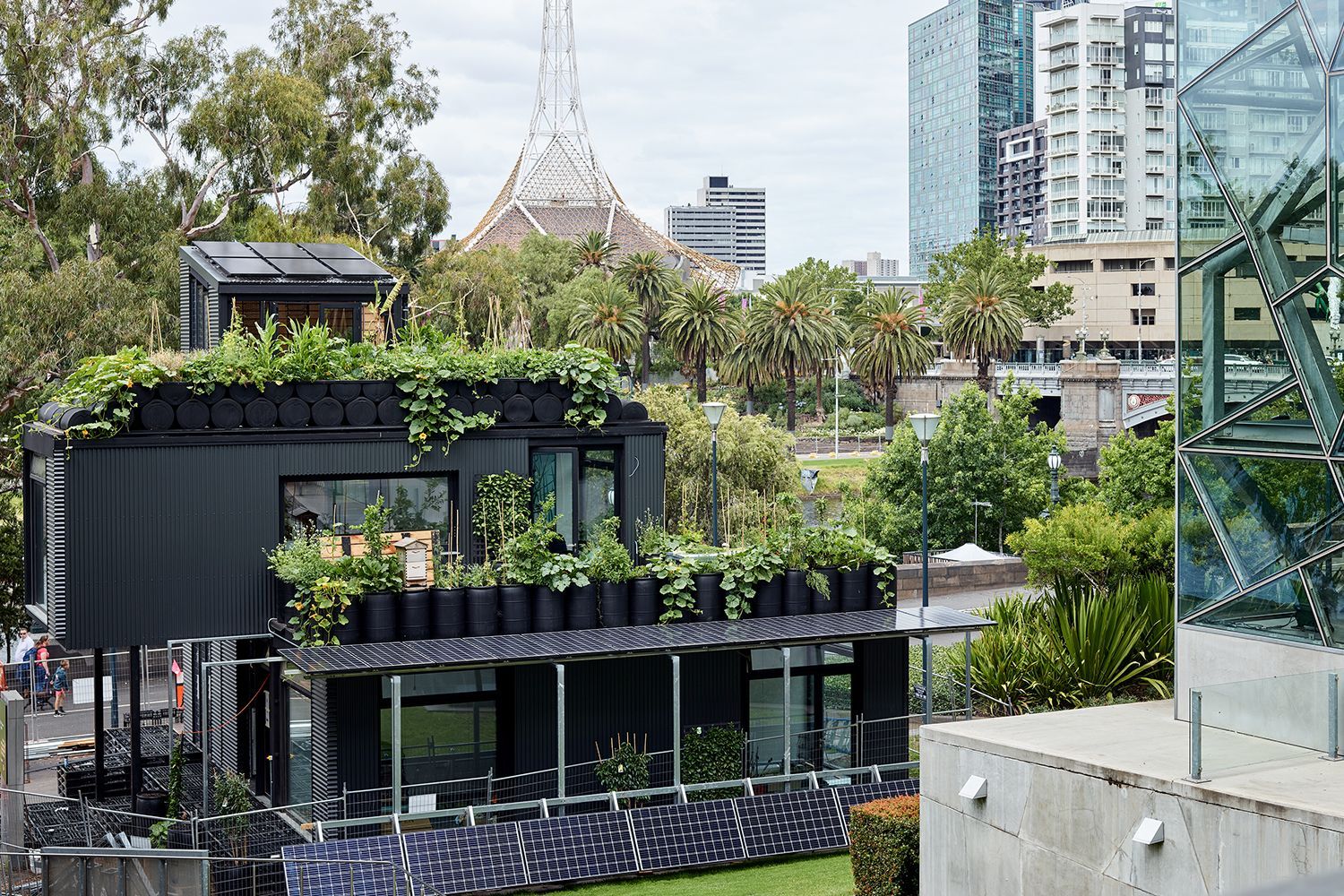
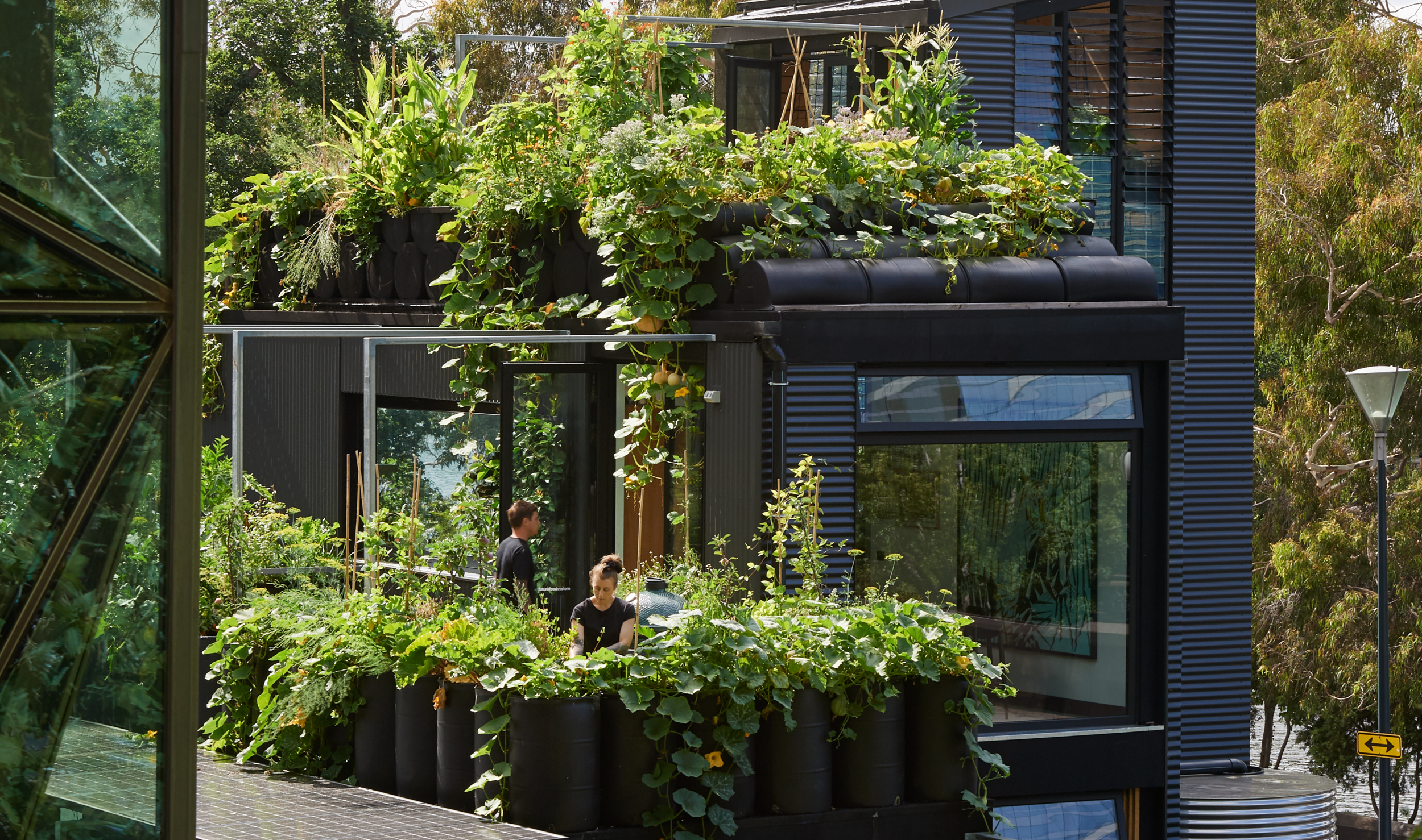
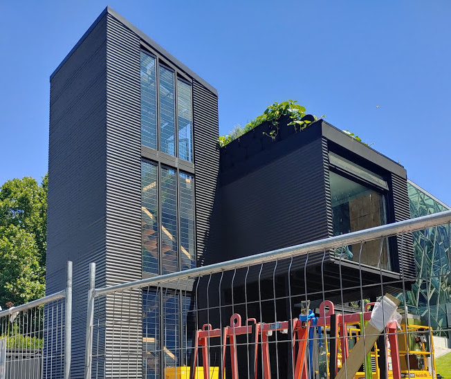
Zero-waste, self-sustaining house installation opens at Fed Square
The self-sustaining, zero waste, productive house demonstrates the potential homes have to provide shelter, produce food and generate energy. The three-storey, two-bedroom home has the capacity to grow and cultivate fruits, vegetables, herbs, fish, mussels and snails, and all in an 87-square-metre footprint.
The home also features an aquaponics system, a charcoal tank, a digestor, closed loop shower and water oxygenation system.
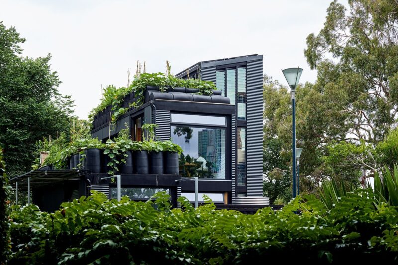
Zero-waste champion Joost Bakker’s latest project, a closed-loop home and urban farm, has opened in Melbourne’s Federation Square, the original site of Bakker’s first restaurant a decade ago.
All waste from the site is used to power the house and grow nutrient-dense produce and building materials have been selected for their healing or recyclable properties. The walls, floor and ceilings are made from a straw-based, fire-resistant panel called Durra Panel, which uses the hollow stalks leftover from harvesting wheat and other crops – one of the world’s most common waste products.
For Bakker, this is his fifth iteration of his “greenhouse” prototypes, which included the world’s first zero-waste restaurant Silo by Joost in 2012.
“I want this to be a catalyst for greater sustainability and self-sufficiency in urban settings,” Bakker says. “I think in the future, we will all live like this.”
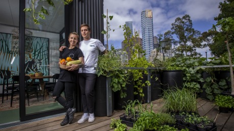
Chefs Matt Stone and Jo Barrett, formerly of Oakridge Winery, will live in the house for the duration of the installation. Known for their zero-waste experimental dishes, Stone and Barrett will spend their residency at the house planting, harvesting food and showcasing the ingredients with on-site dinners, prepared using Miele’s energy-saving appliances.
After the home’s stint at Federation Square, it will be packed up and moved to regional Victoria, where it will then serve as home to Bakker’s retired mother. “When she came through the house, she looked around and said ‘Oh, this will be easy to maintain,’” Bakker laughs. “Most people freak out about all the work there is to do.”
Greenhouse by Joost, supported by Miele, is open at Federation Square until June. Check out the website for more information about tours and dining experiences.
written by : Cassie Hansen 26 Feb 2021 published in : architectureau.com
Gallery of Zero-waste, self-sustaining house installation opens at Fed Square
Zero-waste champion Joost Bakker’s latest project, a closed-loop home and urban farm, has opened in Melbourne’s Federation Square, the original site of Bakker’s first restaurant a decade ago.
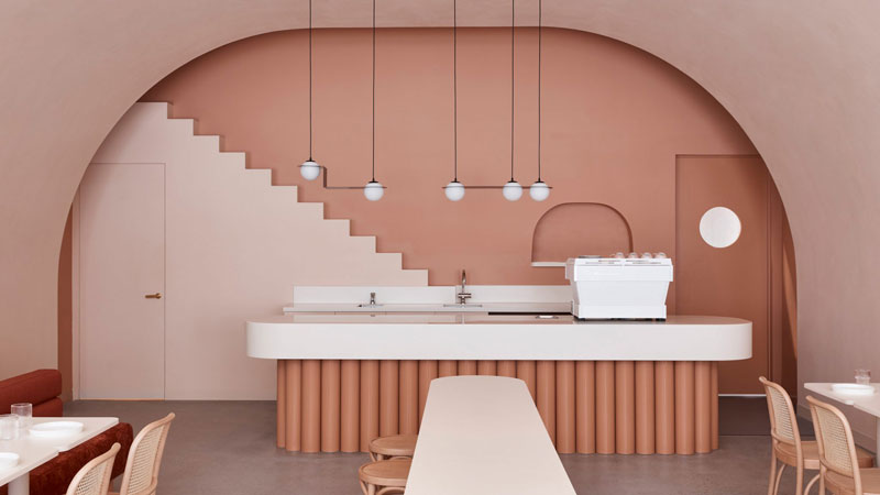
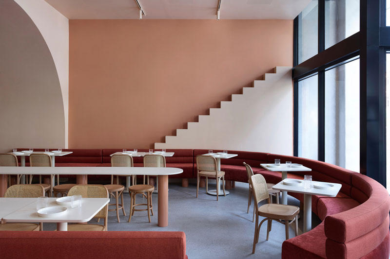
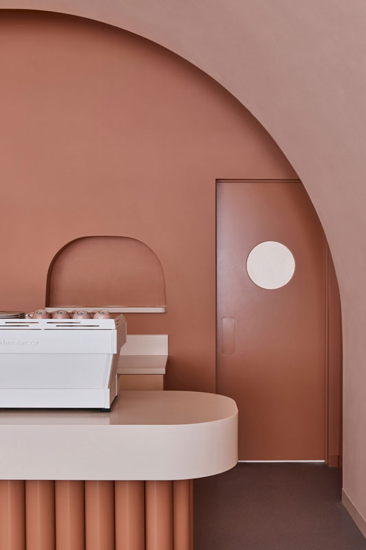
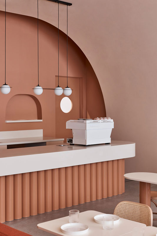
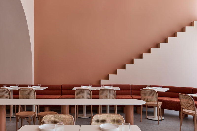
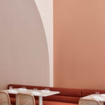
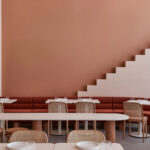
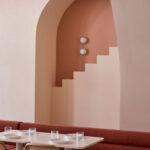
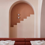
Biasol Design Studio plays off Wes Anderson’s whimsical style with The Budapest Cafe in Melbourne. Filmmaker Wes Anderson’s idiosyncratic visual style inspired the design of The Budapest Café in Melbourne, which follows the success of The Budapest Café in Chengdu, China. Drawing on our appetite for modern abstract art, design and hospitality, we evolved the design experience to create an immersive, gallery-like experience. Minimising the built form maximised the space and the impact of colour in the imaginative and evocative space. Bold, offbeat elements encourage patrons to engage with the design, and the natural earthy palette exudes warmth, texture and character and reflects the local design sensibility.
Melbourne-based interior design studio Biasol used earthy hues and stylised architectural motifs to create a destination inspired by Wes Anderson’s symmetry and nostalgic colour palette.
The Budapest Cafe in Carlton, Melbourne is Biasol’s second edition of its Wes Anderson-informed concept, following a first location in Chengdu, China, that featured marble surfaces and pale pastel greens.
The 94 square-metre cafe has similar pastel shades, but in earthy colours that have been adapted to its Carlton setting and audience.
“Our design draws on Anderson’s meticulous, memorable and magical worlds to create an inviting destination with whimsical character and mythical scenes,” Biasol founder Jean-Pierre Biasol
“We were also inspired by his symmetry and quirky set designs; vivid and nostalgic colour palettes; and the sentiment that infuses his films,” Biasol continued.
“We evolved the design and experience to an earthy colour palette reflecting our local sensibilities,” Biasol explained.
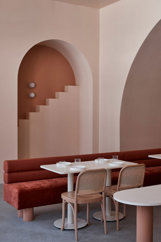
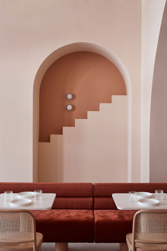
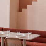
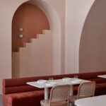
Rust-red upholstered banquettes wrap around the space, adding texture and warmth to the double-height space, and envelop a bar table that functions as the centre of the seating area.
A large sand-textured archway frames a glossy, tubular point-of-sale counter in terracotta, both of which draw customers through the space. Subtle silver hardware, meanwhile, provides a bright, metallic contrast to the softer tones.
The studio’s fondness for modern abstract art, design, and hospitality informed its decision to create “an immersive gallery-like experience,” Biasol said.
This led to an exploration of form and colour, with the aim of designing a place where art meets architecture.
By reducing the interior’s built form, the studio created a dramatic visual aesthetic. Stylised steps to nowhere embellish the venue’s walls, rising behind the tubular counter framed within arched alcoves and encouraging patrons to engage with and capture the “imaginative and evocative” design
“With a richer palette and bolder design, the new cafe is timeless and contemporary for its Melbourne patrons, while still offering a relaxed and indulgent atmosphere and hospitality experience,” Biasol said.
The Budapest Cafe is one of many projects the studio has completed globally. In 2019 Biasol completed contemporary dining spaces for Grind in southeast London, as well the interiors for this east London townhouse.
written by : James Parkes 18 January 2021 published in : dezeen.com
The NSW Government has given the go-ahead to the plans for the Parramatta Powerhouse Museum, in what is being described as Western Sydney’s first major cultural institution.
With plans for the precinct first unveiled back in 2019, with Moreau Kusunoki and Genton winning the design competition. The green light from the state government is a critical moment for Parramatta Council, creating over 4000 new jobs and injecting hundreds of millions of dollars into the local economy.
Minister for the Arts Don Harwin says the final decision to move ahead with the plans for the Powerhouse on the banks of the Parramatta River followed extensive community feedback.
“Now that planning consent has been secured, I am delighted as Arts Minister that Western Sydney will now have the biggest and best museum in NSW,” he says.
“With a focus on science and technology, Powerhouse Parramatta will be the museum’s flagship site and hold the revered Powerhouse collection it is renowned for.”
Member for Parramatta Geoff Lee says the new museum is a gift for a city slowly recovering from the COVID-19 pandemic that in turn puts Parramatta on the global culture map.
“The Powerhouse Parramatta is something the local community has been very keen for and I’m proud that this Government will be able to deliver it.”
Minister for Planning and Public Spaces Rob Stokes says the inclusion of green open space as part of the overall plans will be mutually beneficial for locals and visitors to Parramatta.
“One of the great outcomes of this project is that a carpark on the foreshore is being replaced by a north facing, green public space on the banks of the Parramatta River,” Stokes says.
The NSW Government has given the go-ahead to the plans for the Parramatta Powerhouse Museum, in what is being described as Western Sydney’s first major cultural institution.
Since the late 1970s—when he studied with renowned German artist Gerhard Richter—Thomas Schütte has been subverting traditional art historical genres through his eclectic output of sculptures, prints, installations, drawings, watercolors, and photographs. Schütte makes familiar forms of expression, like memorial portraiture and figurative sculpture, strange through evocative, often disturbing alterations, such as in his treatment of the female nude in his “Bronzefrauen” series (Bronze Women, 1999-ongoing) where figurative shapes morph into abstract or mutant forms, or his “Alte Freunde” series, in which the subjects’ despondent expressions highlight the vulnerability of the individual against the cruelty and complexity of the vast world. Through his work he explores the human condition, offering a critical perspective on social, cultural, and political issues and visually eloquent commentary on memory, loss, and the difficulty of memorializing the past.
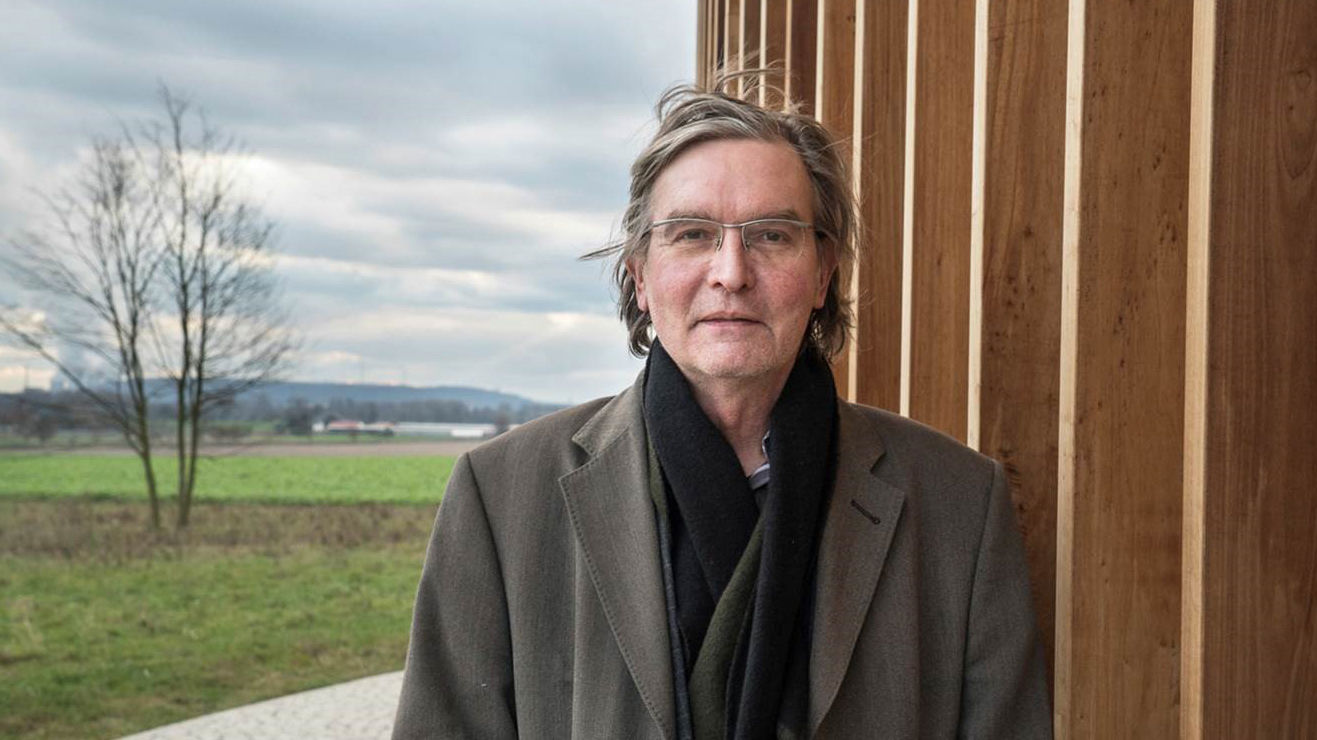
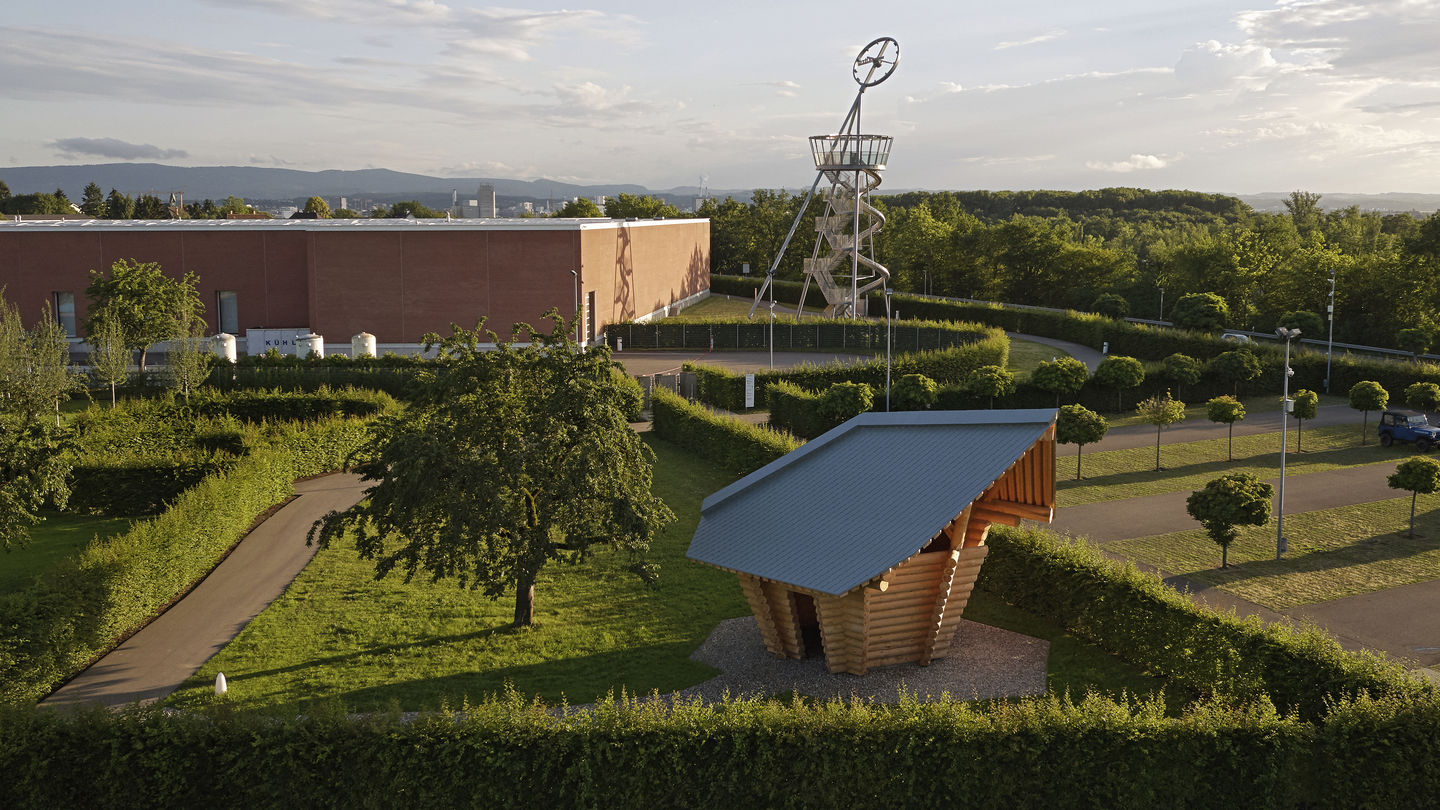
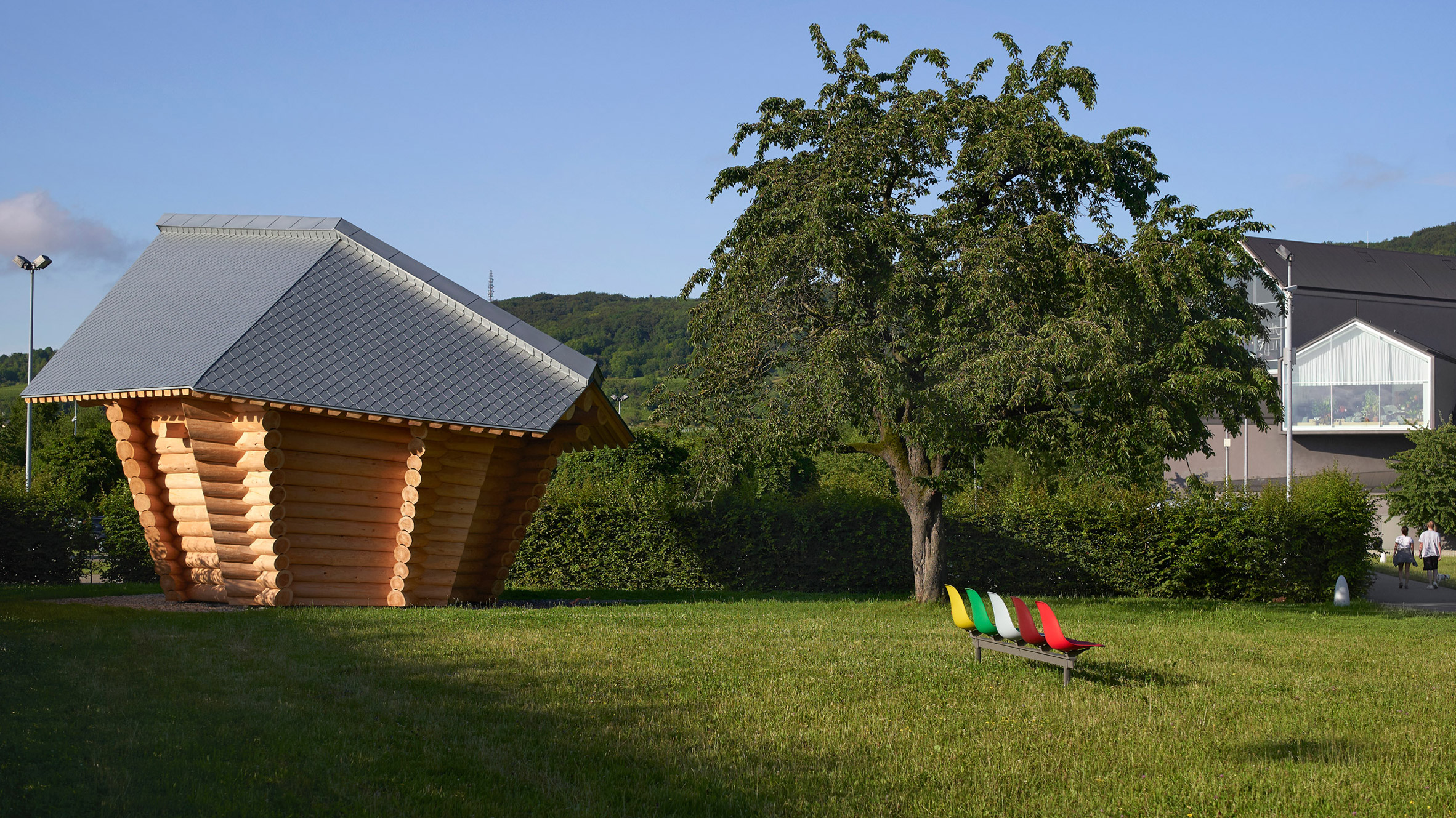
On a visit to the Konrad Fischer Galerie in 2016, Rolf Fehlbaum discovered the model of a log cabin conceived by Thomas Schütte. Fascinated by the structure, Fehlbaum asked the artist if he could imagine a full-scale realisation of the project on the Vitra Campus. In 2018, the Blockhaus became the newest building on the company premises, forming a contrast to the architectural works by other figures. On the occasion of the official opening, the artist Thomas Schütte offered insights into his work.
The Blockhaus is a hybrid structure – both object and functional space – and the first architectural work on the Vitra Campus that was created by an artist. How does this project diverge from the approach and implementation of other buildings on the premises?
”I think the main difference is that I didn’t have to fulfil any expectations. If someone orders a hotdog, I can bring him a steak. Or even just a bottle of water. I am not financially involved in the realisation of the project, so I don’t have an ego problem. And I don’t have a signature style. Basically, I’m presenting an idea, and most of the time the idea is realised in a way that is ten times better than expected. But you still never know. I have good friends who are architects, and they are happy when I can work with them, because then they have a completely free hand in the project’s implementation. Normally an architect can’t do very much, because the banks and financial backers make the decisions. But the main difference still lies in the fact that I am not bound by such constraints; I can define the task myself.”
‘It was the most crooked, and the most unrealistic wooden bricolage that was amongst the choices. And I think the reason is, it’s so different from the other buildings that it makes some sense.’ Thomas Schütte, responding to a question from Rolf Fehlbaum, who discovered a model of the Blockhaus at a gallery.
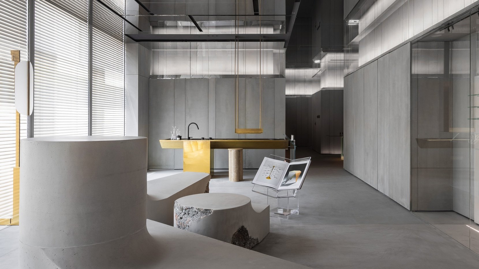
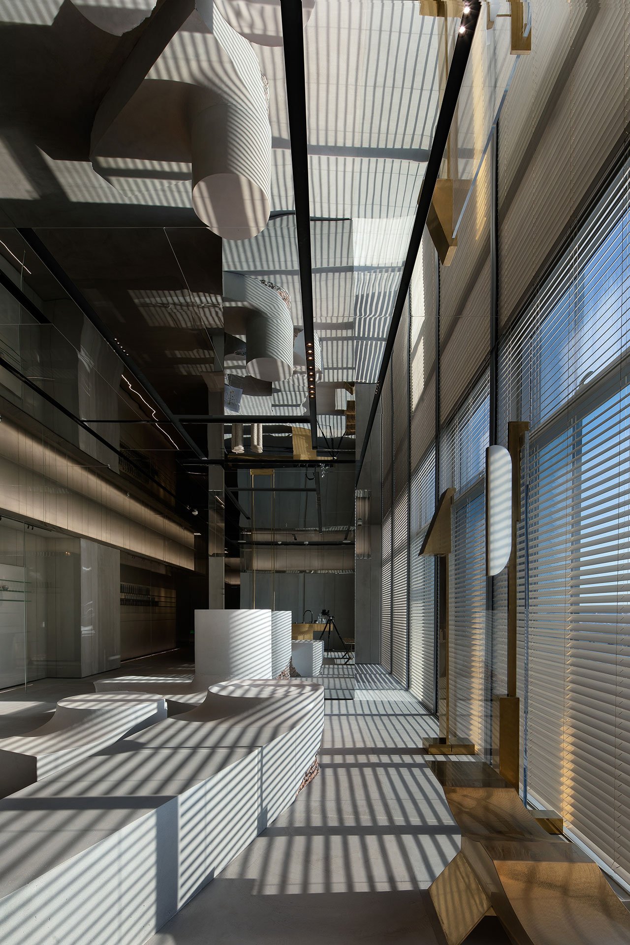
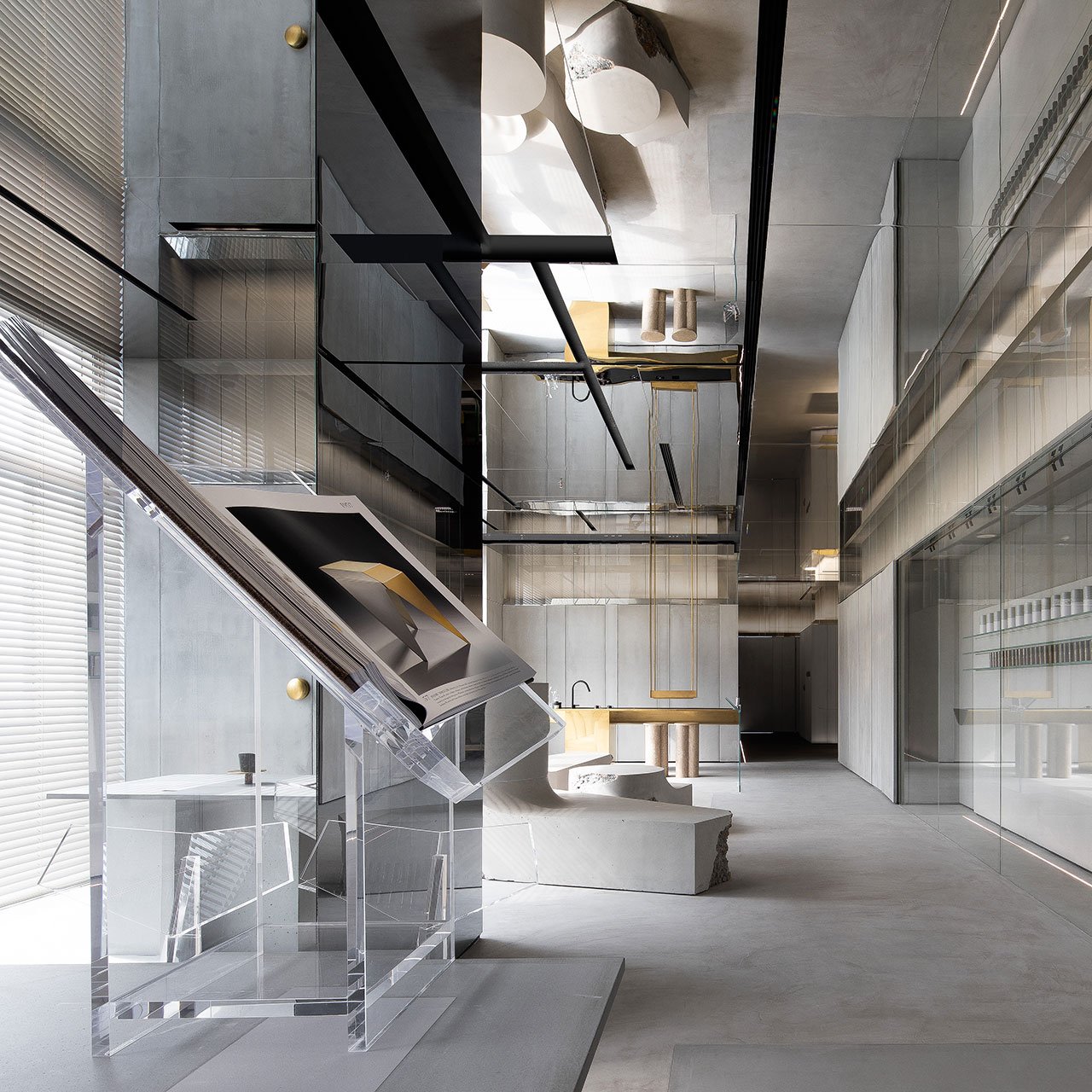
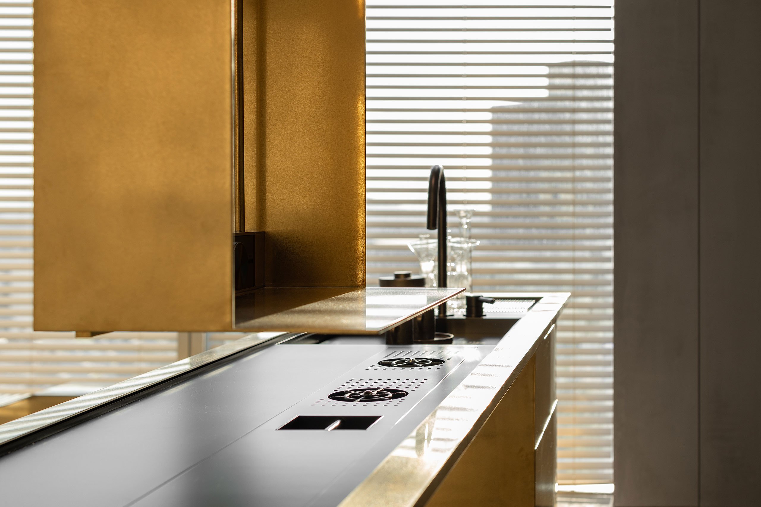
The store’s interior design of cosmetology brand “Meunier Technology Beauty”, is underpinned by a stripped-back, minimalist sensibility that belies a rich amalgam of contradictions: slender, lightweight metal and glass furnishings converse with chunky blocks of concrete; smooth, curvaceous forms are set against rugged, craggy textures; and shimmering, polished brass surfaces are juxtaposed with muted expanses of cement.
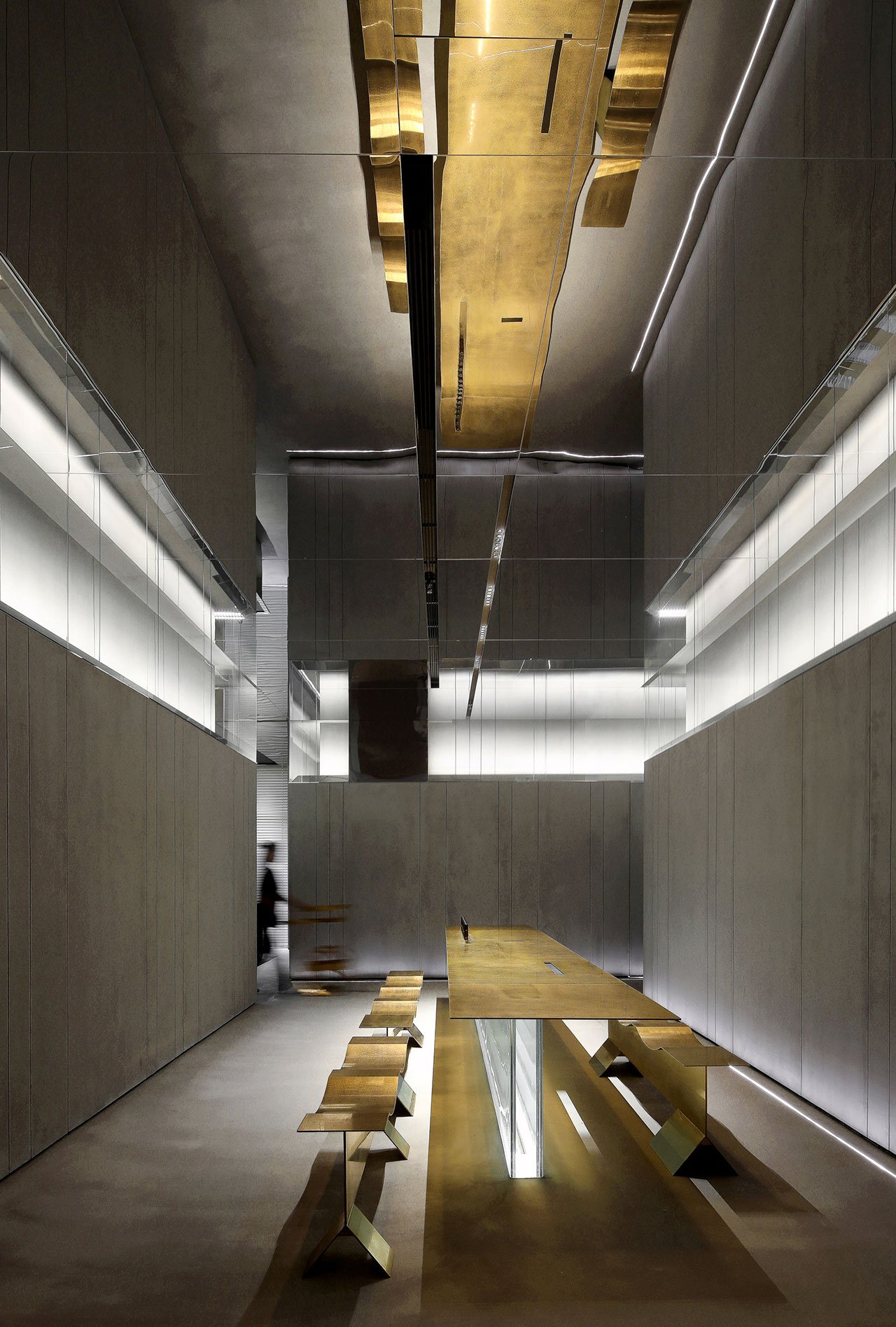
Far from saturating or confounding the senses, these antagonistic statements in mass, form and texture are harmoniously combined into a sculptural composition aided by the mirrored ceilings and the mellow daylight filtering in from the building’s glass facade.
More than an architectural gesture of minimalist elegance, the contradictory sensibility of DOMANI’s interior design poetically alludes to the complexity of the female identity and the intricacies of contemporary feminism, as well as reflects the antagonistic yet symbiotic relationship of external and internal beauty.
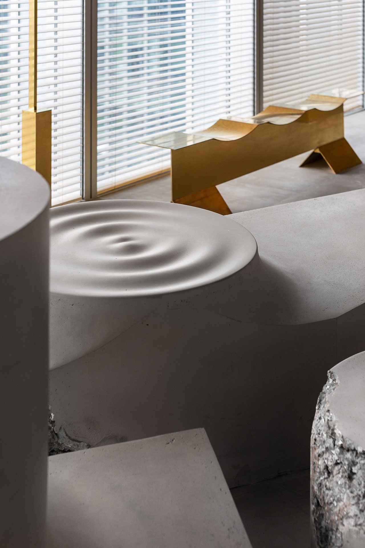
The sculptural quality of the interior design is primarily based on the collection of bespoke furniture by A&V, the studio’s design brand, which range from slender, undulating brass benches and razor-thin brass table tops that seem to be suspended mid-air thanks to a glass base, to the deconstructed composition of concrete volumes in the lounge area. The latter is a sculptural installation of abstract expressionism but it’s also a metaphor for the complexity of the female psyche: softly curved and delicately sculpted yet heavyset and robust with “damaged” spots that represent the “scars in the historical evaluation of feminism”.
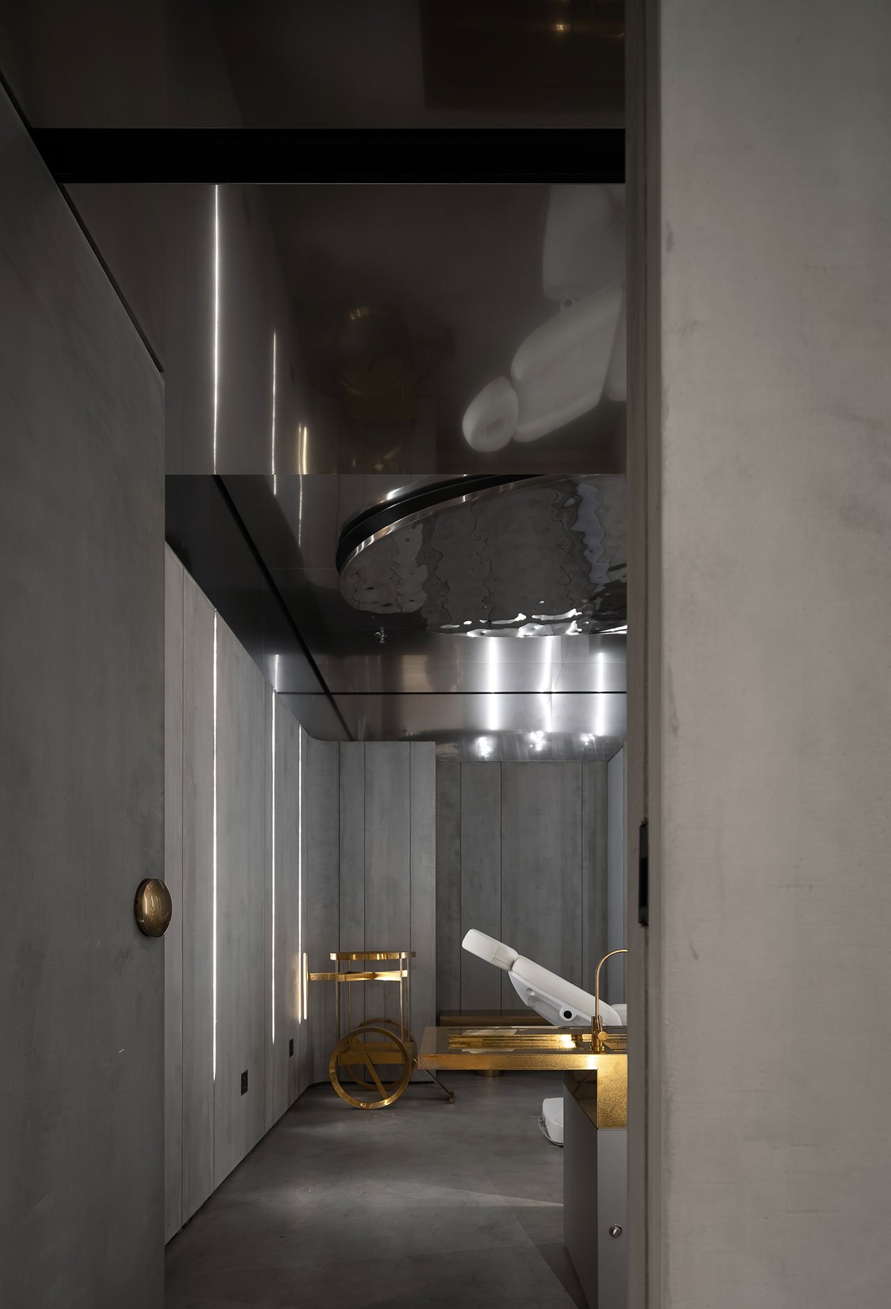
Smooth concrete surfaces, polished brass furnishings and mirrored ceilings that echo the design language of the public areas imbue the rooms with a soothing, hypnotic ambience that aid relaxation. Meanwhile, above the treatment beds, undulating mirrored panels that evoke rippling water greet guests as they open their eyes after a treatment which can also be construed as a clever retelling of the myth of Narcissus: unlike the doomed youth who looked sadly down into the water, guests at Meunier look up at their reflection with a sense of elation
Headquartered in Guangzhou, China, DOMANI has committed to providing creativity and design for each forward-looking customer in architecture, interior and products since its inception in 2005. We devise a high-level integrated, sustainable commercial design that exceed the client’s expectations. With high premium space works, our energy and competency have attained remarkable market feedbacks. Awarded by prestigious international prizes, we have consistently ranked amongst the top architecture and integrated design studios in Asia.
DOMANI adheres to a rigorous professional attitude. We are a team of diverse talents, working alongside a great number of other specialist consultants. Through comprehensive project management, we strive for the best in various architecture projects. All of our responsible design solutions reflect an international perspective.
The store’s interior design of cosmetology brand “Meunier Technology Beauty”, is underpinned by a stripped-back, minimalist sensibility that belies a rich amalgam of contradictions: slender, lightweight metal and glass furnishings converse with chunky blocks of concrete; smooth, curvaceous forms are set against rugged, craggy textures; and shimmering, polished brass surfaces are juxtaposed with muted expanses of cement.
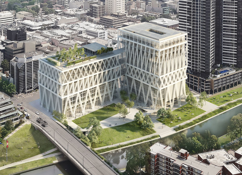
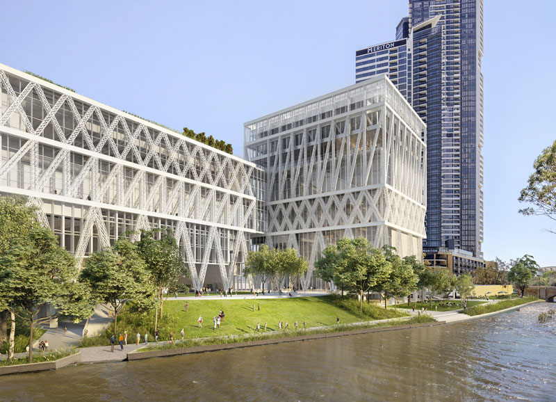
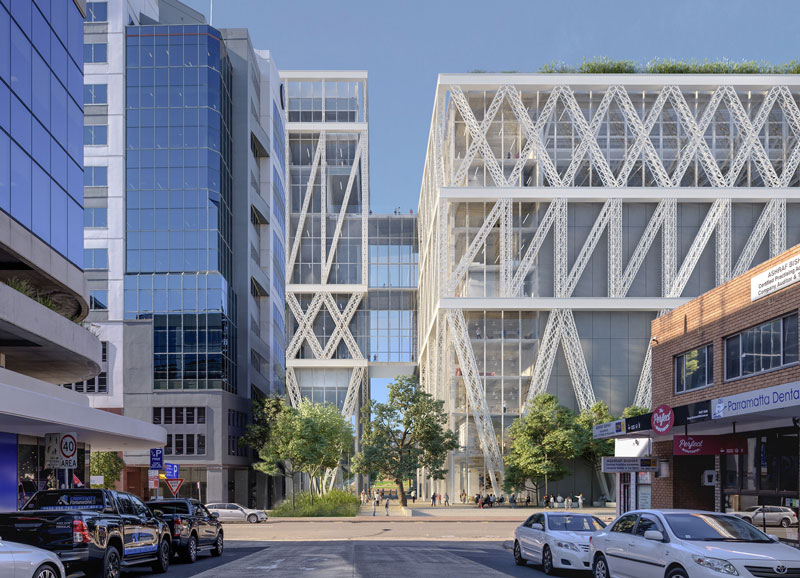
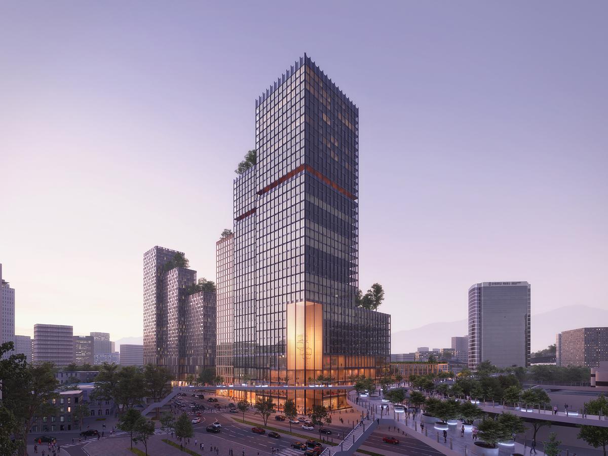
Henning Larsen Wins Competition for a Mixed-Use Development in South Korea
Henning Larsen’s proposal for Seoul Valley was selected as the winner of the Central Seoul Development Competition. Seeking to become a new home for the public in the center of the city, the mixed-use development “merges Seoul’s global commercial profile with an ecological return to downtown pedestrian life”. Other entries included schemes by MVRDV and SOM.
Located on the northern border of Yongsan-Gu, one of Seoul’s central districts, the winning proposal of the 360,644 m² mixed-use urban development, is designed by Henning Larsen in collaboration with local architect Siaplan and retail consultant Benoy. Mixing office, retail, hotel, and residential program within a public podium, the project will enter the Schematic Design phase in the spring of 2021. Aiming to meet the goals of Seoul’s 2030 plan, Seoul Valley creates a comfortable and vibrant space for locals and visitors.
Seoul Valley is such an exciting project for central Seoul. For well over a decade the city has been actively working to revitalize its urban fabric, focusing on the spaces between buildings and the pedestrian links. Seoul Valley fits into that vision, promising to bring public life back to the center not just through shops and amenities but through a design that focuses on public comfort, greenery, and local tradition. —
Seoul Valley merges both human and city scale. Fragmenting its elements into numerous smaller masses as they meet the elevated ground floor where they generate gardens, terraces, and courtyards in between the structures, Seoul Valley invites pedestrian flow to access the project from a sprawling tribune stair on the north side and along the Seoul Skygarden Park to the south.
Office and hotel towers cluster around a leafy core: a Biospheric Layer mitigates pollution, a Percolation Layer blocks noise and forms a lush green interior, and a Conscious Layer stimulates the senses. The massing is the result of extensive wind and climate studies, aimed at reducing heat buildup and prolonging the outdoor season. Retail modules are dispersed throughout the site, creating a free-flowing, ever-changing space that encourages lingering and exploration.
As an industry, we’ve known for a long time the benefits of daylight, exterior views, greenery…but such benefits are often pushed to the side in favor of maximizing frontage in commercial design. Shopping in the future won’t necessarily be about coming out of the shop with a bag, so our goal with Seoul Valley was to have both. In the end, we believe the whole is more than the sum of its parts. — Jacob Kurek, Henning Larsen partner in charge.
written by : Christele Harrouk 30 November 2020 published in : archdaily.com
Henning Larsen Wins Competition for a Mixed-Use Development in South Korea
Henning Larsen’s proposal for Seoul Valley was selected as the winner of the Central Seoul Development Competition. Seeking to become a new home for the public in the center of the city, the mixed-use development “merges Seoul’s global commercial profile with an ecological return to downtown pedestrian life”. Other entries included schemes by MVRDV and SOM.


")