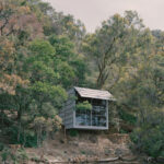
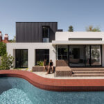
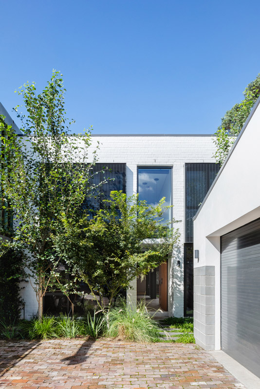
The Third by Dalecki Design is a bright and beaconing addition to a character-rich home driven by purpose, integrity and connection.
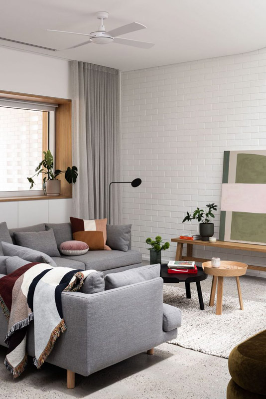
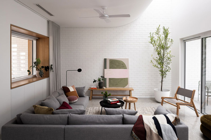
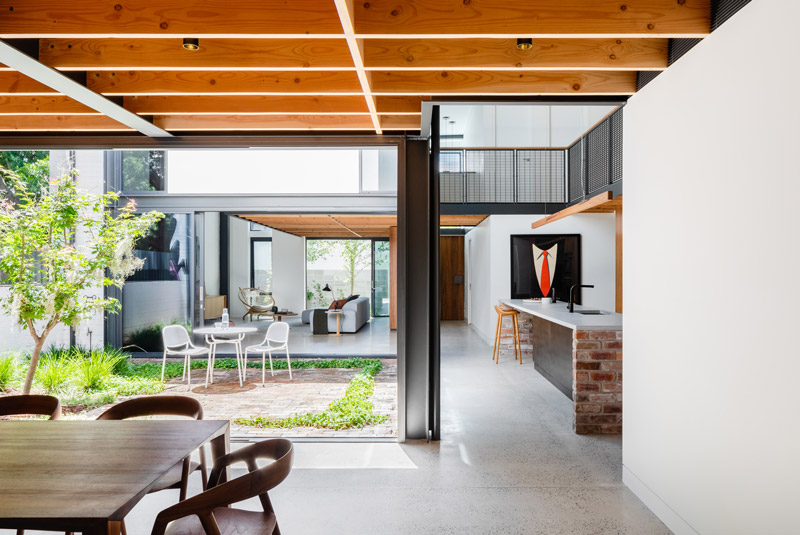
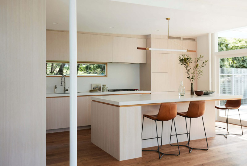
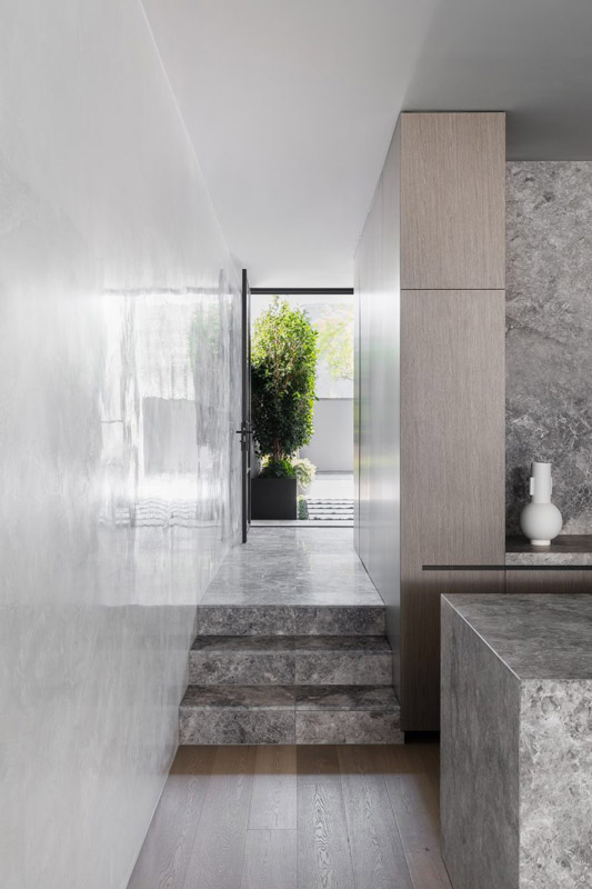
Dalecki Design’s interest in the adaptive reuse of existing homes is evident in the skilful integration of old and new – and this addition to a Federation home in Perth’s inner-north is no exception. Beyond the home’s traditional frontage, Dalecki Design has confidently introduced a contemporary articulation of space that connects with the outdoors, drawing in natural light and ventilation and supporting the daily rituals of family life.
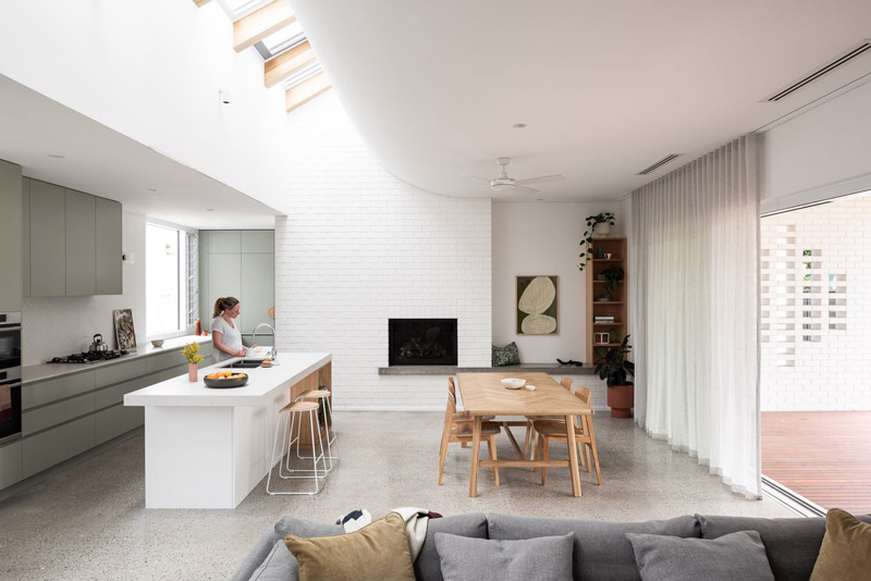
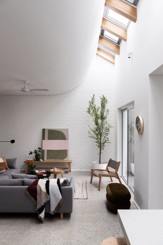
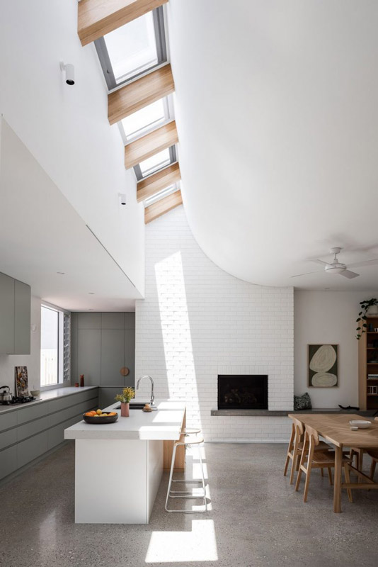
Frustrated by the constrained and poorly-lit qualities of the original house, the clients and their growing family sought light-filled spaces for living and entertaining. Dalecki Design corrected the impractical planning by establishing the front portion of the house as a private zone, creating a new entertaining and living zone at the rear, and introducing a multi-purpose activity room and two external living spaces at the centre of the house – an intermediary area that becomes a vehicle for light entry and engagement across the site.
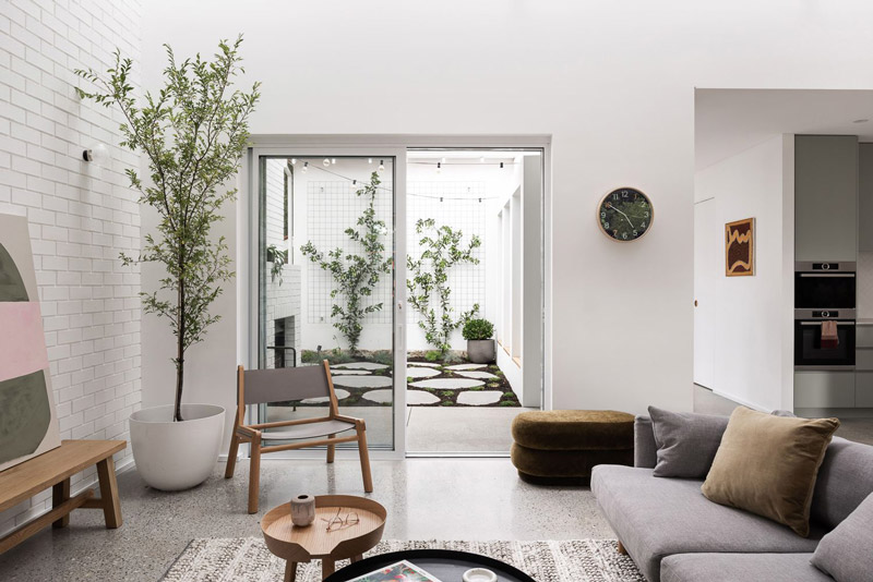
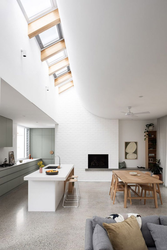
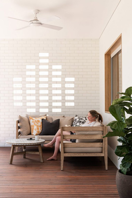
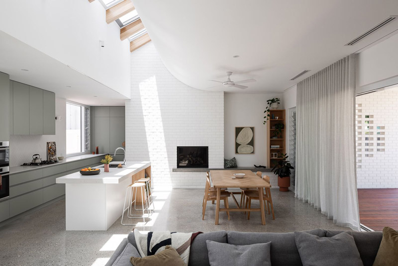
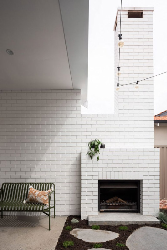
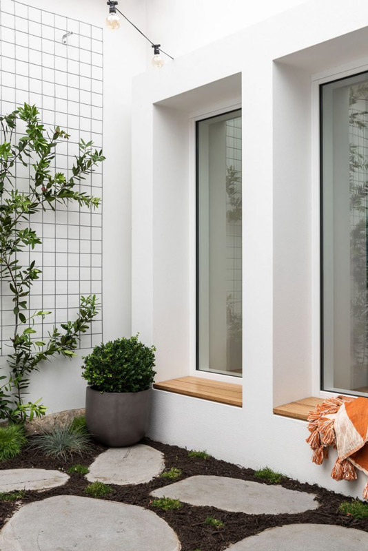
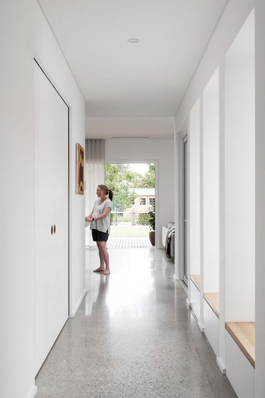
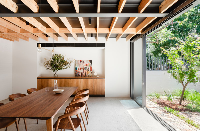
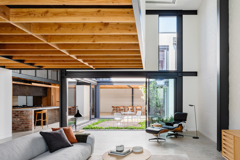
“The clients had lived in the house for some time,” reveals designer Janik Dalecki, “so they knew the quirks of the site, including the sun and breeze paths and wanted to make the most of these opportunities.” Connections between indoor and outdoor spaces gradually increase as one moves deeper into the home. A passage of window seats between old and new directly addresses the winter courtyard and creates different frames as you pass by. This culminates in a dramatic expansion of space as one reaches the lofty proportions of the living spaces, offering clear sightlines across the rear deck and garden beyond.
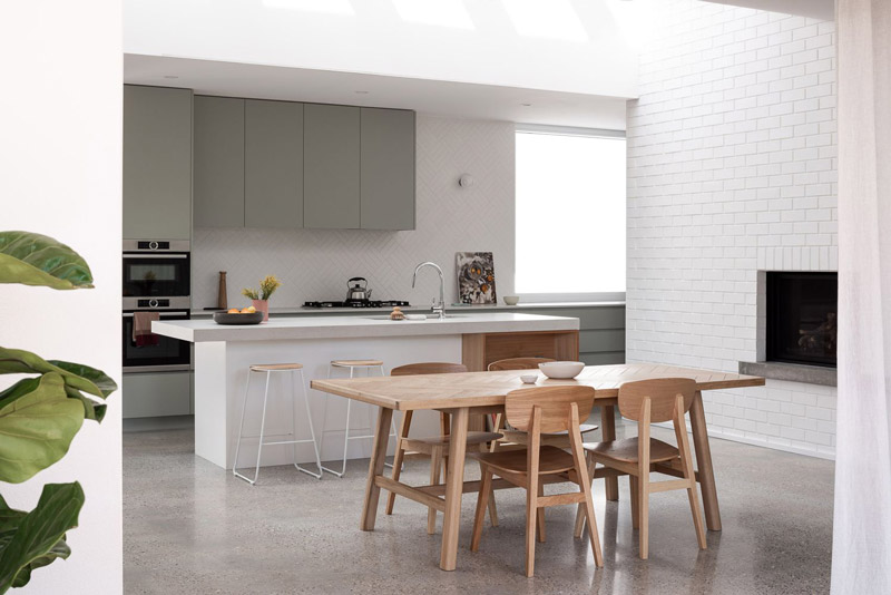
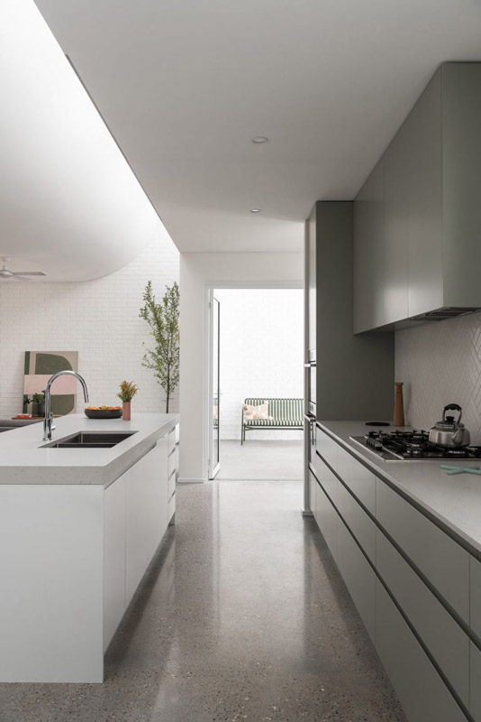
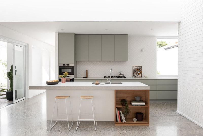
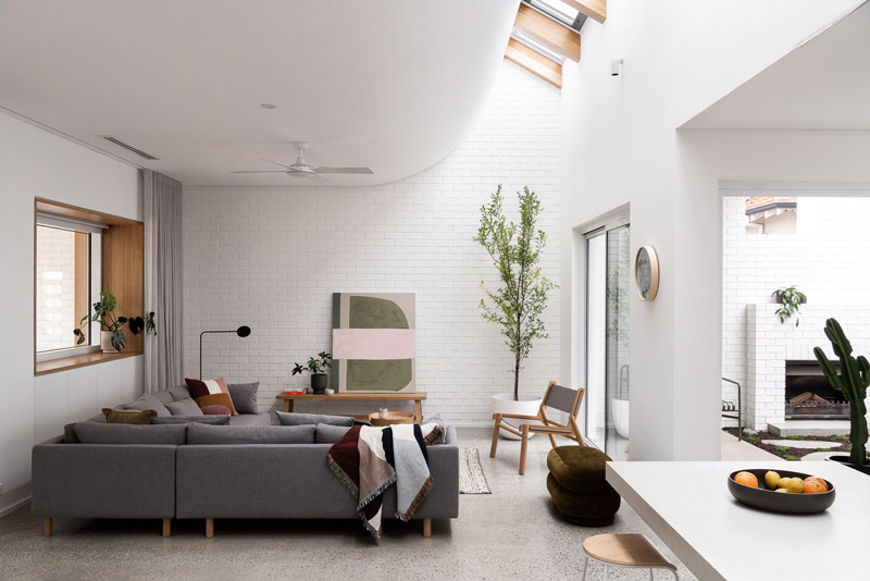
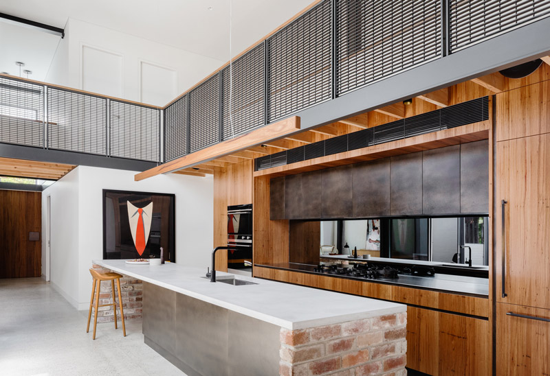
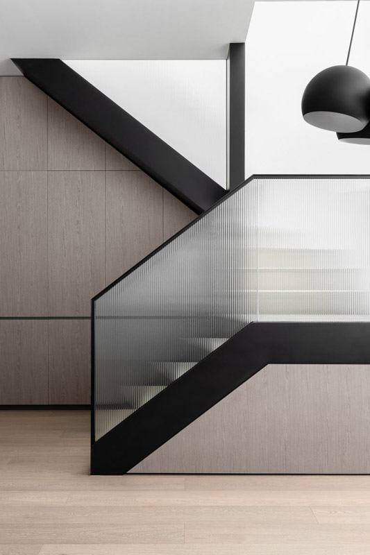
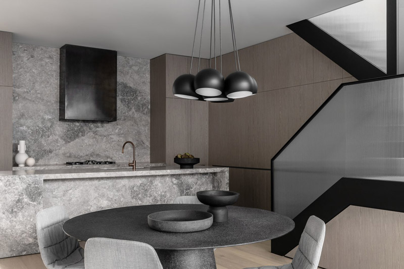
The addition unfurls as a series of interconnected and purposeful spaces for living. A dramatic curved ceiling intersects a linear skylight channel spanning the length of the room – flooding the main living spaces with northern light while creating a chimney effect by drawing in fresh air from ground level openings and allowing warm air to escape. “The sculpted ceiling brings a refined and elegant sensibility to the space, while offering great amenity,” reflects Janik.
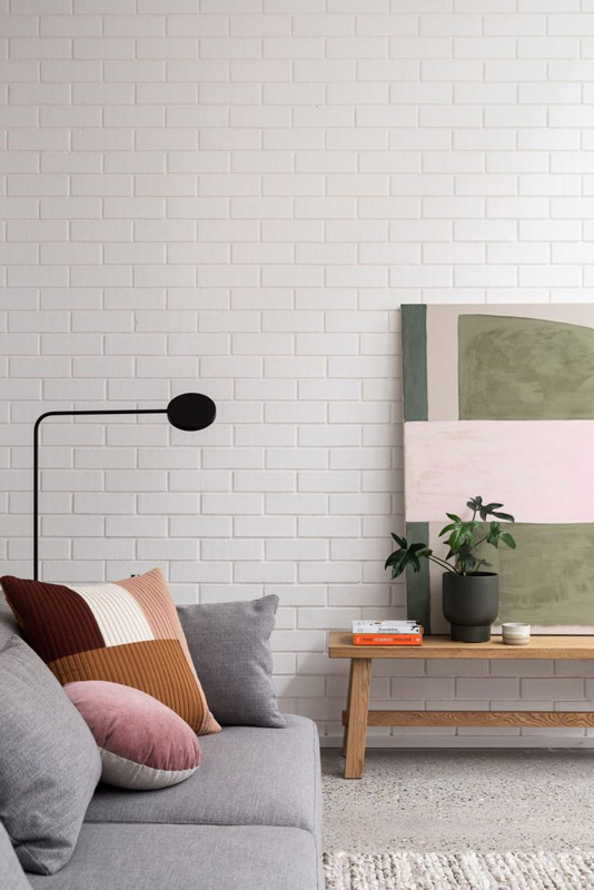
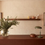
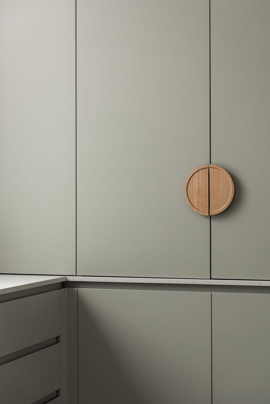
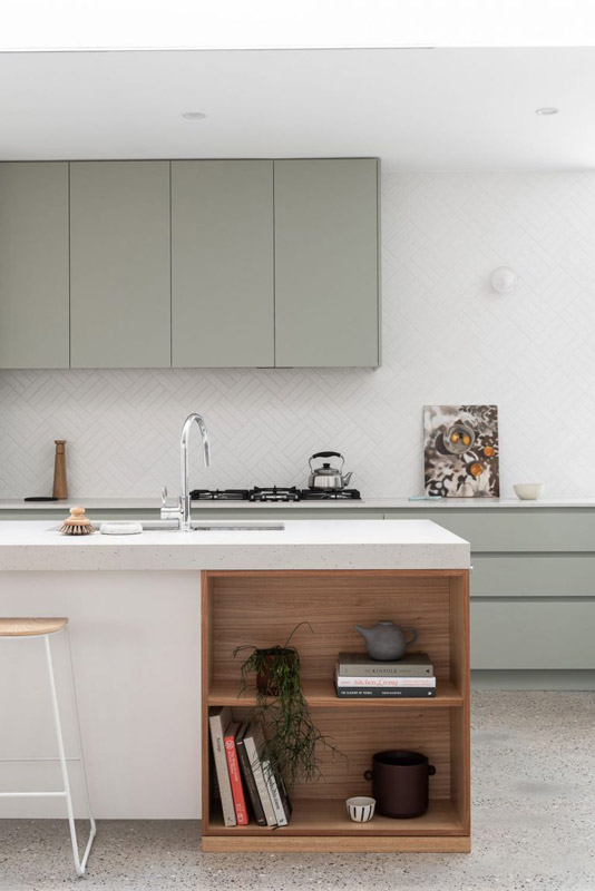
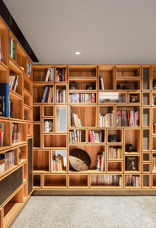
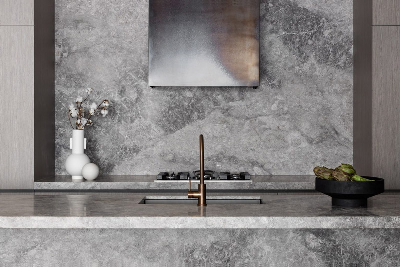
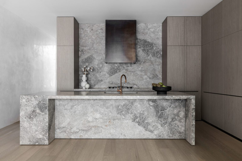
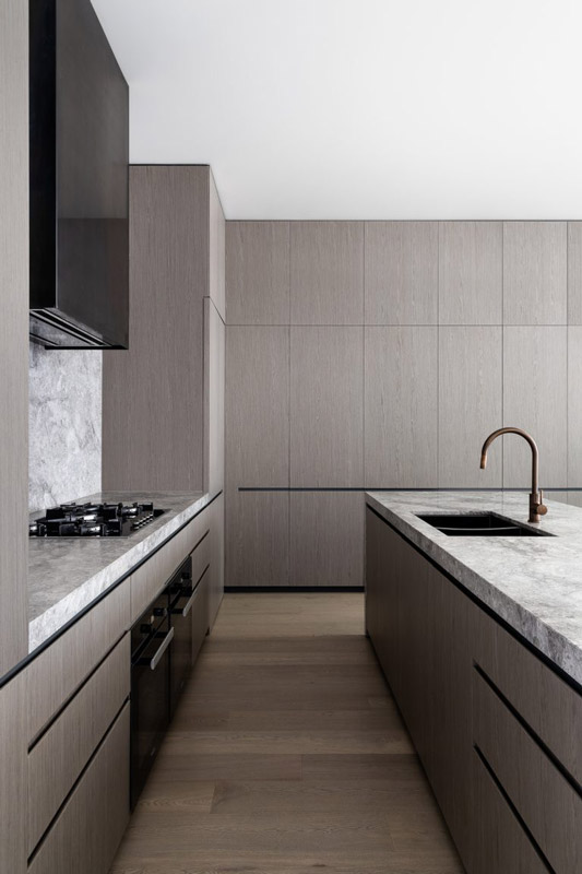
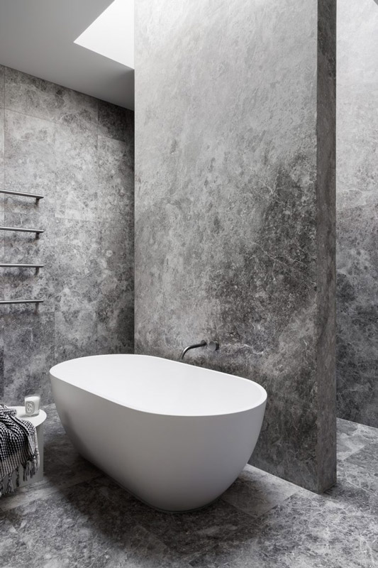
Further bolstering connections between inside and out, The Third follows a seamless material logic. “Face brickwork continues across both the dining and living areas, with light materials enhancing the bright and airy feel of the home,” Janik explains. Consistent details, such as the similarly styled fireplaces in the living area and external winter courtyard, give a sense of cohesion, while warm and tactile finishes, including polished concrete floors, sage-toned cabinetry and timber accents, elevate the experience of home with a sense of timelessness and approachability.
Employing a restrained approach to detailing, materiality and form whilst elegantly referencing the character of the original home, The Third is a sophisticated response to the clients’ brief with a distinctly Australian feel. “Overall, I feel the home provides separation and contrast and speaks directly to the needs of the clients” muses Janik. With reason and purpose in every decision, the overall impact is pared-back and relaxed – an inviting family home that supports the joy of suburban living.
Stomping Ground Brewery by studio Y + PlaceFormSpace
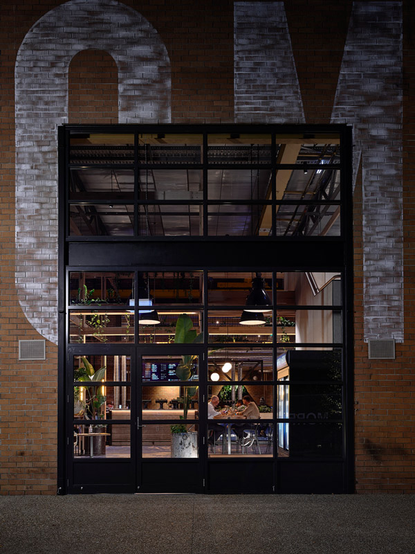
Text description provided by Studio Y and PlaceFormSpace architects. The location of the development is unique – situated amidst an outer suburban industrial and residential area, it was critical to create a welcoming, inclusive, and energetic gathering place, allowing locals to enjoy the same experience of the Stomping Ground inner city venue.
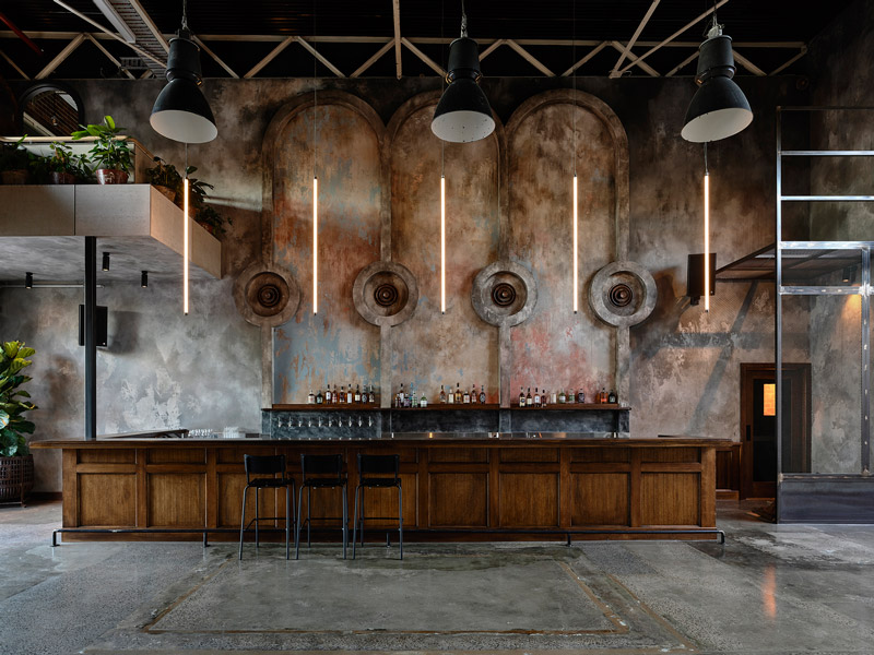
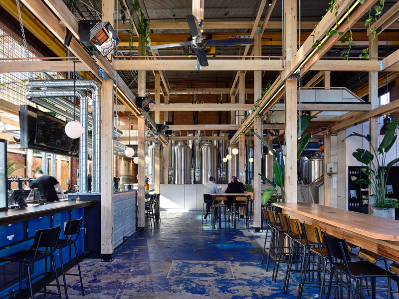
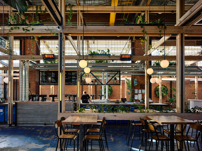
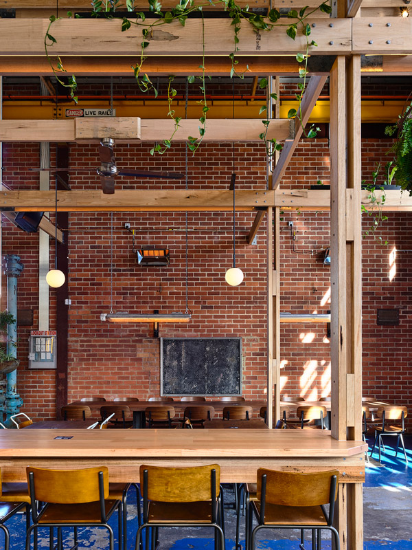
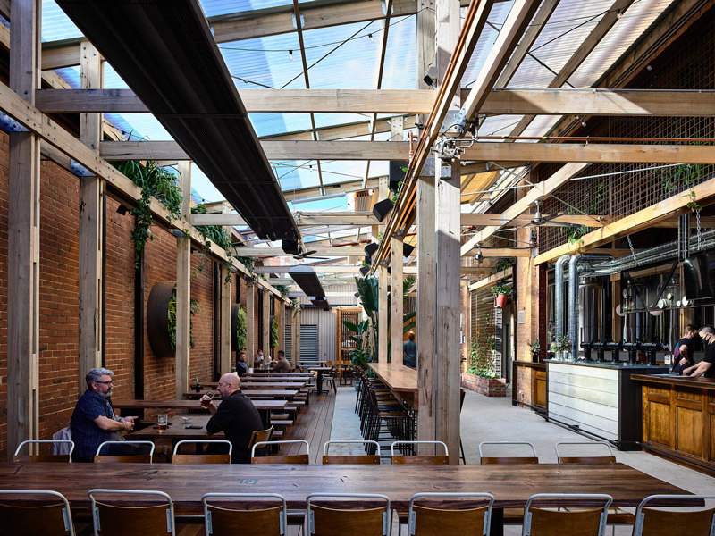
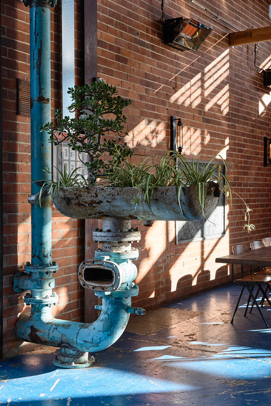
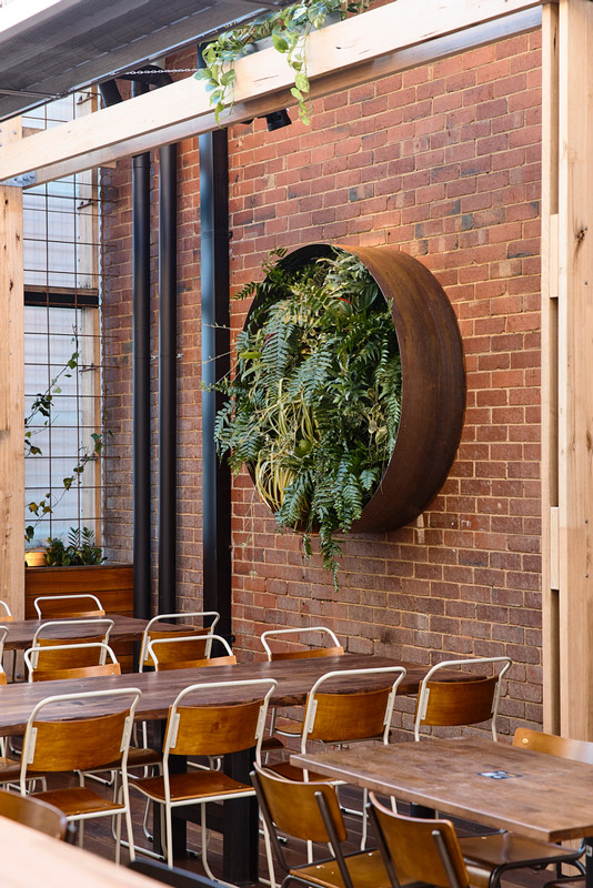
The existing conditions and relating structure of the current building had to be carefully investigated and incorporated into the architectural design. The large site meant that zoning had to be exceptionally considered to ensure sections felt intimate but also retain the open-plan beer hall experience. Minimal finishes create a contemporary industrial feel whilst the found items take inspiration from the original factory.
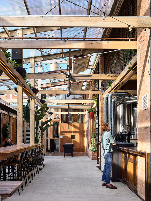
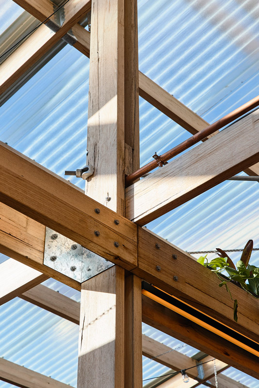
A mesmerising full height timber grid structure is the main architectural feature, it was designed to be modular and exposed, visually linking the outdoor and indoor spaces. Internally it serves a practical purpose, carrying and services such as lighting, AV, brewery mechanical equipment and beer pythons, with planters as a secondary functional use.
Externally the grid is used to support retractable roofs, translucent roofs, and walls. Intertwined with the landscaping, it allows the space to develop character and evolve over time. All connections are bolted, and the timber beams can be re-sed at the end of the building’s lifespan or when a different use is required.
The separate function area was designed to be elegant and timeless whilst remaining flexible. The high ceilings, vertical pendants, feature arches, custom distressed paint and private bridal suite all enhance the unique space whilst paying homage to the original building.
The beer hall staircase leads up onto a bridge above the brewery area. It links to the amenities area and offices and offers an elevated perspective of the beer hall as well as insight in the brewery area from atop. The u-shaped bar separates the beer hall from the beer garden and is one of the key and central elements of the space. The hero bar is clad in existing switchboards and the existing blue floor paint is also a nod to the warehouse aesthetic.
Every light fitting across the project has their own story. The lighting concept was designed to replicate the idea of a sunset beer session. All light fittings were tailored to have layers of optimised filters that replicate the natural colours of a sunset. In a commitment to sustainability and integration, the lighting designers, ambience took the extraordinary step of making a number of the light fixtures themselves including the refurbishment of original factory light fixtures.
Architects: PlaceFormSpace, studio Y
Year: 2021
Photographs: Derek Swalwell
Interior Design: Studio Y
Lighting Design: AMBIENCE
Builder: MIC Projects
MOORABBIN, AUSTRALIA
written by : Hana Abdel 27 Jan 2022 published in : archdaily.com
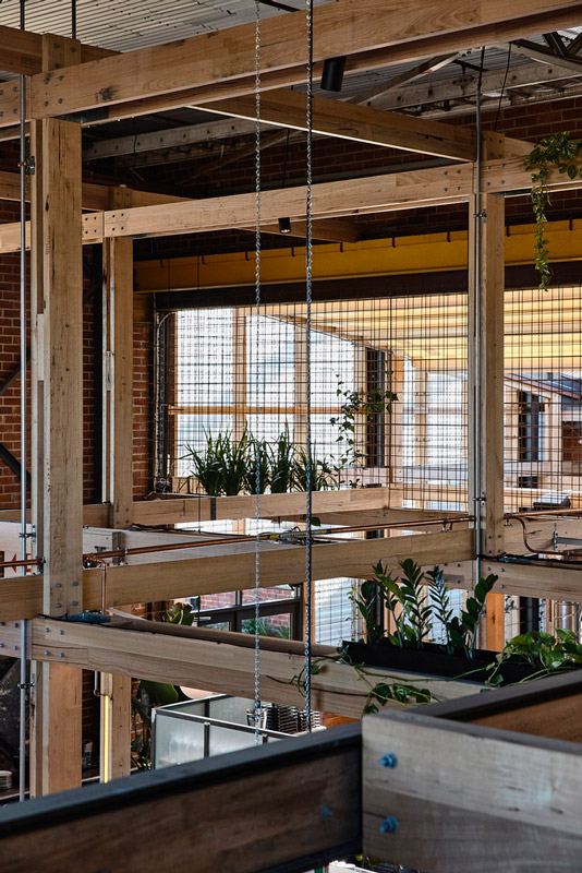
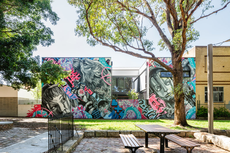
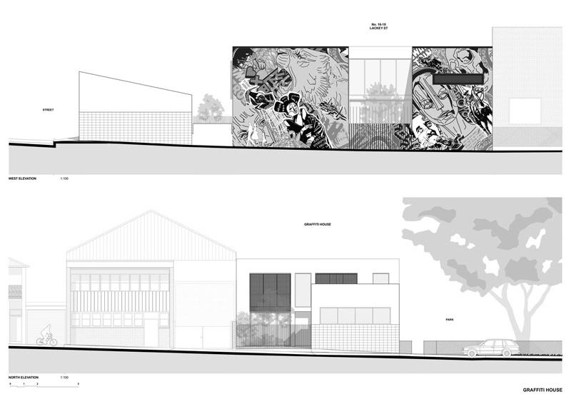
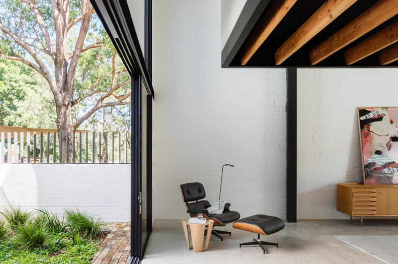
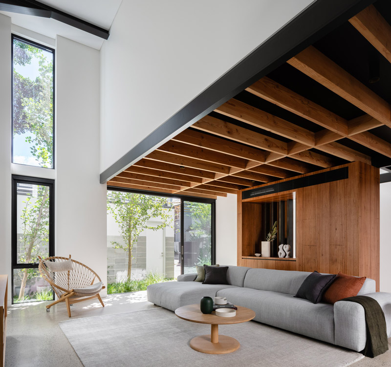
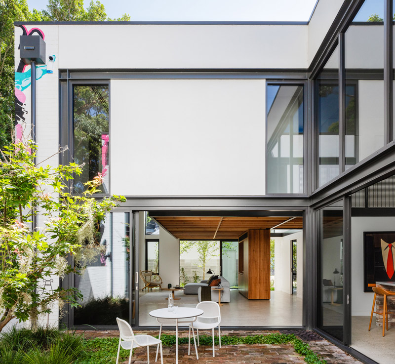
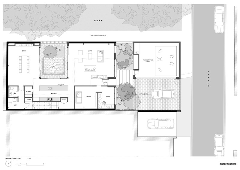
Graffiti House is the amalgamation of a brief which sought to convert an existing clothing warehouse into a home that was both a refuge punctuated with moments of intimacy while also a series of spaces with a sense of drama and connection with the outdoors. The project had a shaky start on-site and not long into the construction the original builder became insolvent. Fortunately, Durack Architects shares an office with a respected builder who was able to take over the works and bring the project back to life.
The conversion of the building into a new 3 bedroom home was a deliberate attempt to prioritize spatial quality over floor space. The clients were a couple with no children and a modest brief looking to make the most of the large open spaces on a modest Sydney budget.
The client had a love of utilitarian warehouse buildings and was adamant that the feel of the original space was not lost through the renovation.
While the original structure had a singularly dramatic presence it also was at risk of being spatially amorphous and without definition. To address this the existing volumes were maximized and defined by a u-shaped mezzanine which contains the plan and is in part suspended from the existing steel roof structure.
While creating a home with a real sense of connectedness this introspective plan has also encouraged intimate spaces wrapped around a protected and elevated courtyard.
While the planning was an integral component of the adaptive re-use of the building it was important that it be complemented with appropriate structure, detailing, and materials.
A sharp, utilitarian industrial aesthetic was employed with exposed steelwork and timber joists along with industrial grating for screens and balustrades typically used as flooring in factories. This was continued into the finer detail with rumbled brass tap fittings and joinery handles.
A relationship has been created between the home and the park through the breaking down and opening up of the facade through the raised landscaped courtyard.
The removal of this section of the elevation floods the interior double-height voids with a dappled light while also offering from the park a filtered glimpse into this new home. Paying homage to the diverse and textured community of St Peters this extensive facade over-looking Simpson Park has undergone a facelift with a piece of a commissioned street art collaboration between a gallerist client and local artist Alex Lehours.
Architects: Durack Architects Area: 339 m² Year: 2021 Photographs: Katherine Lu
written by : Hana Abdel 26 Jan 2022 published in : archdaily.com
Sense of Self Bathhouse - Setsquare Studio + Chamberlain Architects + Hearth Studio
Sense of Self Bathhouse redefines the wellness experience. bathhouse designed in collaboration by Hearth Studio, Chamberlain Architects and Setsquare Studio.
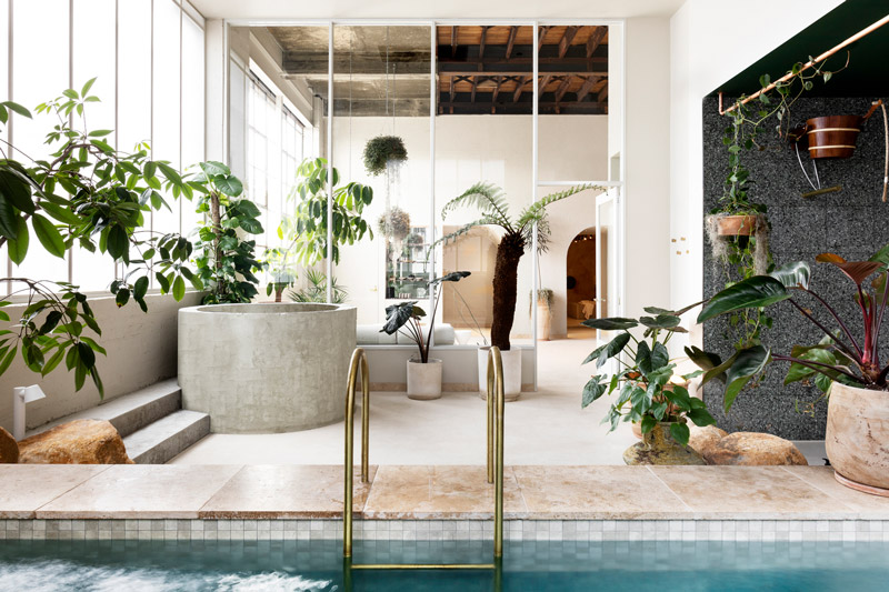
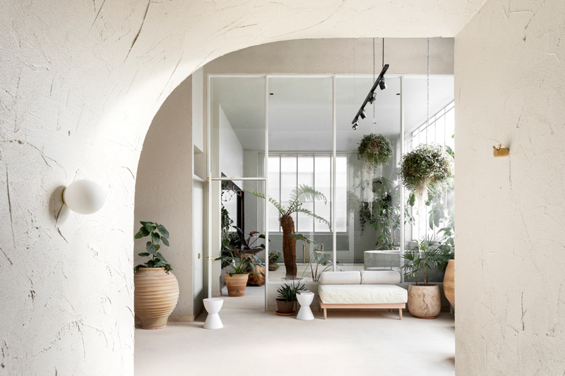
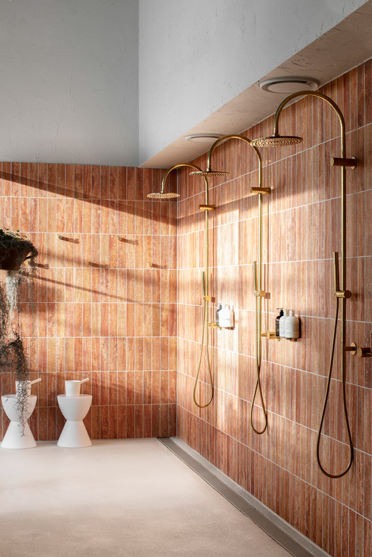
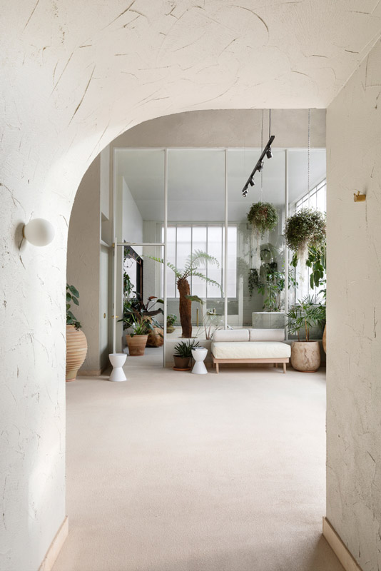
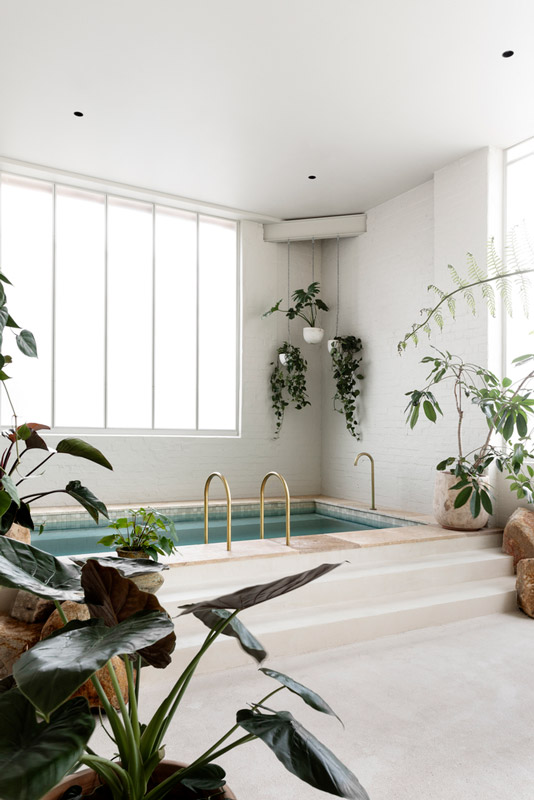
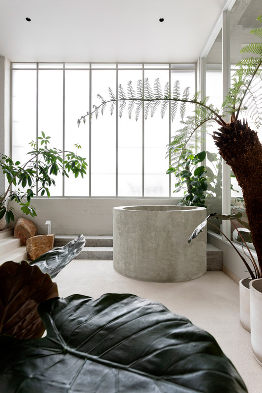
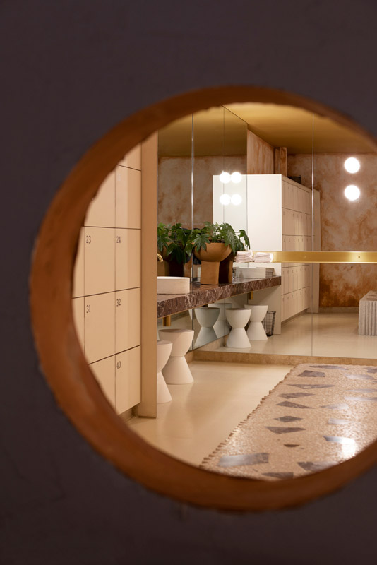
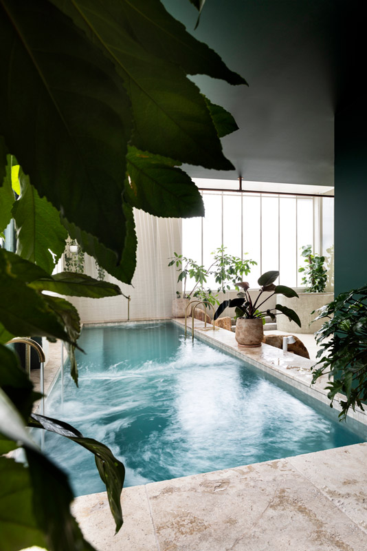
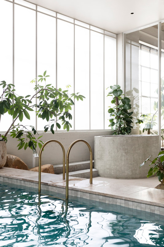
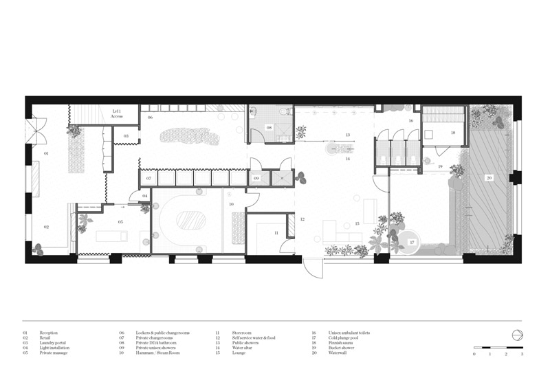
Healthy hedonism: Sense of Self Bathhouse redefines the wellness experience with an inclusive, immersive and design-led model for self-care.In a converted warehouse in Melbourne’s inner-north the ‘Sense of Self’ bath house comprises of; a large mineral bath, Hammam Steam room, Finnish sauna, light-filled vegetated courtyard and cold plunge pool.
‘Sense of Self’ was an unprecedented opportunity to explore the relationship of the (naked or near-naked) body to space, inviting guests to better connect with themselves and their immediate physical world. Sitting beyond the current definition of ‘wellness’, an idea largely defined by the term ‘beauty’ and translated spatially as a solitary activity within a stark white environment, the brief for SOS was to create an empathetic space that engaged in a new idea of well-being – community, acceptance and restoration. An immersive environment that encourages healing, rest and connection.
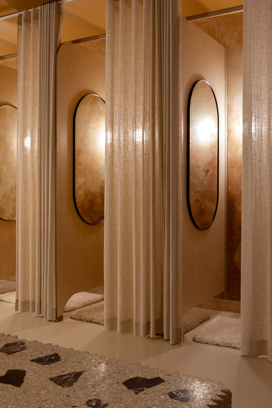
Taking the notion of empathy, the design placed an emphasis on the aspirational task of designing for every ‘body’. Eradicating the demarcation of floor plans based on gender or physical ability the design implemented communal change rooms, communal toilets (with only ambulant wc’s) and accessible communal bathing with a variety of entry options. Conceptually the layout centres around the sequence of rituals embedded in the bathing experience. Prioritizing the relationship between body and physical space, using design to guide users through the order to which a bathhouse experience unfolds.
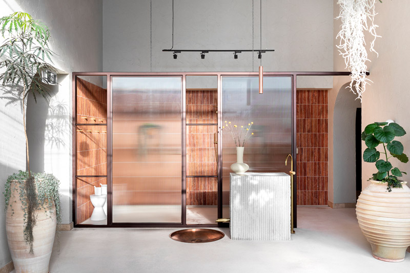
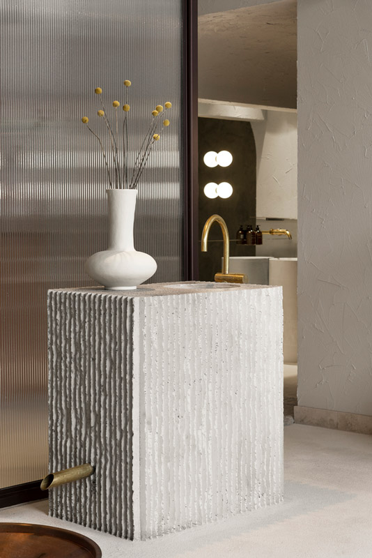
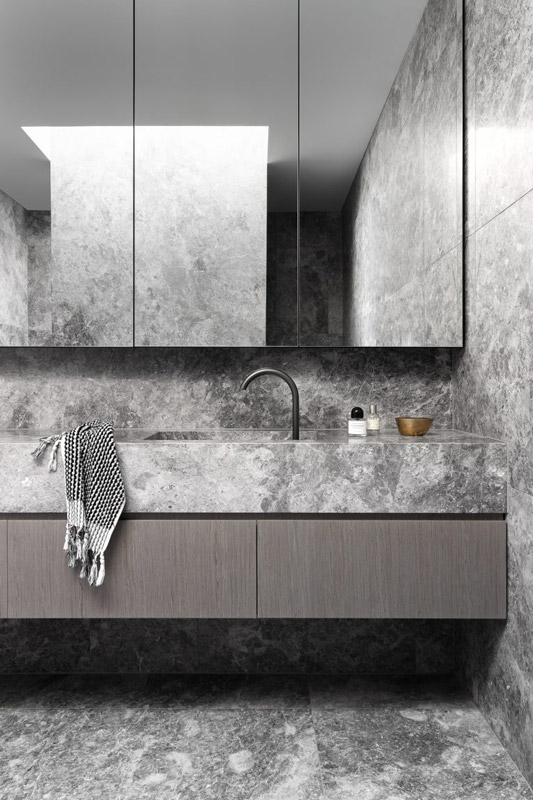
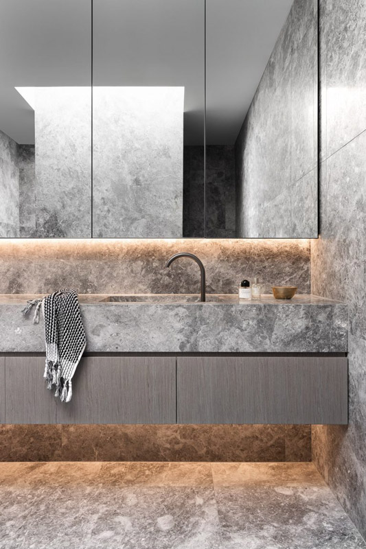
Looking to draw from, rather than replicate, existing bathhouse cultures around the world, the design extrapolates ‘bathhouse’ to its very essence; being that of water. The concept derives materials and form from understanding water as both a movement and a driver for growth, healing and nourishment. Drawing physical materials from concepts such as refraction, still, power, buoyancy and erosion.
Decorative glass and digital projections play with the refraction of light, while the water wall and flowing fabric curtains represent the power of water. Elemental materials such as concrete, travertine and sandstone are cast and carved in such a way that they are encouraged to wear and chip as they would in the natural environment. Vegetation embodies water as restorative. This design aims to define and cultivate communal bathing in Australia.
Architects: Chamberlain Architects, Hearth Studio, Setsquare Studio
Area: 275 m²
Year: 2021
Photographs: Martina Gemmola
Manufacturers: Haymes Paint, Sussex Taps
Builder: MIC Projects
Vegetation: Plant Charmer
Pool Construction: Striking Pools
written by : Hana Abdel 25 Jan 2022 published in : archdaily.com
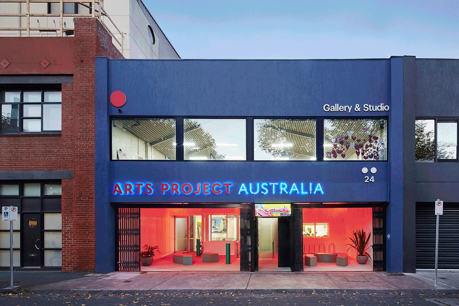
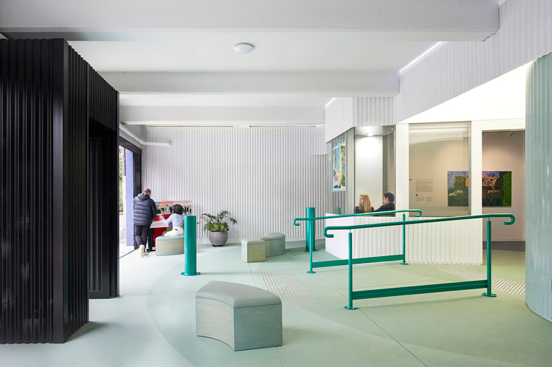
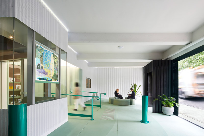
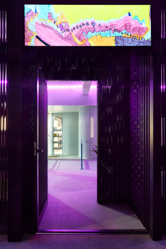
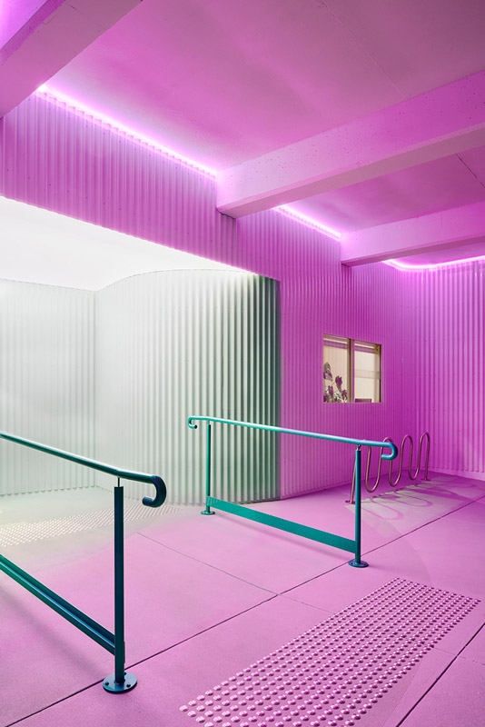
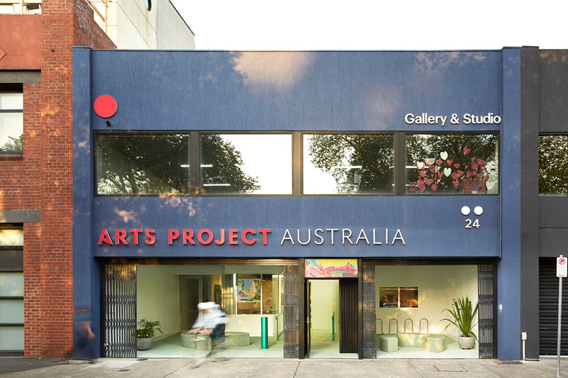
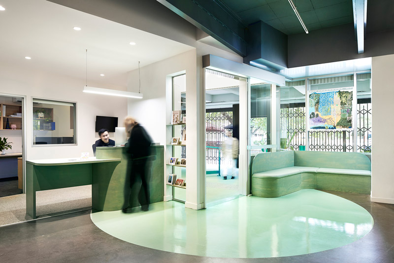
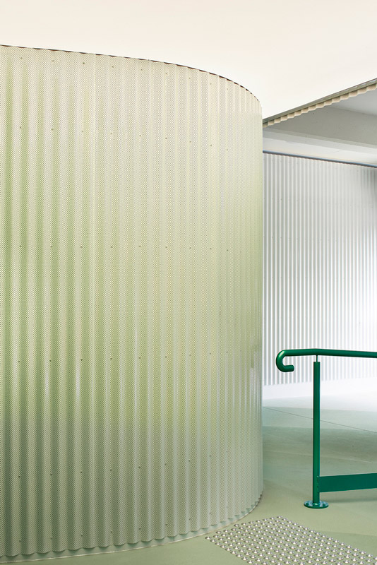
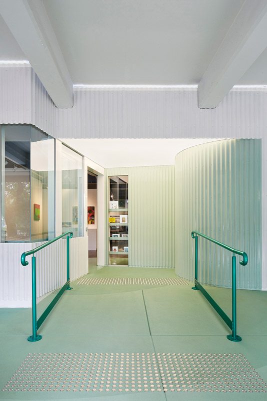
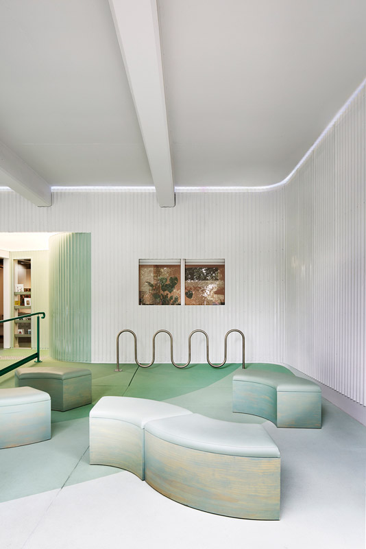
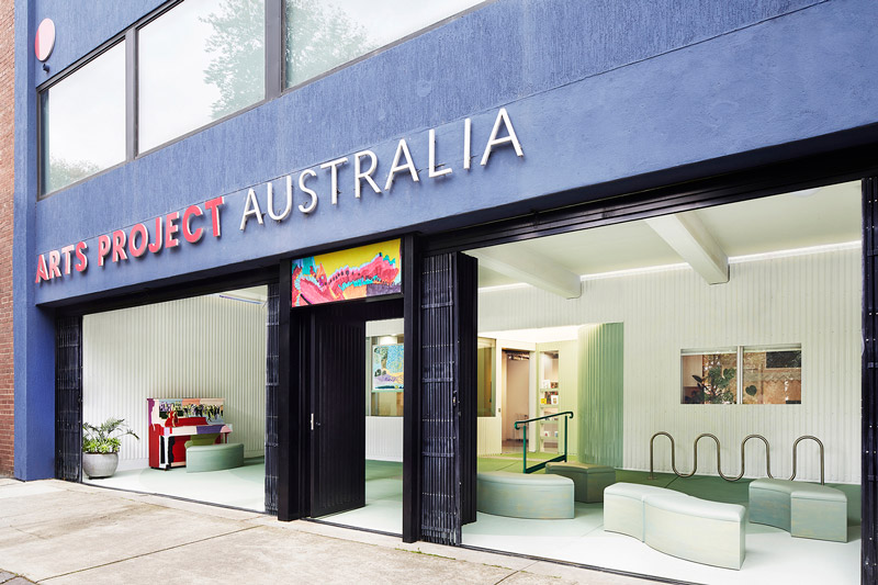
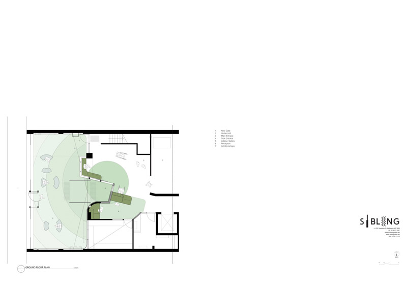
Arts Project Australia — a proud, strong, and unapologetic social enterprise — is central to contemporary art practice in Melbourne through providing art studios and services for artists with intellectual disabilities. This upgrade to its entrance and reception celebrates APA’s contribution to the arts by providing a warm hug to the artists upon entry.
Crossing over the threshold from the street, a sense of calm is instilled with a white and green palette. This tranquil feeling is extended through circular forms that spot behaviour by indicating pathways and seating places.
Guidance is also provided through safety elements, such as the handrails, which are revered in bold green.
Not everything is deterministic in this space. Flexible furniture allows for different occupations (for classes, workshops, social gatherings, and events) while programmable LED lighting irradiates different moods, including if you are feeling blue, or pink.
An art-box lintel above the front door also allows for a changing display for over 150 emerging, mid-career, and established artists that work in the studios.
A sense of belonging is integral to being part of civic life, and art has an important part to play in this process. The upgrade to APA in Northcote put art, and artists, upfront, and in doing so, contribute to the civic life of these artists and the high street of Northcote.
ABBOTSFORD, AUSTRALIA Architects: Sibling Architecture Area:100 m² Year:2020 Photographs: Christine Francis Manufacturers: Laminex, Plyco, Commercial Systems, Duratec Eternity, Forbo, MPS Paving, Maxiply, Ripple Iron, Wattyl
written by : Hana Abdel 23 Jan 2022 published in : archdaily.com
Gallery of Arts Project Australia - Sibling Architecture
Arts Project Australia — a proud, strong, and unapologetic social enterprise — is central to contemporary art practice in Melbourne through providing art studios and services for artists with intellectual disabilities. This upgrade to its entrance and reception celebrates APA’s contribution to the arts by providing a warm hug to the artists upon entry.
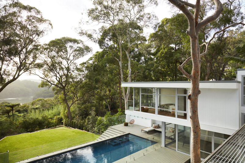
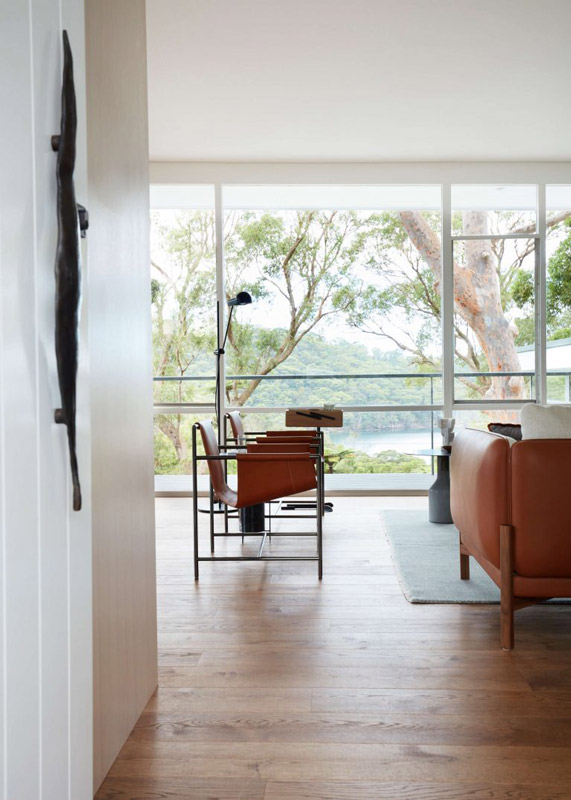
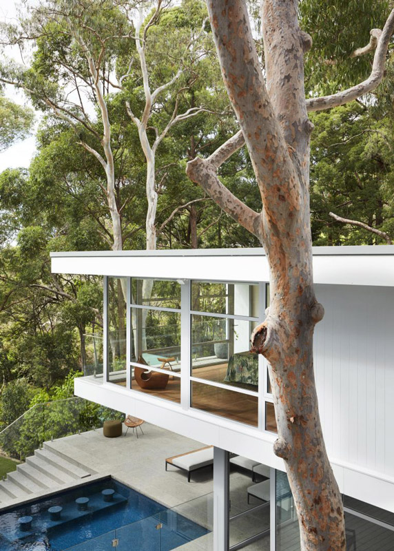
The Quarterdeck by Studio Gorman is a mid-century home nestled into a secluded bushland setting in Sydney’s Sugarloaf Bay.
It was essential that the integrity of the original 1950s architectural house was maintained and revered, whilst also integrating all the latest technology and services to bring the home into this century and beyond. Quarterdeck was reimagined for a tech ‘guru’ wanting to create a family home for himself and his three teenagers. The brief required that the home be doubled in size while simultaneously ensuring it would feel cosy when the client was living there alone, as well as functioning seamlessly when hosting a dozen or more extended family members staying at any one time.
The concept for the interiors drew upon the original distinguishing modernist details of the home. The butterfly roof, exposed structural steel beams, shiplap panelling to the front façade, bagged brick interior walls, and original timber 1950s windows and doors were restored, then subsequently the unique characteristics of these original features informed the design response. Subtle shipping references incorporated by the original 1959 architect, Glynn Nicholls, were also restored, such as the fine steel wire balustrading to the upper deck.
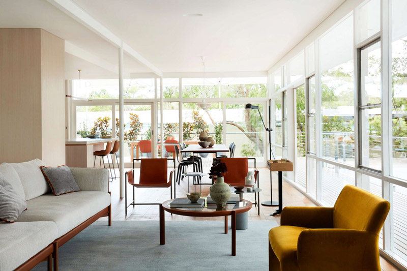
The client’s relaxed lifestyle and his beloved yellow kombi, known as Little Miss Sunshine, were further inspirational springboards for the project. Little Miss Sunshine was parked behind a fixed glass viewing panel adjacent to newly relocated central stair, allowing glimpses of her sunshine form whilst passing through the home. The interior designers played with colour – referencing Mondrian palettes, primary blue, red and yellow were sparingly introduced as bold brushstrokes, which were layered over a base of limed and natural oiled American oaks and lashes of white.
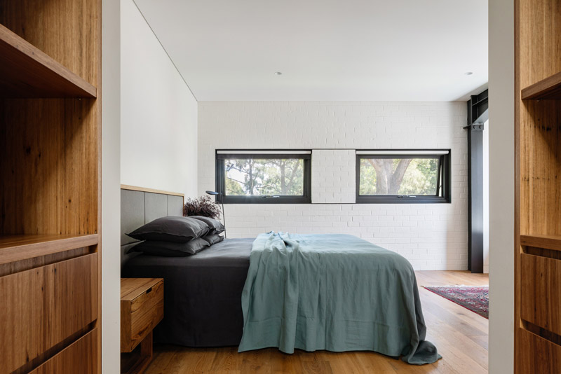
Needless to say, the bushland setting was also an enormous inspiration in the design response for the outdoor areas and in the master suite, which virtually hangs in the surrounding bush of Sugarloaf Bay.
Memorable, playful moments designed into the home are a further unique feature, including allowing the combi to be viewed via the stair, the sunny yellow children’s bathroom and a cave-like hidden cellar behind bookshelves, all of which respond to the client’s playful, relaxed personality. The cellar, with its complex secret entry operated by movement of a special book on the shelves is lined with recycled timber. A moody escape was crafted to juxtapose against the fresh white palette throughout the main home, while incorporating the client’s love of tech, surprise, and red wine.
There were challenges around the sheer size of the desired final home to accommodate extended family on visits to Australia, whilst also consciously working to keep the integrity of the original, much more modest modernist home, and particularly to maintain the humble original façade. Two new wings were designed by the architect to feel like natural extensions. Studio Gorman’s role as interior designers was to manage materiality throughout both the interior and exterior of the home, to craft the cohesive look between new and original that they were seeking to achieve.
Further challenges for the whole team were working within the constraints of the council’s bushfire ‘flame zone’ rating, due to the house backing onto a bush reserve in Middle Cove. This challenged the exterior materiality as well as the overall configuration of windows and doors throughout the house. It also meant that two bathrooms, on the eastern side, could not have any external windows, making their design challenging in terms of introduced light to ensure it looked and felt natural.
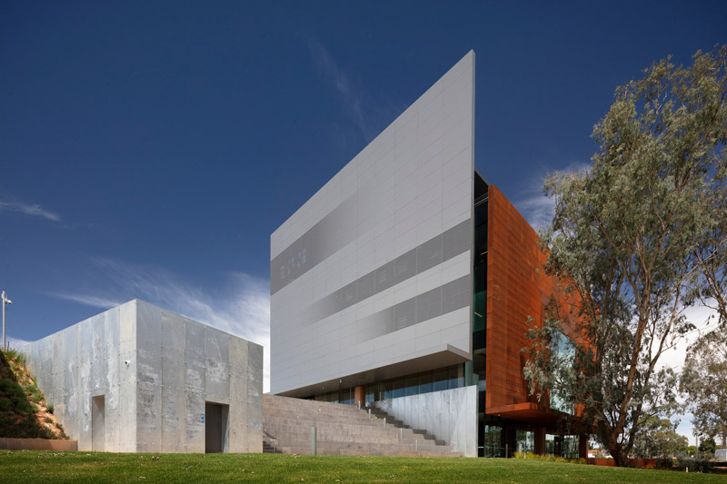
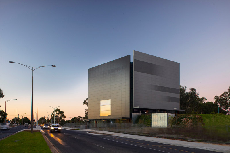
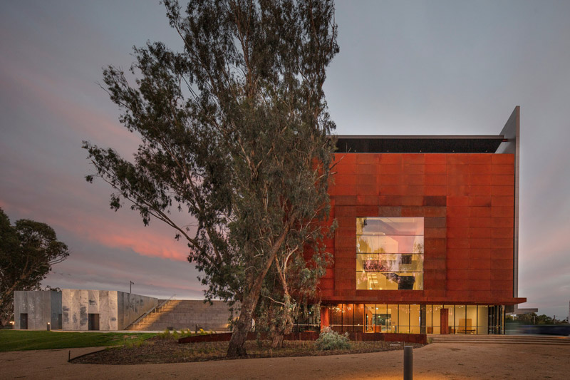
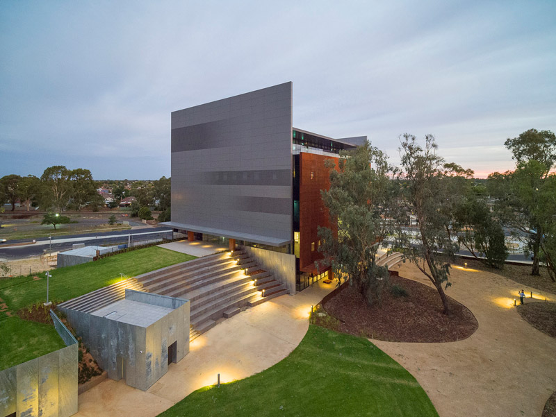
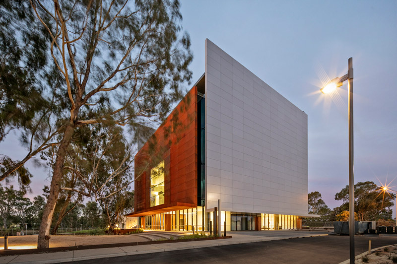
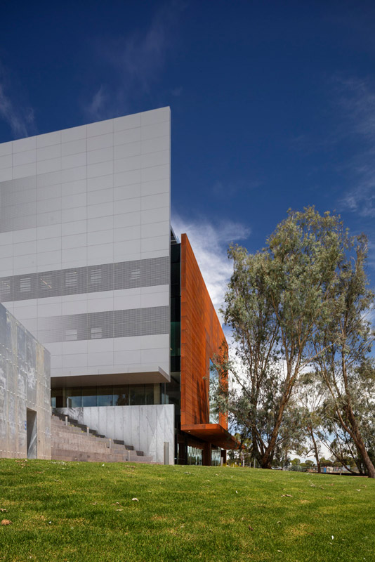
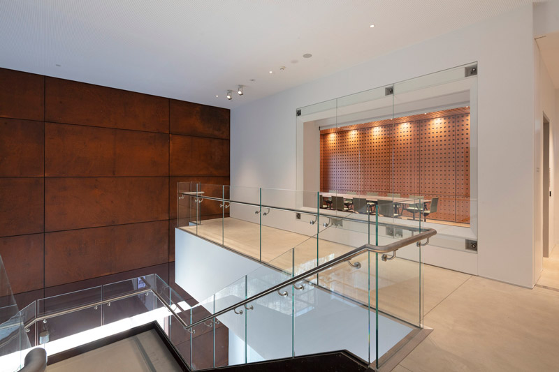
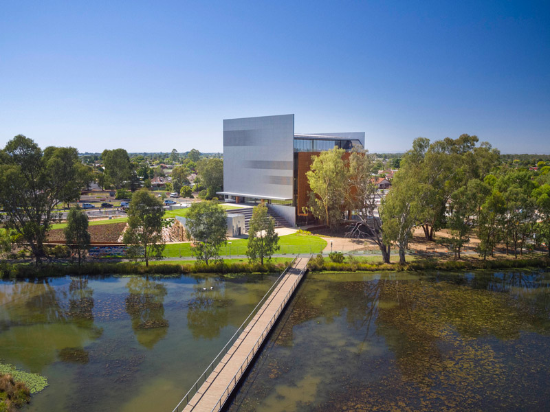
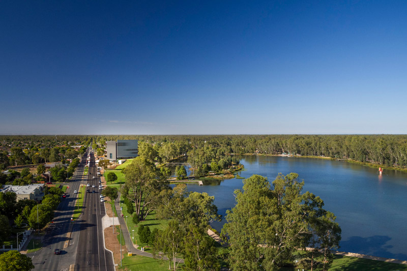
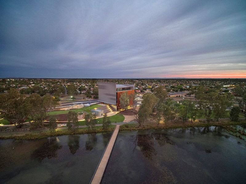
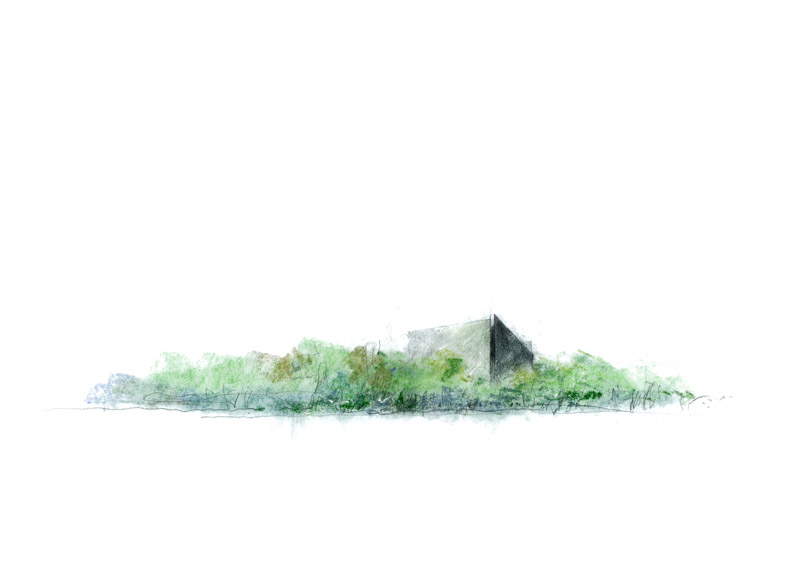
Text description provided by Denton Corker Marshall architects. The design of Shepparton Art Museum is characterised by simplicity and clarity, with compelling imagery creating a landmark cultural destination for Shepparton. It is located on the approach to the town centre, within a popular park within the flat Goulburn River Plain. The scheme was won in a limited competition. It includes an art museum, Visitors’ Information Centre, Kaiela Arts Aboriginal Community Arts Centre and a 150 person event space able to operate out of hours for conferences, weddings and social occasions, all within a 5,000m2 cubic form.
A restricted ground floor, required due to a floodway across the site, was turned into a design opportunity. The small footprint was extruded vertically over five levels to generate the distinctive small-and-tall art museum. This strategy maximises much-used park space, while also creating a beacon in the low, flat Shepparton landscape. The height also affords panoramic views from the rooftop events space across the lake and Goulburn Red River Gum Reserve beyond.
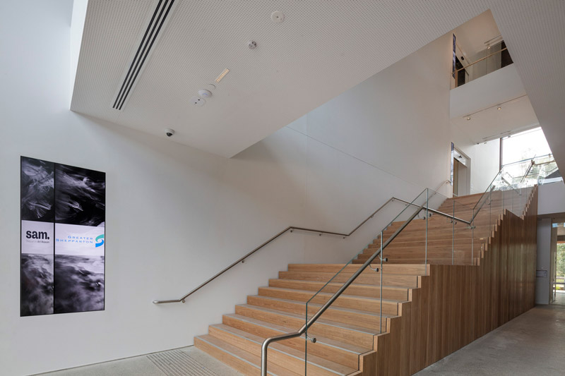
The design is ingeniously integrated into the park via a dramatic Art Hill, screening all building services, back-of-house and loading under the expanded parkland. The Art Hill has the advantage of effectively creating an upper ground level, enabling the museum cafe to enjoy an elevated outlook whilst being directly connected to, and accessible from, the park. Internally, it is a highly legible, transparent and accessible museum experience, centred around an open, circulation galleria. The interior design – the relationship of spaces, intuitive wayfinding, logical relationships – are overlaid with contrasts of drama, reflection, outlook, introspection and discovery. Four different galleries, totalling 800m2, are accommodated.
Two of the galleries are designed to ASHRAE (American Society of Heating Refrigeration and Air conditioning Engineers) Class AA standard to be able to accommodate exhibitions on loan from premium museums and galleries. This required dedicated AHU and preconditioners along with the building envelope, internal partitions and glass sliding doors being designed to higher airtightness requirements. Similar standards are applied to the preparation and conservation rooms and collection storage.
The facades of SAM comprise four thin floating L-shaped plates suspended in the landscape. They group together, at different heights and contrasting materiality, to form a composition at a scale comparable to the red river gums. By subverting the expression of built form into a composition of abstract sculptural elements, scale becomes indeterminate. This allows each facade plate to become a canvas, layered into the treed landscape of dappled light and shade, able to transform as a base for temporary installations or projection imagery as an integral rather than incidental characteristic.
SAM is a building whose physical form is surrendered to a shifting play of colour and patina changing with weather and time of day. It is simultaneously powerful and recessive. Each plate is an element in its own right, powerful enough to be eroded with a combination of large punched and smaller perforated openings where outlook, from within, is required. In effect, the building is conceived as a ‘land sculpture’.
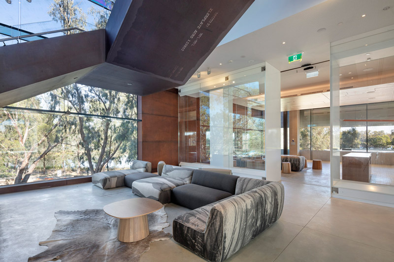
Toorak Town Residence by Skulptur Architecture and Interiors
How can the client’s grand vision be achieved on a compact site? That was the challenge presented to Principal Architect Sophie Gilmore of Skulptur Architecture & Interiors with the Toorak Town Residence project.
Skulptur is a boutique architecture and interior studio based in Melbourne specialising in bespoke residences that exemplify luxury living. “Our design process is built on foundations of refined simplicity, uncompromising detail, and architectural craftsmanship,” says Sophie.
“We are committed and passionate to achieve exceptional and tailored outcomes for each client. Creating and refining each project is what we love to do, inside and outside of work.”
The studio’s philosophy of creating timeless architecture redefined for contemporary living is exemplified by Toorak Town Residence.
The project stems from an approach that Sophie describes as from first client meeting through to project completion “working towards a unique vision that carefully considers client requirements, adding generational value to be celebrated daily through luxury living.”
Skulptur has a strong emphasis on interior design which comes from Sophie’s initial studies in Interior Architecture at Monash University, prior to a completing a Master of Architecture at The University of Melbourne.
“With this background I tend to work in reverse to most architects, thinking about the interior planning first before focusing on the exterior,” she says.
“Taking a holistic approach of considering the interior design, architecture and landscape collectively marries the spaces together, creating highly considered homes. These values are instilled in Skulptur’s design principles.”
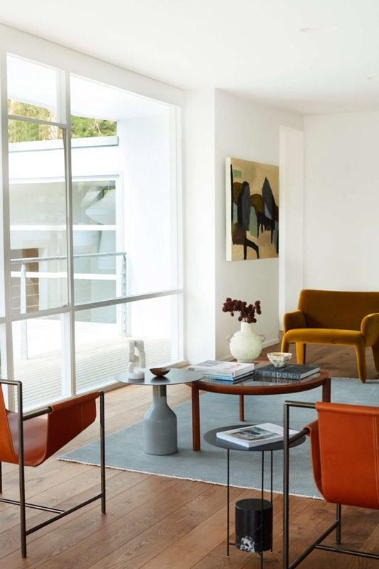
Working with a narrow, compact site, the two-storey Toorak Town Residence is the result of meticulous planning to maximise the sense of space and natural light.
A contemporary yet timeless architectural statement from the street is paired with a restrained interior palette of neutral materials, while carefully framed vistas that flow from each space create an uplifting inner-city sanctuary.
“One of the focal points of the client brief was to maximise the dwelling footprint on the site,” recalls Sophie. “Working with council in the town planning stage enabled us to achieve 250sqm of internal space, on a 170sqm site, while still having generous gardens.”
Located on a verdant Toorak street, the new dwelling abuts 1930s neighbours of varying styles. Equally honouring refined classical architectural principles and the luxury of the new, the residence now sits comfortably yet boldly in step with its neighbours, with the sculpted geometric form and vertical emphasis of the double-height glazing creating an elegant addition to the streetscape.
The interiors throughout are meticulously detailed and refined, befitting the rigorous geometry of the architecture while maintaining a timeless and classic aesthetic. Fine craftsmanship and careful material selection are evident upon entry, with honed limestone floors and Venetian plaster walls enhanced by detailing in timber and aged bronze.
Responding to the client brief to maximise natural light and green outlooks, the spaces within the dwelling are delineated by floor-to-ceiling glazing overlooking landscaped terraces and courtyards, also designed by Skulptur. The consequent seamless integration of indoors and outdoors adds calming aesthetic layers to the home while also enhancing privacy from neighbours.
An embracing and functional central familial gathering zone ties together the home and its inhabitants. Says Sophie, “the warmth and richness of materials that emanates from the living spaces and adjoining kitchen are intended to create spaces that naturally draw the family and their guests.
” Complementing this approach, iconic furniture pieces upholstered in natural woven fabrics and silks and Australian artworks were carefully selected by Skulptur to further enhance and layer the materiality and liveable sense of luxury imbued in each and every space of this uplifting inner-city sanctuary.
Restraint and detailed design with careful selection of materials and finishes tie this project together, both inside and out. With its timeless aesthetic and cohesiveness of form and space, the home will be embraced and appreciated by the home’s inhabitants for years to come.
TOORAK, VIC, AUSTRALIA PHOTOGRAPHY Timothy Kaye
ARCHITECTURE Skulptur Architecture and Interiors
INTERIOR DESIGN Skulptur Architecture and Interiors
BUILD Kabsav Projects
Penelope Barker
LANDSCAPE DESIGN Skulptur Architecture and Interiors
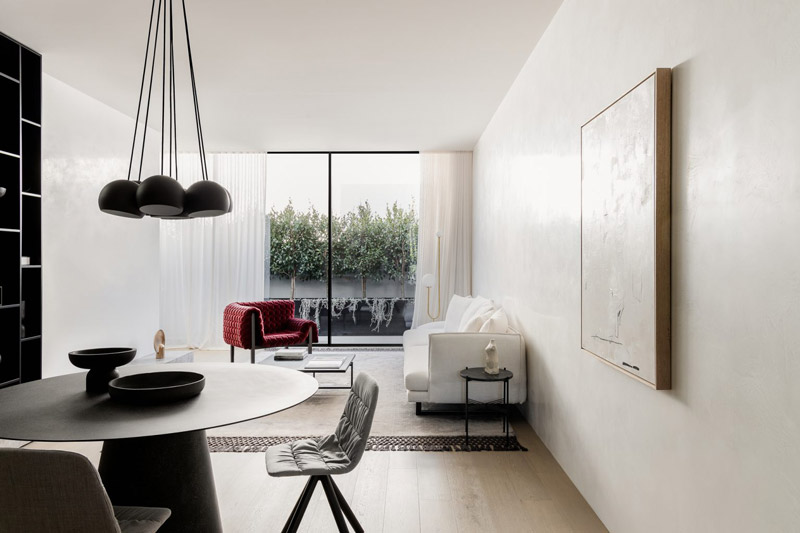
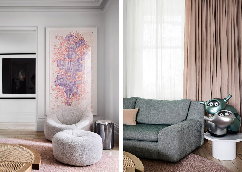
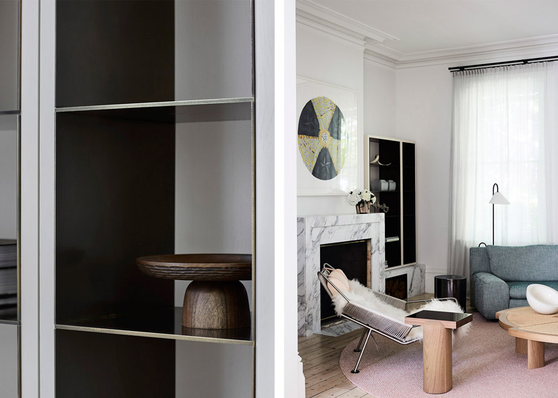
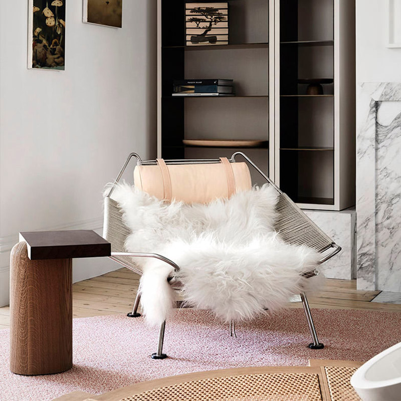
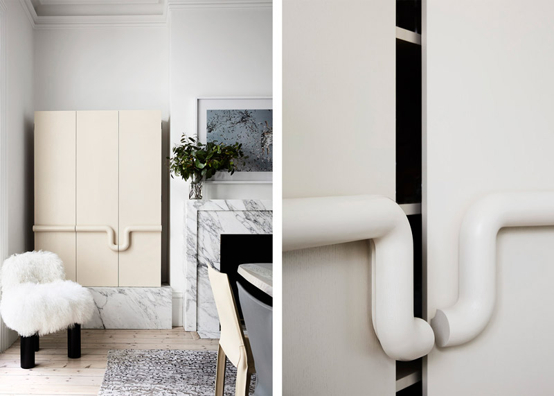
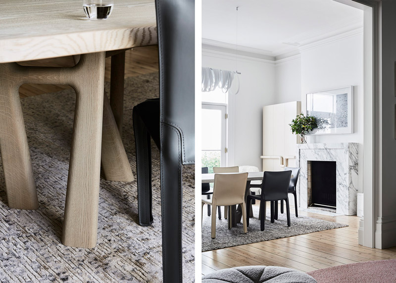
The overall result of South Yarra House 2 by Fiona Lynch is a space that very much reflects the client’s playfulness and complements their eclectic art collection.
An emotive potency defines Fiona Lynch Office’s work. Incorporating architectural and interior design services, our atmospheric creations embody a spirited minimalism with a keen emphasis on custom joinery, furniture and lighting design.
Founded in 2013 by Fiona Lynch whose painterly command of colour and texture is infused within all her residential, retail, office, hospitality, institutional and hotel projects, inventive uses of space, captivating tonal explorations and tactile material selections harmoniously meld artistic instinct with considered poise.
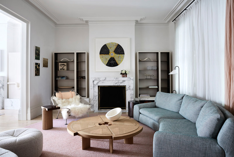
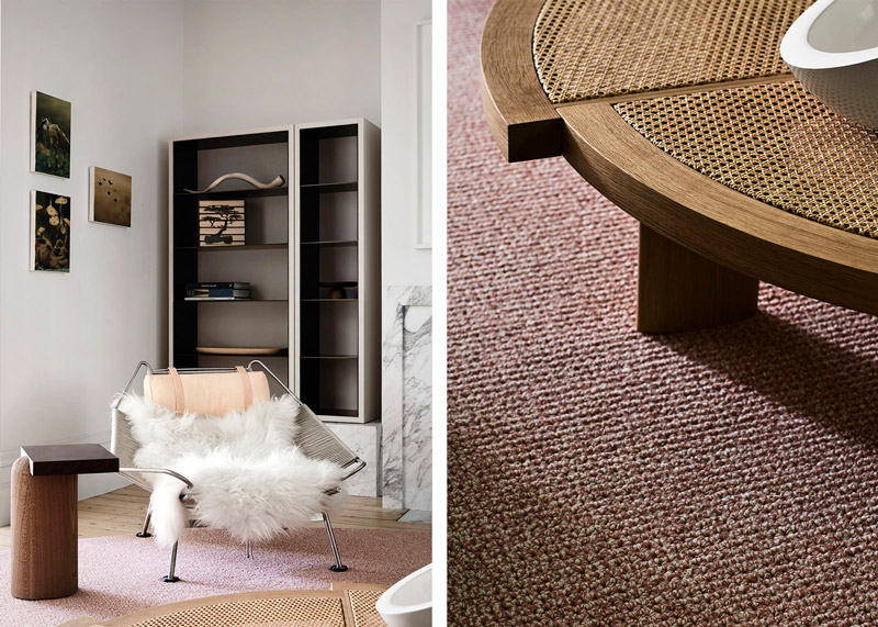
“The brief given by our client for this Victorian Terrace was to create a space in which they could relax but also entertain guests.
When re-planning their dining and formal living areas, we played with textures and materials to create an engaging and flexible space. The approach is exemplified in the bespoke joinery alongside the fireplaces. The living area has open shelving of painted oak, lined in bronze, sitting atop marble boxes. The dining room joinery uses bi-fold doors with a beautiful circular solid oak handle detail, also sitting on marble plinths echoing the living area. The overall result is a space that very much reflects the client’s playfulness and compliments their eclectic art collection.”
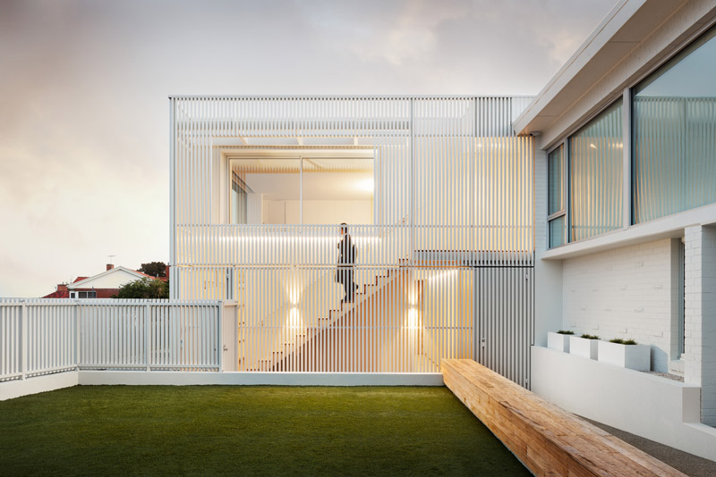
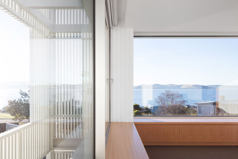
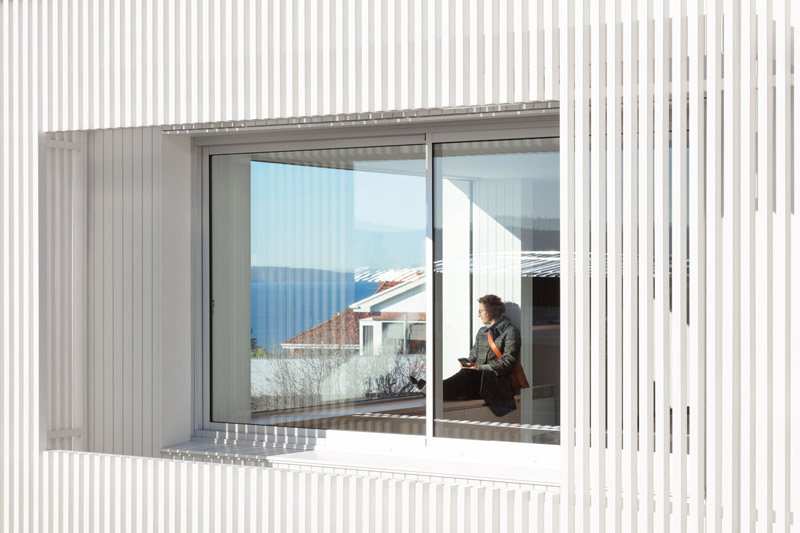
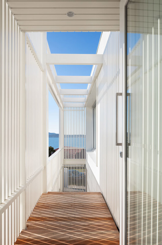
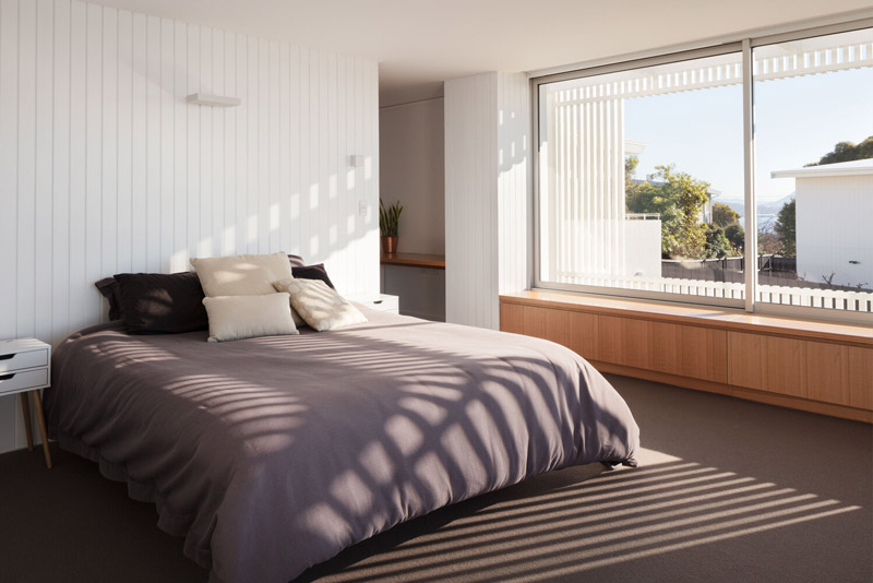
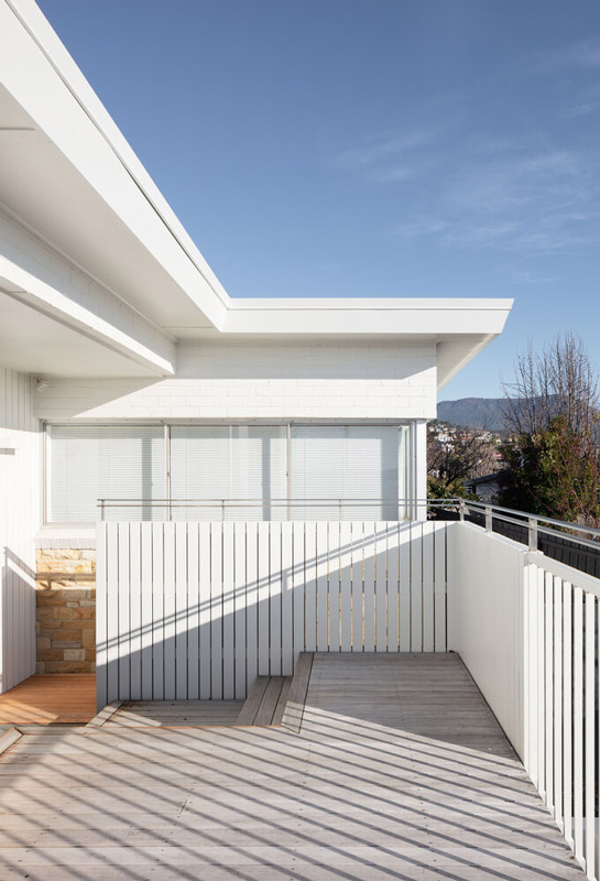
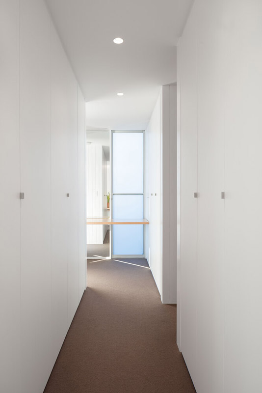
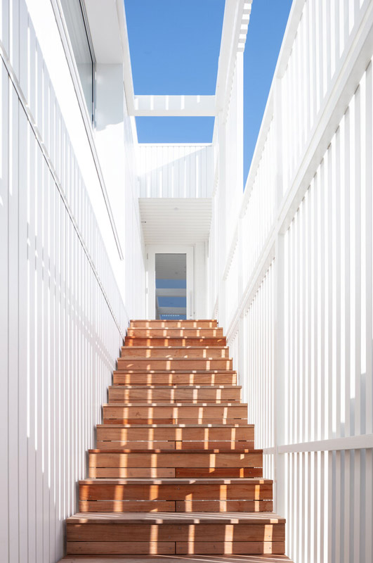
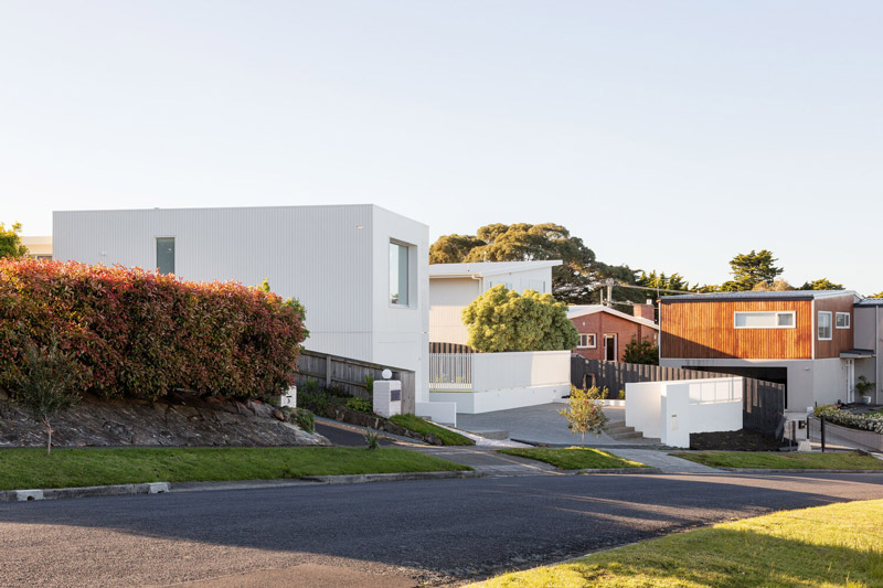
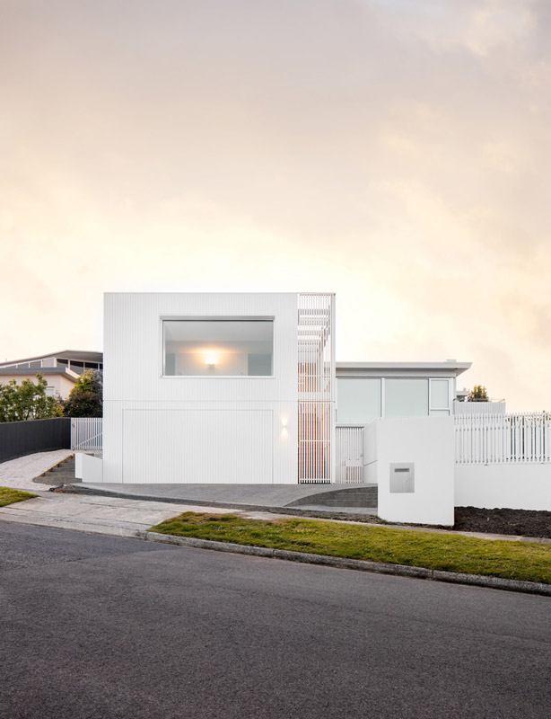
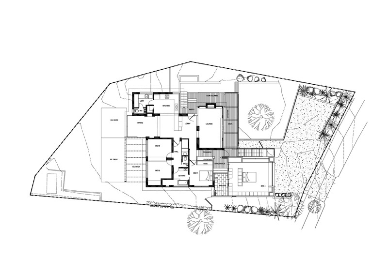
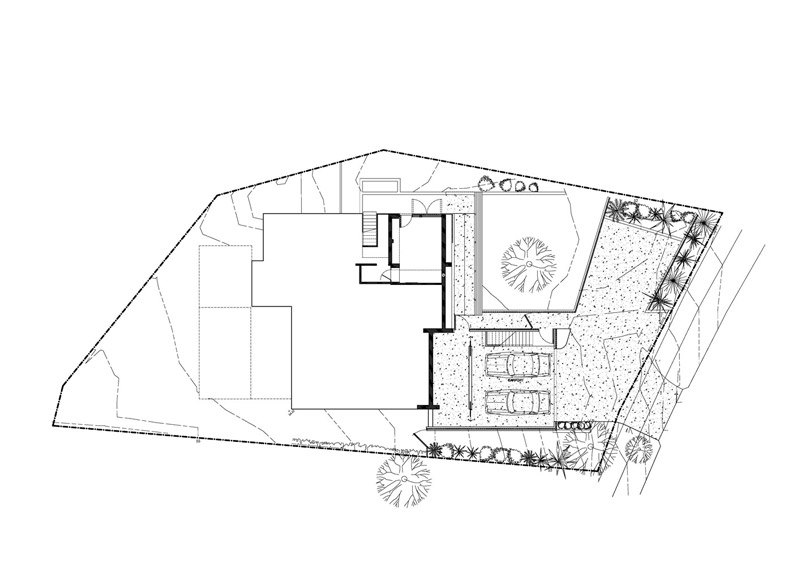
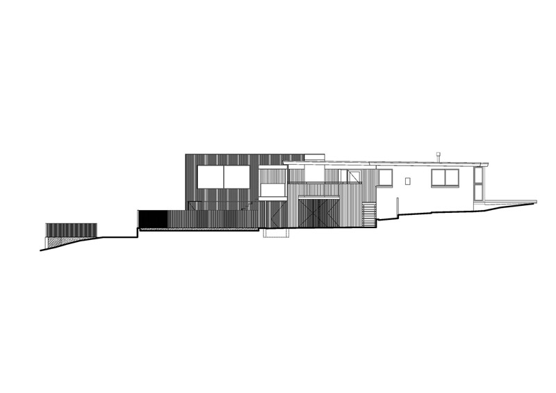
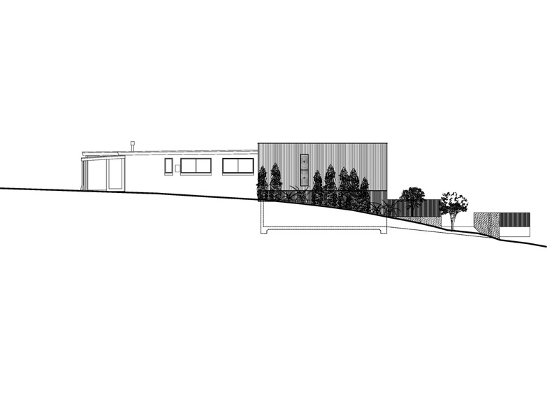
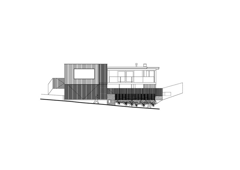
Text description provided by Biotope Architecture. Post-war Australian architecture in the 1960s was dominated by the Beachcomber, an affordable, open plan family home. In Tasmania, however, it was a slightly different story. Although the houses were influenced by the Beachcomber style, they were made with materials that suited the climate, involving more masonry than what was used on the mainland. The White Lookout is an alterations and additions project for a professional couple and their growing family inspired by the iconic Beachcomber and the spectacular location with impressive views of the Derwent River.
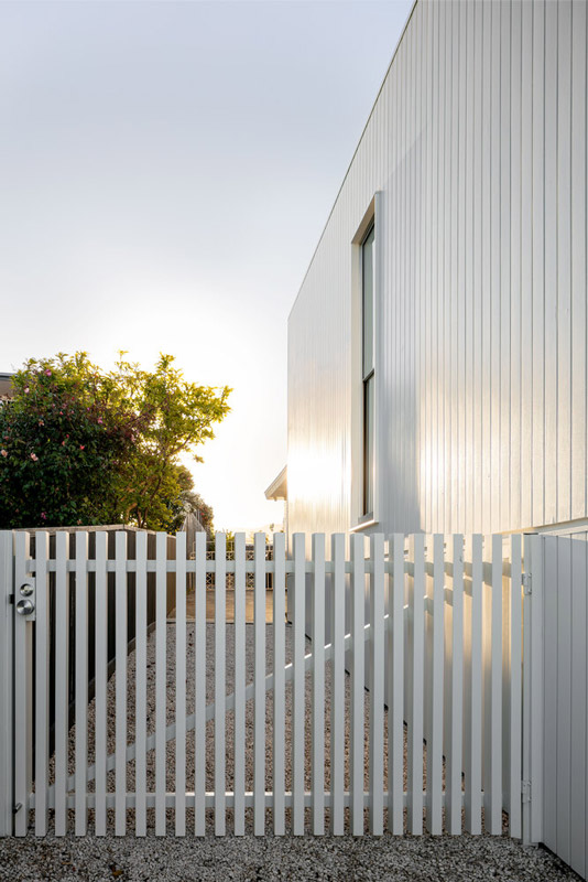
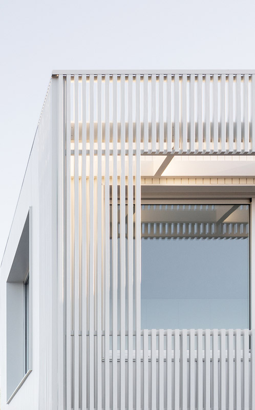
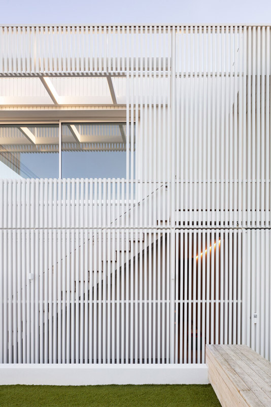
The existing 1960’s home is considerably set back from the front boundary, resulting in a largely unusable and exposed front yard. To remedy this, we designed the extension to the front yard using a combination of timber cladding and slatted screening, also adopting slatted fencing around the much needed additional play and entertaining area for the family.
The slatted screen to the new extension has a dual purpose: it screens the stairs and provides shade from the summer sun to the newly added bedroom, which opens out to eastern water views and to the north for solar gain.
For the additions, our material palette inspiration came from the painted masonry, timber cladding and concrete stairs of the original house. The new bedroom, ensuite, garage and stair are infused with 1960’s and Beachcomber sensibilities, while a parapet roof works to maximise views and minimise the height from the neighbouring properties.
The white Lookout Project Details
Architects: Biotope Architecture + Interiors
Area: 60 m²
Year: 2021
Photographs: Joe Grey
written by : Hana abdel 12 Jan 2022 published in : archdaily.com