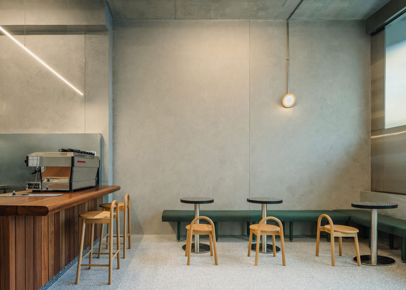
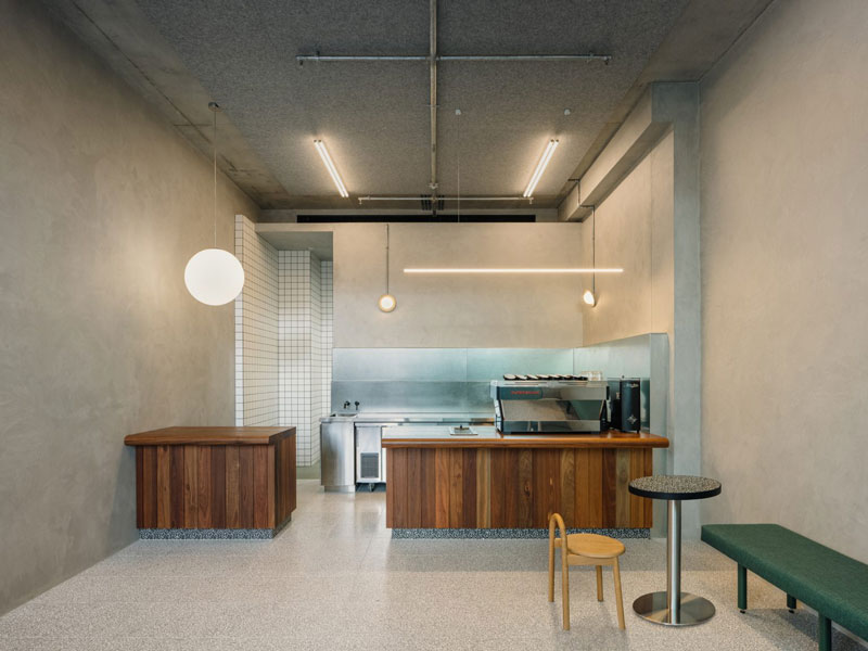
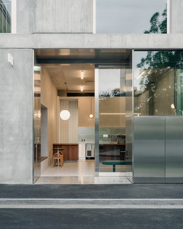
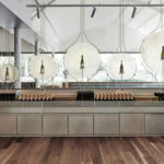
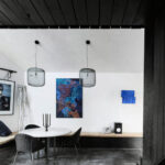
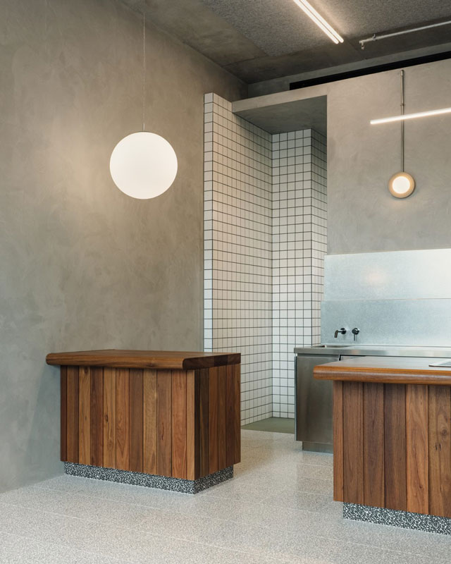
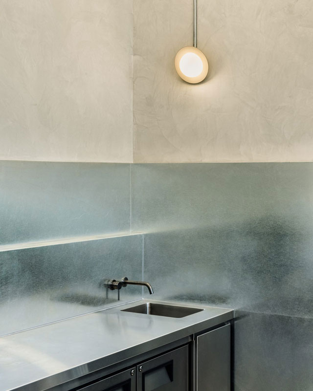
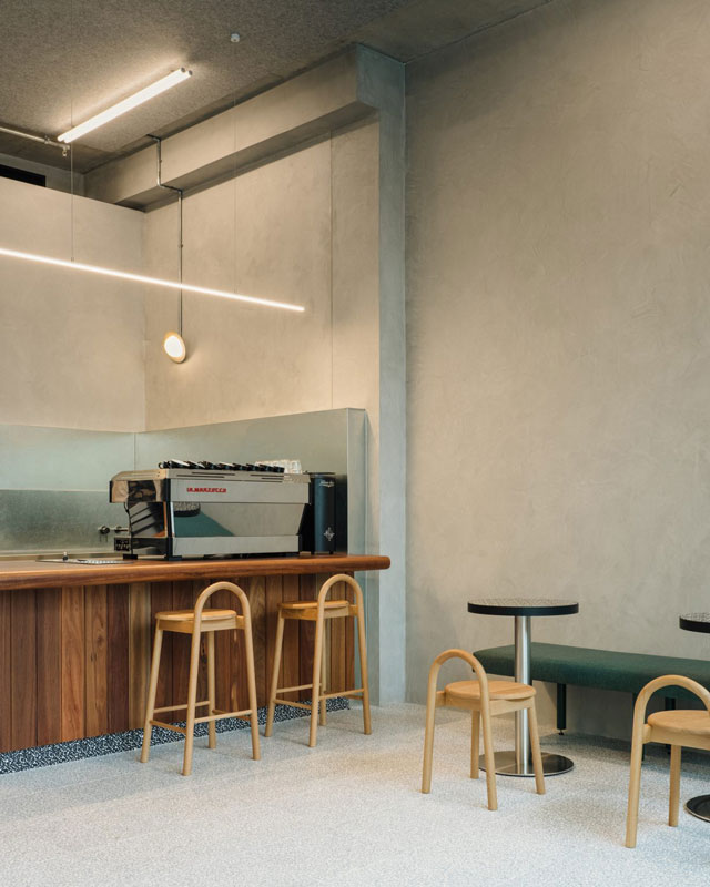
Set in Melbourne’s Richmond’s textural grit and bustle, Midi 3121 acts as a transformative place of escape. Within the architectural shell by MA Architects, the café offering celebrates that which Melbournians hold most dear – coffee. Drawing from the solid and brutalist form of the building it sits within, a sense of contrast and warmth form the foundations for the directive for the space, further brought together through an expressed craft and heightening of detail. Together with specialised graphics by Tom Clayton, Sans-Arc Studio reimagines the traditional coffee offering, maximising impact through a deliberately conscious approach. The resulting sense of calm is achieved through diffused lighting and subtleties in textures, enlivened by interplay with light throughout the day.
Built by Frameworks Melbourne, the engagement by Sans-Arc Studio came after the kitchen had already been made and the project was nearing completion. This left a limited timeframe to complete the story for the space, drawing on the surroundings and existing narrative of the area and the architectural proposition to form a fitting response. In its slightness, each element needed both utility and not distract from the overall volume and industrial feel already in place.
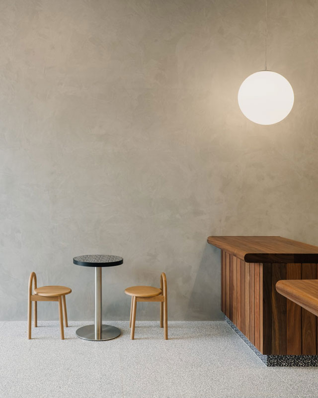
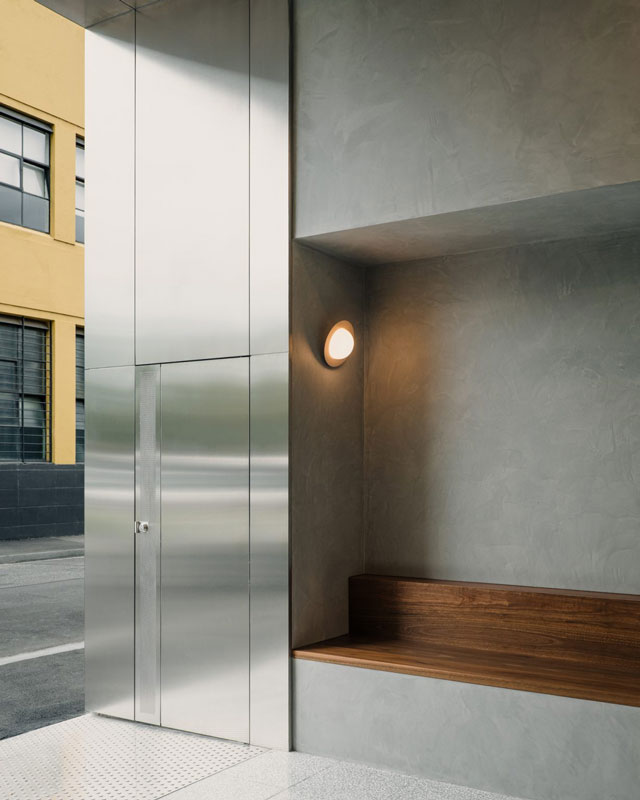
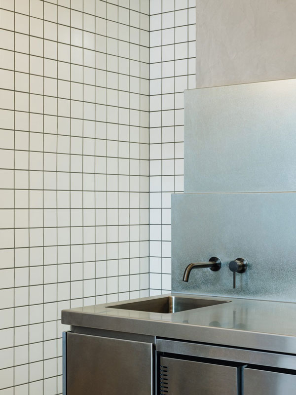
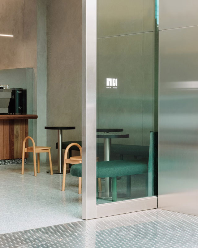
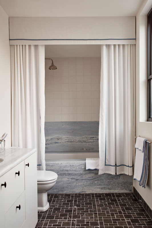
Behind the stainless steel and glass shop front, the seamless poured flooring runs throughout the space and into the kitchen. Acting as a textural anchor within the space is the timber counter that welcomes guests and encourages a sense of engagement. The element expresses the artisanal and a handmade approach, similar to the story of coffee making itself.
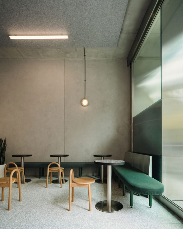
Hugging the inside and side wall is a linear banquette seating element, where a softly muted green breaks up the monochromatic palette and introduces colour. Select equally minimal furniture and accruements are then dotted throughout, sitting as sculptures internally. While the larger concept of the building uses monolithic and masonry features to create presence in place, as the elements of Midi 3121 reveal themselves, they show a considered refinement.
The journey from the macro to the micro connects through materiality and the expression of the form, while allowing contrast to create a natural hierarchy.
Midi 3121 draws on a less is more philosophical base, seeing Sans-Arc Studio carve a restorative place to pause in the process.
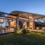
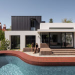
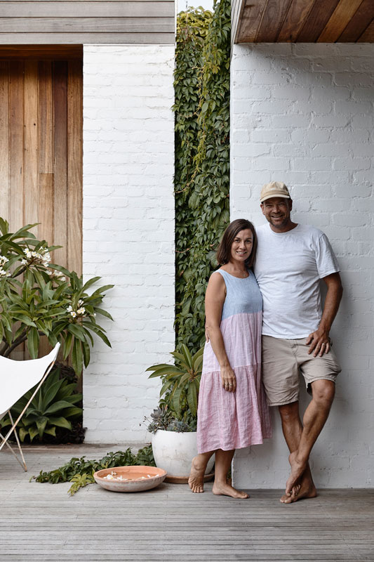
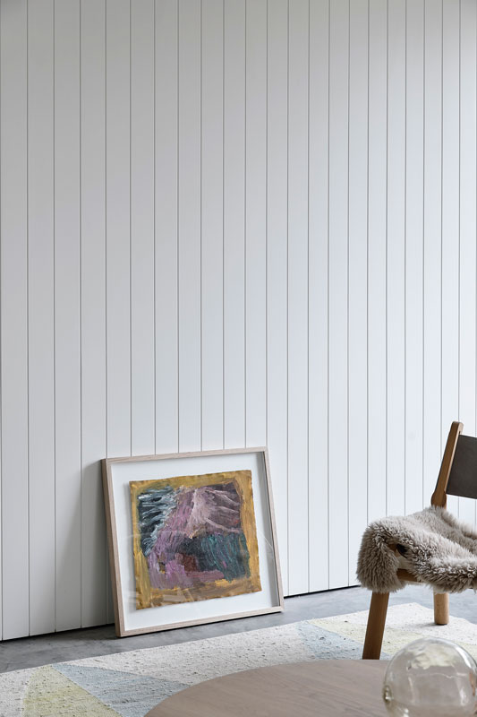
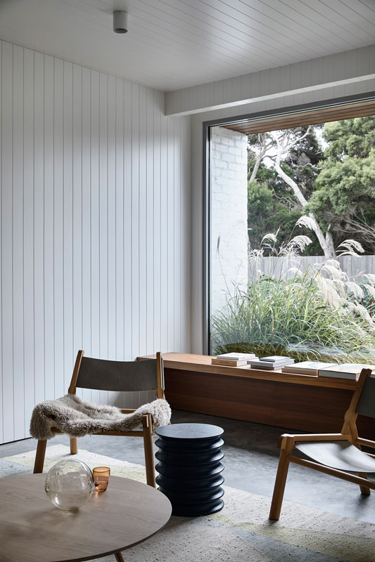
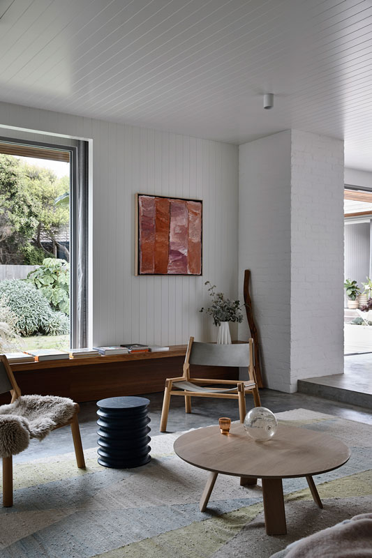
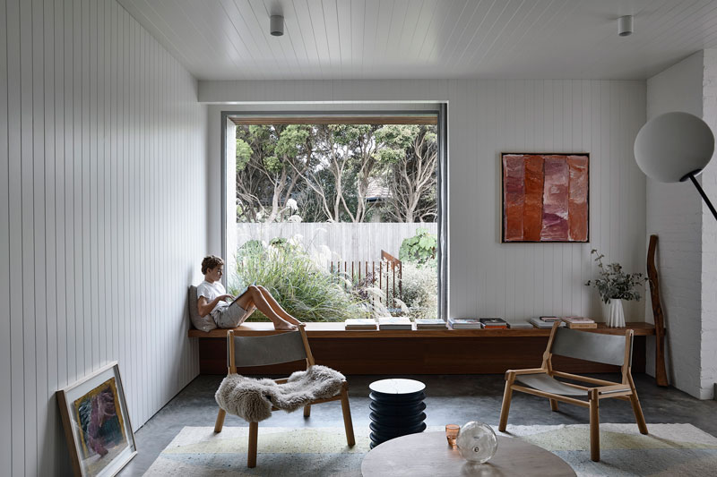
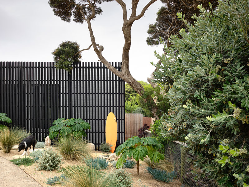
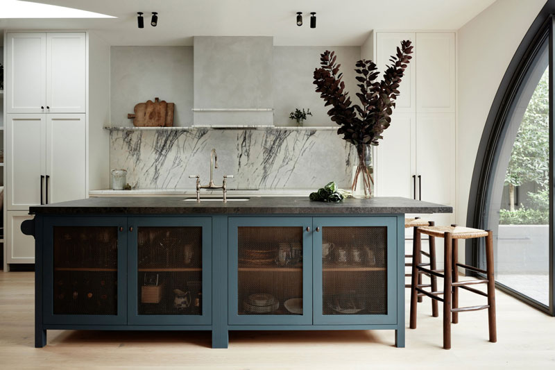
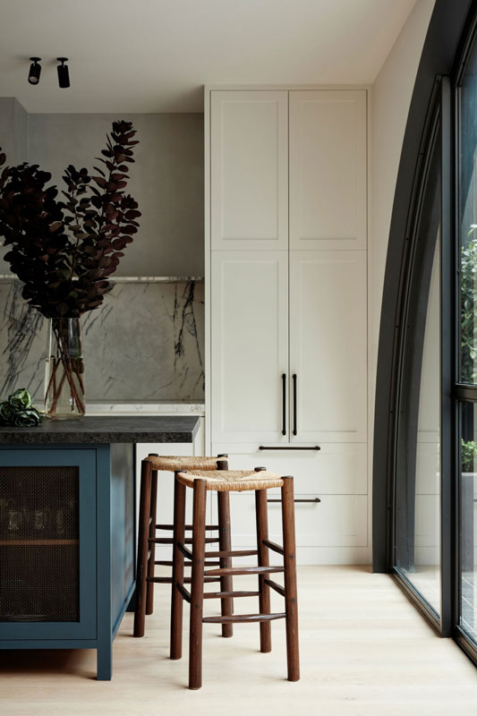
Text description provided by Project 12 architecture. Set amongst the dunes and Moonah trees of Sorrento Back beach, Sorrento Residence project comprises of a new home for a family of four. Client and builder, James Clarebrough, wife Emily, and their two boys Archie and Milo had been living on the site for a couple of years, in an old fibro beach shack.
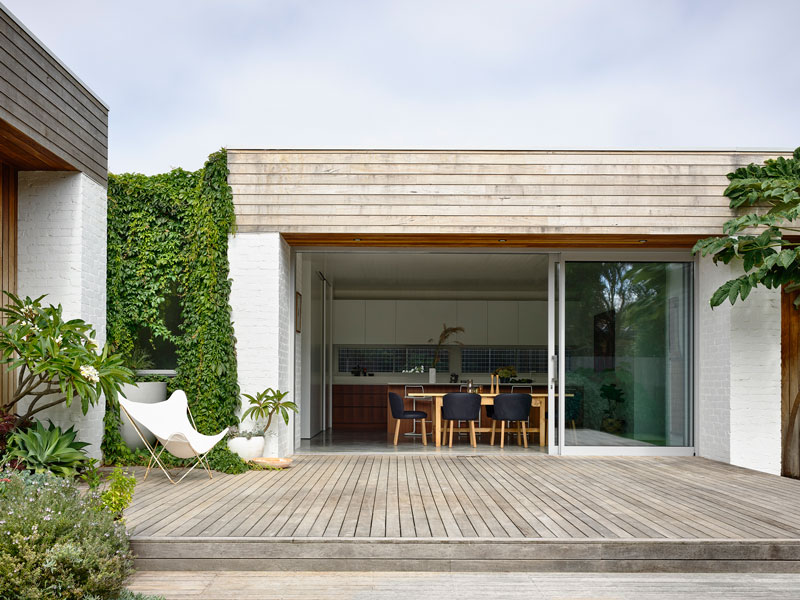
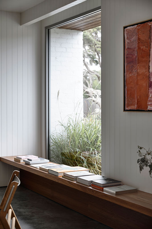
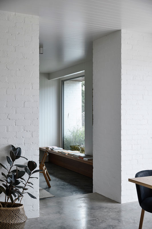
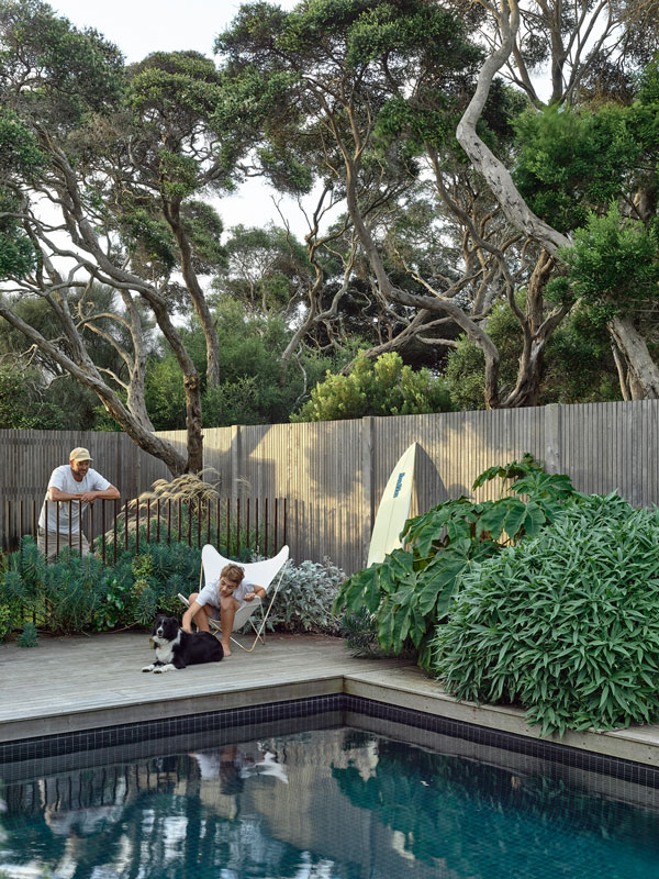
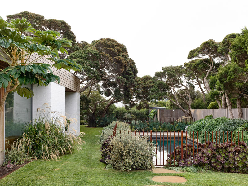
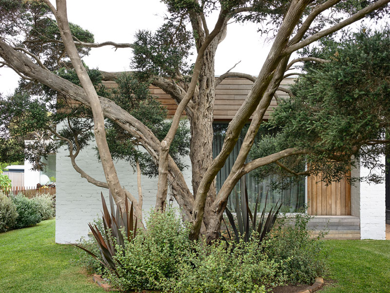
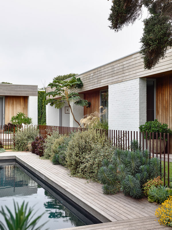
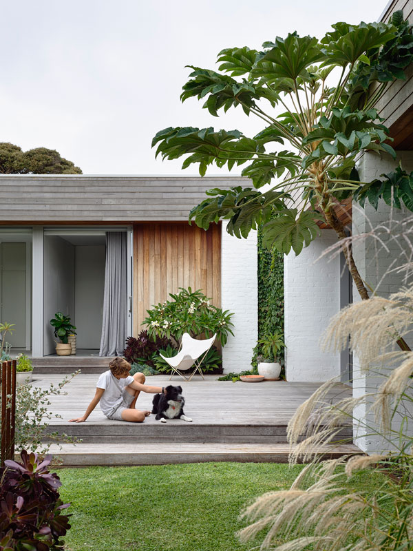
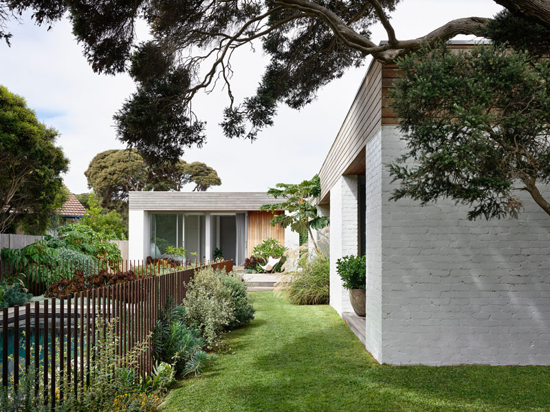
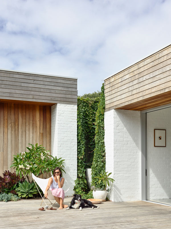
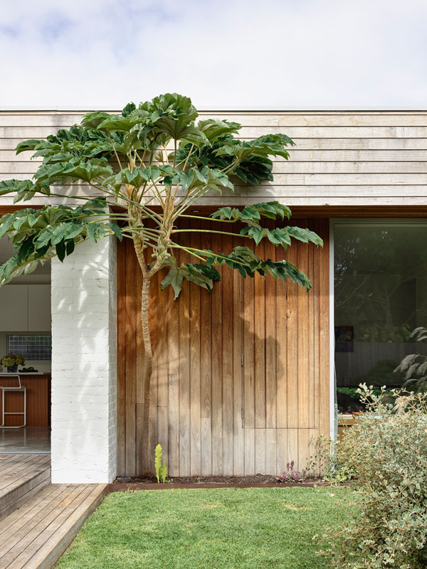
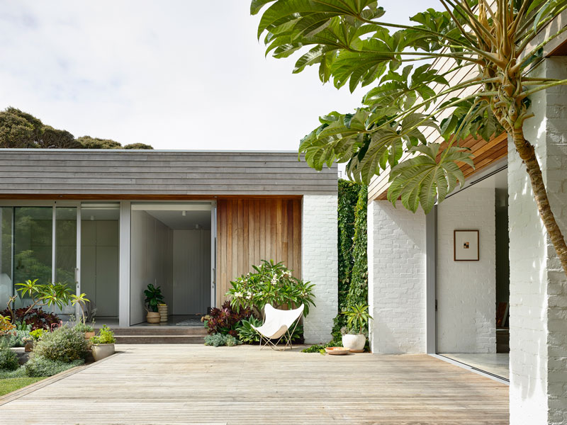
Their brief was for a family home which respected the coastal site and provided a home which was luxurious, yet also relaxed. The house is cut into the site and terraces down gently to respond to the gentle fall of the block.
The front of the house is clad with charred timber ship-lap boards and battens, screening views from the road and which can be closed when the family is away. Stepping behind the screen the material palette softens, comprising of white recycled brick and silver top ash cladding. The external materials are robust, responding to the coastal environment and providing the required bush fire rating.
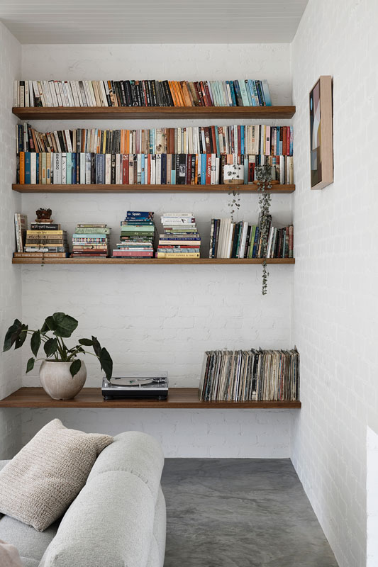
The texture of the recycled bricks is continued into the interior spaces and complimented with the warmth of the spotted gum to joinery elements.
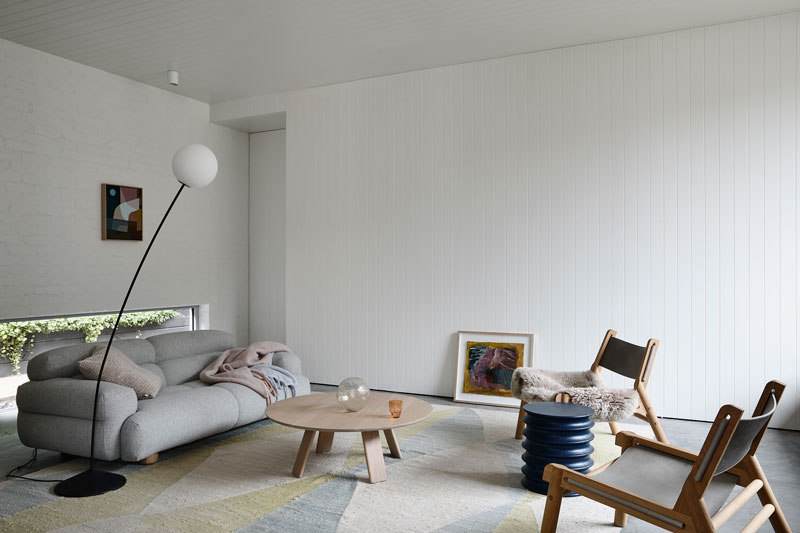
The L-shaped plan is orientated towards the north west of the site, maximizing natural light and providing protection from the prevailing weather. A double garage and children’s bedrooms are located to the south east of the block, with living spaces arranged towards the north and facing out to the terrace and pool.
The master suite is positioned to the end of the plan, separated from the main living spaces and nestled in the shade of an established Moonah tree.
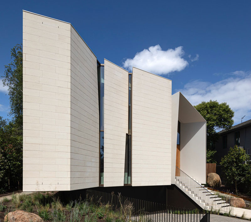
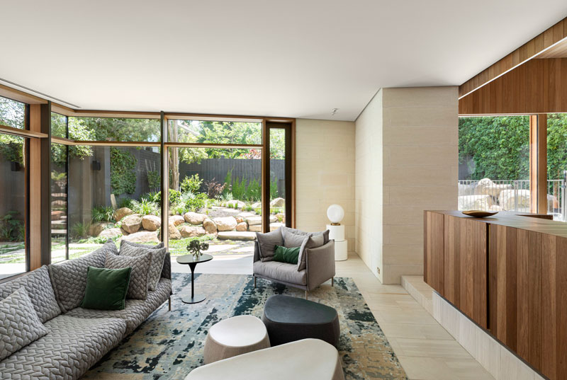
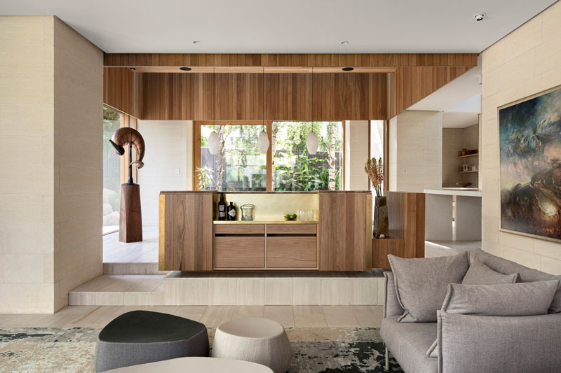
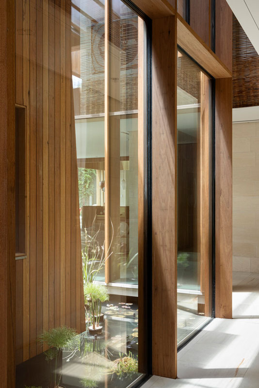
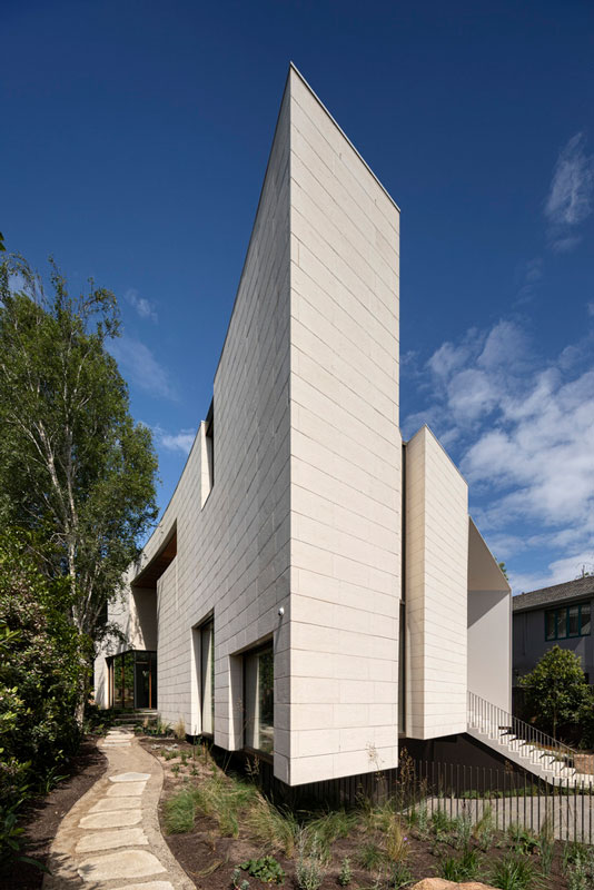
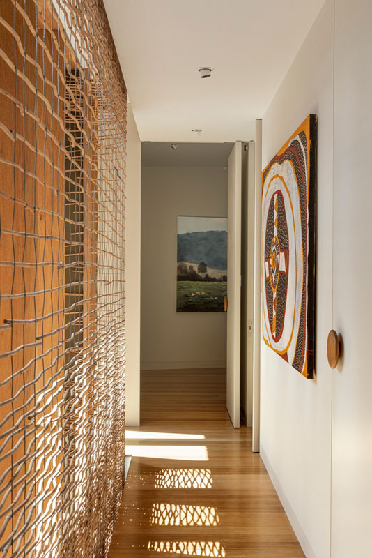
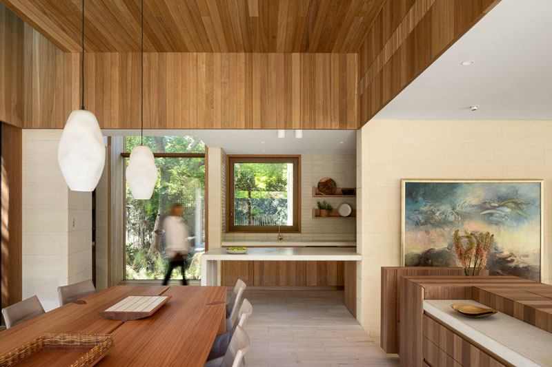
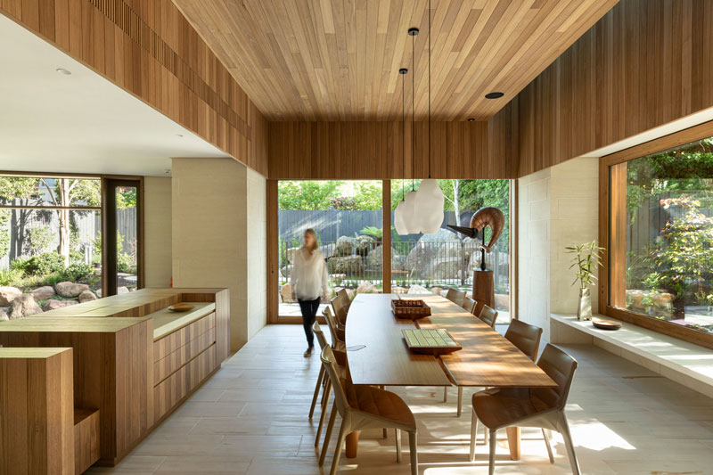
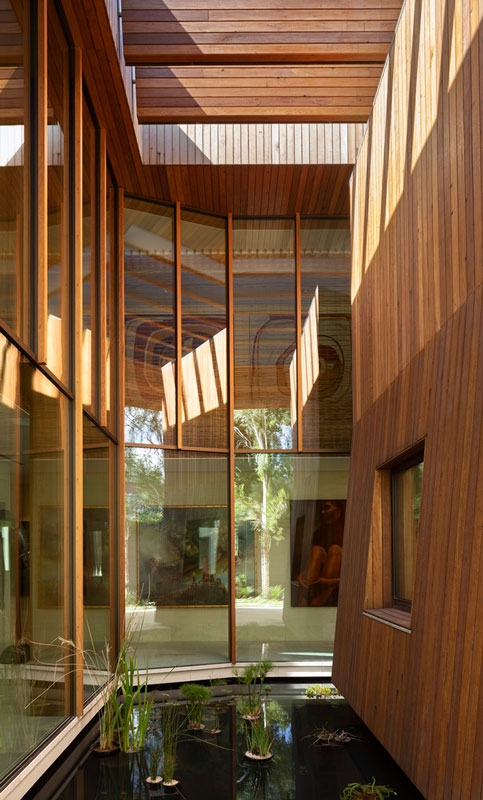
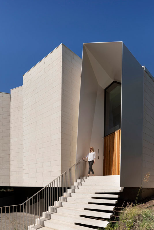
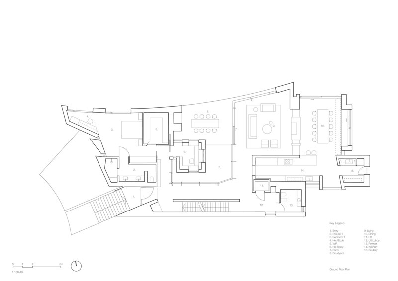
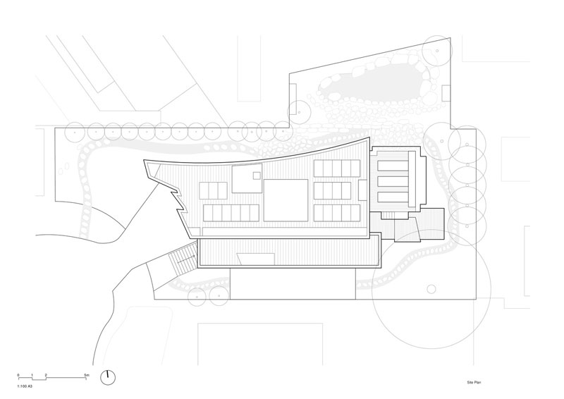
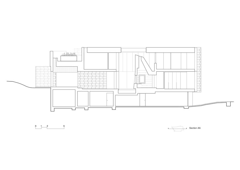
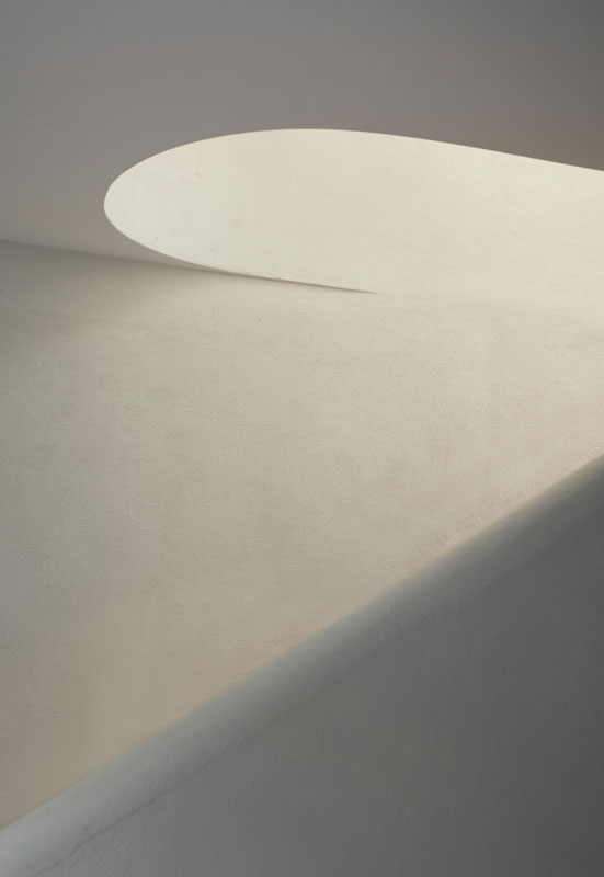
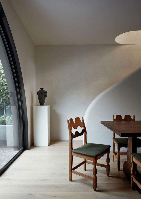
Text description provided by John Wardle architects. A house that can generate, capture and provide everything it needs on site. A house that minimises its environmental impact beyond the site. This was our client’s ambition, while also creating a generous and delightful living environment. An outer shell of Mt Gambier limestone is carved away to create several carefully orchestrated window apertures.
Those on the street are aligned to achieve light but control privacy and solar ingress into the bedrooms. Larger openings on the north elevation allow for ingress of sun and sky views. The largest aperture is a central, shaded courtyard that draws in natural light, ventilation and the winter sun into the heart of the house.
The setting includes a planted pond in which sits a timber lined study. Everything is set around this calm and contemplative centre, but with views and links outward to a lush surrounding garden.
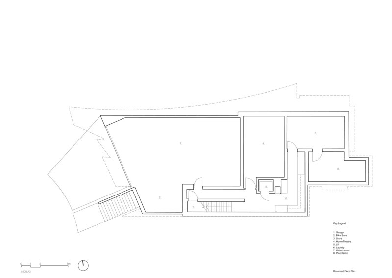
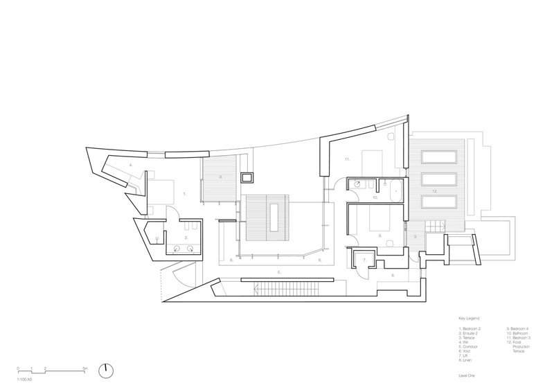
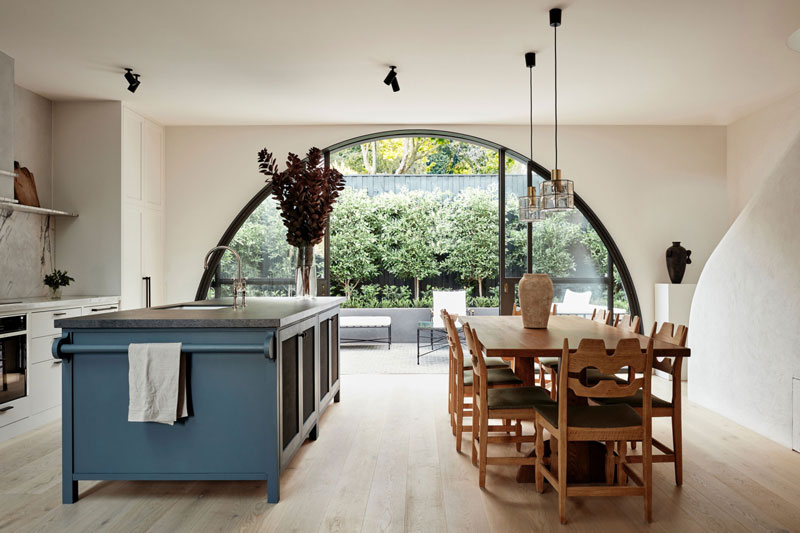
From the street, a broad sweeping stair leads to a steel portal that identifies the entry. Inside, the spaces are set around the courtyard. Natural light fills the house from various sources whilst remaining well shaded. Living and dining, kitchen, powder room, main bedroom suite and two dedicated studies occupy the ground level. Guest bedrooms, bathrooms, and a roof-top kitchen garden are located above at first floor level. A basement houses most of the building services equipment, a wine cellar, larder, music studio and cars. The garden has been sensitively landscaped with a strong emphasis on native planting.
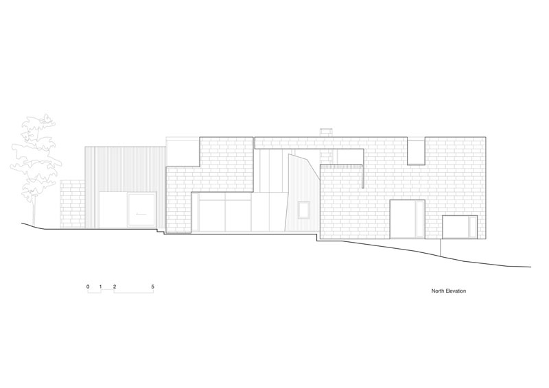
Limestone is a natural material, locally sourced, and is very simply extracted from the quarry. Its production requires minimal energy expenditure. The hand of the maker is in evidence as the stone is cut, sliced, laid and detailed, often to achieve inventive outcomes – a radiused plan, a cantilevered end, or an oblique opening. Recycled timber cladding to the dining room pavilion and study will eventually weather to a silver grey.
The appearance of the house will evolve, as the timber and stone accept a patina of weathering over time. The interior of the house has a reductive, quiet material palette with a focus on details that accommodate the hand and eye. Siltstone floor tiles from Queensland complement limestone walls. Recycled blackbutt from New South Wales is used for timber cladding and window frames. Reclaimed Tasmanian oak is crafted into flooring, interior linings and joinery.
Two complimentary and voluntary standards were implemented to reach the sustainability ambitions of the project. Adopting Passivhaus principles achieved a comfortable living environment using minimal energy input by creating an incredibly high performing and uninterrupted building envelope. Prefabrication of the thermal shell in a controlled factory environment helped to achieve quality control. Superior indoor air quality is attained using a 100% fresh air mechanical ventilation system with heat recovery.
In addition, the Living Building Challenge directed the selection of healthy, local materials and an off-grid approach to energy and water management. As much a research project as design effort, to realise such ambitious sustainability goals required a highly collaborative effort from everyone involved.
Project Details
TOORAK, AUSTRALIA
Architects: John Wardle Architects
Area: 675 m²
Year: 2021
Photographs: Dianna Snape
Construction Team: Arkit, Sinjen Group Prefabricator
Structural Engineering: 4Site Engineers
Building Services Engineer: Umow Lai
Civil Engineering: 4Site Engineers
Geotechnical Engineer: Macgregor Geotechnical
Landscape Design: Grounded Gardens
written by : Hana abdel 13 Feb 2022 published in : archdaily.com
Prahran House by Pandolfini Architects and Sophie Davies
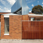
Extending a traditional and quaint Victorian-era cottage, Prahran House is given a new and more generous life to accommodate its growing young family. Pandolfini Architects and Sophie Davies balance the character and charm of heritage elements with a contemporary crispness for a revised relevance.
Located in its namesake, the heritage cottage sits nestled in amongst similar era homes, all retained through their own interpretive lenses. Although reflective of the original origins of the residence, the owners’ growing family required the footprint to be expanded to allow for a comfortable habitation of their coming chapters.
While keeping the heritage frontage in place, the addition expands on the previous two-bedroom home and adds an additional bedroom and bathroom, opening generously through a shared living zone into a beautifully curated courtyard garden setting. With architecture by Pandolfini Architects and interior design by Sophie Davies, the team worked to infuse some of the original charm of the home with a balanced openness, allowing the family to come together and be apart as needed.
A careful crafting of the original home, Prahran House is built by Davies Henderson with landscape design by famed landscape architect Paul Bangay. Important to the extended narrative was keeping the home’s character and detailed elements, maintained by ensuring every new gesture felt deliberate and as an evolution into the new. Purchased with a 1990s extension already added to the rear, the first step saw its removal to make way for a set of cohesive and binding principles.
Like any modern home, guaranteeing an open and connecting living space was crucial to allowing occupants to come together and balance out the other more separated areas in the process.
A key part of the brief for the family of four was that the new had to feel like a natural progression of the old and not feel distinctly different or in competition. Looking to European influences, as well as a seamless integration of heritage and contemporary additions, the proposal takes a formalised approach with traditional moments, timber crafted features and a palette that emphasises personality. Oak timber flooring binds each of the spaces throughout, whilst polished nickel fixtures and fittings, stone and specialised plaster finishes add a variety of textures, balancing one another.
By retaining the essentials and building outward and upward, Prahran House nurtures the essence of the original home. Pandolfini Architects and Sophie Davies add a sense of connection and identity of its current custodians, in keeping with the original framework of the residence.
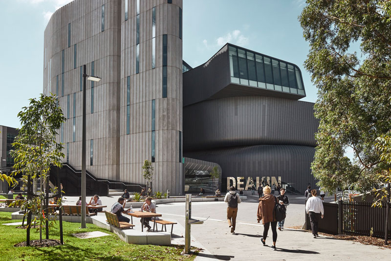
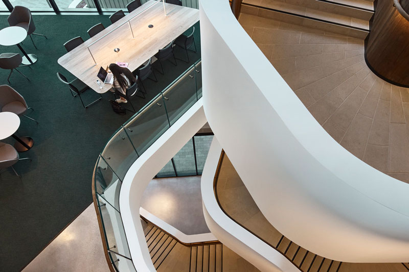
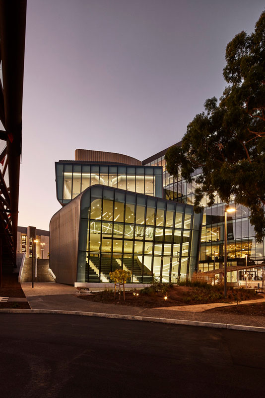
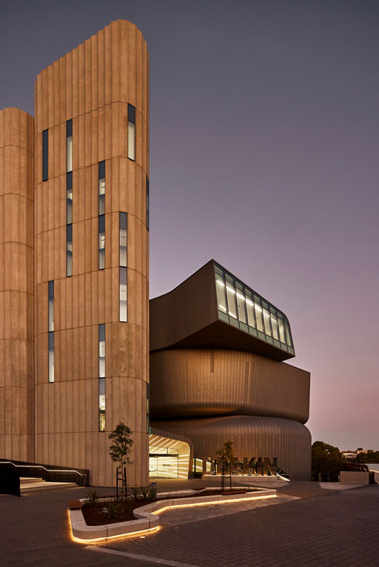
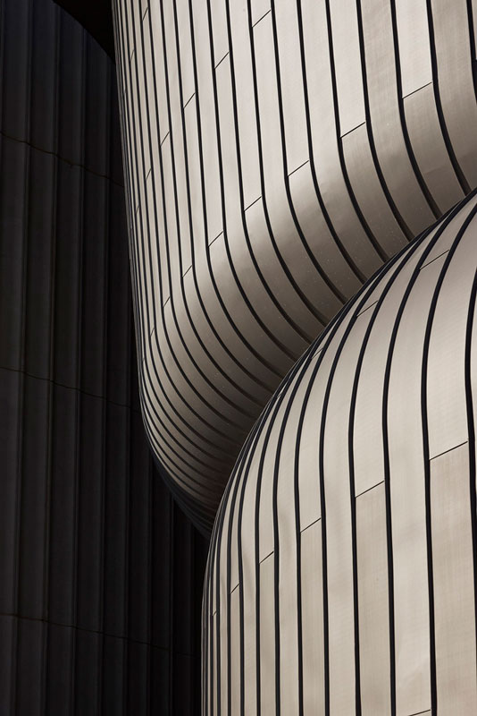
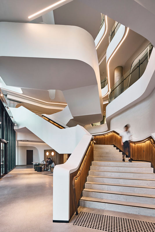
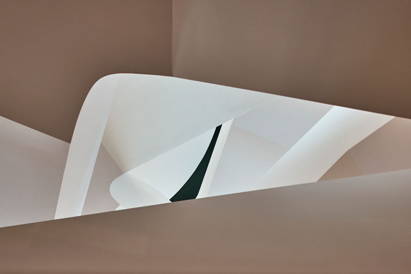
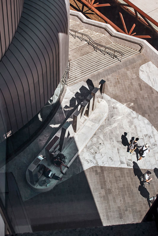
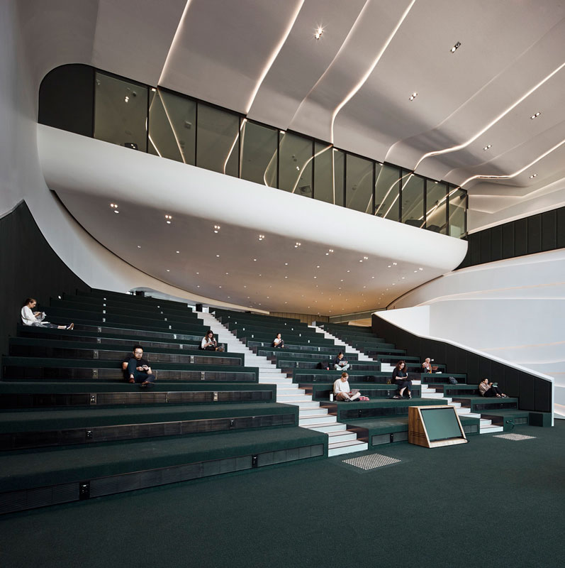
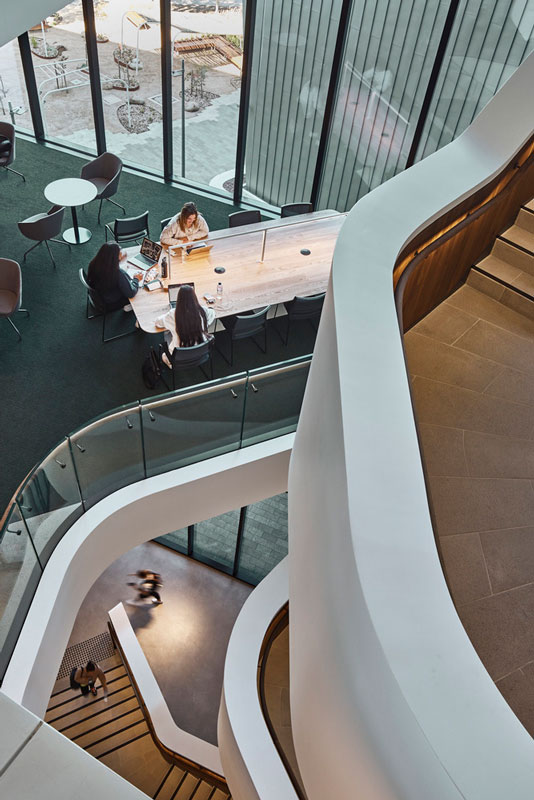
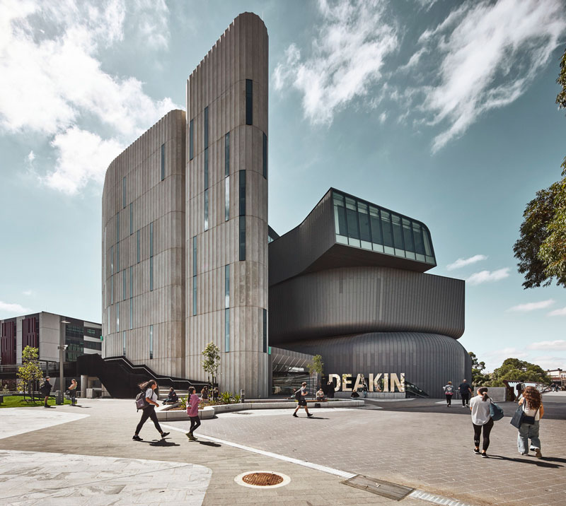
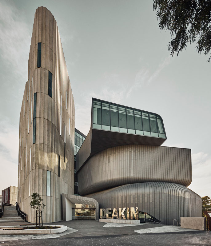
Woods Bagot’s Deakin Law School Building introduces a sculptural and coiled learning environment to reconcile the university’s splintered Burwood Campus in Melbourne. Creating a beacon and gateway to the Elgar Road Precinct the building provides a point of orientation, wayfinding, and enhanced campus experience. The Deakin Law School Building’s arresting geometry arose from the innovative blend of learning spaces held within. Each space addresses a different emerging methodology of teaching, doing away with the traditional lecture theatre in the process.
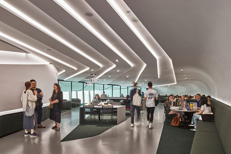
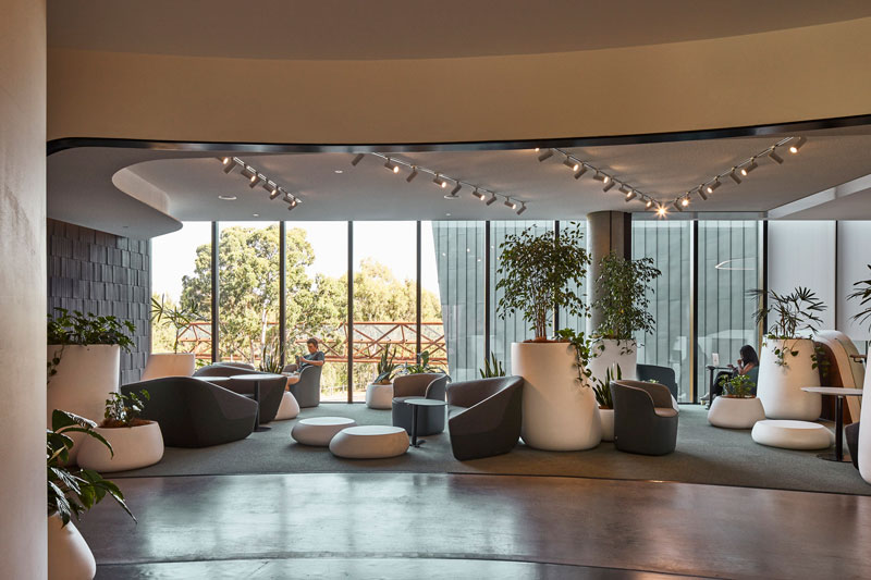
The building delivers five levels of flexible, media-rich learning spaces that cut across the continuum of formality and informality, with students able to move seamlessly between modes of learning. Technology bars, group pods, and individual spaces create opportunities for connection, collaboration, or private study.
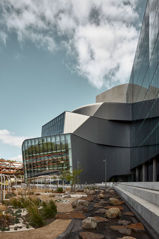
Two levels are dedicated entirely to student support and health and wellbeing services, with spaces allocated for student retreat and contemplation on campus. The Wellness Garden, nestled between the building and Gardeners Creek Reserve, features native plants, stones, a deconstructed creek, and tiered seating. While the winter garden on level five provides a space high above the trees, with a vertical plant wall and floor-to-ceiling glass louvers.
Three larger experimental Premier Learning Spaces challenge conventional learning typologies – a large, tiered presentation space is designed to serve as collaborative space when not in presentation mode; large group working spaces can operate as informal learning spaces when not timetabled.
Set apart from this main rectilinear teaching wing and in an orchestrated contrast of masses, the Premier Learning Space is clad in zinc and articulated as curved organic extrusions. Each response to the site’s sloping landscape, moving students energetically through the space and spiraling upward to frame a different view of the precinct. Sitting on the Northwest edge of the university’s Burwood Campus, the law school site was largely disassociated from much of the campus due to the waterway that schisms the campus in two.
A new link bridge completed during the Law Building’s construction sought to provide a connection back to the Elgar Road Precinct. With an understanding of the proposed bridge design, Woods Bagot this constraint as an opportunity for the building to form a mediation role within the campus, an organizational framework for the public realm, and the existing campus infrastructure. The building’s striking form and glinting materiality serve as a form of wayfinding, ushering students across the link bridge and creating a campus traversability that had never existed before.
The first large general-purpose learning and teaching space added to the campus in a decade, Woods Bagot has created a learning landmark that embodies the university’s commitment to evolving pedagogies. A campus catalyst and arresting arrival point within the university’s Elgar Road Precinct, the building’s impact extends well beyond its perimeter.
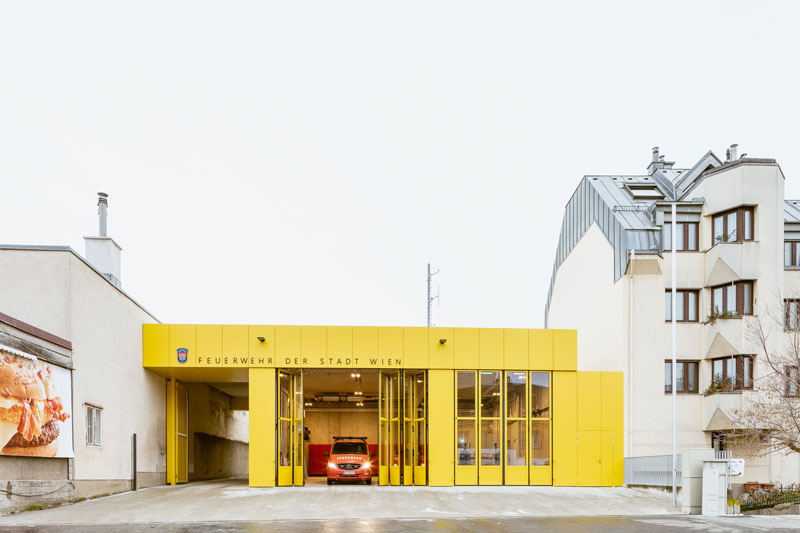
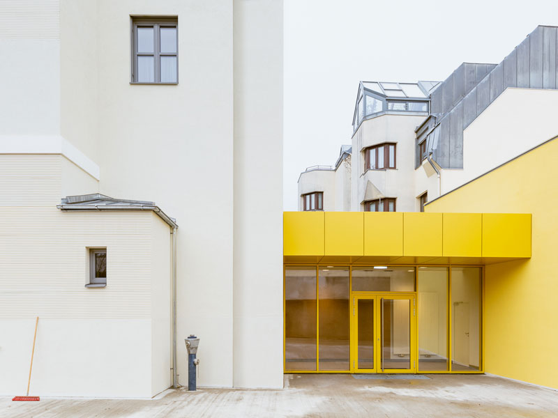
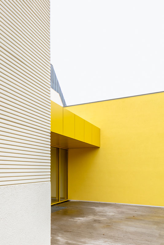
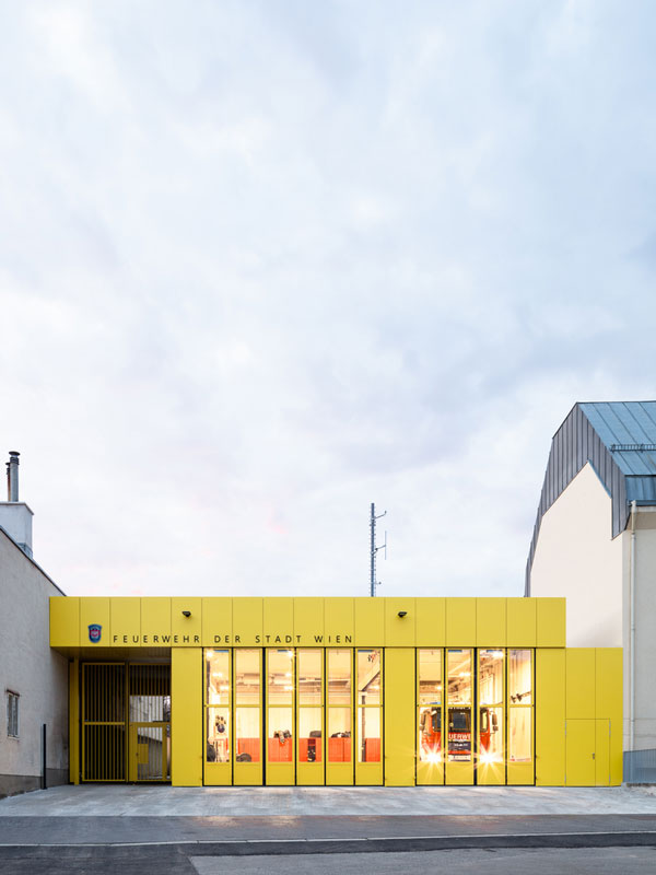
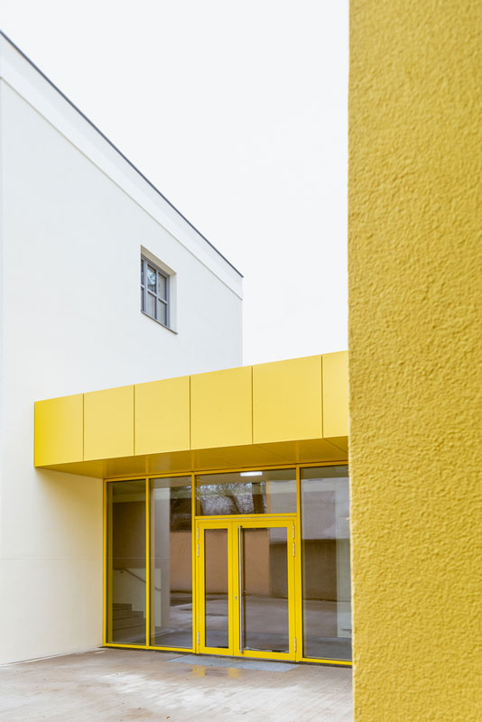
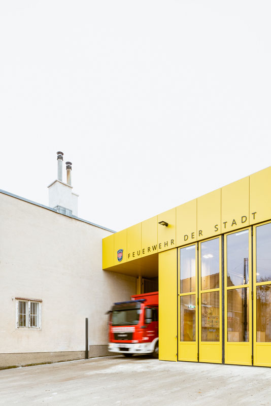
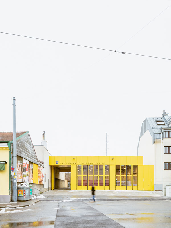
Text description provided by Illiz Architektur. When the alarm sounds at Vienna’s Speising Fire Station, the firefighters have just 30 seconds to get ready and turn out. When every second counts, the primary task of the architect is to ensure optimum process efficiency and so tactical functionality. At the same time, the brief for this vital infrastructure project, a building that is staffed 24 hours a day and 365 days a year, called for a distinctive architectural design.
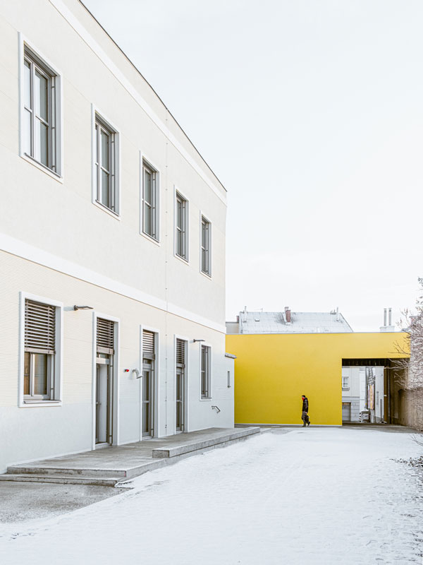
The revamped station comprises three spatial/functional units: vehicle hall, high-activity areas, and quiet rooms. The space in the late 19C building at the rear of the site, which extends back some distance from the street, has been reorganized and is now fully usable. The common areas and kitchen with adjoining dining room and outdoor terrace are located on the ground floor; the six quiet “ready rooms” for the twelve firefighters are accommodated upstairs.
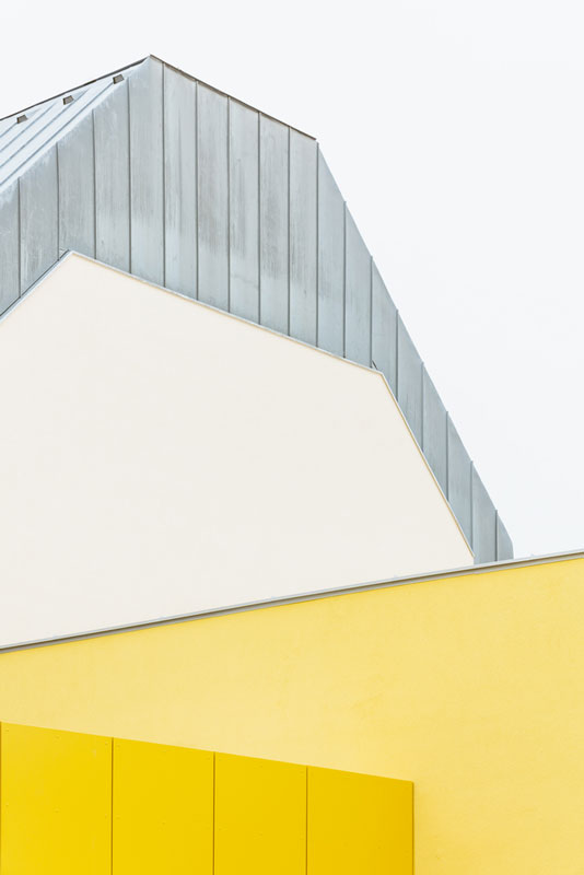
The new single-story vehicle hall faces the street. Now connected by a low-level “linking structure”, which also forms the main fire station entrance, both the hall and the original building remain recognizably independent structures. The watch commander’s office is strategically positioned close to this main entrance, between the vehicle hall and the common areas.
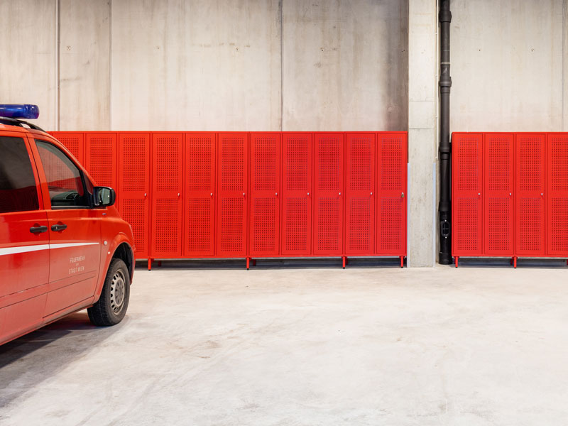
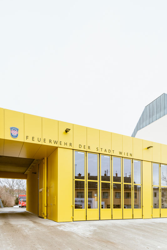
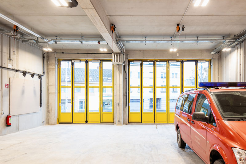
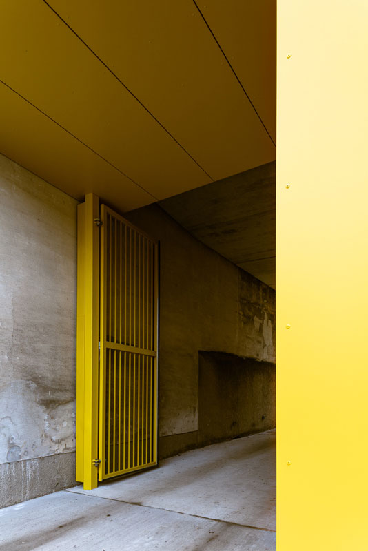
The thermally decoupled design of the vehicle hall is both efficient and sustainable. A high degree of prefabrication was chosen in view of the short construction time, with precast concrete elements and hollow-core slabs spanning the 12-meter-wide hall, where three red fire engines stand ready to turn out at a moment’s notice. Arrayed along the rear wall is a series of red lockers. Elsewhere, the interior of the hall is dominated by fair-faced concrete, a non-flammable material that conveys a sense of safety.
To the left of the hall, a high entry gate regulates access to the interior courtyard, which provides space for staff parking and training exercises. To the right, a change in facade height indicates the lower ancillary rooms behind.
The new build presents a continuous face to Speisinger Straße and gives the forecourt a newfound clarity. While the outsized vehicle hall, rising to a height of six meters, blends into the larger urban context, the functional building envelope with its characteristically high folding garage doors provides a very individual stamp. The column-and-architrave style facade creates an unexpectedly tectonic effect and the functional drop-in facade height creates a welcome gap at the junction with the adjoining firewall on the right.
The choice of the classic yellow so often found on Viennese facades – and which dominates in Speising – helps tie the new building into its surroundings. This strong primary colour brings together the various metal elements of the facade and gives Speising Fire Station its own distinctive character. Taken as a whole, the project offers a protective, public-service space for the firefighters who regularly risk their own lives to save those of others.
Speising Fire Station Project Details
WIEN, AUSTRIA
Architects: Illiz Architektur
Area: 605 m²
Year: 2021
Photographs: tschinkersten
Lead Architect: Daniel Sutovsky
Building Physics: RWT plus ZT GmbH
Electrical Engineering: Woschitz Engineering ZT GmbH Construction Work: Steiner Bau GesmbH
written by : Paula Pintos 8 Feb 2021 published in : archdaily.com
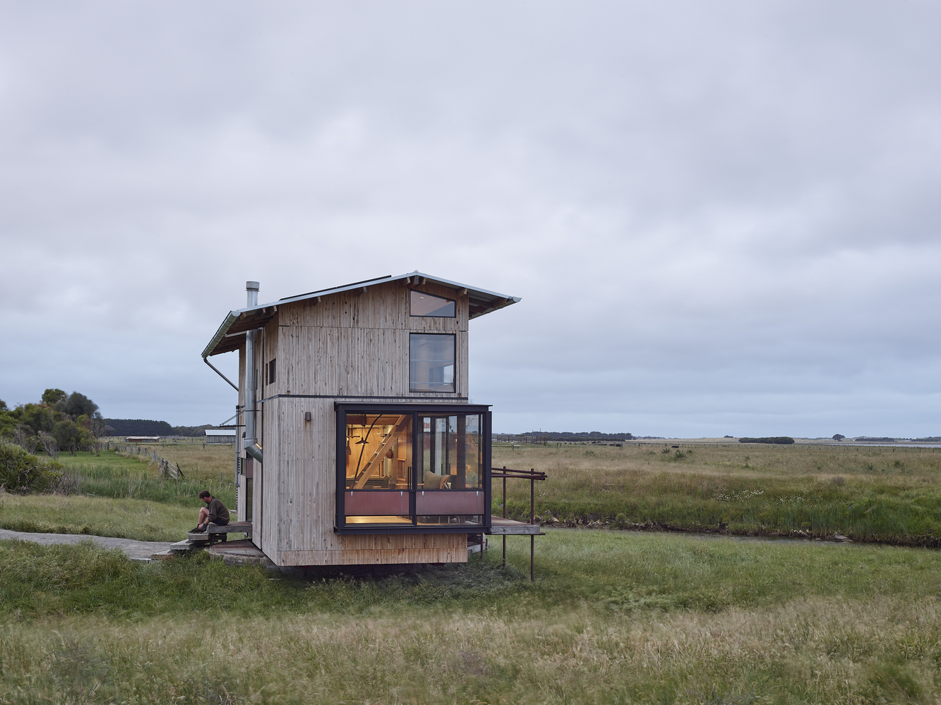
A Unique Residential Experience –Skylark Cabin by Barry Connor Design
Strongly connected to its location, Skylark Cabin provides a unique residential experience. Barry Connor Design creates a home immersed in the ever-changing environment of the Ben Ohau Mountain Range.
Settled into the foothills of Twizel, Canterbury, Skylark Cabin is revealed as a poignant retreat. Escaping from the stresses of urban life, the structure functions as an off-grid cabin, complete with a luxurious outdoor bath to enjoy the natural sky reserve in serenity. Sitting on the intersection of sightlines to Backbone Peak and the Ben Ohau Mountain Range, the cabin is designed to effectively respond to its location; following the trajectory of the sun during different times of the year, the cabin makes the most of the interplay between light and shadow, inside and out.
As seen from the road, Skylark Cabin presents as an intriguing structure. At just under four metres in height, the home is elevated from the foothill in the shape of two rectangles, slightly skewed. Upon closer inspection, the angular building emerges as a compact residence – just under 50 square feet – with orange accents on the wood façade to represent the client’s love of the colour.
Barry Connor Design uses larch for the cabin exterior; the durable nature of the material withstands exposure to the weather on the reserve. The form of the home is intentionally sharp; gutters and downpipes are contained within the cavity of the rainscreen rather than left out to feel the full force of the wind.
Architecturally, Skylark Cabin encourages residents to enjoy the surrounding landscape. Windows of various sizes throughout the home make for particular, defined views of Backbone Peak and the Ben Ohau Range, whilst an open sightline from the bedroom to the reserve – passing through the living room – allows the cabin to borrow visual space from the outdoors. By providing many vantage points, Barry Connor Design makes residents privy to moments of natural beauty, such as when the wind runs through the tussock grass or snow comes to rest on top of a hill.
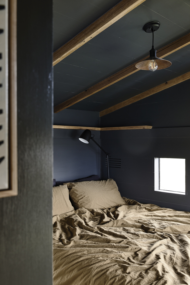
Split into two zones of living – cleaning-sleeping and living-kitchen-dining – Skylark Cabin encourages a simple, unhurried way of life. Upon entering the property, a casually styled bedroom lies to the right with an ensuite and laundry unit tucked behind. Turning left from the entryway leads residents into the main living area, which is combined with kitchen and dining facilities. Sheets of beech plywood along the walls and ceiling pull natural colours into the cabin, whilst a large skylight above the bed alludes to the night sky in an oversized, telescopic fashion.
Throughout the home, Barry Connor Design maintains a comfortable and sophisticated aesthetic, with the edges of the plywood sheets highlighting the geometric proportions of the structure. By creating a cabin that bears witness to its ever-changing external environment, Barry Connor Design ensures that the experience of Skylark Cabin is like no other.
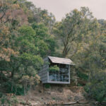
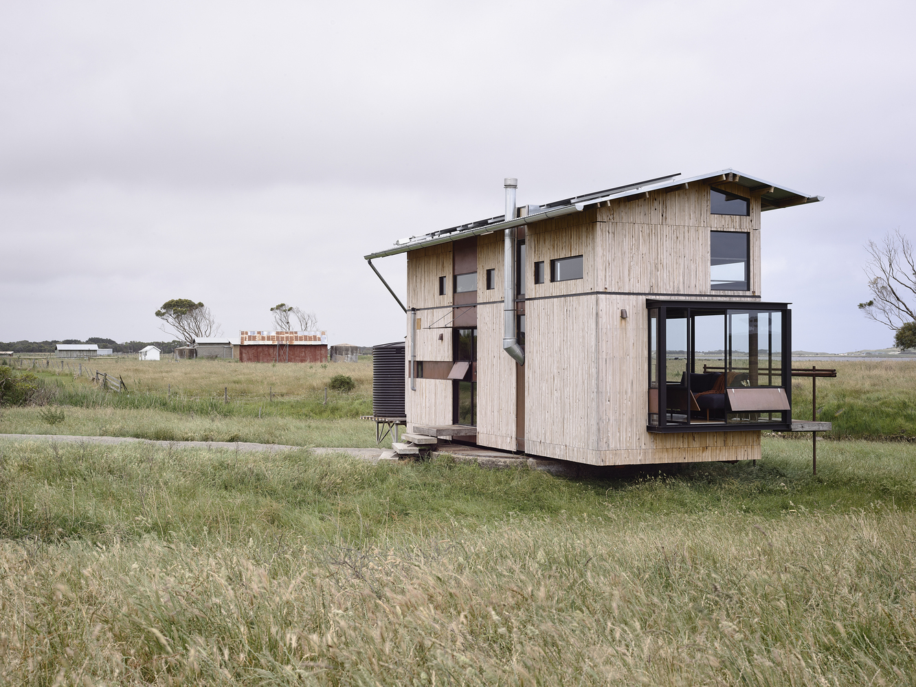
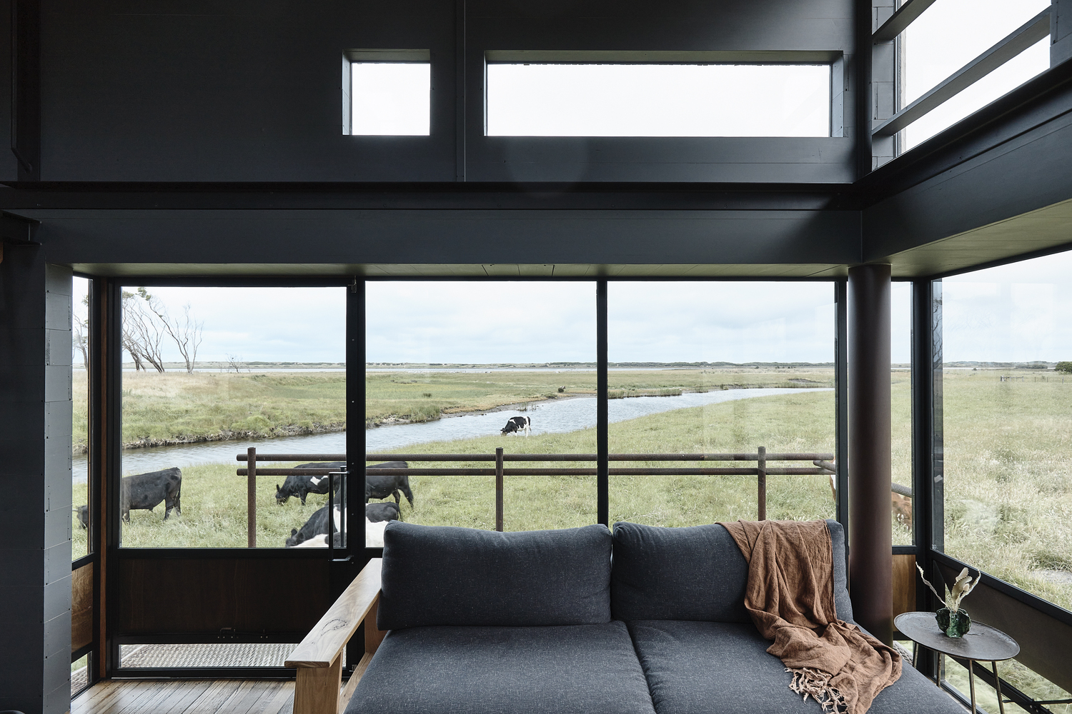
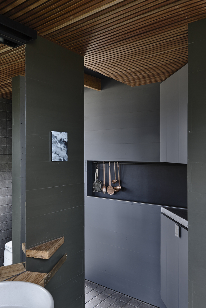
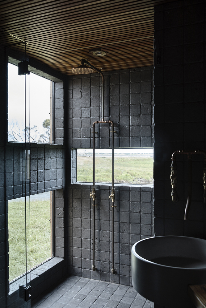
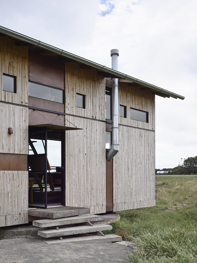
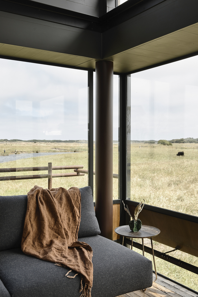
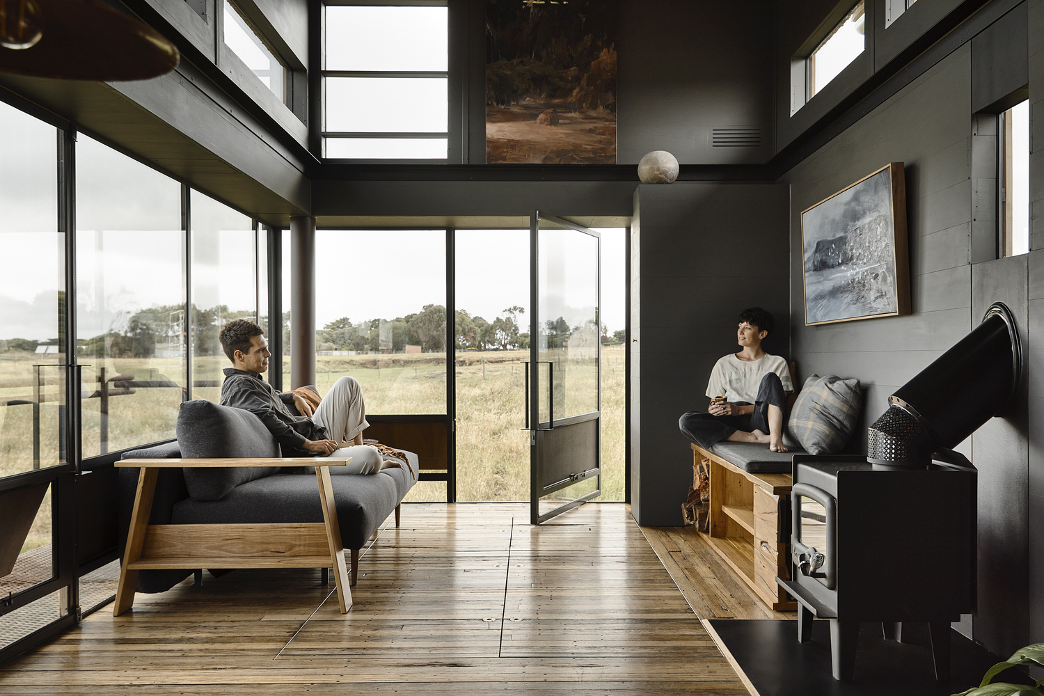
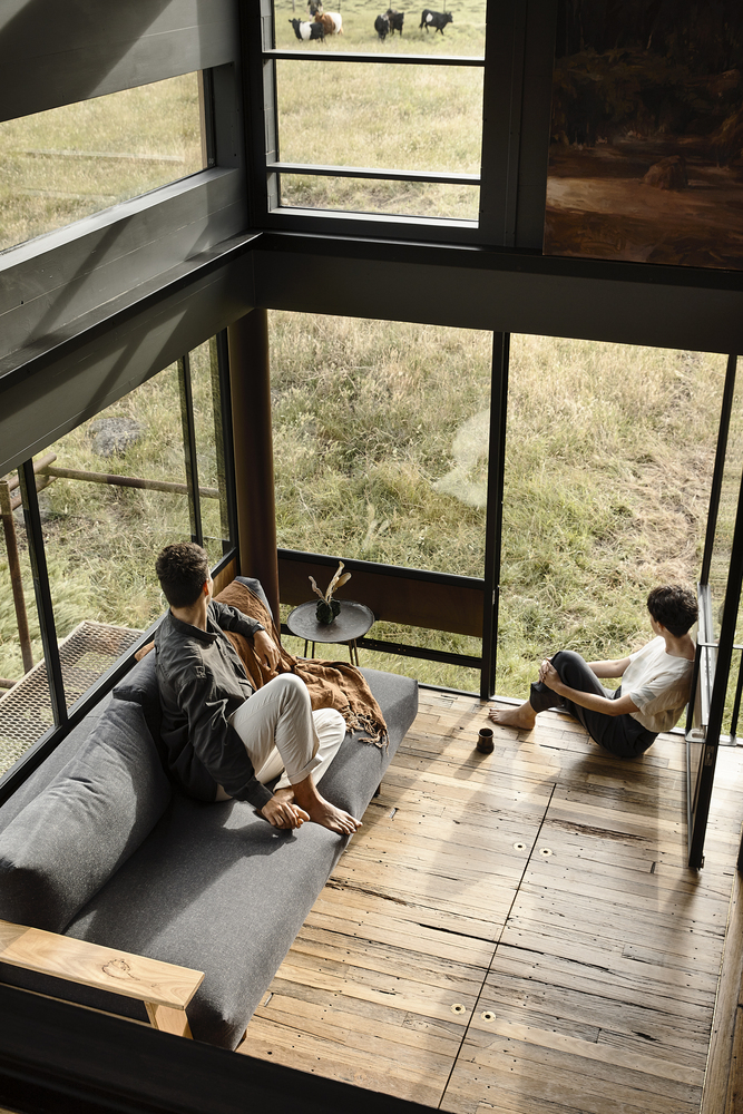
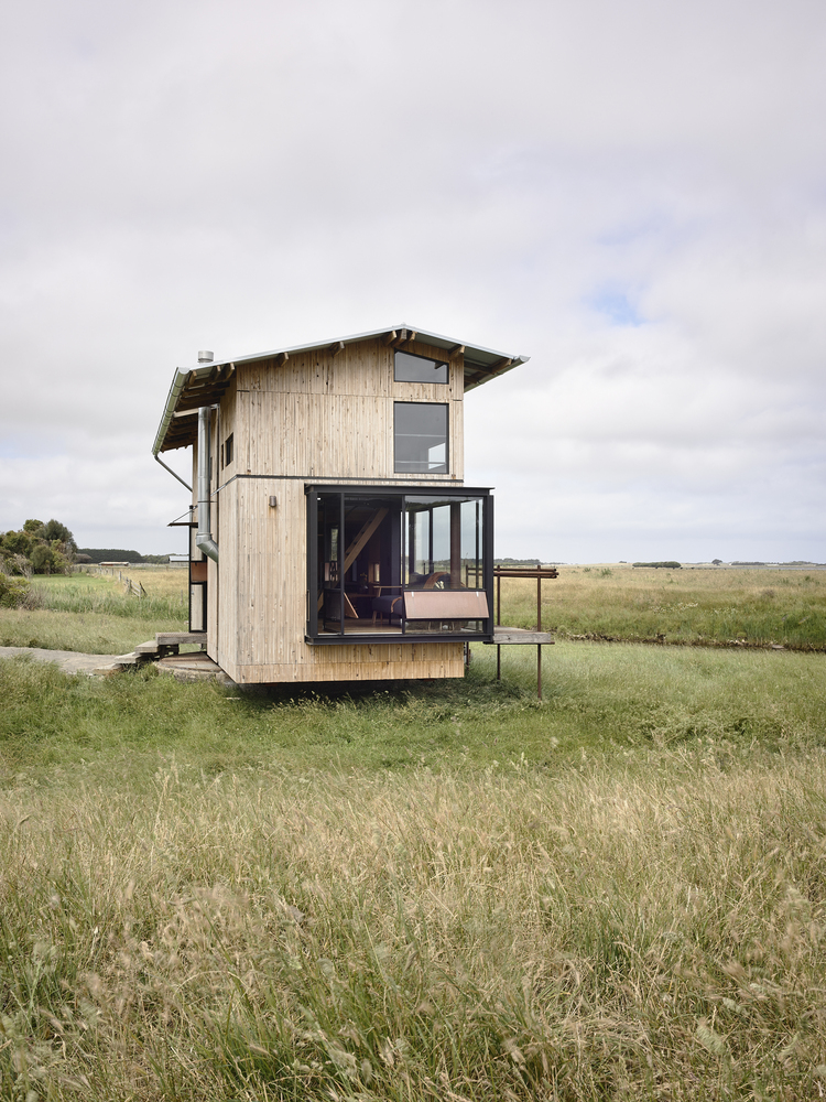
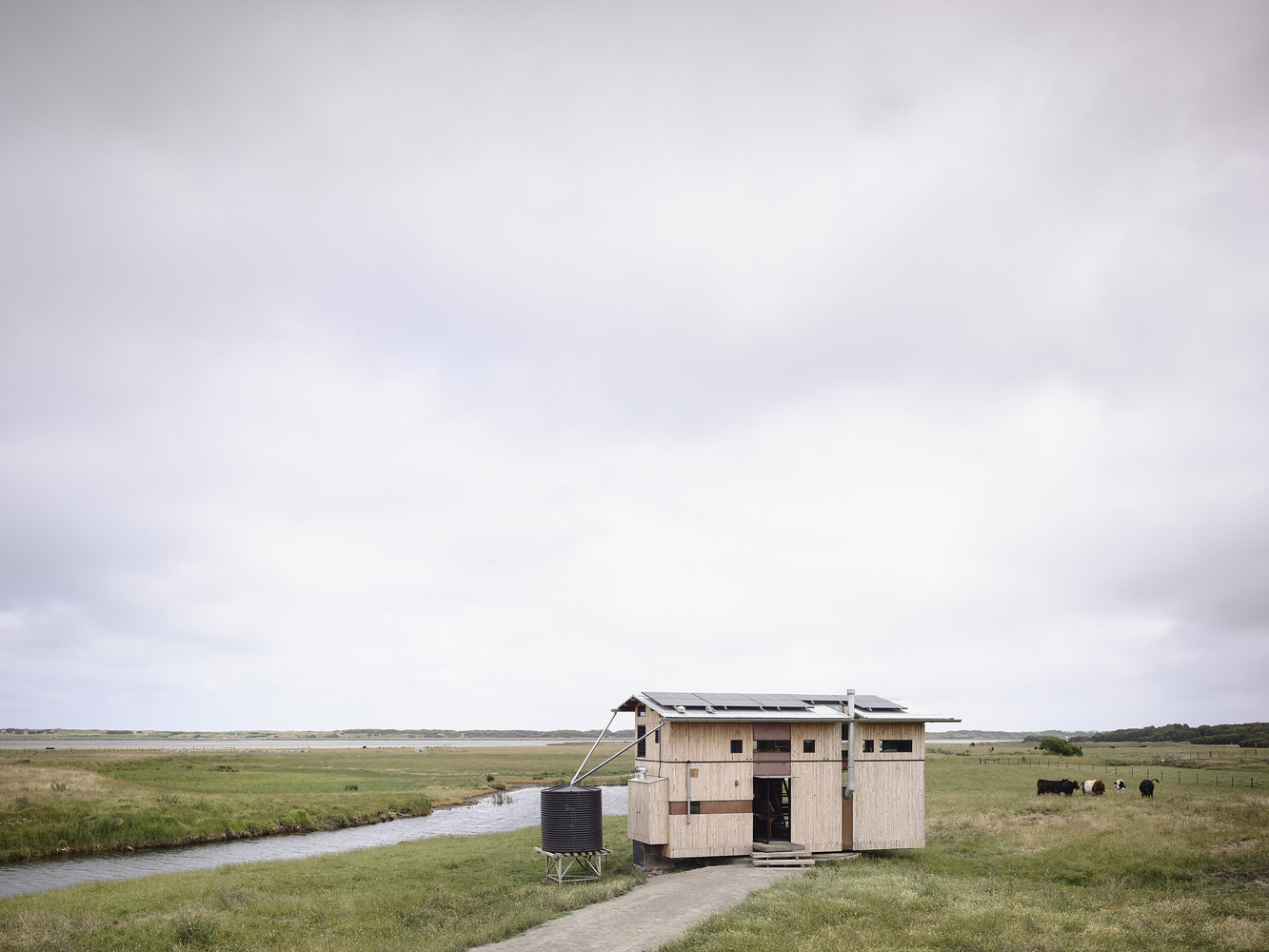
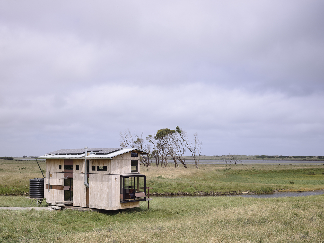
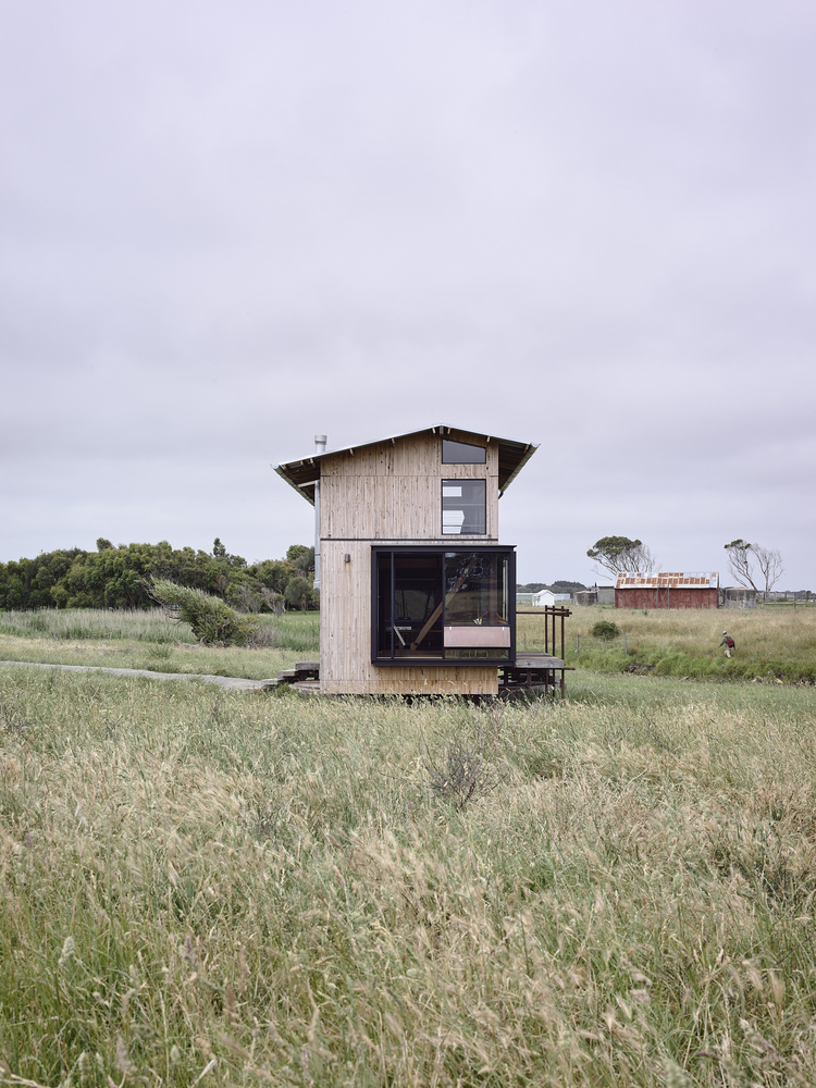
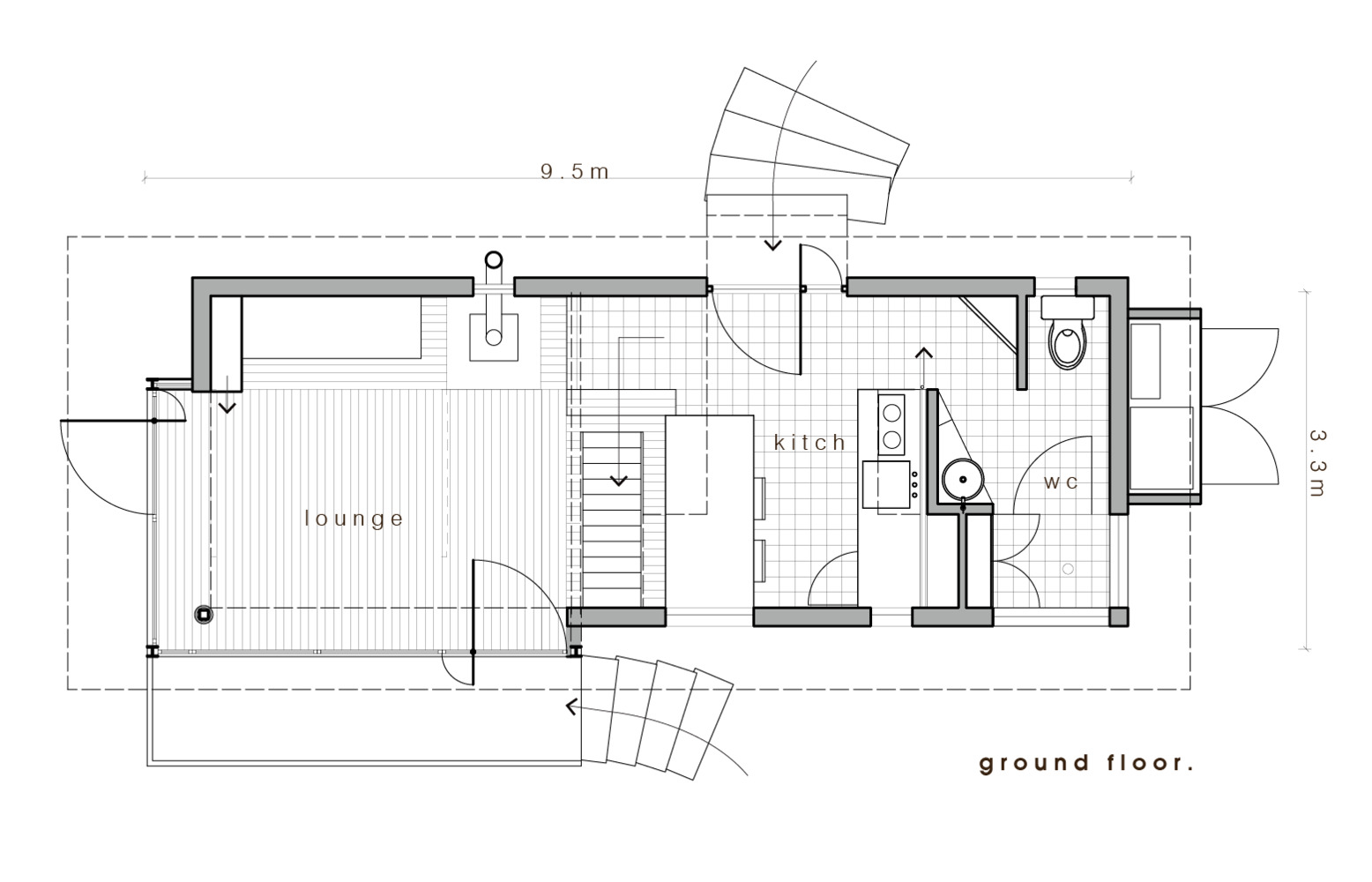
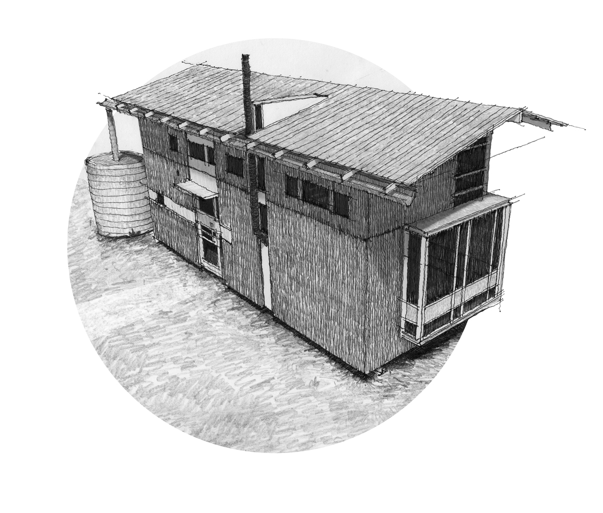
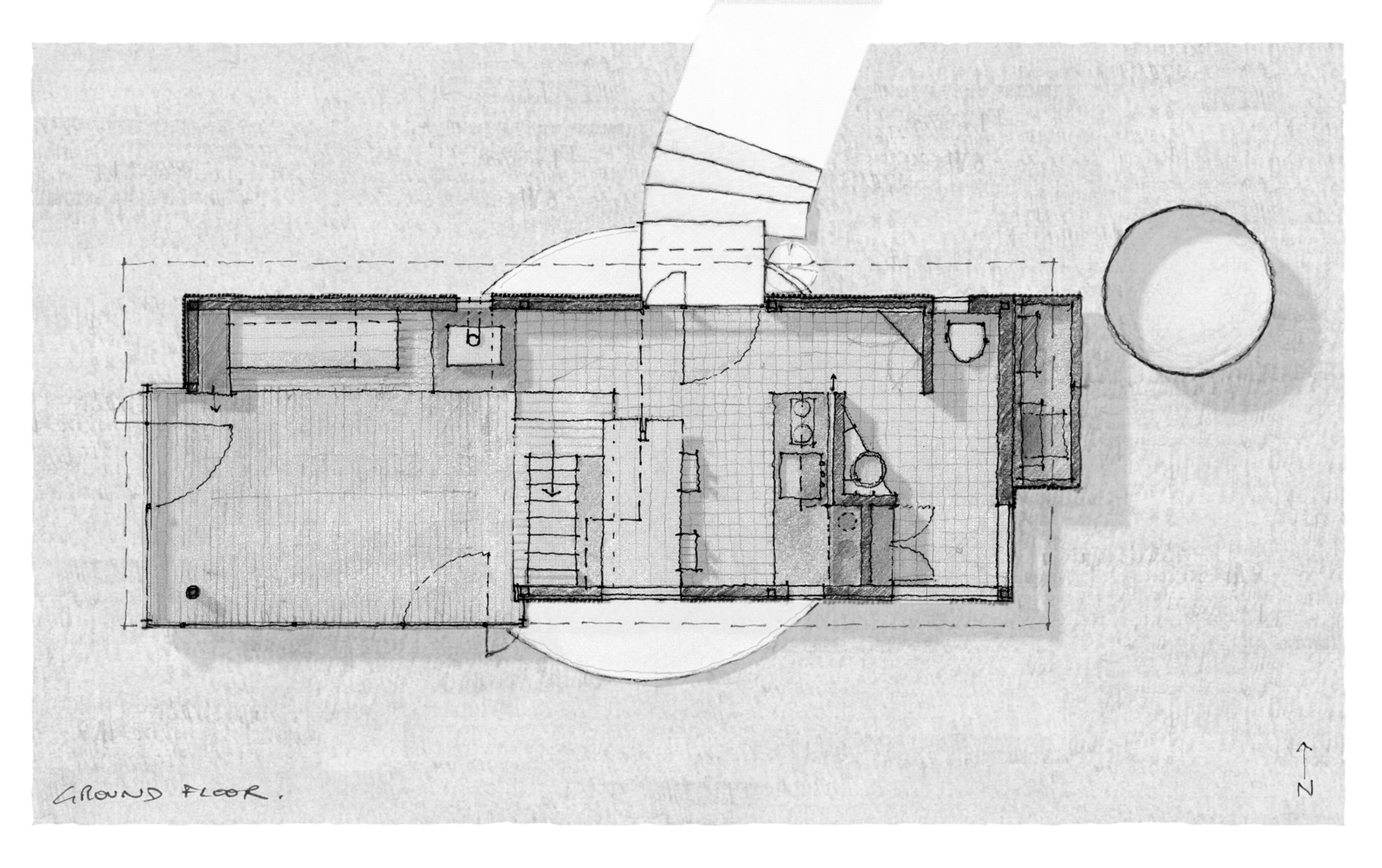
Text description provided by Small architects. The Brook sits in a paddock atop an old Gasometer among the ruins of a flour mill. It is situated in Rosebrook, South West Victoria, on the traditional lands of the Gunditjmara people.The Brook was designed to capture the remarkable wetlands surrounding the Gasometer, with windows that frame the Moyne river, lush paddocks and the occasional passing dairy cow.
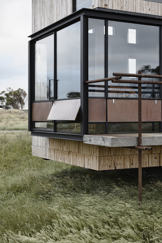
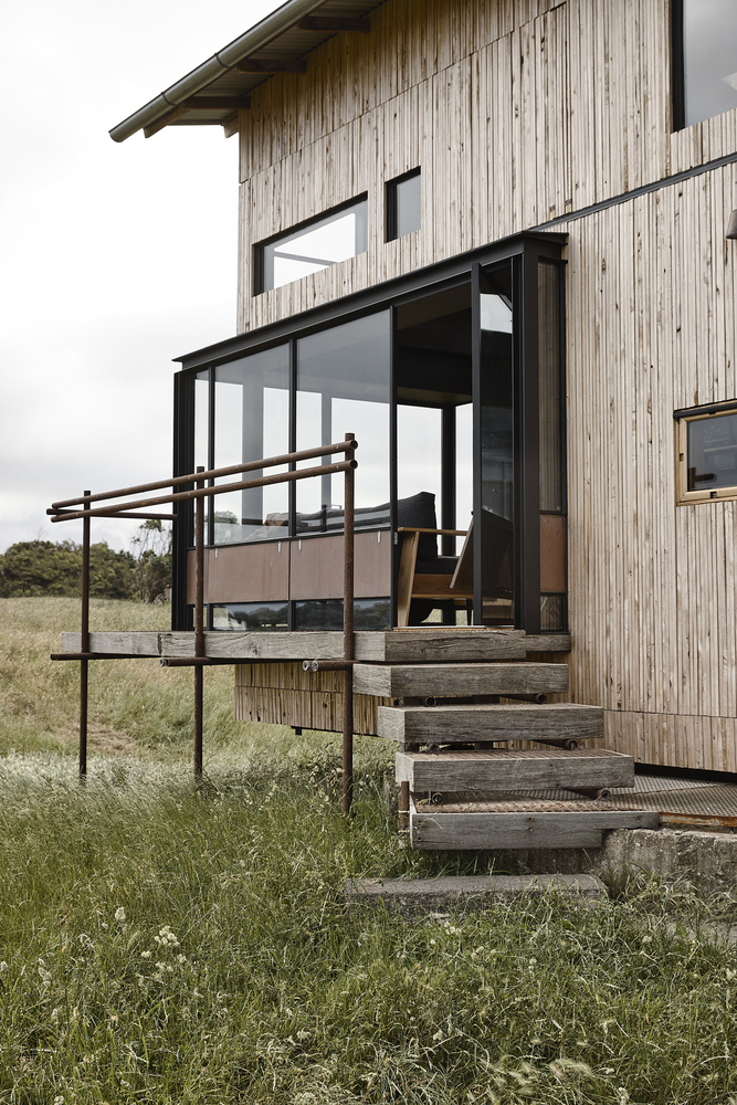
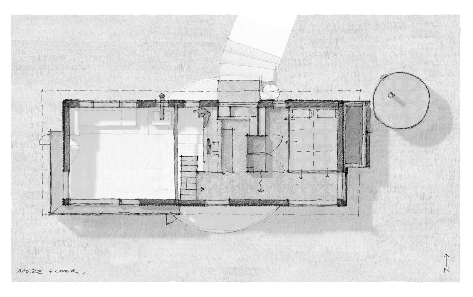
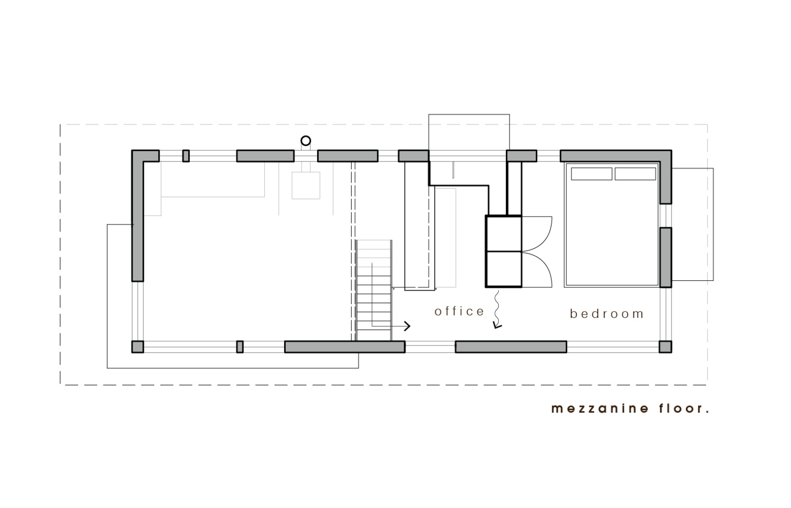
The brief was further determined by the dimensions of a truck trailer, which is the most suitable size for a tiny home. While it was important to create a home that could be transported beneath power lines, it was also essential that the space felt generous and open. The solution came in the form of a telescopic frame with a retractable roof and cog system, which lowers the roof for transport and raises it on location, creating a high-ceilinged living space. The system is the central design feature of the home.
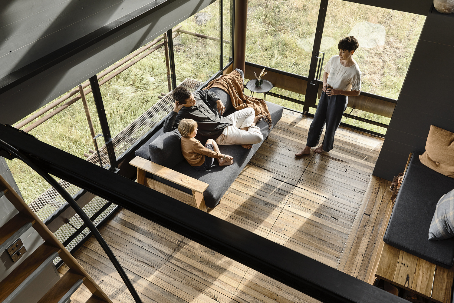
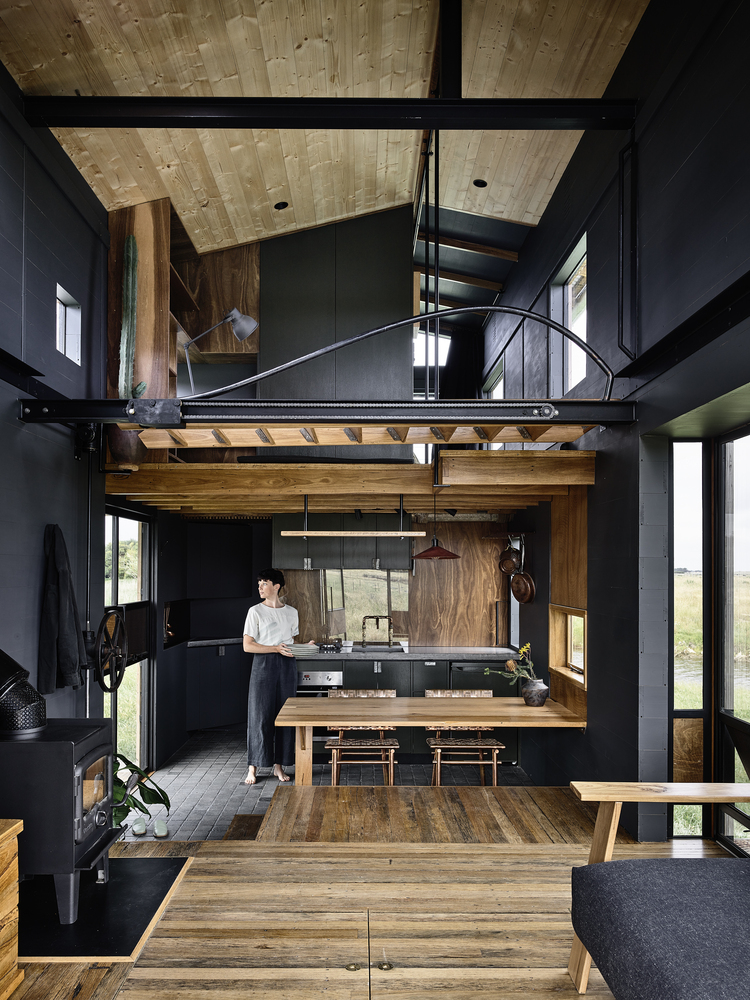
Multi-use and intersecting spaces are the focus of the interior in order to maximize the utility of the limited footprint. Staggered flooring creates opportunities for storage and seating as the rooms transition from kitchen to lounge, and mezzanine office to the bedroom. The sliding door closes off the bathroom but reveals hidden storage in the kitchen.
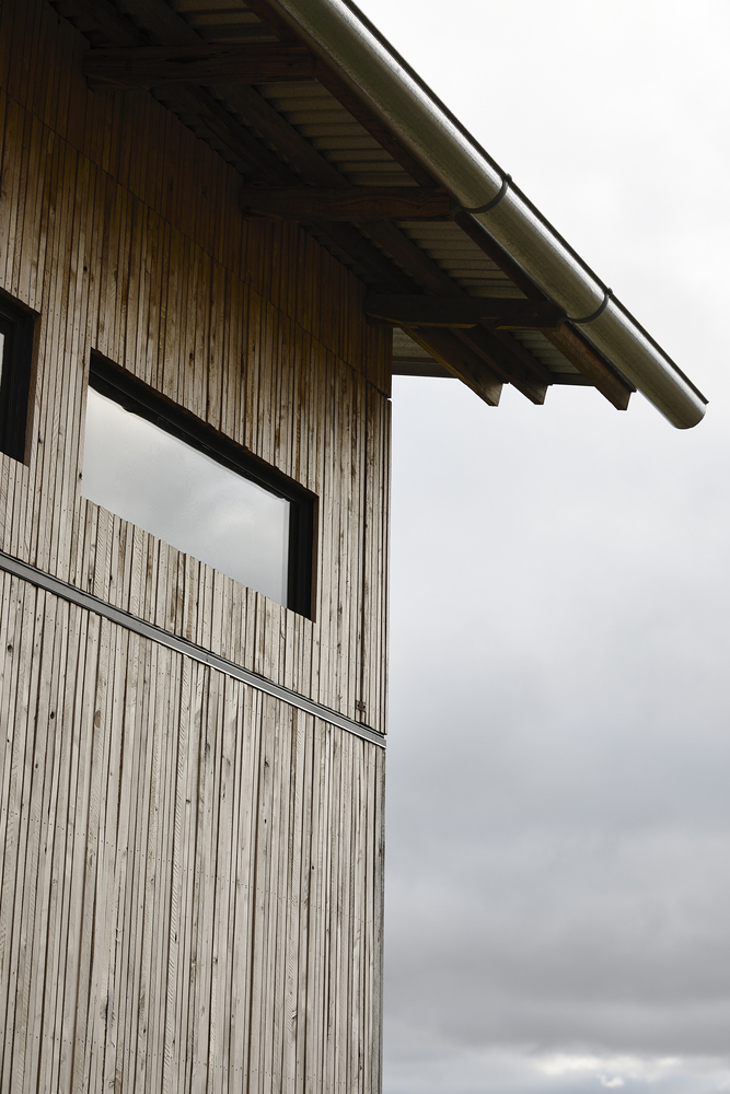
The double-height gives the lounge an additional sense of space. It features a split-level office, where the mezzanine floor becomes a seat for the study and the desk becomes the guardrail. It is a small space, but it feels much larger, given it shares the height of the lounge. The lower section is encased by steel glass windows and pivot doors. Copper and ply louvers run horizontally along with the glass, hiding fly wire but coaxing the south-westerly breeze to travel up through the building.
Material availability and selection were inspired and informed by the rural setting. Folding into the landscape of rusted red farm sheds and weather-beaten coastal buildings, the Brooke consists of locally sourced or recycled elements that reflect its locale. Thin strips of locally felled cypress make up the exterior cladding. As it greys from the wind and the rain, it will resemble a house of twigs, twisting and slightly bowing against the oxidizing copper, gradually melding into the landscape.
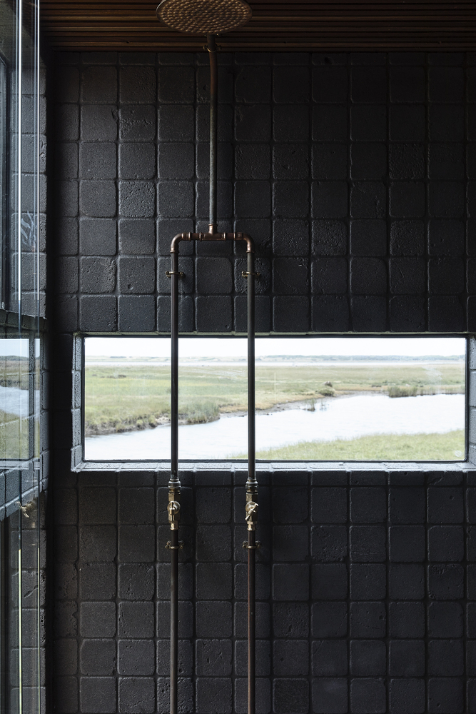
The floor-to-ceiling windows mean the building is flooded with natural light by day, so the interior materials chosen are warm, textured and dark. Local volcanic rock lines the bathroom, concrete and galvanized steel details throughout with recycled hardwood from building demolition. The staircase at the entrance and deck are all completely recycled from nearby concrete cow troughs and mesh from an abandoned pig shed.
Project Details
Architects: small.
Area: 27 m²
Year: 2021
Photographs: Derek Swalwell
Lead Architect: Nick Lane
written by : Hana Abdel 6 Feb 2022 published in : archdaily.com
The Brook sits in a paddock atop an old Gasometer among the ruins of a flour mill. It is situated in Rosebrook, South West Victoria, on the traditional lands of the Gunditjmara people.The Brook was designed to capture the remarkable wetlands surrounding the Gasometer, with windows that frame the Moyne river, lush paddocks and the occasional passing dairy cow.
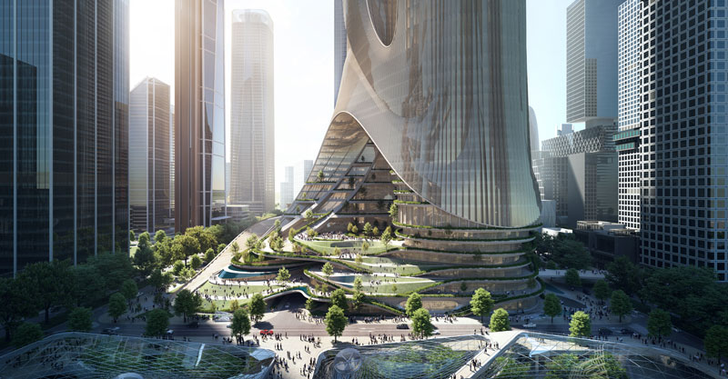
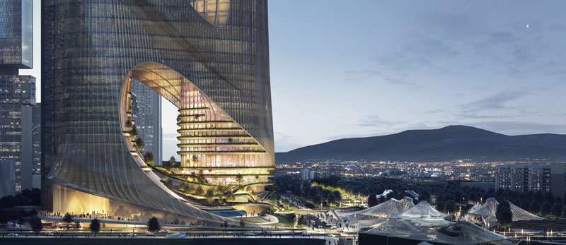
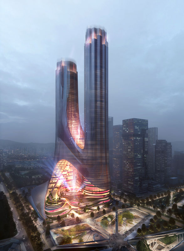
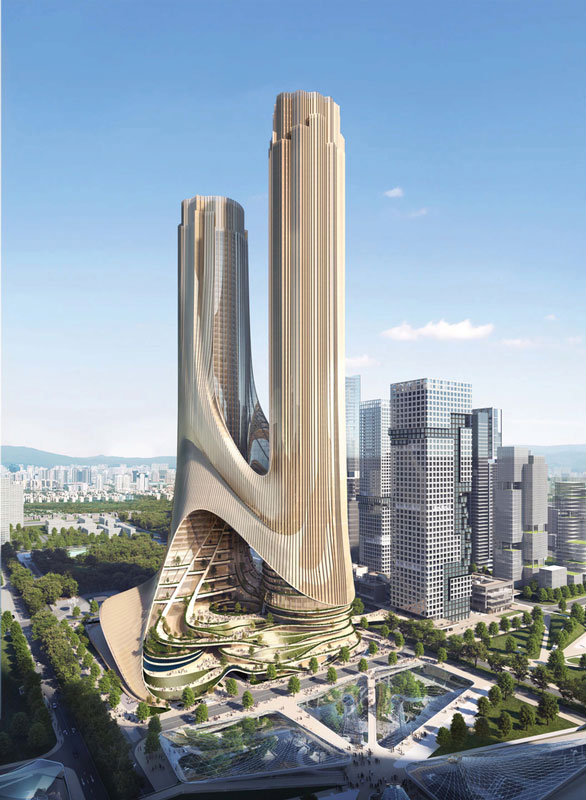
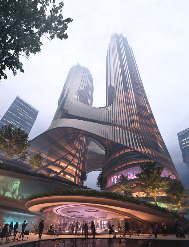
ZHA Wins Competition to Build Tower C at Shenzhen Bay Super Headquarters Base
Zaha Hadid Architects (ZHA) has won the design competition to build Tower C at Shenzhen Bay Super Headquarters Base, in China. The winning design is a multi-dimensional vertical city of two naturally-lit towers that respond to the city’s urban intersections. The proposed tower responds to the city’s intersection of the north-south green axis and east-west urban alley. The architecture connects with the adjacent park and plazas, transforming into a terraced landscape, and extending upwards between its two towers. This extension invites visitors into the center of the building where cultural and leisure facilities are placed. The towers are tied together with sweeping bridges that give panoramic views of the city.
The architects behind the project wanted to unite the urban landscape, so they extended the Shenzhen Metro network and integrated a stepped podium with the adjacent park, to ultimately create a new unified public space. Since the priority was the pedestrians, the architects included extensive bicycle parking spaces and charging facilities. Based on the innovative 3D modelling tools developed by ZHA, the architects were able to optimize efficiencies in architectural massing, orientations, and façade-to-floor ratios. The team’s final design stands at nearly 400m, wrapped with double-insulated glass curtain walls. The building’s design and vertical channels incorporate natural and hybrid ventilation with environmental control for each floor.
In coordination with the district’s smart management systems and ambition to increase efficiencies and well-being, the project will be constantly monitored, evaluating external and interior conditions, adjusting the latter in real-time to reduce energy consumption. The project will also incorporate water-collection and recycling, as well as photovoltaics. All the aquaponics gardens situated on the terraces will biologically filter the surrounding atmosphere. Low-volatile organic materials will also be installed to minimize indoor pollutants. The proposed building will be an important economical center in the Chinese city, serving Guangdong, Hong Kong and Macau. The project, which will act as a global technological hub that includes clusters of corporate headquarters, is planned to accommodate 300,000 employees each day. In addition to the business facilities, Tower C will Include multiple venues to host international conferences, exhibitions, and cultural programs, as well as residential developments, a transportation department, botanical lands.
written by : Dima Stouhi 6 Feb 2022 published in : archdaily.com
Nickson 61 Commercial Building by Smart Design Studio
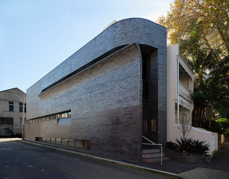
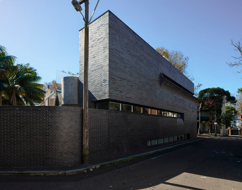
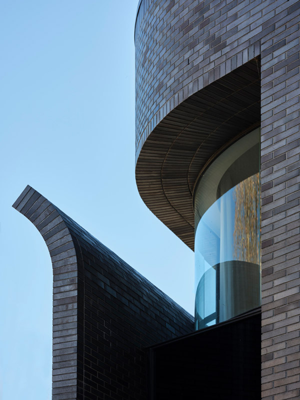
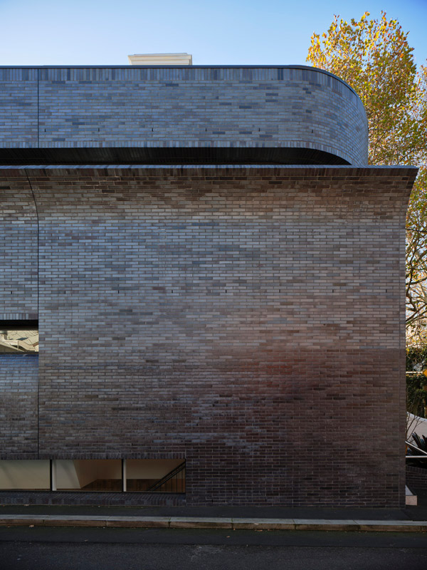
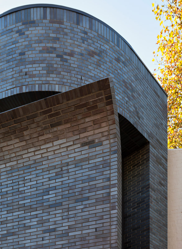
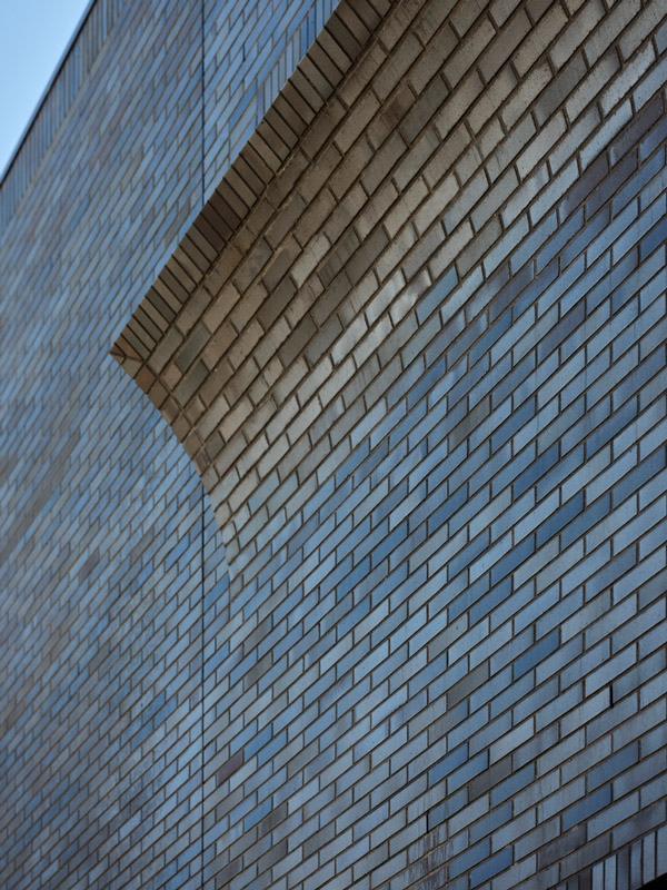
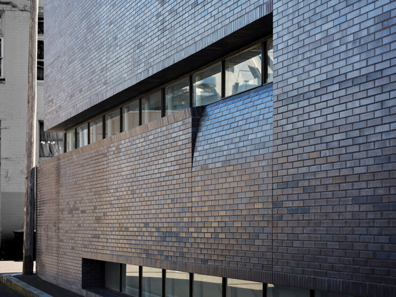
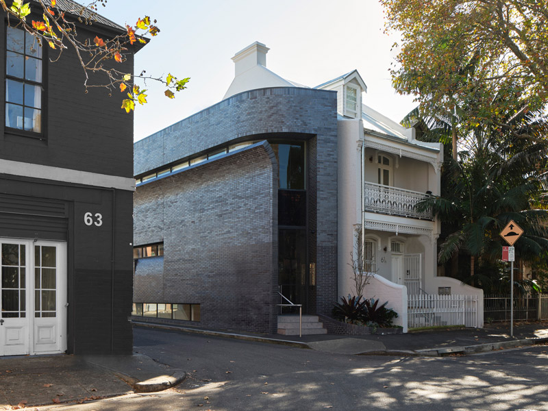
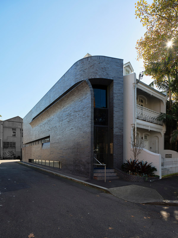
Text description provided by Smart Design Studio architects. Located at the meeting point of commercial and residential zones in busy and vibrant Surry Hills, Nickson 61 presented an ideal opportunity for the adaptive reuse of existing building stock to provide a significant architectural contribution to the area. The site is located on a corner at the end of a row of terraces towards the southern end of Nickson St. It is visible from busy Cleveland St and is adjacent to both commercial and residential properties. The site contained a late-19th century terrace and a three-meter-wide vacant end lot. This lot was originally occupied by a free-standing dwelling that had been demolished to make way for an access lane.
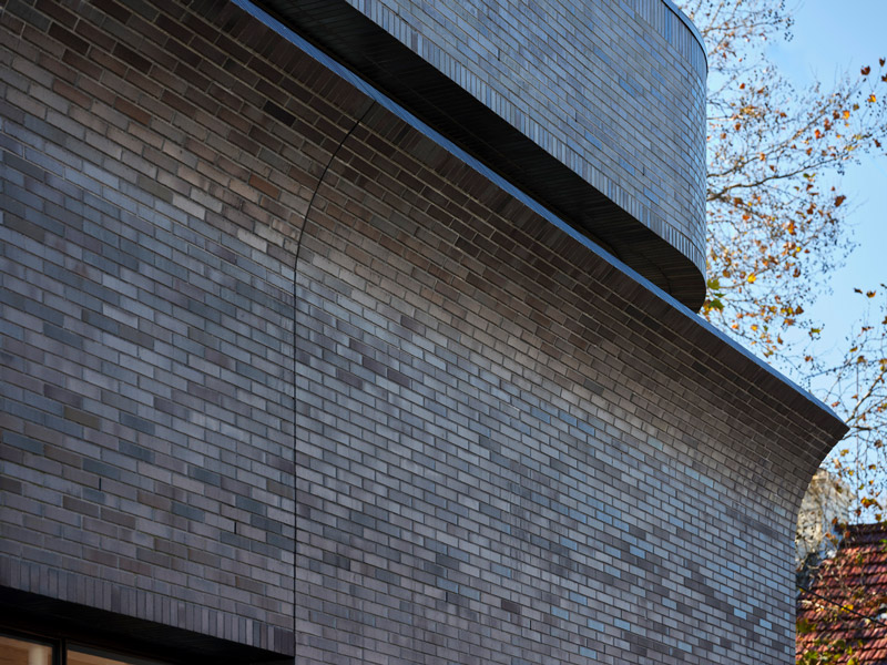
The traditional typology for a corner site within this conservation area is the corner shop – a modest-scale building that reinforces the corner and provides public amenity and personality to the urban precinct. The design establishes a contemporary version of this typology, addressing the traditional angled corner boundary form and responding to the typical brickwork construction of the corner building. The bold new peeling form completes the row of the terraces and provides contrast to the existing built form that was restored to its original Victorian detail. The sculptural form is carefully considered to retain the expression of the adjacent terrace envelope, while strategic slots in the façade curve out to open to the street corner and sky.
At an urban scale, the key objective was to revitalize the residential accommodation in response to the increasing density of the area and demand for adaptive re-use of existing housing stock. Two new high-quality residential units are provided on the two upper floors. Residential entry to the building is via the front door of the existing terrace, ensuring privacy & separation from the corner commercial entry while maintaining an active residential frontage to the street. The first-floor balcony overlooking Nickson St retains the existing terrace balcony. The upper floor level is built within the existing roof form to retain the scale of the existing street frontage and established building pattern.
The small-scale ground floor and basement single commercial space, compatible with mixed-use of the surrounding area, provides engagement and activation to the street. The commercial entrance is located on the corner of the site, highly visible and separate from the residential entry. Along with the bold form of the new infill, this establishes a dialogue between the commercial buildings of Cleveland St.
Although this area prohibits commercial development, we were able to achieve planning approval through strong arguments for street engagement and sophisticated transitions between residential and commercial Nickson 61 is a contemporary, bespoke contribution to Surry Hills. It offers clever reuse of existing building stock to provide boutique commercial and residential space that typifies the vibrant mixed-use character of the suburb and provides a bold formal addition to the architecture of the area.
Nickson 61 Project Details
SURRY HILLS, AUSTRALIA
Architects: Smart Design Studio
Area: 211 m²
Year: 2021
Photographs: Romello Pereira
Manufacturers: AutoDesk, Austral Bricks, Bentley, Boral, Lysaght, Skheme, Viridian, Airlite, Bluestone, City Scape Steel, Fielders, Make
Builders: Jackal Constructions
written by : Hana abdel 1 Feb 2022 published in : archdaily.com
Gallery of Commercial Building by Smart Design Studio
Located at the meeting point of commercial and residential zones in busy and vibrant Surry Hills, Nickson 61 presented an ideal opportunity for the adaptive reuse of existing building stock to provide a significant architectural contribution to the area. The site is located on a corner at the end of a row of terraces towards the southern end of Nickson St. It is visible from busy Cleveland St and is adjacent to both commercial and residential properties.